Avoid These Design Traps If You're Going Bold With Pattern Drenching
We may receive a commission on purchases made from links.
Maximalism is taking on a new form through the power of patterns. Piggybacking off of the hyper-saturated color drenching trend, there is a dynamic new approach to busy decor. Pattern drenching is the concept of layering the same style of pattern throughout one room. You can achieve this eye-catching look through textiles, wallpaper, and upholstery. That being said, trends constantly expand to accommodate a wide variety of tastes, and this particular look has grown to include mismatched patterns as well — just as long as they saturate the entire room.
However, top designers know that pattern drenching can go wrong if the space isn't carefully curated. But with their tips, amateurs can still achieve a polished-meets-playful look. Rather than feeling overwhelmed by the options, focus on these key pieces of professional advice. We've rounded up the top design traps to avoid according to industry experts, including exclusive quotes from interviews with Kristin Regen, Joyce Huston, Laura Cate Todd, Arielle Rosenblatt, and Manuela Hamilford. Learn how to personalize your space with patterns and discover the mistakes you should avoid at all costs.
Not sticking to a color palette
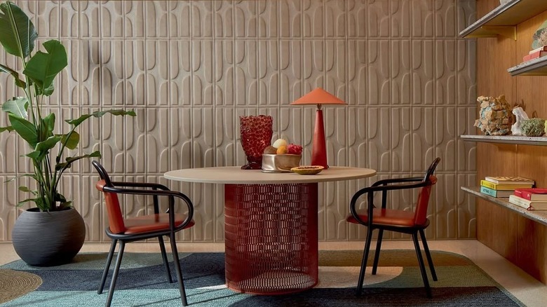
Pattern drenching is the new, modern twist on vintage — but it must look intentional. Maximalism doesn't mean throwing restraint out the window. If you want to pattern drench the right way, it's important to learn the difference between bold and loud. There is a method to the madness. Kristin Regan, interior designer and owner of KR Interior Design, explains: "A common mistake with pattern drenching is using too many loud, multi-colored prints — it quickly turns into visual chaos. Instead, start with one bold, multi-colored pattern (like a floral featuring pink, green, yellow, and blue). Then, add a secondary print that's more subdued and uses just a few of those colors — such as a plaid in greens and blues. Finally, incorporate a simple, grounding print in a single color pulled from the main pattern—like a green and white stripe."
Using a connecting color scheme is a great way to ensure that your patterns don't compete with one another. The goal is to create an exciting atmosphere that doesn't cause anxiety. You can also apply the 60/30/10 rule to your pattern drenching. That means that 60% of your space is a variation of a single shade, 30% of your room involves a specific secondary hue, and the final 10% is an accent color. Make sure that each of the patterns includes at least one of the two anchoring colors. This simple trick ensures cohesion and prevents the room from feeling disjointed. You can also use solid-colored decor throughout your space to emphasize specific shades and tie the patterns together.
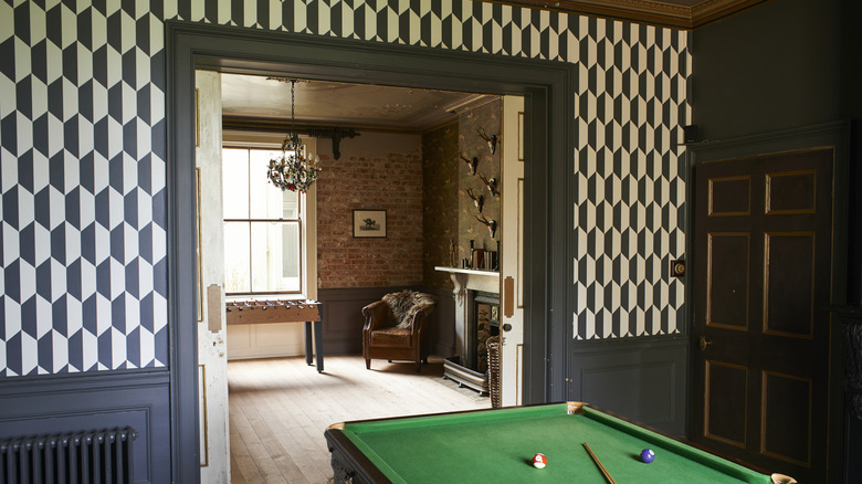
Layering similar-looking patterns together
It's easy to fall in love with a single style of pattern, but you can have too much of a good thing. Contrast is imperative so as not to inundate onlookers with visual overload. Joyce Huston, lead interior designer & co-founder at Decorilla Online Interior Design, shares her insight: "I don't recommend placing the same style of patterns on top of each other, like florals on florals. It's overwhelming and overly saturated. Instead, create harmony by combining different styles, such as geometric patterns next to more classically floral or botanical ones. It's a great way to create visual interest in a room that doesn't overwhelm."
Although the original concept of pattern drenching involves using the same kind of pattern throughout your space, choosing patterns that are too similar can backfire. Using florals on florals can lean grandmillennial -– which is a style that's on its way out. However, there is a way to make similar patterns work together rather than against each other. For example, consider a more traditional floral pattern, like these jinchan Linen Blend Curtains, next to a more contemporary design, like this Tache Modern Abstract Bedspread. The theme is the same, but the different styles will create contrast rather than competition.
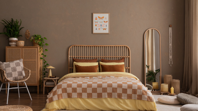
Using same-sized patterns

In addition to contrasting styles, you should also consider the size of your selected designs. Laura Cate Todd, interior designer and owner of Laura Cate Interiors, explains how to perfectly mix patterns in your home decor like a design expert: "When every pattern is the same size, whether they're all large or all small, they end up either competing for attention or fading into the background. For example, if you have a large-scale, sprawling floral on the drapes, it's much more effective to pair it with a small-scale print on the wallpaper, like a ticking stripe or a hand-blocked motif. This kind of scale contrast allows each pattern to breathe and be appreciated on its own." The danger, she explains, comes from the lack of visual variation: "On the flip side, using two large-scale patterns or two small-scale patterns next to each other can feel either overwhelming or underwhelming. The eye doesn't know where to rest, and the space can lose its sense of cohesion."
A recurring piece of advice is that contrast allows the eye to relax and take in every piece of decor equally. A messy atmosphere can be avoided by selecting patterns that have slightly different features. For instance, if you're drawn to geometric patterns, a large-scale diamond print on an area rug could be paired with a medium-scale lattice on an accent chair and a small-scale grid on throw pillows. Keeping the pattern family consistent lets the eye recognize a single element. This technique works equally well with patterns like chevrons, dots, or abstract brushstrokes. The goal is to maintain a consistent vibe within the decor while allowing each pattern to play a different visual role.
Forgetting about negative space
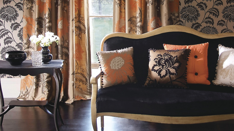
In spite of its name, pattern drenching doesn't mean you need to cover every inch with decorative motifs. Arielle Rosenblatt, an interior designer and owner of Arielle Rosenblatt Interior Design, speaks about the importance of negative space: "Pattern drenching often fails when there's no visual relief. Even the most maximalist designs need negative space to breathe. In a Cedarhurst residential project, I incorporated solid-colored statement pieces amid the patterns — a velvet sofa became the perfect resting spot amid patterned wallpaper, drapery and accent chairs. This strategic placement of solids prevents pattern fatigue and highlights the beauty of your chosen prints."
Eclectic decor still requires restraint. There are a few ways to make sure that you balance your patterns with negative space. First, pick your primary patterned piece. This statement piece will serve as the main focal point of the room. It could be curtains, a bedspread, or a large piece of furniture. Next, make sure that the area around the statement piece is largely clear, allowing it to stand out as intended. The backdrop behind or next to the busy pattern should look clean. Then, take your complementary patterns and spread them evenly throughout the room, making sure to include negative space in between.
Overlooking texture as pattern
The term "pattern" doesn't have to be exclusive to flat, two-dimensional motifs. Todd gives another pertinent tip regarding unexpected patterns to consider: "Grasscloths, sisals, and other textured materials can be great alternatives to traditional prints. Many of them offer subtle woven patterns that mimic the effect of a small-scale print without overwhelming the space. It's a great way to add depth while keeping things balanced."
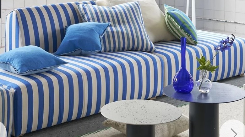
For example, stripe drenching is the bold decor move that designers are loving right now, but it's not only reserved for two-dimensional designs. Stripes (and other patterns) can be introduced through a variety of textured materials, adding both pattern and tactile interest to a space. Think ribbed wall paneling, woven natural fiber rugs with linear detailing, or grasscloth wallpapers with subtle vertical or horizontal weaves. This Safavieh Area Rug is an excellent example. Textiles like pleated drapery, bouclé upholstery, or quilted throws can also create a layered look. You can also incorporate these DIY textured wall art ideas to make your home look elegant on a budget. Don't forget to apply the same negative space concept mentioned above, and include some smooth, texture-less elements in between your textured, patterned pieces.
Not choosing patterns with added texture
In addition to using texture as a pattern, it's important not to be repetitive with the textures you select. Rosenblatt expands on the importance of textural variety by noting: "When working with multiple patterns, varying textures become crucial for depth. I recently designed a dining room combining silk damask wallpaper, wool geometric rugs, and linen botanical drapery — the textural contrast prevented the patterns from appearing flat or overwhelming. Always include tactile diversity when layering multiple patterns for a truly sophisticated result."
As Rosenblatt's example suggests, you can create a refined space filled with tactile patterns, as long as you include enough variation. Just like mixing the size and scale of patterns is important, the textures throughout your space should range from sleek to coarse. For example, pairing smooth cotton drapes with a chunky knit wool throw can elevate both pieces, allowing their patterns to stand out without competing. Additionally, furniture upholstered in linen -– or other natural fibers – adorned with patterned embroidery can create tactile layers that will balance any bold, contemporary decor. Alternate between soft and structured, glossy and matte, and large and small patterns to create visual and sensorial depth in equal measure.
Not considering transitions to other rooms
No matter which designs you choose, the most important factor is the way you integrate pattern drenching into your home. As the owner of Hamilford Design, a luxury interior design studio based in Notting Hill, Manuela Hamilford offers guidance on nailing a cohesive appearance: "Think about the space as a whole — it can be jarring ... if the bold, drenched room clashes with adjoining rooms." To keep it from feeling that way, think about how your patterned space can reflect the rooms surrounding it. "Use colors from the same tonal family or repeat certain elements, like wood finishes, metal accents, or fabrics — this will give a sense of flow," she explains.
You don't have to carry the patterns themselves throughout your entire home, but you should pick an element that the patterned decor possesses to carry through your interior. For example, if you have a bold floral wallpaper with green leaves and pink flowers, you might pull the green from the leaves and seek out an armchair or sofa in that selected shade. If one of your patterned pieces has a metallic touch, use that finish through fixtures or hardware. By defining and repeating these smaller elements, you can create visual links. Color drenching can also boost the tranquility of your room, and you can use it in tandem with pattern drenching — as long as you have some areas of reprieve.