The Paint Trick Designers Swear By For A More Luxurious Kitchen
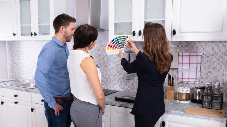
Choosing the right paint colors for your kitchen is a big deal. It's the heart of the home, where family and friends gather, so getting the tone just right can elevate the entire space. White kitchens will always be in style, making it a classic go-to choice for most homeowners, but white paint still comes with a variety of different hues and tints to choose from. Narrowing down the perfect shade of white from a pile of swatches can be daunting, especially when it's going to cover everything in your kitchen from the walls to the cabinets and trim. To get a look that feels truly professional and stylish, it's best to follow the advice of expert interior designers. In fact, it's worth considering the trick many designers use to give kitchens a boost of luxury: using two different shades of white on the walls and woodwork.
It's a choice that you may not think to opt for, as it seems counterintuitive to a cohesive design. However, experienced designers have been using this trick for years to give kitchens a more dynamic and layered look. With the right shades of white, this simple method can take your white kitchen design from flat and typical and transform it into a thoughtful, luxurious space that feels timeless.
Layer two shades of white for a stylish contrast
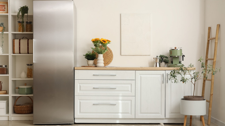
Dimension is a key aspect of interior design, and layering different elements is one of the easiest ways to achieve it. It's a technique often seen in decor, whether it's layering area rugs or curtains, but many homeowners don't realize the value it can bring to your paint choices as well. A slight difference in the shade of white on the cabinets and the walls adds a subtle contrast, introducing a layered look that allows certain details to stand out. There are many tips to help you pick the right white paint for your space, but if the shades you choose don't complement each other, it can negatively affect the design. When pairing, it's important to maintain a consistency in tone, so avoid placing cool and warm toned whites next to each other. Instead, look for a similar shade with a small difference in LRV (Light Reflective Value), and use the white with a higher LRV on woodwork like trim and cabinets.
Many designers prefer to use a fresh white like Benjamin Moore's "White Dove" on the woodwork to give the space a lifted look, pairing it with a slightly darker white to bring in some dimension. Other professionals recommend pairing colors like Sherwin Williams' "Pure White" for woodwork, and "Alabaster" for the walls — this duo gives the walls a sense of warmth and creamy appeal, while the brighter white on the woodwork allows the design to look clean and sleek.