9 Accent Wall Colors To Capture The Feeling Of Golden Hour All Day Long
There's something universally comforting about the golden hour — the way it bathes a room in warm light, softens harsh lines, and makes everything feel a little more magical. It's no wonder so many people want to bottle that glow and bring it indoors. The good news? You can mimic the warmth of golden hour all day long with the right paint color, creating the perfect accent wall in your home.
When you think of colors we associate with the golden hour, you may jump to warm hues like oranges, yellows, and reds. Research shows that traditionally, these colors tend to evoke feelings of creativity and energy, which is perfect for rooms where you want to entertain or create a cozy vibe. But even colors traditionally regarded as cool — like purple, blue, and green — can still complement the golden hour look when they have warm undertones. For example, a color like olive green has more warmth to it than an emerald green because it contains more of a warm, yellow base than a cool, blue base.
That being said, you can capture the feeling of golden hour with a wide array of colors. Whether you want to make a sunset-inspired statement in your living room or a magical backdrop for your bedroom, choosing an accent wall color with warm undertones is key. From dusky oranges and soft pinks to spring greens and sun-kissed blues, you can recreate the glowing charm of golden hour any day.
Brick red offers earthiness and drama
Brick red is reminiscent of the look of clay rooftops at sunset, capturing golden hour's richness. This color adds grounded warmth to any space, especially in dining rooms, kitchens, and libraries. A hue like Red Pepper from Behr offers a more subdued approach to the wall color. Or you can try Benjamin Moore's Country Redwood for a bolder, more saturated impact. This brown, orange red goes great with natural materials like warm woods, terracotta planters, and soft linen curtains. For balance, consider neutral floors or off-white trim to keep the room feeling open.
Bright red orange inspires playfulness and creativity
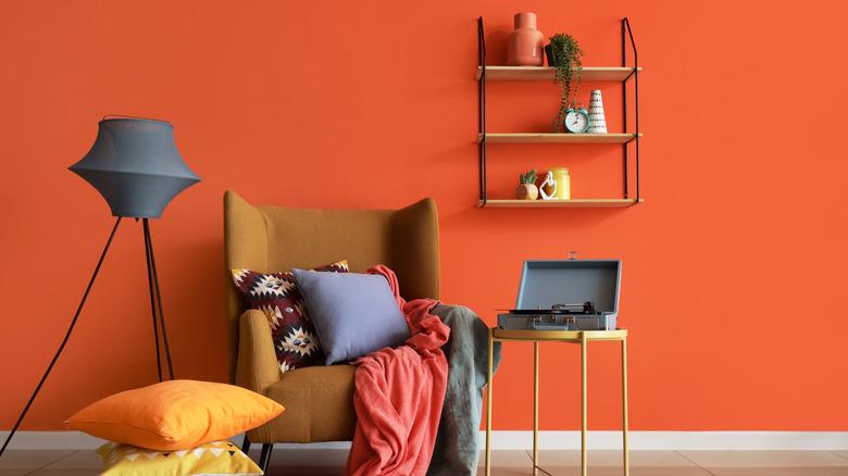
Bright red orange is bold, energetic, and unapologetically fun. A paint color like Salsa from Benjamin Moore delivers a fiery pop, while Backdrop's Bada Bing! skews more coral and electric. Both colors are ideal for recreating the golden hour in creative spaces like playrooms, craft rooms, and kitchens. Keep the rest of the space grounded with warm white, clay, or beige. And consider framed abstract art or playful pottery in complementary shades to lean into the color's retro flair. For a more refined approach, pair it with minimal styling and soft, indirect lighting for a golden glow.
Choose burnt orange for depth and sophistication
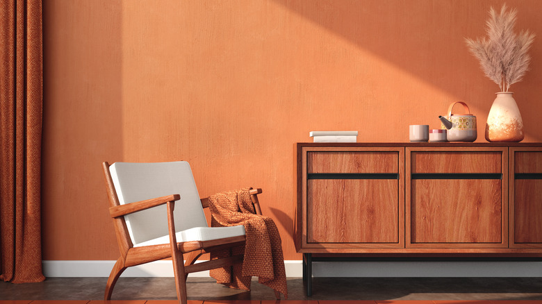
Burnt orange is the underappreciated interior design color finally getting its moment — and it's the perfect candidate for a golden-hour inspired space. This color has plenty of warmth and personality, especially when used on an accent wall that gets natural light. Valspar's Cattle Drive is a soft clay-orange, while the shade Fireball Orange from Benjamin Moore leans more paprika toned. Since burnt orange is so bold and warm in color temperature, it can brighten up dark spaces — try using it in rooms that don't get much natural light for a boost of energy.
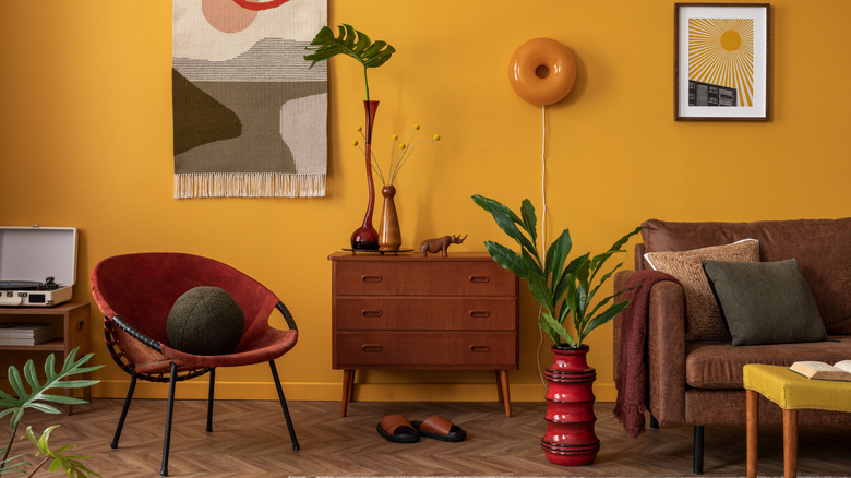
Golden yellow evokes sunlight
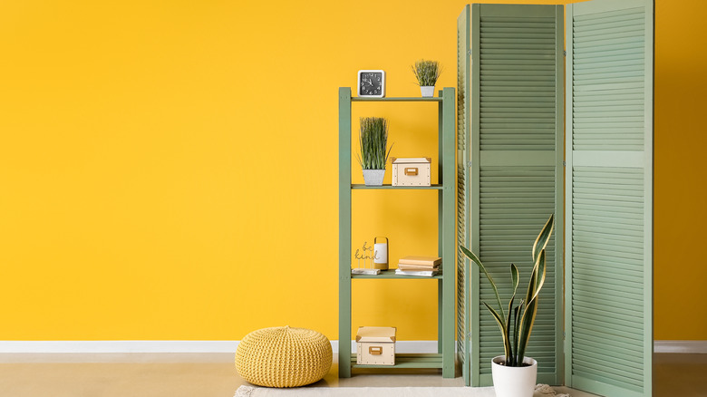
Nothing channels golden hour quite like a rich, honey yellow. It mimics late-day sunlight in the coziest way, brightening spaces without feeling artificial. For a buttery, bold look, try Benjamin Moore's Golden Retriever — a warm gold that plays well with wood tones. Or go a touch deeper with Goldenrod from Sherwin-Williams, a yellow that's cheerful and rich without overpowering the room. Use this shade in kitchens, bedrooms, or entryways for a timeless pop of sunshine that works year-round. And try pairing it with natural wood, matte black hardware, or creamy neutral linens to balance the vibrancy.
Embrace chartreuse walls for a jolt of sunshine
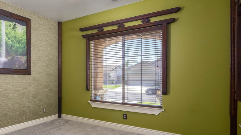
Lively and fresh, chartreuse captures the natural energy of the golden hour. Backdrop's Pretty Ugly is a vibrant yellow-green with retro flair that will make a bold statement in any room. But for a more subdued approach to the color, try something like Benjamin Moore's Vienna Green, which is still springy, but less saturated. For decor colors that complement chartreuse and still capture that late afternoon, sun-drenched whimsy, try peachy pinks, deep oranges, and light tans.
Opt for olive green for grounded golden-hour interiors
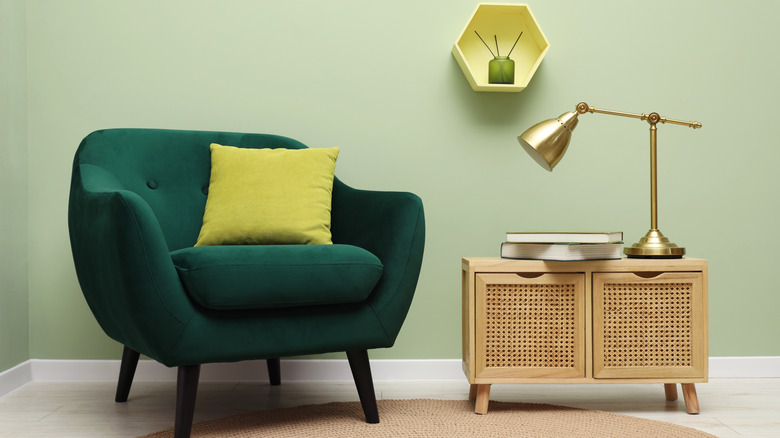
Olive green is earthy yet radiant, with enough golden undertones to feel sunny rather than somber. Olive Shade from Behr has strong, toasty depth with a brownish base, while Basque Green by Sherwin-Williams has a more yellow undertone, but is still a dark enough shade to feel mature. Olive green is a smart option for those who want a more neutral golden-hour tone that still elevates and energizes the space. Bring even more dimension to your olive paint with an easy DIY board and batten wall hack that works in every room.
Try teal for unexpected warmth
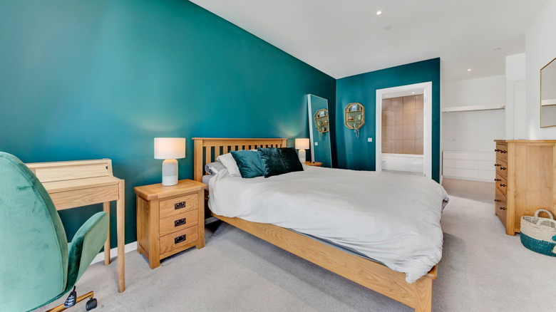
A warm teal brings a surprising twist to golden hour-inspired color palettes. When the sun hits it just right, teal walls radiate a turquoise-green glow that feels both cozy and coastal. Go with Sherwin-Williams's Lagoon for a bold teal with a warm base. Or for look that's smoother and slightly dusty, try Farrow & Ball's Oval Room Blue, a lighter green-blue with enough depth for a striking accent wall. Layer your teal pick with brass or copper accents and soft, sandy tones to enhance the golden hour vibes in your space.
Embrace the surprising warmth of deep purple
Deep purple is another one of those unpredictable picks you may not immediately associate with early evening sunlight. But it can give off serious twilight energy, capturing the golden hour's drama as the sun dips low. Choose a purple-red shade like Backdrop's Lobby Scene for extra warmth, or something like Eggplant from Benjamin Moore for a rich, slightly less red hue. Either brings moody elegance to bedrooms, reading nooks, or even bathrooms. Keep the room from leaning too cool for golden hour with decor finishes like bronze, gold, and antique brass.
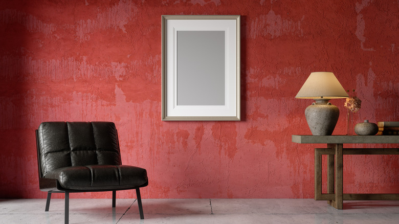
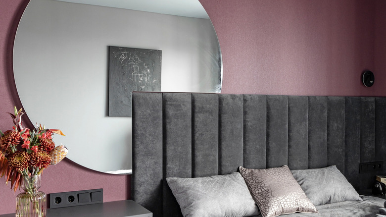
Earthy pinks impart a soft glow
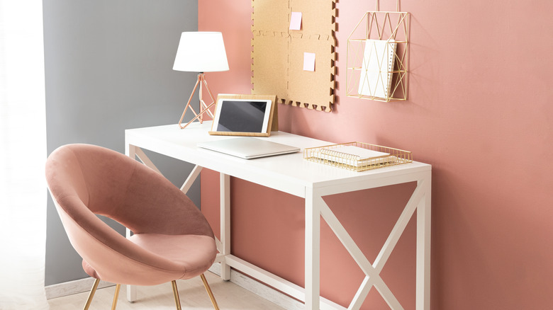
Earthy, terracotta pink is an easy pick for golden hour-inspired interiors — it's soft, inviting, and subtly sunlit. To replicate the look of this room, use Behr's Shiny Kettle. Or for a slightly more saturated hue, try something like Farrow and Ball's Red Earth. Lean into the earthiness of the shade by styling it alongside linen bedding, ceramic art, or rugs in natural fibers like jute. For a modern twist that provides contrast, add darker accents to the room, like a black accent chair or steel-framed mirror, which will really pop against the blush shade.