8 Paint Colors To Avoid Using In A Living Room (And Cozier Alternatives To Try)
From wrestling for the TV remote and crying foul over lost board games to getting your act together to entertain guests, there's plenty that living rooms bear witness to. However, for them to be truly functional and offer us a safe and collected space in which to unwind, they must be painted in colors that feel warm, calm, and relaxing. Unfortunately, not all paint colors are cut out for this task and can backfire, making you unhappy when you walk into the room, potentially questioning your life choices.
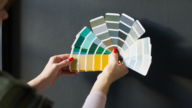
That's why, to save you the overthinking and any expensive do-overs, House Digest reached out to six design experts to get the scoop on the worst living room paint colors, and what to consider instead. They suggest retiring cool grays, deep navy, and purple shades, because they get monotonous real quick and counteract the warmth essential for living spaces. Also, think twice before incorporating any primary, neon, or highly saturated shades that may look spectacular in small samples, but may overwhelm the area when applied to entire walls. Sticklers for cleanliness should steer away from glossy black paints, while you must shun bright whites to prevent the space from looking hospital-level sterile. Interested in learning more? Here's a quick discussion on the eight paint colors to avoid using in your living room and better alternatives to try.
Avoid cool grays because they take away the cozy factor
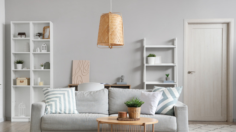
You're perhaps no stranger to the craze for all-gray interiors, a trend TikTok uncharitably coined "Millennial Gray." From walls to furnishings, homeowners coated everything in different shades of gray — most notably with cool blue undertones. While the shades may exude understated beauty and class, your living room isn't the right place for them. Justifying why that's the case in his exclusive interview with House Digest, Christopher Boutlier of the Washington, DC-based Christopher Boutlier Interiors, says, "It was everywhere for years, but it often ends up feeling flat and lifeless, especially in spaces where you want warmth and connection."
Complementing his views, Gala Magriñá, holistic interior designer and principal at Gala Magriñá Design, adds in her exclusive House Digest interview, "Cold, flat grays can make a living room feel sterile and emotionally distant. They drain the space of warmth and soul, which is the opposite of what you want in a room designed for connection and unwinding."
So, if cool grays instill an institutional feel, how can you restore your living room's liveliness with paint? To stay on this color spectrum, switch to smoky taupe, suggests Boutlier. "It has all the versatility of gray but with far more warmth and sophistication." But if you're willing to switch gears, heed Magriñá's recommendation: "I love Gondola Ride by Benjamin Moore as an alternative. It's a deeper green hue that, when used monochromatically, can create a cozy cocoon effect ideal for lounging or conversation."
Shun harsh, bright whites, as they make living rooms seem unfinished
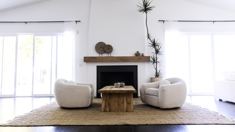
White paint has — unarguably — been treated as a safe bet by most homeowners. It generally teams well with existing furnishings and infuses the room with airiness and brightness. Surely, it would make your living room appear welcoming and larger than their true dimensions, right? According to Cathleen Gruver of the Northern Virginia-based Gruver Cooley, that's not the case if you paint the room in stark white hues. "Harsh bright whites might seem like a safe choice, but they can come off feeling sterile or unfinished in a room where you want to relax," she explains in her exclusive conversation with House Digest. Basically, steer clear of such shades if you don't want your living space to resemble a dentist's office or a research lab.
To avoid imparting your living room a clinical feel, yet experience white's freshness and verve, Cooley advises incorporating it in softer undertones. "Try a creamy off-white or a warm ivory — these still give you that light, airy feeling, but with a more welcoming undertone." However, if you'd like to layer up your room's warmth without letting go of the cool palette, Cristiana Crin, director of design and founder at Perpetuum Designs, makes two Sherwin-Williams recommendations in her House Digest interview. She feels that through Eider White and Crushed Ice, "you're introducing a pigment of softness that will bring calmness with or without the presence of natural light."
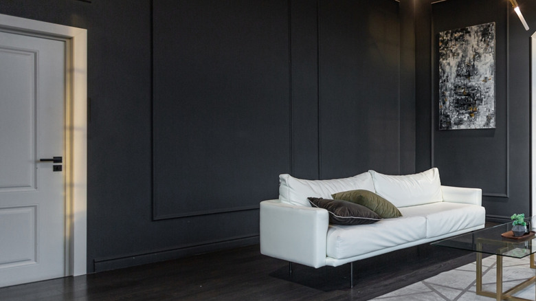
Reject deep navy and charcoal in small rooms because they look heavy
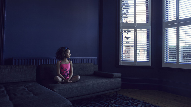
Though they may seem elegantly timeless and sophisticated at first glance, dark colors like deep navy and charcoal won't enhance the balminess and warmth of your living room. Plus, they'll make matters worse if you're dealing with limited square footage, because such paint colors make a small room feel even smaller and boxed in. Explaining the reasons for this, Gruver comments, "While deep, saturated colors like navy or charcoal can be stunning, they tend to absorb light and can feel heavy in smaller living rooms." Such feelings of overwhelm are uncalled for in rooms where you tend to loosen up and unwind for the day.
However, don't lose heart; there are still ways to add a pop of color to small living spaces without them coming across as enclosed and boxy. "A great swap would be a muted earthy tone — like a soft terracotta, olive, or clay — which brings depth and personality without overwhelming the space," advises Gruver. To justify her choice, she leans into color psychology. Invoking the imagery of a sunset, a forest, or a cozy café, she suggests that people feel more relaxed in spaces that mimic natural tones. So, the next time you need to pick the perfect shade of paint, she recommends that you "lean into warmth, softness, and colors that support how you want to feel in the room," and you'll have your answer.
Give primary shades a pass, since they can be too strong and overwhelming
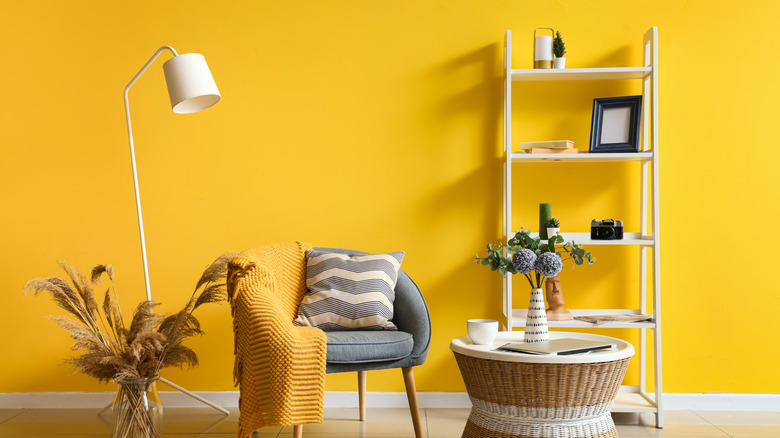
Next time you're exploring the color wheel for inspiration, don't get stuck on primary shades. Drenched on all walls, these colors — be it red, yellow, or blue — can feel overbearing, rather than creating a sense of ease. Commenting on this in his interview, Boutlier mentions, "I always tell clients to be careful with color in a living room. Bright primary shades might look fun on a paint chip, but once they're on four walls, they can feel overwhelming and even a little chaotic." He further puts this into perspective by elaborating on the vibe each color creates in the gathering area. He feels rooms painted in bright yellow tend to "read as harsh and artificial." Besides, when the lights are switched on, this unsophisticated feeling intensifies. As for the other shades, he adds, "a pure fire‑engine red can feel loud and restless, and a bold electric blue can turn cold and stark." In short, none of these colors inspire ease or will invite you to curl up and stay put.
Fortunately, you can still use these hues in your room, provided they're "deeper, softer, or moodier versions that have more depth," opines Boutlier. To create a dramatic, albeit inviting area, he suggests using "saturated scarlet or a rich crimson." A calm, cocooning quality can be fashioned through moody indigos or softened slates. Yellow's sharpness can be softened through gentler shades like warm creams or soft alabasters.
Pass up on high-energy neon colors in relaxed spaces
According to Crin, it's best to keep neon swatches off the table for living rooms, because they offend the eye. "While brightness can be a popular choice, especially for the younger generation, high-intensity pigments are loud and tiring," she explains. Most of the popular neon offerings, from pinks to aqua, usually invoke high energy, which defeats the purpose of congregating in the living area. After all, you don't have to inhabit a room imbuing the vibe of a post-apocalyptic cyberpunk movie just because you're watching one. Besides, as Angie Kreller, interior designer at Yabby, puts it during her exclusive interview with House Digest, "[Neon colors] can age fast and will be hard to pair with your furniture."
To tide you through this predicament, both our experts have varied advice. If you love neon yellows, branch out to softer hues. Crin recommends Benjamin Moore's Golden Straw for its peachy-creamy undernotes. "Colors like Golden Straw have the perfect combination of bright, fun, and comfortable at the same time." In contrast, Kreller offers a golden rule for decision making. "Try a pastel version instead of going all in on the neon." Such streamlined palettes will restore tranquility and calm to the space.
Rule out dark purple, since it's hard on the eyes
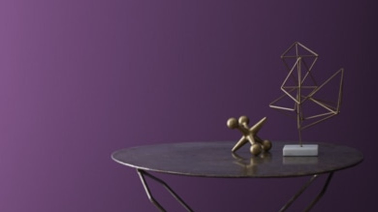
Dark purple is another paint color our design expert says to avoid using in the living room, and there are two reasons why. "While it could be considered 'avant-garde,' it will be hard to decorate and it can become really trying for the eye, especially if your living room is facing north," explains Crin. Essentially, for all their regal embellishments, dark purples are usually too moody for an area meant for relaxation. In north-facing rooms that don't receive much natural light, such moodiness is magnified further and you might feel as if the room is closing in. This will lead to an abject feeling of overwhelm and frustration. Although you can try to temper this effect by bringing in furnishings in neutral shades, it's usually hard to strike such a balance, with the overall scheme coming across as disjointed and jarring.
Given these reasons, Crin believes understated colors like lilac can be a hearty compromise when you wish to stay on this color spectrum and want to play around with your décor choices. "While still in the purple family, lilac is much softer and leaves plenty of room for many-many choices of fun/bold decor pieces that can serve as darker accents," she details. Consider adding seating or décor pieces in blues or pinks, or use this excuse to give in to your love for soft grays (we might not like them on walls, but as accents, they sure are great).
Keep away from reds, since they can be too energizing for living rooms
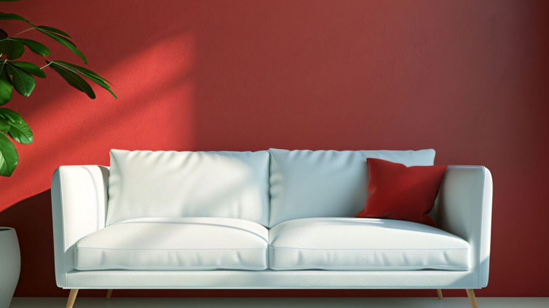
Before you bring out your pitchforks to defend your right to red walls, there is no need for such a bloodbath — we all know how good they can look, thanks to Jean-Pierre Jeunet's "Amélie." However, if you aim to turn your living room into a peaceful retreat, Kreller believes reds aren't up to the task. She notes, "Red is a great color for rooms that you want to energize, but in a room like a living room, it can make the room look intense — especially when it's meant to be a room for relaxation." Digging deeper into color psychology also highlights that exposure to this bold shade can conjure feelings of aggression, dominance, and impulsiveness. Since it may also aggravate stress, those keeping busy schedules should rule out the idea of covering their walls in dollops of red paint.
With red out of the picture, are you wondering what shade you can use to instill color and drama into your living room without your emotions going haywire? Terracotta might be a good choice. "If you want the same impact without the stimulating effect, then a terracotta will be a great alternative, with more of a grounded and earthy feel," feels Kreller. Plus, if your living space doesn't have the best lighting, terracotta might just be classed as the best paint color to brighten up this low-light room.
Choosing high-gloss black paint for your living room will highlight dust particles
Granted, glossy black paint colors can make a serious statement, and will especially appeal to your sensibilities if you're deep into the dark academia trend that's taken over your readings and playlists. However, it's best to use this color sparingly around your home, and not at all on your living room walls. Why is that, you ask? Olga Doykhen, founder and principal of Olga Doykhen Interior Design, answers the question during her exclusive interview with House Digest, "Glossy black walls tend to reflect light inconsistently and spotlights dust particles, making the room frustrating to clean." Not to mention, they can visually shrink the room, which can be inconvenient in modest homes.
So, to avoid wasting even more of your precious time in keeping those lustrous black walls clean, swap out the glossy finish for something matte. Doykhen feels shades like "a matte charcoal or deep, muted brown-black" could be cozier alternatives. They'll keep to the theme and your dark academia heart without piquing the urge to dust your walls. Moreover, being relatively lighter in shade, they can better bounce around the room's light, maintaining its visual weight.