How Designers Pick The Perfect Shade Of Paint
According to Shearer Painting, people have been painting their homes since as far back as 38,000 B.C when a mixture of soot and animal fat was used on cave walls. Even though humans have been expressing themselves with paint colors for centuries, picking a paint color for your space is still one of the most overwhelming decisions for homeowners.
Luckily interior designers have perfected the art of picking paint colors for a variety of projects both interior and exterior.
Consider exterior material
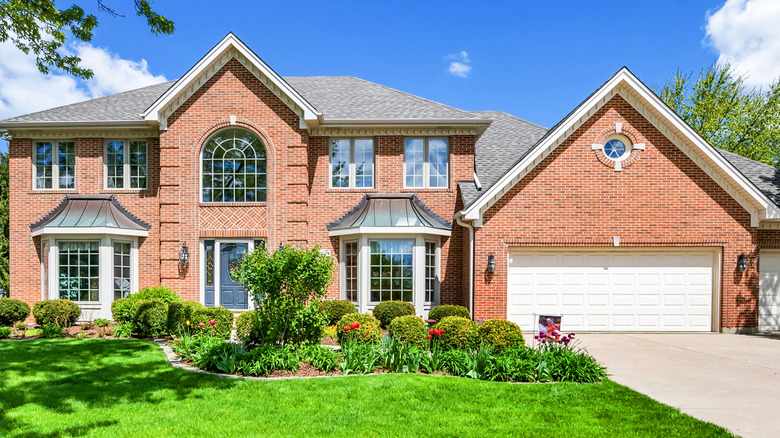
When picking a paint color for the exterior of a home, experts pay special attention to what material they'll be painting. According to Paper Moon Painting, the material of your home or mixture of materials plays a big part in selecting your perfect shade of paint. For example, if you have unpainted brick accents or walls, it's recommended that you match the undertone of the brick to the undertone of the paint color. This will make the home look coordinated and give it more curb appeal.
Additionally, because colors are brighter when they're outside, it's important to consider how light will interact with your home's exterior material. It's recommended that if you want a white or off-white home, you should plan for a color that is two or three shades below your chosen color on a fan deck. If fan decks do not have a darker shade of your desired color, you can ask your local paint specialist for a percentage of a tint of your desired color instead of the full tint.
Consider home value
When painting the exterior of your home, it's important to consider the curl appeal a color will provide. More importantly, if you're planning to sell your home in the near future, it's recommended to pick a color based on perceived home value. According to realtor Shayla Twit, painting an exterior with light shades of yellow is known to attract buyers. Waterfront homes sell well if they are painted a shade of blue.
For a home's interior, to increase the likelihood of selling, it's recommended that homeowners paint with a neutral or earthy color palette (via Matt O' Neill Real Estate). Realtor, Matt O' Neill recommends considering the lighting and functional requirements of a space when choosing a paint color to sell a home. For example, you wouldn't paint a kitchen black if it gets no natural light, because there wouldn't be adequate lighting to make the space usable.
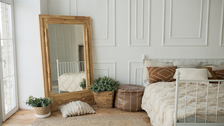
Look at what pieces you're stuck with
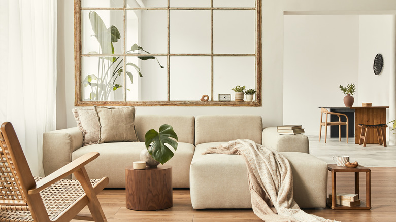
According to interior designer Sharrah Stevens on Youtube, picking a color palette is one of the main things you can do to make your home look expensive and beautiful. Her first step is to consider the items that you're stuck with, like bricks on a fireplace or exposed wall, red-toned flooring, or large items that are difficult to move or have personal meaning to you.
If you have to work around something like flooring, purchase small cans of paint samples to visualize how it'll look with your trim and flooring (via Godfrey Hirst on Youtube). Painting samples onto a wall will allow you to see how the color looks in your space and interacts with the natural light in the room.
There are also some paint colors that naturally pair well with certain flooring. For example, white walls compliment the neutral undertones that are in light-wash wood (via Julie Khuu on Youtube). Meanwhile, gray wood flooring looks great with neutral walls like off-whites and beige. It's also recommended to look at the undertones in flooring to determine which paint color to pick. If the flooring is warm, consider a warmer-toned paint color like a rich beige or a warm gray.
You can also pull your color palette off of pieces of furniture that you're stuck with. For example, if you have a large armoire that has sentimental value, you can look for tones of paint that match the undertones of the wood or pull colors from any stained glass or ornate handles on the piece.
Consider the facing of the room
One of the factors not considered enough when it comes to painting a room is the different facings of a room. Leslie Hendrix Wood at Hadley Court defines room facing as the direction a room faces. The direction of the room will impact how sunlight is filtered through natural light sources.
For example, in north-facing rooms, there is very little direct sunlight, so the light that does filter through is naturally on the cooler side in tone (via Paint People on Youtube). To combat the cool overcast that comes in through windows, look for a warmer paint color and use warmer-hued artificial lighting in your room.
For south-facing rooms, it's recommended that colors are also warmer because in the height of the day up until the afternoon, south-facing rooms are filled with warm light. But as the day progresses they become very flat and dark (via Three Bears Home Staging).
In east-facing rooms, light is less consistent and depends on the environment. In the morning, east-facing rooms will have a soft bright light that floods through the windows and the room gets darker as the day goes on. By contrast, west-facing rooms do not get brighter and warmer until later in the day when the sun is at its peak.
Paint everything white
One of the easiest design hacks is to paint everything a shade of white. According to interior designer Nick Lewis on Youtube, when painting a room white it's important to factor in the lighting of your space. To address this he recommends purchasing paint samples and painting them on each wall in the room, and to monitor how the colors interact with the natural and artificial light already in the space.
When picking between paint, there are a few types of white to pick from. Neutral shades are known for creating high contrast and dramatic looks to everything they interact with, including trim and doors. Warm whites have a cream-based undertone to them. These are used to brighten up small rooms or make a room appear cozier. Warm white paint should not be used when a room is filled with cool-based materials, like a concrete floor or a wall of marble. This is because the different elements clash and make the room look disordered and badly planned.
Cool whites on the other hand have cool undertones and complement rooms that have a lot of natural light flooding into them or have a lot of cool-toned elements that are fixed, like cool gray flooring. You want to avoid cool whites in rooms that have a lot of warm elements and rooms that don't have a lot of light flooding into them.
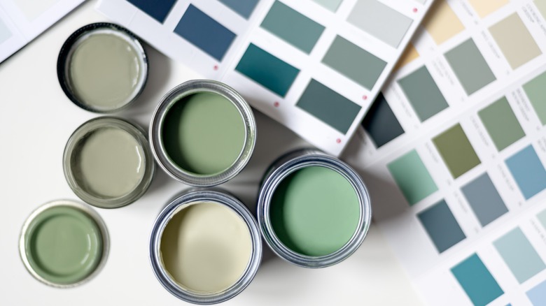
Factor in your color palette's undertone
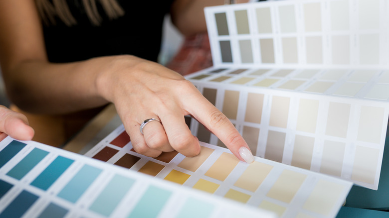
Undertones are one of the biggest tools interior designers use when it comes to picking a paint color. According to Joyfully Growing, a paint undertone is what sets it apart from the other shades in its slide or color deck. To determine a color's undertone, you can look at its manufacturer's website which may list the undertone as well as the light reflective value (LRV). Some companies also list the undertones on the back of color swatches or as part of their sampling decks index page. If neither option is available to you, you can also compare paint swatches to a piece of paper or a black object, this will allow you to see the paint's undertone.
For more complex or designer paint colors, the manufacturer will list on the website what the undertone is. Your local paint specialist will also be able to point out the unique shades in the color. For example, Benjamin Moore's Creamy White, is a mixture of multiple paint colors, causing this color to have yellow and olive undertones, making it a warm-toned color. To complement a color with these undertones, you would either decorate and accessorize using similar tones in monochromatics or to use the opposites on the color wheel to offset the warmth.
Take inspiration from the color of the year trends
While many designers do not recommend following trends, color trends are a great way to get inspiration for design and decor that will be available in the marketplace. This can make decoring your home very easy, especially if you don't want to spend a lot of money to make a place beautiful.
According to Valentina from the House of Valentina on Youtube, brown has gained popularity in the United States and Europe, making it one of the biggest color trends predicted for 2023. Brown is predicted to be seen in decorative objects as well as paint color trends. Brown is also available in warm, neutral, and cool tones, making it perfect to be incorporated into a home.
For 2022, it was predicted that various shades of green were the colors of the year (via Nick Lewis on Youtube). Nick suggests when picking a color, especially one that's a color trend, place it into an online color picker, which will let you determine how much warmth and coolness is in the shade. Some color pickers will also show you the complimenting accent colors for a paint color. This will allow you to determine if you want your shades to be warm and relaxing or to be eclectic and bold.
Paint everything a neutral color
When paint colors in a space contrast too much, it can make the room overwhelming and look thrown together. One of the best ways to avoid this is to paint everything a neutral color, especially if you want to avoid painting rooms white.
Designer Erin Hiemstra tells Camille Styles that neutrals are an essential element when designing a room and that with a color of choice as your foundation, neutrals can pull it all together and make it feel cohesive.
When picking neutral paint, it's important to consider its undertones, the natural and artificial lighting available in a space, and the design style you're going for (via D.Signers on Youtube). Neutral colors are colors that do not have an overwhelming chromatic content added to them. For example, pure neutrals are pure, untouched shades of white, gray, and black, while near-neutrals are colors that have been mixed into neutral base colors or that were made by mixing two complementary colors.
Undertones matter significantly to neutral paint colors because the undertones come out more when matched with a neutral color palette. For example, Paper White by Benjamin Moore appears like a tinted shade of white. But when it's painted into a room with pure neutral accents or compared to a pure neutral, the green undertone comes out. This can make the room look different than you may have anticipated.
You can also determine which colors you want in your space by looking at a color wheel. Colors that are grouped together tend to look better and will either play up cool neutrals or warm neutrals based on how they're arranged in a space. Additionally, based on your interior design theme, you can choose to follow a complimentary, analogous, or monochromatic color scheme in your space.
Compile inspiration boards
Designer Katie Sullivan of Pretty Domesticated swears by gathering inspiration into a mood board or collection before picking a paint color. Katie suggests people scroll through online resources or magazines and collect rooms, items, and pictures that catch their eye. Together, they form your personal style and can be transitioned into an interior or exterior space. Over time you'll discover if you favor a relaxed, moody, or masculine vibe to your home.
You can also create a mood board directly on services like Spoak, where you're able to create mood boards and renderings of your room. You're also able to view mood boards, decorative items, and renderings that other designers have made and use them as inspiration for your home. If you don't have access to an online service that specializes in design, you can also make a mood board on Pinterest or Photoshop.
Mood boards are also useful when it comes to decorating your space because they lay out things you like and allow you to further think about the functionality of the space.
It's important to get a mood board drafted out because every design style lends itself to a different type of color, taking into account shades, undertones, finishes, and the darkness or pigmentation of colors.
After your mood board, you can order a color deck or color samples from your local paint shop and start comparing the colors to objects you already have, like tufted couches or a decorative rug. Kim suggests before painting, to compare at least three shades of paint in actual paint form on walls, although she typically samples upwards of six colors.
Customize your color
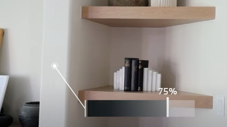
You may not know that you can customize your paint color. Although many paint brands have extensive paint decks and paint lines that are filled with virtually identical shades, you may discover you want a paint slightly altered without going into another undertone or a darker shade. For those purposes, you can get a paint percentage changed.
According to Molly from Design Loves Detail on Youtube, you can adjust a color by percentages to make a color lighter. When you ask for 75% of a color, for example, the paint specialist will only use 75% of the paint formula required to make your selected color instead of the full 100%. What's left from the formula not being mixed in, is an extra bit of the color's base color, which is usually a neutral or white tone based on the company. Commonly percentages are used in 25% increments with 75% being the most common adjustment. To make a color super bright or washed out, you'd ask for 25% of the formula.
Molly suggests when adjusting color formulas by percentages, to try and stick with colors with a greige undertone, so the color isn't washed out and still retains some of its color integrity.
Adjusting a color by percentage is also a great way to keep a color consistent in a home with multiple facings or differences in wall texture or lighting.
Take your paint's LRV value into account
One of the most important aspects of paint that pros consider is looking at the light reflective value (LRV). According to Diamond Vogel, the LRV is the amount of visible and unusable light that is reflected off a painted surface. For example, pure black has an LRV of 0 because light is absorbed by it, while pure white has an LRV of 100 because 100% of light is bounced off of that shade. LRV is useful in interior design because it lets designers gauge how color will look in a room, especially throughout the day, and based on its facing. For example, a green with an LRV of 75 tells designers that the color may look dark on a swatch, but it will appear lighter when it's painted in a well-lit room or it does not need that much extra accent lighting to keep its color integrity.
LRV can be found on the back of some color samples, for example, all of Benjamin Moore's colors have LRV displayed on the back of individual cards, color decks, and on the website. On the other hand, Sherwin Williams has LRV displayed in the index of their color decks and on their website. Both brands also have LRV listed on their AI apps that allow you to visualize a room in any color they offer.