17 Perfect Paint Color Combinations To Pair With Trendy Butter Yellow Cabinets
Butter yellow cabinets are everywhere. This hue is the latest kitchen cabinet color trend that's completely taking over this year, as many homeowners are looking to bring a ray of sunshine into their space. While sage green had its moment on kitchen cabinets a few year sago, butter yellow can give any room a lighter, uplifting feel. Folks are craving quaint kitchen designs with plenty of whimsy and a touch of vintage aesthetics, all of which allow this color to thrive. However, finding the right colors to pair with butter yellow can be tricky. After all, not everyone wants their home to look like it belongs in the English countryside.
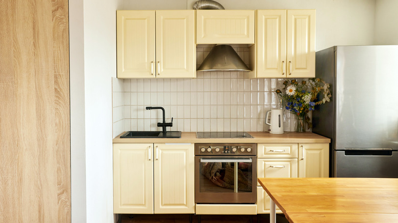
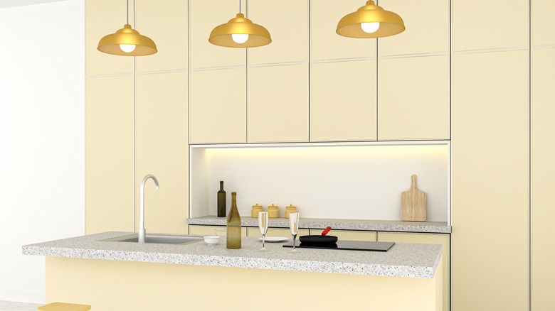
Butter yellow is a soft, pastel color with a hint of warm undertones. The hue's saturation can depend on the lighting and the homeowner's personal preference, but this delicious shade is often more pastel than the classic mustard yellow of yesteryear. This makes it tricky to match with other tones, however, as lighter colors can make a space feel washed out while bolder notes might overpower a butter yellow base. Thankfully, there are plenty of pleasing colors that will complement it while enhancing your design — including white and black, as well as shades of red, blue, and green. It's all about finding the right balance to create the most impactful effect.
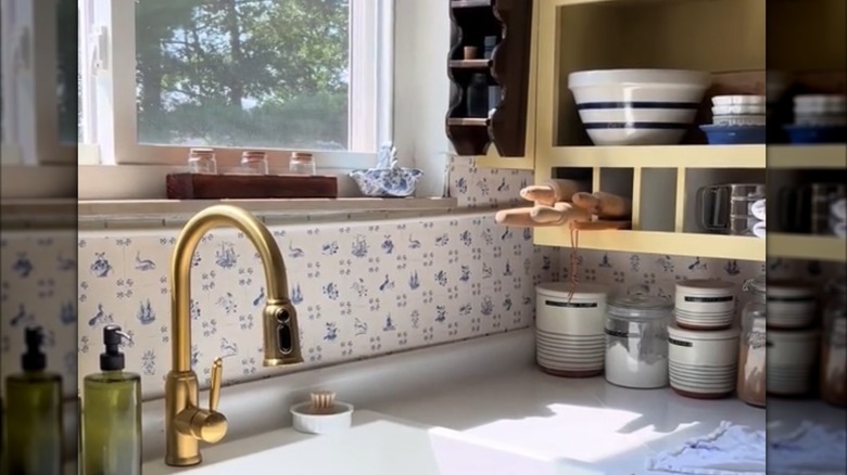
Gentle turquoise
Turquoise is a classic color pairing for yellow cabinets. Whether you lean into the pale blue side of this color or opt for more of a sea foam green undertone, turquoise will add flair and personality to you space. Blue and yellow are both primary colors that complement one another well. This allows turquoise to shine as a pop of color alongside pale butter yellow notes. It's not a loud color combo, but instead a gentle, natural pairing that feels cottage-like or coastal, depending on how you style it.
Dusty gray
Gray and yellow have been a go-to color combo for many homeowners since the 2010s. In the era of minimal, modern aesthetics, charcoal gray reigned supreme, and bold yellow tones added a splash of color. Today, trends have shifted to softer, more organic hues. Butter yellow paired with a dusty, pale gray feels light, natural, and inviting. While some might argue that dark gray is going out of style, it's fair to say that different shades of the color, like a warmer, dusty silver, can be quite trendy alongside pale yellow tones.
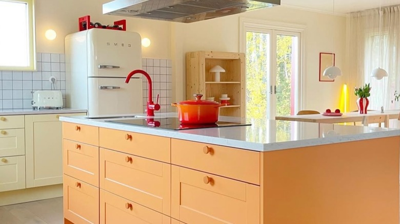
Rich terracotta
Butter yellow is a soft, airy color that's well-balanced with grounding tones like rich terracotta. Since terracotta is similar to orange, which can be analogous to yellow, the hues pair beautifully with one another. Additionally, terracotta adds an earthy feel to the kitchen, something that appeals to today's trend toward more organic, natural aesthetics. When incorporating terracotta into your design, keep it minimal with accents on tile flooring, a backsplash, or as a mini feature along window and doorway trim.
Cobalt blue
Another complementary color pairing that's sure to add a spritz of personality to your space is cobalt blue and butter yellow. Since these two colors feature different shades and saturation, cobalt can bring a bold, impactful look to a pastel kitchen backdrop. Given cobalt's boldness, though, it's best to utilize it sparingly, like in a few vintage fine china pieces throughout your kitchen.
This is widely considered an intuitive pairing, as blue and yellow often appear together in nature. Think sandy beach and deep blue ocean, or bright blue sky and sweet yellow sunshine. Use nature as inspiration when curating a design with this palette.
Picnic red
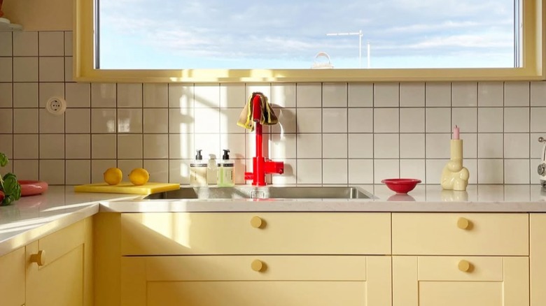
Just as blue and yellow mesh well with one another, red and yellow are another go-to primary color pairing. Picnic red, in particular, can be gentler than, say, a fire engine red. Notably featured in checkered, striped, or gingham prints, this color can add warmth and visual appeal to a buttery yellow kitchen ensemble. Pairing different shades of red with this yellow can also make the space pop and give your design more variety. Use picnic reds as accent tones so you don't overwhelm the space.
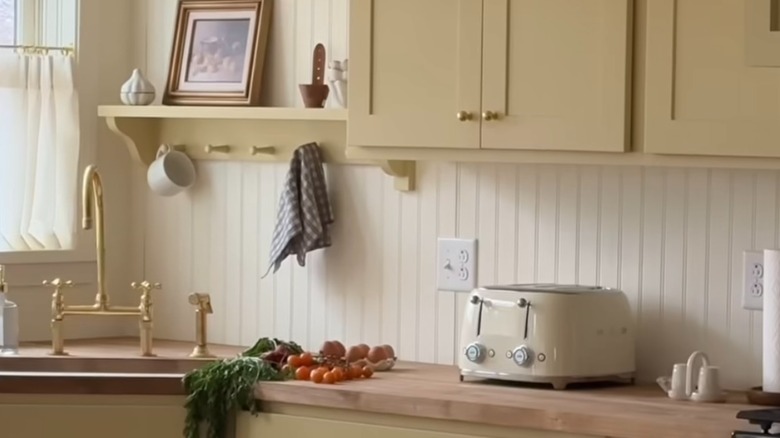
Toasted cream
If you want the light, bright feel of an airy color palette without subjecting yourself to stark white, you might gravitate toward warm cream tones. These add a softer, more natural look than crisp white hues. Further, they often pair well with yellow. Choose a cream color with warm yellow or red undertones rather than cool blue or gray. Red undertones will add a unique layer of warmth, while yellow undertones may feel more monochromatic and act as a base so you can utilize other accent colors.
Sky blue
Sky blue is a super trendy color, particularly in coastal and cottage aesthetics. Both sky blue and butter yellow can fall into the pastel color category, making them must-haves for quaint aesthetics. A painted sky blue center island, for example, can add a pop of color to butter yellow cabinetry. However, be aware that overusing this color alongside butter yellow could create a flat look in your space. Vary up the palette with differing tints, like cream or white, to break up any monotony. Further, aim to use sky blue as an accent rather than as a dominant color in your kitchen palette.
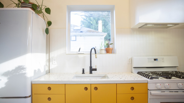
Dramatic black
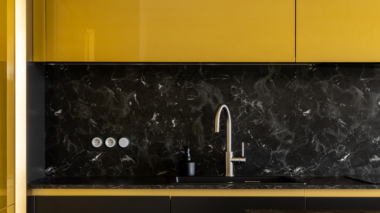
Black and yellow pairings can be hit or miss in home design. On one hand, you risk your home looking like a giant bumblebee. On the other, you may consider these colors to be a match made in heaven. Black offers a grounding, moody appeal to your space and can look quite modern when used correctly. Alongside butter yellow cabinets, you might achieve a cozy, intimate, vintage vibe. Some homeowners have also opted for darker wood or red accents to invite variety into the palette, thus preventing the black from appearing too heavy.
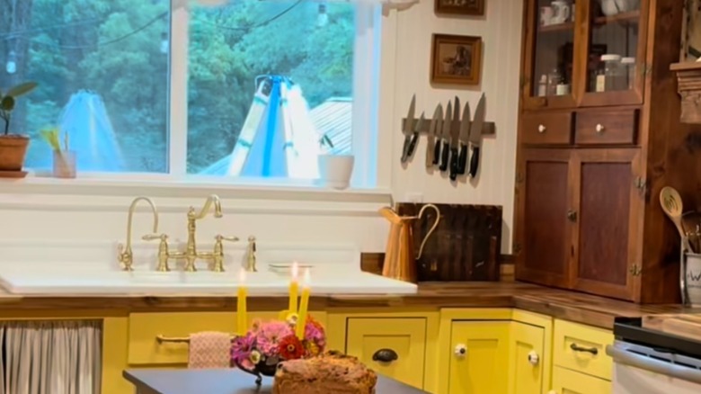
Crisp white
A classic color pairing, white and yellow go hand in hand, uplifting the look of your space. If you're craving an airy, light, and gentle aesthetic in your kitchen, you can't go wrong with white tones alongside your buttery yellow cabinets. Consider quartz or white marble countertops, a white backsplash, or even walls painted in this crisp, neutral color. You could also opt to utilize white pottery, appliances, or decor to blend the two colors and create a gorgeous, pristine look.
Peachy pink
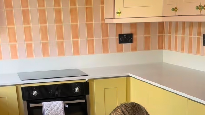
If you prefer a more modern, Gen Z aesthetic, add peachy pink to your kitchen color palette to create a fun and whimsical maximalist vibe. Peach tones are one of the more flirty and playful ways to decorate with Gen Z yellow. These colors are soft, youthful, and offer an eclectic feel that many young renters and homeowners are craving in their spaces. We love the idea of a peach and pink backsplash alongside butter yellow cabinets. Though, you could also opt for peach-toned walls or peachy accessories to pull off the same effect.
Earthy brown
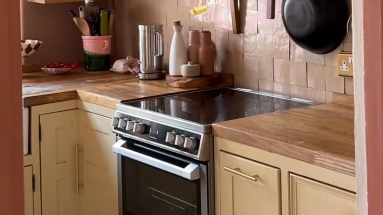
If you prefer a more subtle color pairing, earthy browns, particularly expressed through wood tones, can be a good option for butter yellow cabinets. Opt for a butcher block countertop or classic wood upper cabinets for a two-tone look. Incorporating more wood can help ground the space and allow your yellow kitchen cabinets to pop as an accent tone. You might also prefer to keep the rest of the palette neutral with white or cream when using brown and yellow together to prevent the look from getting too repetitive.
Sage green
Millennials love their sage green, and for good reason. It's an organic hue that looks gorgeous with almost any other color, including butter yellow. While Joanna Gaines says this nature-inspired color is perfect for kitchen cabinets, it could also be a stunning, uplifting pairing for butter yellow cabinets instead.
To incorporate sage green into a yellow kitchen, consider adding the hue via a backsplash, houseplants, or two-tone cabinetry. A sage green kitchen island could also be a classy choice. Alternatively, some homeowners paint their tile with checkerboard sage green and white next to butter yellow cabinets for a unique look.
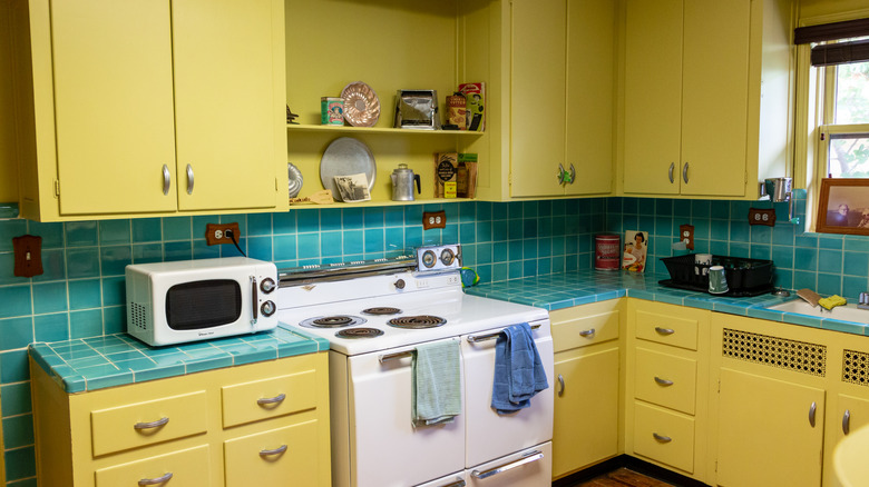
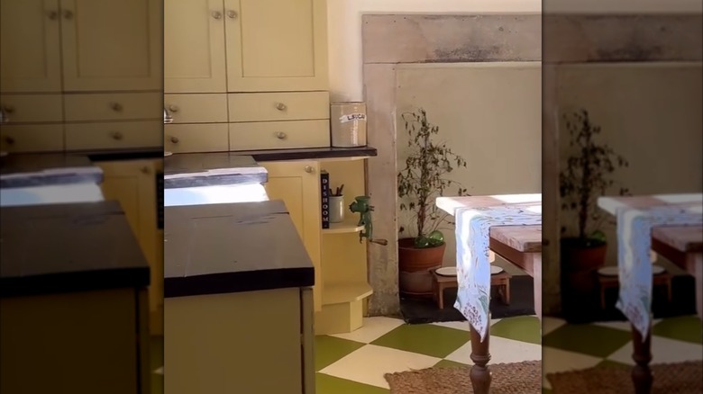
Yellow on yellow
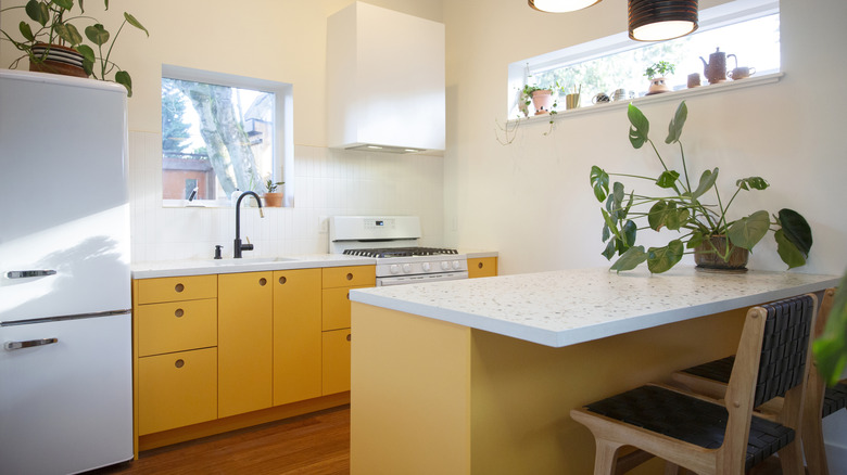
When in doubt, monochromatic color palettes are a great go-to. Yellow on yellow can look lovely in a kitchen, brightening the space and offering a gorgeous sunshine feel. Further, color drenching is super trendy right now, so you could participate in this aesthetic by emphasizing your butter yellow cabinets with other yellow hues. A full yellow tile wall with sleek cabinetry looks modern and fresh. Or, consider painting your walls the same color as your cabinets for a smooth, seamless look.
Moody burgundy
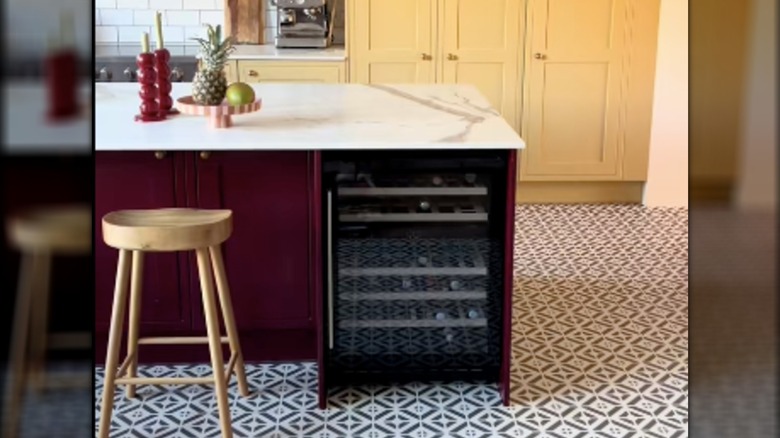
When experimenting with color, burgundy is a bold hue that can make a statement alongside butter yellow cabinetry. While the pastel yellow will offer a soft, gentle touch to the space, wine-deep burgundy will invite a moody and impactful punch that gives your kitchen more flair. This color combo might be best for modern and luxe kitchen designs where the daring color palette feels more natural and invigorating. We like how some folks have used burgundy as an accent color to create a focal point in a butter yellow kitchen design.
Soft mauve
Mauve and butter yellow are an untraditional color pairing, but they somehow strike the perfect balance. While we often see purples and reds paired with yellow in interior design, mauve introduces a softer touch. This color is romantic and adds depth to the light and airy yellow notes. One way to pull off this color pairing is to drench the room with mauve, creating the perfect rosy backdrop for your butter yellow cabinets. Using yellow as an accent tone is also a great way to participate in the color trend without overwhelming your space.
Muted tangerine
If your home has a retro vibe, you might find that butter yellow cabinets pair beautifully with a tangerine accent tone. Consider painting your center island a bright tangerine color to add more flavor and vintage vibes to the space. Since tangerine is a muted pastel orange, it works well with pastel yellow tones and often acts as part of an analogous color combo. Some homeowners have leaned into this analogous palette by pairing butter yellow and tangerine cabinets with bold red accents for a cohesive look.
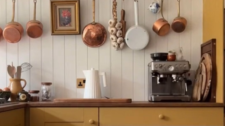
Cozy honey
Yellow and brown pair well together, but there are plenty of different shades to choose from. While earthy browns are good for grounding your kitchen design, honey colors might give your space a more relaxed, cozy feel. Honey-colored wood floors, for example, look seamless and inviting beside butter yellow cabinetry.
If you really want to lean into this toasty-warm vibe, consider adding honey accents through rugs. You can also use a honey wood in your center island. Bronze details on fixtures and hardware can also bring in that homey, warm feeling that honey and butter yellow offer.