The Designer-Approved Paint Shade That'll Make Your Small Living Room Appear Larger
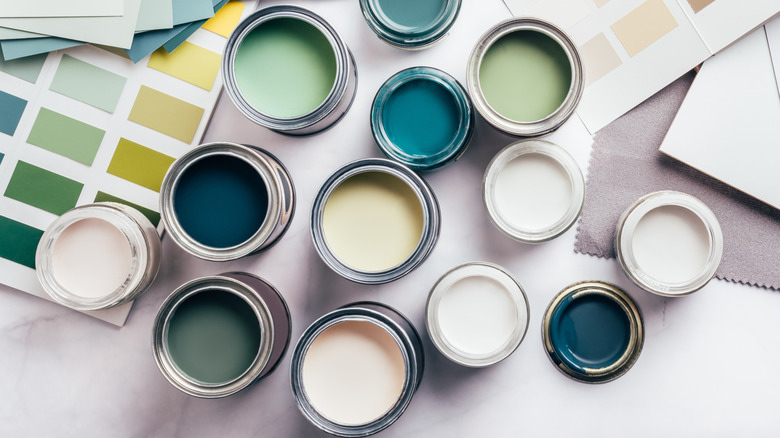
Paint has a wonderful way of tricking the eye. Rooms painted in deep, dark shades feel cozier and more compact, while light hues instantly make a room feel more spacious and airy. If you have a small living room that you'd like to look larger, a few cans of white paint can do the trick. But if you're not sure which shade to pick – there are after all roughly 150,000 white paints to choose from — consider going with a classic: Benjamin Moore's Glacier White.
Benjamin Moore describes Glacier White as a "versatile off-white with hushed cream undertones." The color's high light reflecting value (LRV) (which is a metric designers look at to pick the perfect shade of paint) is 80, which means it reflects a lot of light, though not so much that it feels stark. This will make the space feel light and open, which is why if you're trying to visually expand a room, Glacier White is a great option. Anna Still, co-founder of Still Johnson Interiors tells Southern Living that Glacier White is one of her go-to choices because it's not overly bright and it doesn't have significant warm or cool undertones. "Because of the neither-here-nor-there hue, it avoids hemming us into one color palette and isn't so bland that any bare walls seem undecorated," she says.
Why Glacier White pairs well with many different colors
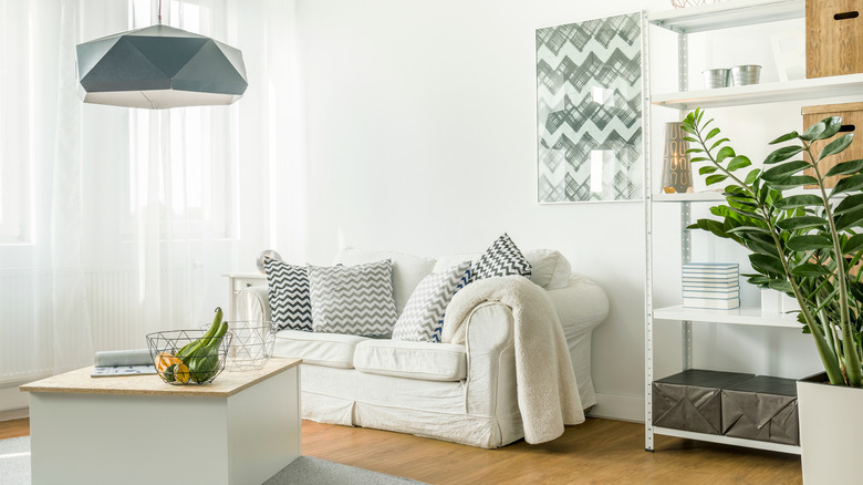
Because of its neutral undertones, Glacier White is a good alternative to Benjamin Moore fan favorite, Swiss Coffee, which can appear too yellow in some spaces. It also pairs well with various shades depending on your style. In modern rooms with earthy elements, it couples nicely with Benjamin Moore's Wildwood Crest — a neutral gray with a green undertone. If you're going for a transitional or coastal aesthetic, it works well with Benjamin Moore's Annapolis Green, which is a grayish blue hue with subtle hints of green.
It is important to note that, like all paint colors, Glacier White will read different depending on the amount of natural light in the space. In a room that gets a lot of natural light, the paint will appear brighter. Alternatively, in a space that's naturally darker, it could end up looking a bit dull. Surrounding paint colors on ceilings, doors, or trim will also impact how it looks in a particular space. To avoid one of the mistakes people make when choosing a paint color, be sure to look at a large sample of the actual paint — not a swatch — in your room to get an accurate idea of how it will read during different times of day. If you want to avoid picking up unwanted undertones and keep things looking consistent, you can also consider using Glacier White throughout the entire space, since it also makes a perfect timeless paint shade for trim and molding.