How The Once-Outdated Color Pairing Can Be Used To Modernize Your Home
Whenever a new trend enters the interior design conversation, it's natural to be eager, or at least curious, to try it out in your home. However, internet design trends become old news just as quickly as they appear, and you risk your rooms looking out of touch. Brown and burgundy have long been considered once-trendy paint colors that will make your home look dated. Fortunately for those whose homes are adorned with these hues or who, despite shifts in trends, still prefer them, they are back in fashion. You might even be able to use them to quickly freshen up a room.
It wasn't uncommon to find swaths of rich browns and warm burgundy paint embellishing walls in the 2000s. Many house interiors of the time leaned into Tuscan decor, which used this color combination to create an atmosphere of country elegance. Now, decades on, designers are embracing moody hues like brown and burgundy once again, predicting a revival. After all, it's not the shades themselves that make your home look dated, but how they're employed. Earthy, rich, grounding neutrals are effortlessly timeless. They anchor us in nature. When you reconsider their use in texture, patterns, and decor, they can modernize a home.
Use brown and burgundy for accents and furniture
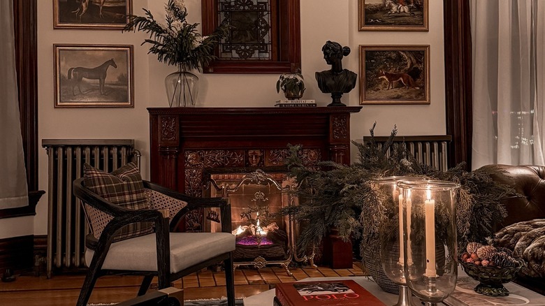
Using that particular '90s brown and burgundy for trim, accent details, and block painting — anywhere in the home, really — is widely considered outdated. For example, walls and fixtures in these colors are associated with a dated look because they make a room feel stuffy. However, with simple adjustments to shade and saturation, these two hues can work well in contemporary spaces.
Opting for light, warm, airy browns, such as Spiced Brandy or Cocoa Nutmeg by Behr for the walls rather than the dark, rich browns, sways a room toward sophistication. You can pair sleek-silhouetted bespoke furniture with deep brown accessories for contrast. Alternatively, pair coffee-hued wenge furnishings with creamy walls.
When using burgundy in a room, consider reddish-brown shades like Chesnut by Benjamin Moore used as accents — on board and batten or staircase fixtures, for example. Burgundy pairs particularly nicely with off-white. It's also worth incorporating timeless furniture, such as coffee tables, mirrors, sofas, or lighting fixtures, in these deep shades into a room with a neutral palette. Their darkness offsets some of the starkness, softening the design and adding a touch of elegance.