The One Color To Avoid Painting Your Dining Room (And What To Choose Instead)
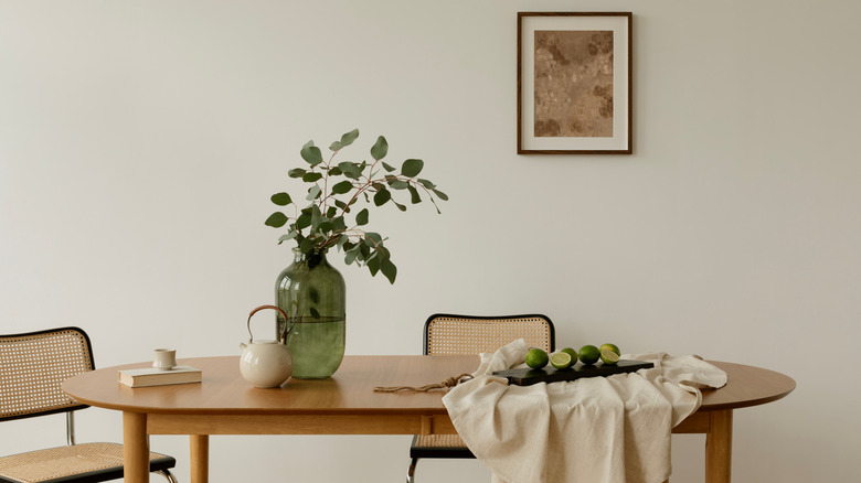
Your dining room is the place where not only meals are shared, but conversation and time with loved ones, too. It's important to make intentional design choices that allow the space to feel as comforting and inviting as the memories shared. While there are many appropriate, colorful dining room ideas to help liven up the space, you'll want to avoid the worst paint colors, such as white paint that has cool undertones, to avoid risking the space feeling cold and sterile. White paint with warm undertones, on the other hand, is your best bet at creating a friendly and welcoming environment.
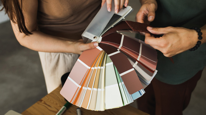
Neutral shades, specifically shades of white, are popular paint colors for many reasons. For one, white paint can lift, open, and brighten up the space, lending a blank slate for other decor to shine. These shades also affect perceived space, making a room look bigger than it actually is. Plus, white is a versatile backdrop and can complement a variety of different interior design styles. However, there are so many different shades of white and specific wall finishes that can affect the overall feel of the space, and undertones are also a key detail when choosing the right shade for your dining room. While they can make the space look clean, cool undertones can deprive the room of warmth.
The shades you should use instead of cool whites
As with choosing any color for your dining room, there are a number of things to keep in mind when picking the perfect white paint. That's because even a neutral shade like this one can affect a room in a different way, depending on a variety of factors. These include your specific interior design style, the size of the dining room, and the lighting situation.
For example, rustic styles, including farmhouse decor, which favors a light and airy dining room area, can be complemented by laid-back white shades like Alabaster by Sherwin-Williams. Its softness and effortless brightness evoke a cozy environment. Modern or contemporary interior styles, on the other hand, rely on bright, space-expanding shades to evoke a clean look. In that case, Swiss Coffee by Benjamin Moore might be a great fit for this type of style. This warm and creamy off-white shade is inviting, but it also adds a level of sophistication to the space.
The size of your dining room matters, too, as well as how much natural light (if any) the room gets. Make sure to take swatches and test them in the space before making a decision. As mentioned before, certain colors can impact the perceived space of a room, and certain shades can make a room look smaller than it is. For smaller dining rooms, crisp white shades are a great choice, like Benjamin Moore's creamy Acadia White, which is both warm and bright. For large dining rooms, opt for a cozy shade like Greek Villa by Sherwin-Williams, which offers a subtle elegance.