The Vintage Paint Color That's Making A Trendy Comeback
Have you ever walked into a room and felt instantly transported to another decade, all because of the color on the walls? Trends often circle back around, but the return of the blush and apricot family might be the best surprise yet. We can finally say goodbye to years of stark, cool neutrals and prepare for a return to soothing vintage shades: A collection of soft pink and peach tones is making a major comeback and the presence of these hues on your walls will feel like a comforting hug from your home.
Color experts suggest the attraction to these pink paint shades is a natural reaction toward colors that feel safe and calming, especially when life feels unpredictable. This revival isn't about the bright, bubblegum pinks of the past, but rather muted, dusty, and terracotta-tinged hues. These colors, sometimes referred to as "dirty pinks," often have almost sepia undertones, giving them a more mature feel than the harsher pinks you might use in a child's room. This difference allows the color to be used in sophisticated ways in living spaces and kitchens, rather than just in a bedroom.
Why are soft pink and peach paint colors trending right now?
The warm, inviting colors of peach, blush, and rose tones in paint offer a sense of comfort and familiarity, inspiring designers to use them to shift the mood of a space. These shades are associated with nurturing and are said to ease feelings of anger, aggression, and stress. They're part of a cultural shift where pink is seen as being a neutral option for any home.
This color family has been used throughout many decades, showing how adaptable it is. In the 1930s, pinks were used to create a sense of glamour and luxury, and peachy apricot tones were popular from the 1920s through the 1940s. It's probably for that reason pink is the one color that will instantly infuse vintage charm into your bathroom or home in general. Softer and warmer pinks were used during the 1980s, usually paired with more muted tones like gray to make them feel more modern. Today's comeback is rooted in warmth and familiarity, getting away from the coolness of previous decades.
These best color pairings for soft pink and peach
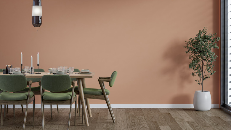
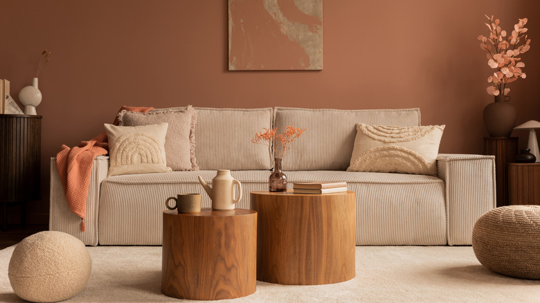
One of the advantages of using these terracotta-forward pinks and blushes is their ability to adapt to many different styles. Apricot is particularly versatile, as it sits between orange and pink on the color wheel and pairs well with an array of other colors while still maintaining that sense of warmth and liveliness on its own. These days, designers use them as earthy neutrals, meaning they can be substituted for traditional cream or beige to bring added depth without overpowering a room. The secret to mastering the trend is in balancing the warmth of the shade with grounding, complementary colors.
For a truly modern feel, try pairing a pale, peachy pink with deep navy or charcoal gray. The contrast adds sophistication, pulling the pink away from feeling overly soft. Green is another natural partner for this palette, creating an organic feel in a room. More refined greens like sage or olive — or even a deep emerald — provide a dramatic contrast. Designers are also having success by using the color drenching method, painting the walls, woodwork, and ceiling in a single peachy shade. This technique creates an enveloping, cocoon-like atmosphere, perfect for bedrooms or cozy reading nooks. For textural accents, these colors work well when they're paired with materials like brass, wood tones, and plush fabrics like velvet and boucle.