The Bold Color Trend Giving Kitchens A Mood Boost In 2026
If home is where the heart is, the kitchen is one of the most important chambers within it, being a powerful force that allows life and love to grow, flow, and spread. This means we want it to be a happy place, and as 2026 takes hold, we have new opportunities to experiment with this space and boost its mood. One trend that is all about the good vibes is saying goodbye to all-white kitchens and using bold colors in your home instead, with burnt orange being one hue set to bring optimism and warmth into the kitchen. "Orange is a bold choice but also has heritage appeal," said designer Edward Bulmer (via Homes & Gardens). "It's a grown-up color that adds personality while feeling timeless."
Although burnt orange may feel the complete opposite of more stylish hues of gray and black, there is actually a sophisticated edge to this brooding tone, with flickers of red and brown coming through and adding depth to your space. There is also a versatility to the color. As designer Lindsey Putzier explained to Better Homes & Gardens, "Burnt orange, while certainly a color on its own, can also act as a perceived neutral because it's so close to a natural copper color."
How to add burnt orange to your kitchen
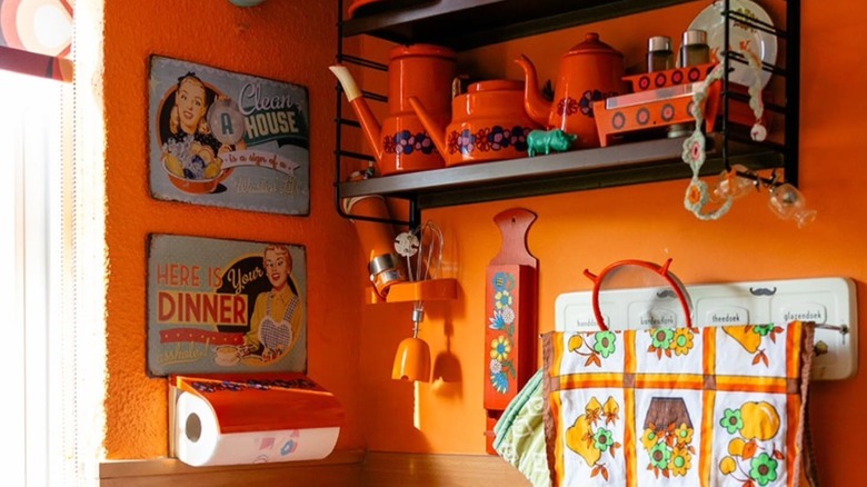
Burnt orange is an excellent kitchen color for inspiring creativity, but it can be difficult to know how to use it, especially if you are starting with a simple, white space. It can be incorporated in the walls, cabinets, backsplashes, and shelves of a kitchen, depending on how much of the color you wish to use. When bringing this shade into your kitchen, it is helpful to look at your current design. Burnt orange goes well with teal and navy tones, or you may wish to match it with blush pink for a whimsical, playful vibe. If you want to nail the mid-century modern look in your home, try pairing burnt orange with cream and warm wood tones. For a more earthy kitchen, matching it with forest green creates an inviting and warming space.
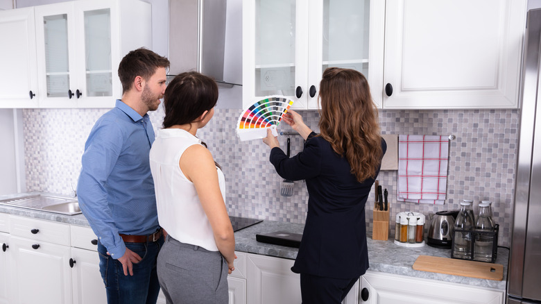
If you are making burnt orange a primary color in your kitchen, interior designer Madison Adam warned against using it in a monochrome way. She told Better Homes & Gardens, "You'll find it ends up looking dull." That is not what we want when aiming to make our kitchen our happy space! Instead, repeat the color throughout the room, using it in small spaces to make it look intentional. You may also wish to bring accessories into your kitchen that share this color, such as vases and utensil pots. You can even purchase burnt orange toasters, blenders, or coffee makers to complete the look.