The Bold Color Combination That's Making Your Space Look Dated
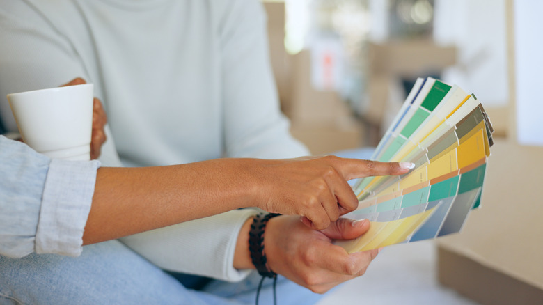
Whether you're a seasoned decor expert or a novice decorator, it's widely understood that creating a cohesive color palette for your home is an important part of making a statement that's true to your personal style, as well as keeping it fresh as design trends shift over time. In an era of bold, moody, and neutral colors that seem to continue to dominate modern homes, it's hard to imagine that bright yellow had a place in the design cycle, or that it was often used alongside another daring shade like burgundy. Yet, the wine-soaked, sunny interiors were once all the rage, imbuing a flashy essence that has, unfortunately, become especially jarring now, despite the surge in maximalist decor popularity. As a result, the application of this bold color combo, however you decide to blend the two, has become outdated.
While you might not be able to immediately point out the application of yellow and burgundy, especially if you lean on neutrals or a minimalist style, think Tuscan style decor. This interior style relies on warm earth tones, including dark, wine reds, rich yellows, and their complementary brown shades in between, so it's not uncommon to find this yellow-burgundy color combination in homes like these. But much like this decor style, many interior designers warn against using this combination in their homes. Instead, you may want to soften up the colors if you want to use them together, or choose a totally different combination by using them independently from each other.
What color combinations to use instead of yellow and burgundy
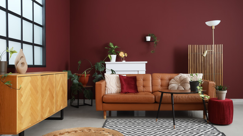
In case the combination of burgundy and yellow hues in Tuscan decor gives you pause, consider that in interior design, many older styles get their moment back in the limelight, and even a certain 1920s design trend is having a big boom in popularity today. But employing your colors intentionally is important to revive an outdated combination. That said, you don't have to totally ditch red and yellow hues altogether. Tweaking the saturation of either color can help soften up the space. Deep red wine paint can contrast with accented furniture that features a pale yellow console table, for example. You might also consider toning down your chosen paint color with a soft red instead, such as Garrison Red by Benjamin Moore, which can pair well with a bold yellow accent, like a mustard-yellow couch. Pale yellow walls, as another example, work as a subtle backdrop that can allow moody burgundy accents to pop. A sculptural marble coffee table with burgundy hues can be a focal point in your living room.
Alternatively, you might consider utilizing a bold yellow or burgundy-red independently, paired with other shades. Red paint effortlessly makes a statement and can complement a moody vibe in any room. Classic Burgundy by Benjamin Moore not only adds drama, but it also provides an elegance, especially when contrasted with lighter accented furniture. A cream-colored console table or artisan coffee table can look effortlessly chic with this paint background. On the other hand, a neutral paint shade, such as creams or even earthy wallpaper, can complement sunny accents and brighten up a room to make it feel airy and cozy.