13 Tacky, Outdated Trends We Can't Help But Love
We may receive a commission on purchases made from links.
While it's the design world's job to call things out when they start to read as stale or overdone, there's many a tacky, outdated trend some of us regular folks can't help but continue to love. You might cringe when you see these design ideas — or you might feel secretly validated because deep down, you could never understand why they garnered so much hate. And maybe you even felt like you needed to keep your love for these "dated" decor choices under wraps, because they were just so gauche. Well, having these trends in your home doesn't have to be a guilty pleasure — instead, it's time to proudly like what you like ... no matter what HGTV says (even though we've been tuning in for well over 20 years).
If leopard print ottomans or shiplap-covered walls in every room call to you, it's your time to shine. Perhaps you've always silently thought matching furniture sets just make sense, no matter what designers might say. Or maybe making fun of monogrammed towels always felt a bit out of touch, and the way the world has turned on wall-to-wall carpet seems unwarranted? Here are the dated design choices that some might call tacky, but which we still have a soft spot for, either because they're fun, historic, quirky, or just downright practical.
Our maximalist hearts love trend mixing
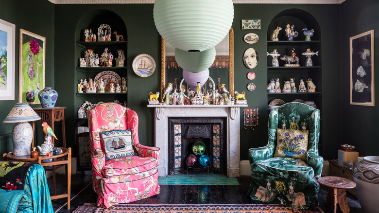
Trend mixing is thought to be tacky because it's too visually overwhelming. Incorporating so many different pieces in one space can give you "stylistic whiplash," as interior and product designer Rachel Blindauer told House Digest when asked about the internet trends going out of style in 2025. "A gingham slipcover and a disco ball can't always coexist peacefully," she said. "Early 2025 saw viral mashups like 'cottagecore meets Y2K' and '70s disco meets prairie house.' They were fun — but deeply impractical."
Homes with trend mixing might be tacky if they seem to just mindlessly be following what's currently the it-look on TikTok, but if you're a maximalist at heart, channeling different styles (even if some are faddy) in your space can be very fun. It's easy to trend mix and have it stick if you have the right vision, i.e., one that is totally you. "A lot of people are anxious about mixing styles and periods, but perhaps you can look at it in the same way as getting dressed: Confidence and a few reliable staples can go a long way," decorator and dealer Adam Bray told House & Garden. Like Bray, we don't see trend mixing as inherently chaotic — instead, it can also be an outward expression of all one's favorites from each era in home design, mixed beautifully.
Curio cabinets are cool
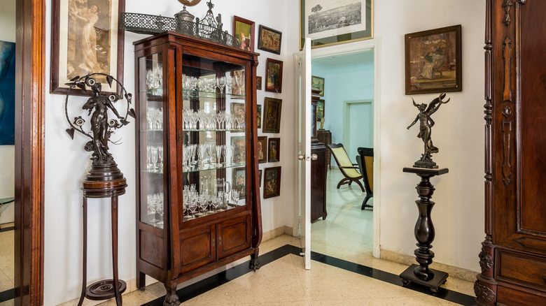
You've likely seen curio cabinets in museums or in the dark corner of your great-grandmother's living room. Most would say they're a bit outdated because of these associations alone, but others still don't like them just because of the massive chore of keeping the quirky knick-knacks inside clean. "Curio cabinets are old-fashioned and outdated, so people no longer use them as furniture," strategic construction advisor Lionel Scharly told Apartment Therapy. "The glass part also [collects] a lot of dust so it is a very high-maintenance cabinet."
Yet they will always hold a special place in our hearts, especially as collectors, because the furniture itself actually possesses a lot of inherent character — even if you disregard the fascinating objects inside. Made of gorgeous solid woods like oak, walnut, cherry, and mahogany, curio cabinets are like little museums of all the things you love, curated especially for your home. Plus, with a few modern cleaning solutions (like a can of Falcon Compressed Gas), it's actually not that hard to keep things inside dust-free. For this reason, our answer to whether curio cabinets are going out of style will always be no!
Shiplap is cute, not corny
Shiplap first came into most of our lives through Joanna Gaines and her hit show "Fixer Upper." Throughout the 2010s, it seems like every single house she and Chip renovated in Waco was covered in this material. Because its resurgence in popularity took off so suddenly due to the show, some see using shiplap as a Joanna Gaines-approved DIY that now just seems tacky. It was used so much in such a short period, that it can now feel a bit like a timestamp.
But most lifelong farmhouse chic enthusiasts will agree that shiplap is sweet and classic. Yes, it might have been a bit overused in the past few years, especially in condos and city apartments, where the finish can feel a little out of place. But that doesn't take away from its inherent, historical charm. "Shiplap offers a look that is very crisp and clean, while still feeling warm and inviting," designer Kathy Kuo told Homes & Gardens. The inherent qualities of shiplap panelling haven't changed, and we think that shiplap has always, and will always, provide a cozy, nostalgic feel to the right space. And not nostalgia for the 2010s, but for the early 1900s farmhouse aesthetic that Gaines was originally recreating when she reintroduced the trend on her show.
Millennial pink was there for us when we needed it most
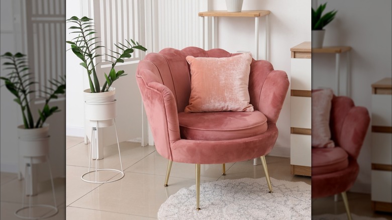
Pink was incredibly on trend for millennials as they came of age, making it part of the color combination that unfortunately screams 2010s. Things peaked in 2016 when Pantone named Rose Quartz its color of the year. For many, this strong of an association with a certain time period is enough to put them off the color forever.
But despite its associations for some, pink is an incredibly versatile color, which is probably why there continues to be new waves of pink appreciation in design (like 2023's Barbie Summer). Since its inception, millennial pink in particular has stood out as an understated yet consistent option for accent pieces around the house. Senior manager of color marketing at Benjamin Moore, Hannah Yeo, agrees: "Millennial pink has evolved from a generational phenomenon into a prominent player in today's interior color palette," she told Homes & Gardens. "Its warmth and versatility make it easy to incorporate into everyday space."
Monogrammed towels are classy, not tacky
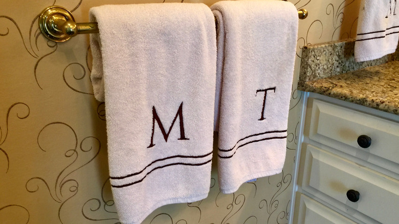
Is monogrammed home decor going out of style? Many might say yes, and consider monogramming as quite tacky. Something showy and try-hard that rich people (or people who just want to seem rich) slap onto all the linens in their home as some sort of status symbol. For years, monograms have seemed a bit like something out of a 1990s movie and not something someone modern and minimal would have on hand in their space.
Whether monograms are in (hint: They might be trending back — as the cozy, more intricate styles of previous decades overtake stark minimalism in design) or out, there are many, many people who have always loved them and had them around. In fact, for most of those who grew up in the American South, monogrammed towels, linen napkins, and even bathrobes have always been a staple of home design. Monograms offer a strong tie to family history, as these items for your home are often given as gifts during engagements or housewarmings. They are also one of the fun design tips to make your home feel like it came out of a rom-com, as there is something so nostalgically Nancy-Meyer's coded about wrapping yourself in a fluffy towel emblazoned with your initials.
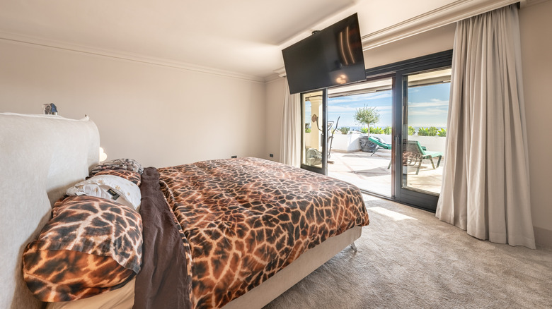
If you're a maximalist, then animal print counts as a neutral
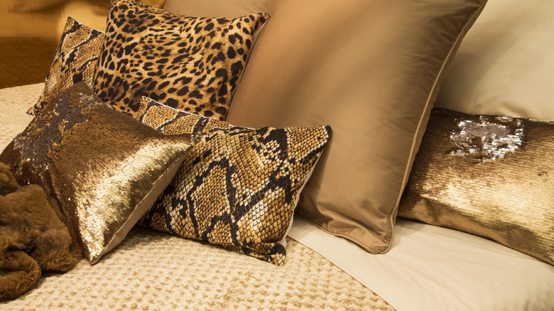
You might have rolled your eyes at this headline, but hear us out. For a long time, animal print has been seen as the epitome of tacky. Whether it's leopard, python, or even cow or zebra print, animal-inspired designs have always been in and out of fashion and polarizing in the middle. They were extremely popular during the Art Deco period, as well as the '70s, '80s, and even into the '90s. Yet because of this timeline, some shy away because of how easily animal print ties into specific eras. For others, it's the prints' associations with alternative, subversive culture or cheap, imitation materials that put them off.
From being used for their quirk or fun tackiness, to more upscale applications, animal prints will likely always have a place in design. And whether you enjoy their kitch, or their classy connotations, animal prints can play various roles in decor — from adding movement and organic pattern to injecting a little irreverent, maximalist edge. Mark Tremblay of Marc-Michaels Interior Design agrees. "Animal prints are rooted in nature and blend seamlessly with a wide range of palettes and materials such as warm woods, stone, metals, and layered textiles," he told Southern Living. They simply go with everything!
High-contrast checkered flooring in kitchens is back (we hope)
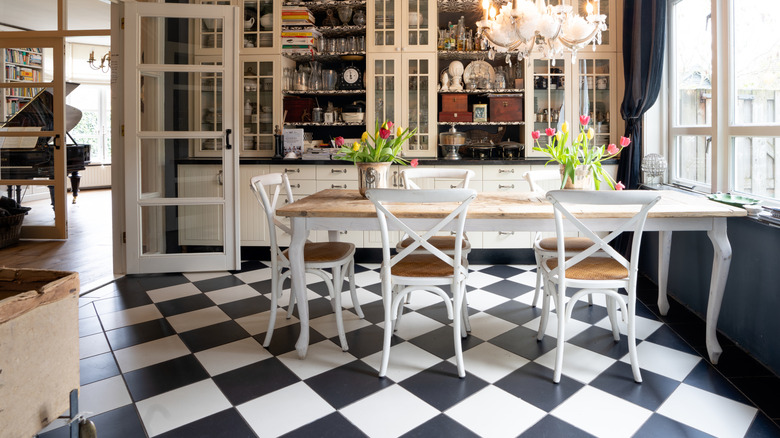
Checkered flooring in kitchens has long been popular. This flooring pattern has been falling in and out of favor for literally centuries. In kitchens, checkerboard patterns can make small spaces look larger and inject visual energy. Although checkered flooring is almost inherently timeless, lately, checks have saturated design, and they're also a hallmark of '50s diner aesthetics. Besides the recent overuse in design, there's something almost stereotypically "kitchen" about checkerboard flooring — probably thanks to all of the checked linoleum floors that dominated many a retro kitchen. Which to some, automatically puts it into tacky territory.
Yet this "kitchen stereotype" feeling is exactly why we love the checkerboard so much. It's a classic and therefore steady and predictable, while also offering a punch of pattern. And we aren't alone in our love for its revival. Alec Baldwin has shown off the trend in his new kitchen, as has Kendall Jenner. It's all part of an expanding interest in grandma chic, which is "an artful fusion of time-worn elegance and contemporary maximalism," Jennifer Ebert, the digital editor of Homes & Gardens, told the outlet. It's a revival of things that have long been seen as old-fashioned, like checkerboard tiles and floral wallpapers, but "all layered to evoke a sense of nostalgia infused with character, warmth, and unmistakable individuality."
Matching bedroom sets take the work out of decorating
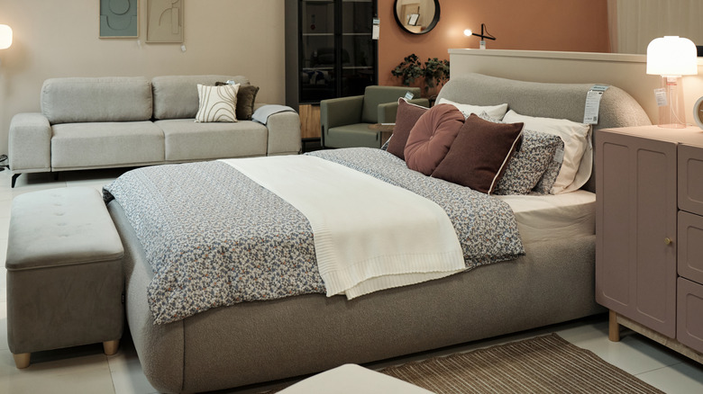
Some might say having identical nightstands that match your bed frame and dresser can look a little too uniform and flat, and therefore tacky. In the world of interior design, many might consider mass-market furniture like this completely devoid of any personality, and it's often pointed to as a decorating mistake best left in the 1990s and early 2000s, when it was especially popular. This isn't unreasonable: Matching furniture sets can give off the vibe of a model home showroom (or worse, corporate office space) instead of a house that real people actually live in.
However, for many of us, matching furniture sets still hold a very practical place in design. Being able to walk into one store and come out with a room full of furniture is helpful since not everyone has the time (or desire) to piece things together or shop around. In short, matching bedroom sets take the work out of decorating. Yes, a beautifully curated collection of individual finds will give a more designed feel to your space, but mixing and matching investment pieces can feel like a minefield. And if the foundational furniture items serve as a cohesive backdrop, it's still possible to express your personality with accessories. "When the furniture 'matches' in wood tone, color, and style, it lets the eye rest on statement pieces in the room," designer Karissa Barker told Apartment Therapy. "When every furniture piece is a standalone, it can feel like the eye is drawn everywhere all at once, and the room feels less cohesive and more chaotic."
Wall-to-wall carpeting creates a cozy living space
Carpet in every room in the house became very popular during the 1950s due to increased manufacturing capabilities. This significantly lowered the price of the material, and fluffed it up a bit, so it was soft underfoot. Before the '50s, carpet "was around, people knew what it was, but it was effectively an upper middle class and upper class product," carpet expert and professor of history at Kennesaw State University, Dr. Randall Patton, told Apartment Therapy. "It was not the kind of thing the average, working-class homeowner would think about putting down on their floors." Thanks to its sudden affordability, homes right through to the 1980s were covered in carpet — which then in turn led modern homeowners to see it as old, gross, and super tacky due to outdated patterns and its inherent age. Especially the cream carpet present in so many homes from the early 2000s.
But, if you put aside these pendulum swings of public taste and popularity, wall-to-wall carpet isn't as impractical as many assume. Obviously, we don't want it in the bathrooms (yes, people went overboard back in the day) — but there are spaces in the home where carpet can make sense. Carpet can absorb sound, add insulation, and make areas like bedrooms feel softer and cosier. Wall-to-wall carpet in living rooms might not make sense for every household, but for ones that don't see very high-impact traffic, they can add a soft, retro-yet-stylish feel.
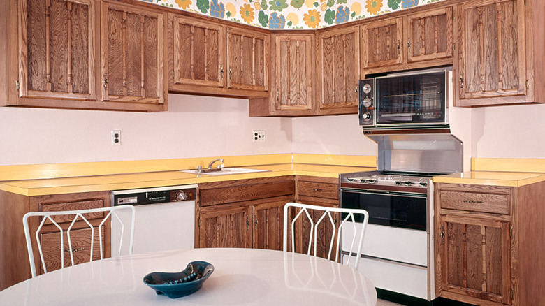
Tuscan kitchens offer nostalgic warmth
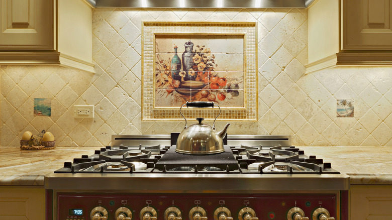
Nobody wants to live inside an Olive Garden, or that's what most people would say about the Tuscan kitchen trend. The jewel of interior design in the late '90s and early 2000s, the look is defined by dark cherry cabinets with warm-toned backsplashes, plus brown granite countertops and wrought iron accents through things like light fixtures and drawer pulls. Add in some imitation fruit, either in a bowl, tiling, or even wallpaper patterns, and you can call it a day. Trends eventually moved on from these dark, heavy hues as kitchens became less theme-y and veered more light and bright.
But we are still at the restaurant because we love these spaces for their nostalgic warmth. And we aren't the only ones! Tuscan kitchens are the quirky kitchen style no one ever expected to trend again, yet here they are. In recent years, kitchens are moving away from the starkness of the 2010s and back to warm, lived-in "homey" spaces. Think: burnished copper with a bit of patina and rustic colored cabinets. The trend has always made us feel like we're cooking in our mother's kitchen, instead of a sterile, industrial space.
Typography art is actually quite motivational
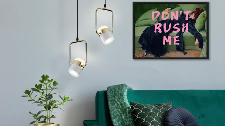
We can see you rolling your eyes now. The live, laugh, love posters in your friend's front hallway. Gather written in a wispy cursive and framed with matte black, hanging above your mother's dining room table. Typography art is peak 2010s millennial, sure. From the Rae Dunn craze to semi-motivational posters hanging in homes, the trend makes a lot of people cringe.
And while yes, typography art can feel overdone, let's not lose sight of the fact that it can, truly, bring a little joy into someone's day. These silly reminders to slow down and take everything in aren't so silly after all. We've always loved the visual cue to remember to appreciate the little things, and for reminders of how we want to live or use a space. Sure, you could have Impressionist art hanging on your bedroom wall, or you could make it a little quirky and add bold lettering across it, as pictured in the Dont Rush Me Wall Art Vintage Pop Art — to make things more fun. It's this unexpected turn, plus genuine silliness and positivity, that means typography art will never be totally tacky to us.
Laminate countertops come in cool colors
Laminate countertops typically don't rank among most people's top picks for materials. Introduced in the 1940s and most popular in the '50s and '60s, laminate is a visual so closely tied to these eras that to many, it's inherently out of date. It's also a very popular choice for kitchens in mass-produced apartment complexes, which can also make it seem tacky, cheap, and overdone. Plus, laminate counters can have some maintenance drawbacks. "If there is damage to a laminate countertop, whether from a hot pan or natural wear and tear, you often have to replace the entire countertop section," designer Danielle Davis told The Spruce when discussing its downsides.
Yet laminate countertops can be quite practical. True, you can't refinish laminate like you can with other materials like butcher block and natural stone, but it's relatively resistant to heat and stains, while being significantly cheaper than most other countertop materials. Modern laminate also does a better job at mimicking stone and wood finishes, and it comes in solid colors, too. You can find bold tones (like IKEA's terracotta EKBACKEN option), or more muted hues like Wilsonart's Britany Blue shade at Home Depot.
Houseplant overload isn't trendy anymore, but plant parenting is timeless
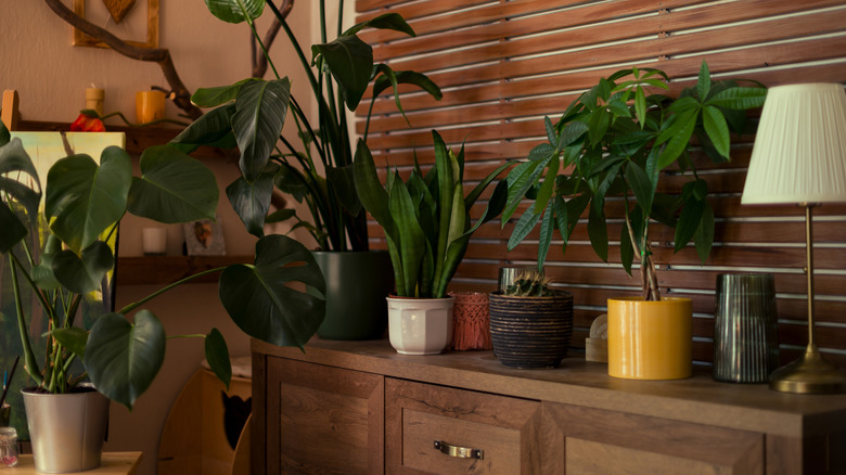
Keeping houseplants is a practice that dates back thousands of years, spanning cultures and continents. In more recent history, the popularity of potted plants has continually waxed and waned through the decades. Houseplants trended hard in Victorian times, and again in postwar homes and '70s counterculture. In the 2010s, boho living spaces were brimming with everything from massive fiddle leaf figs to potted snake plants. When the pandemic hit, houseplants trended even harder, and sales broke record levels.
As the world opened up again, we naturally eased off a little on the houseplant obsession, and the time of houseplant overload passed. But what didn't fade is the fact that being around greenery, and taking care of it, can lift us up. Research says having lots of plants around can make you happier — and there's no reason happy plant parents should move on from this "outdated" trend.