5 Ideas For Perfect Pattern Mixing When Decorating Your Space
While minimalism and clean aesthetics have taken the interior decorating world by storm as of late, it is beginning to fall out of favor, with designers taking more of an interest in cluttered, maximalist approaches. Maximalism focuses more on your own personal expression through home decor, with lots of mixing and matching, bright and bold colors, unique antique or vintage furniture pieces, funky statements, and more, per Wayfair.
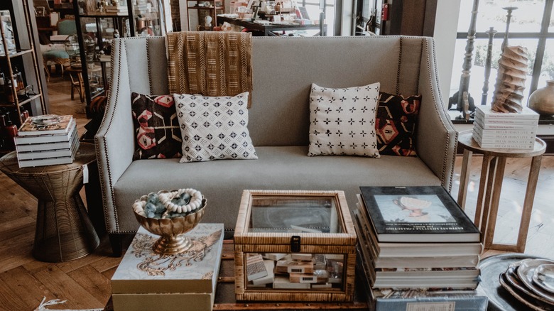
One major staple of the maximalist decor style is pattern mixing. Pattern mixing is just what it sounds like — mixing two or more patterns in one area. Some fashion and home decor experts alike regard pattern mixing as a taboo design approach, but when done correctly, it can create a truly unique, eccentric, and perfectly maximalist look. While simply throwing together a hodgepodge assortment of multiple patterns is fine, knowing how to edit yourself and incorporate other elements into the mix can help create a cohesive but trendy space.
1. Start slowly with similar colors
Pattern mixing can be a very intimidating home design choice, so start slowly by controlling your variables. That is, instead of diving headfirst into multiple bold and busy, multicolored patterns, start with one color or color scheme, only deviating with patterns. Masterclass recommends finding a handful of colors with the same tone and warmth/coolness and incorporating some fun but understated colors from there.
For example, first decide if you want your space to be cool (blue, green, purple) or warm (red, orange, yellow) toned. Next, decide what you want your dominant color to be. For a more understated approach, choose a color like white or gray for a cool-toned room, or beige or cream for warmer features. Then, choose a secondary color, like green or orange, and find some patterned chairs, rugs, throw pillows, etc. in that color. Finally, find an accent color, like blue or yellow, and add solids in that color to tie it all in.
2. Use stripes as a neutral
If you don't want your color pallet to be neutral, consider making your starting pattern neutral. According to Ballard Designs, stripes act as a neutral but are still a bold and eye-catching pattern. For example, you could start with a striped couch, chair, or other large piece of furniture, and then center your color scheme around the item. Then, add in understated and complementary florals, dots, or geometric patterns.
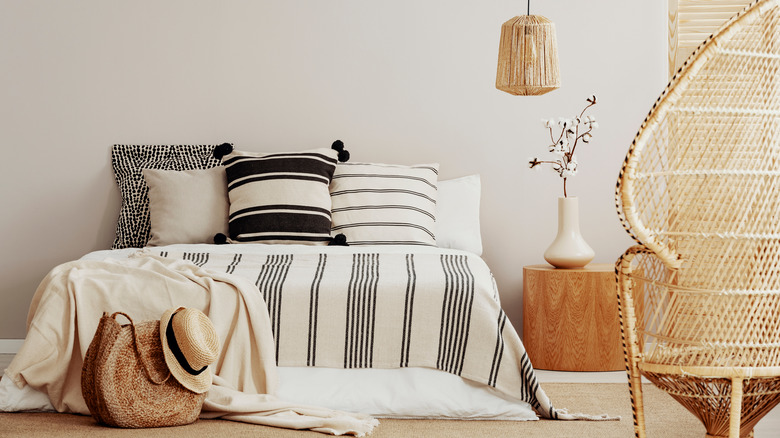
Alternatively, you could keep it simple by mixing lots of different striped patterns together. Layer a thin, horizontally striped blanket with another thicker, horizontally striped throw. Add in some varying stripe patterned pillows, and you have a very clever but thematic pattern mixed room. Consider keeping them in the same color scheme, or else it may get out of hand. You can get creative and use striped tiles in alternating directions as a kitchen backsplash, combine stripes with a plaid pattern for a more homey, country-style look, and more (via LIV for Interiors).
3. Stick with one orientation
One of the major issues with pattern mixing is how easily the multiple colors and patterns can overwhelm and overlap each other. If you don't want to stick with just one pattern, like the previous stripes example, or just one color, you'll need to find at least one similarity between the patterns. Decoholic recommends finding patterns that all follow the same orientation — horizontal, vertical, diagonal, etc.
This will help your eyes travel in one direction, making the space seem purposeful and controlled as opposed to overly cluttered and busy. This doesn't have to be obvious with patterns like stripes or arrows, but more subtle with florals that are taller than wider paired with a similarly elongated damask pattern. If your pattern is more square or doesn't have a particular orientation, change the shape of the item. For example, opt for a long rectangular pillow with a wide, flat floor cushion in varying patterns.
4. Don't forget about size
Another tip for expertly mixing patterns without going overboard or having the space look too busy is keeping in mind the size of the pattern, especially relative to the size of the patterned object. According to Tidbits and Twine, the size of your pattern should be relative to the item — small patterns will look best on small items like throw pillows, blankets, and other small items, and larger patterns will look best on curtains, rugs, and furniture upholstery.
Be careful with this, though, as lots of small patterned objects can very quickly overwhelm the space. Consider pairing a large print Moroccan or argyle rug with smaller print paisley throw pillows. This will also work great in accordance with the previous tips, like color matching and keeping the patterns in the same directional orientation. Similarly, it can be fun to focus on the same pattern in varying sizes, like plaid, stripes, or dots.
5. Be careful with prints
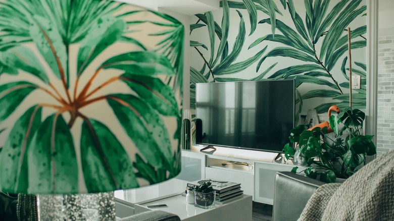
Aside from traditional patterns like stripes, plaid, dots, damask, floral, ikat, etc., there are a variety of fun prints to explore. There are more eccentric animal prints (cheetah, zebra, tiger, cow, etc.), as well as bold graphic prints, like banana leaf, hibiscus, and more. While these patterns and prints are full of personality, be careful that you don't do too much all at once.
Masterclass warns that mixing prints is something that needs to be done delicately and with balance in mind. While you certainly can throw together lots of cheetah and zebra patterned items, it may become gaudy and overbearing. Instead, try to balance out your color scheme, and either make the busiest pattern the one you work around or include it sparingly as an accent. Try to stick to a theme, too — a delicate floral pattern may look odd next to a bold and modern print. Finally, try and match each fun print with a more traditional pattern — calm down your vibrant zebra rug with simple stripes or polka dots.
