20 Interior Paint Color Trends You Should Know About In 2022
Choosing a color for your home can be both fun and a little stressful. Not only do you want it to be a color you'll love for years to come, but you also want it to match your other interior decor. According to Home Made Lovely, you should choose your paint color based on your decor rather than the other way around because it's easier to choose from a selection of paints rather than find decor that matches a specific shade. You should also keep undertones, paint sheens, and the room itself in mind.
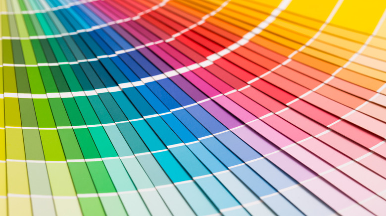
The trending colors of the year from a variety of brands are overwhelmingly in the green family. These calming natural shades are quickly becoming the new favorites for living rooms, kitchens, and bedrooms. Other natural shades are also gaining popularity, like soft blues, terracottas, and pinks that offer some color without being too bright or overwhelming. People love the relaxed feel these colors bring to a room and even to accent and fixture pieces like built-in bookshelves and kitchen cabinets. Of course, neutrals are always in. But paint trends are seeing a move away from the stark whites and grays for warmer whites and tans. Moody blacks and charcoals are also becoming popular paint choices. All of these colors seem to complement each other, creating a laid-back, colorful but not bright, and relaxed color scheme for a home.
Pantone Very Peri

Of course, one of the trending colors of 2022 is Pantone's Color of the Year, Very Peri, a blue with red undertones created by the color company. This color has a vibrant and electric energy that many people are using as accents throughout the home, especially in living rooms and bathrooms.
Farrow & Ball Shadow White

Stark white interiors are no longer the go-to. Though neutrals aren't going anywhere, they're becoming much warmer and cozier, as seen in Farrow & Ball's Shadow White. Warmer undertones in neutrals feel more organic and natural and pair well with features like exposed brick and natural wood in living rooms.
Sherwin-Williams Evergreen Fog

Soft greens are the color that many paint companies have chosen as their color of the year. For Sherwin-Williams, that color is Evergreen Fog, a mid-tone gray-green. The color feels organic and calming, which makes it an ideal option for bathrooms and bedrooms.
Benjamin Moore Enchanted Forest

This dusty shade of green brings the tranquility of nature into your home. Enchanted Forest by Benjamin Moore will make your home feel like it's connected to nature. And though this color can make a statement, it won't overwhelm your space. Many people are loving this color on built-in shelves in the living room and office.
HGTV Home by Sherwin-Williams Aleutian

A comforting blue will never go out of style. Aleutian, created by HGTV Home by Sherwin-Williams, is reminiscent of your favorite pair of faded jeans. The color was named this brand's Color of the Year for 2022 and was made with comfort and calmness in mind. Feel relaxed with Aleutian in your bathroom or bedroom.
Glidden Guacamole

A vibrant green was named Glidden's Color of the Year for 2022. Bright as a ripe avocado, Guacamole brings a fun style into the home while maintaining the earthy vibe that's so popular in homes now. If you love the green cabinet trend, Guacamole is a color that should be on your radar.
Sherwin-Williams Felted Wool

Earth tones are the new neutrals because they pair together well and make a space feel warm and cozy. Felted Wool by Sherwin-Williams is a lighter, saturated brown that feels very organic and dreamy. Pair the color with whites, greens, and yellows to enhance the warmth in rooms like the living room and office.
Behr Breezeway

Cool and refreshing, this blue-green is Behr's color of the year. Breezeway is reminiscent of everything beachy, from ocean waters to sea glass. The coastal feel doesn't mean you have to have a coastal interior. Paired with crisp whites, creams, and wood tones, you can create a soothing color scheme that fits with any interior style.
Sherwin-Williams Iron Ore

Like stark white, stark black can feel too harsh in an interior. That's why shades like Iron Ore by Sherwin-Williams, which is more like dark gray with a warm undertone, are becoming more popular. A moody charcoal also feels luxurious and elevated, which is why they're perfect throughout the home, including the exterior.
Valspar Gilded Linen

Another warm neutral, Gilded Linen by Valspar, feels organic and compliments open spaces well. Gilded Linen was chosen to be one of the company's colors of the year and was made to represent confidence, curiosity, and strength. This shade can make a home feel more open and clean, so it's ideal in living rooms and entryways.
Benjamin Moore October Mist

Benjamin Moore chose October Mist as their color of the year. October Mist is a silvery green that's soft and calming that mimics the color of flower stems. The shade pairs well with darker shades for a warm palette that would look great in living rooms and bedrooms where relaxation is a top priority.
Dunn-Edwards Art and Craft

Stark neutrals are out, and warm, earthy neutrals are what's currently trending. That's where Art and Craft by Dunn-Edwards comes into play. The warm brown provides a rich shade that's cozy, a neutral that doesn't feel boring. Art and Craft is ideal where it can make a statement, like in dining rooms.
Valspar Subtle Peach

A neutral with a little bit of depth, Subtle Peach is a gentle shade that's meant to relax and feel intimate. The sophisticated neutral shade also makes it a great backdrop to show off artwork and decor. Subtle Peach would be a great whole home paint color, especially for living rooms, entryways, and bedrooms.
Benjamin Moore Wild Flower

Benjamin Moore created this color to be an effortless option for your home. This shade of red has undertones of pink and orange, which creates a unique hue that feels organic and bold. It pairs well with creams and taupes, as well as warm shades of yellows and dark blues. Use this color as a statement in your dining room.
Benjamin Moore Philipsburg Blue

Blue has long since been treated as a neutral because the colors pair well with almost everything. The trick to this is to choose a blue with gray undertones like Philipsburg Blue by Benjamin Moore. This blue is harmonious and will look great on office built-ins, kitchen cabinets, and bedroom walls.
Graham & Brown Breathe

Relax with Graham & Brown's Breathe, a powdery blue that's colorful without being overwhelming. This shade is sure to brighten up your home and will pair well with taupes, tans, and natural woods for earthy-inspired homes. Use it in bathrooms and bedrooms to relax or as a statement in living rooms.
Farrow & Ball Faded Terracotta

A calm neutral with a little bit of color, Faded Terracotta by Farrow & Ball provides homes just that. This warm tone is perfect in homes, whether it's being used as an accent or all over a room. Faded Terracotta pairs well with other earth tones like creams, browns, and greens.
PPG Olive Sprig

The organic green of Olive Spring is PPG's 2022 color of the year. Olive Sprig evokes the feeling of velvety leaves from your favorite plant. The soft shade is a great option if a neutral home isn't for you. PPG created this color with focus and relaxation in mind, so it's best in offices, kitchens, and bedrooms.
Benjamin Moore Natural Cream

All-neutral homes aren't going anywhere, but the trend is getting tweaked. The stark interiors feel cold and unfeeling, which is why the warmer neutrals are trending. Shades of taupe like Natural Cream by Benjamin Moore feature more complex, warm undertones that feel like home. Use this neutral throughout the home, like on kitchen cabinets and living room walls.
Valspar Lilac Lane

Valspar named Lilac Lane one of their Colors of the Year. This warm lavender shade offers a pretty, dusty pastel that provides a calming touch of femininity. The color pairs well with other organic shades the company named as part of their 2022 Colors of the Year Collection. Lilac Lane will provide a pretty pop of color in bedrooms.