15 Paint Colors For Your Walls That Will Complement Natural Wood Trim
It has become the default to paint wood millwork and trim in our interiors. While driven to easily repair or cover years of use, to lighten, or update, the variation and movement of wood grain and growth have been concealed and homogenized with gallons of the stuff. Scores of hardwood floors have been taken beyond the pale.
Simple Home Simple Life suggests giving it a second thought rather than another coat. According to the lifestyle design blog, the organic and warm element of wood helps to create a relaxing home. It notes that while in some instances, painting wood casings can offer a solution — such as when dark crown molding feels heavy, visually lowering the ceiling height — there's no need to paint every inch of it.
Kylie M. Interiors, meanwhile, explains that certain hues neutralize wood details, helping them to appear more discreet — but recommends those colors for the walls, not the wood: a design sleight of hand with a brush and roller. Just as the orangey-ness of wood trim can be camouflaged by the right paint color, its beauty and brilliance can be highlighted with complementary paint, too.
It's a natural in a Craftsman, brownstone, mid-century modern, or farmhouse home; the interiors happen to look wonderful in hues that pair seamlessly with waxed or stained wood, like deep green, indigo, and ivory. Regarded as dated and dark until recently as the market favored airy layouts and light neutrals, natural wood trim is again gathering accolades with its depth and character. We've selected 15 paint shades to perfectly support and celebrate what it has to offer.
1. Midnight navy
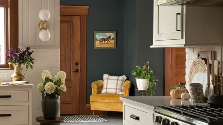
Almost-black navy paired with warm wood recalls wool suiting and leather Oxfords — it doesn't get more classic. Light cabinets and countertops balance the deep wall color near the entrance, and an ochre yellow bucket chair keeps things from feeling too serious.
2. Parchment
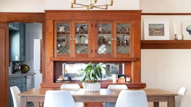
Soft ivory contrasts with darker wood trim, yet the yellow undertones in both tie them together. Choosing a light yet warm neutral honors the Craftsman style while allowing for a brighter interior. Further, it's an accommodating backdrop for colorful fabrics, art, and tile — a common element in Craftsman homes, or painted cabinets, as seen in the nearby kitchen above.
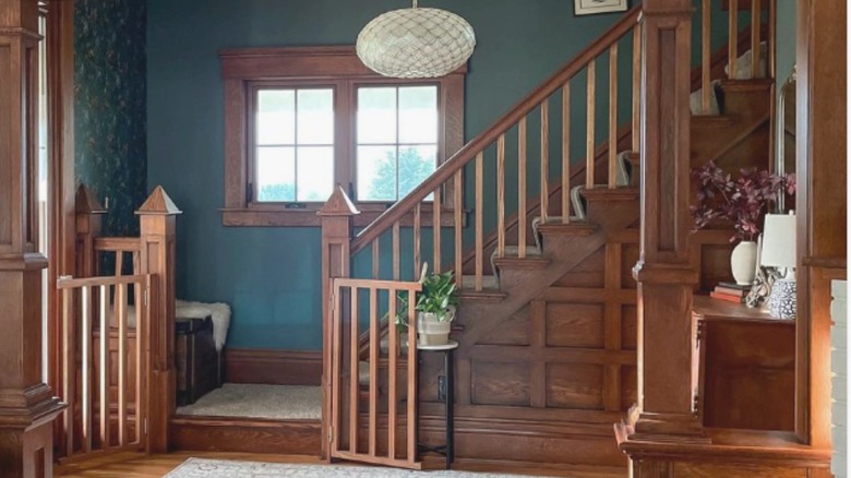
3. Dark teal
Teal is a mix of blue and green, colors that bring out the warmth in orange or red leaning stains because of their opposite placement on the color wheel. Deepened by a bit of black, dark teal is regal and a bit mysterious.
4. Ice blue
A powdery blue like shaved ice is warmed by a rich mahogany finish. The color looks at once timeless and modern. When combined with seagrass and shades of beige, the space is reminiscent of the seashore; to keep it sophisticated, focus on soothing elements instead of creating a beach theme.
5. Emerald
Mid-greens are a harmonious option to pair with wood because of their associations with vegetation and the natural world, according to the home service site Angi, while the bolder shades contribute a nice pop of strong color. The Renovation Husbands chose Benjamin Moore Colonial Verdigris as a complement to the paneling in the parlor of their Victorian home.
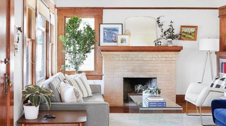
6. Cool white
White contrasts with darker windows and door casings, accentuating the graphic nature of their shapes and contours. Layer the cool paint color with tonal whites, beiges, and grays in accessories and fabrics; combined with natural wood trim, it makes for a cozy and textured space.
7. Slate blue
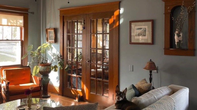
Gray slate blue is a perfect complement to strong and warm wood detail. It can stand on its own without competing, while it brings the richness of the trim forward. Perhaps because of its natural stone-like color, it works well in Craftsman, rustic, and mid-century modern spaces.
8. Warm white
The Gold Hive says they love to experience the solid casings and thick baseboards in their historic home, and further explains that the lumber present in older construction isn't like what's used today. A white wall brings out the warmth of the wood trim while highlighting chunky details.
9. Dusky turquoise
A dusky blue-green can feel moody and luxurious; it's reminiscent of turquoise gems and the ocean. Here, it's muted enough to be grounded and earthy, tying the walls to the tones in the wood and brick.
10. Blush
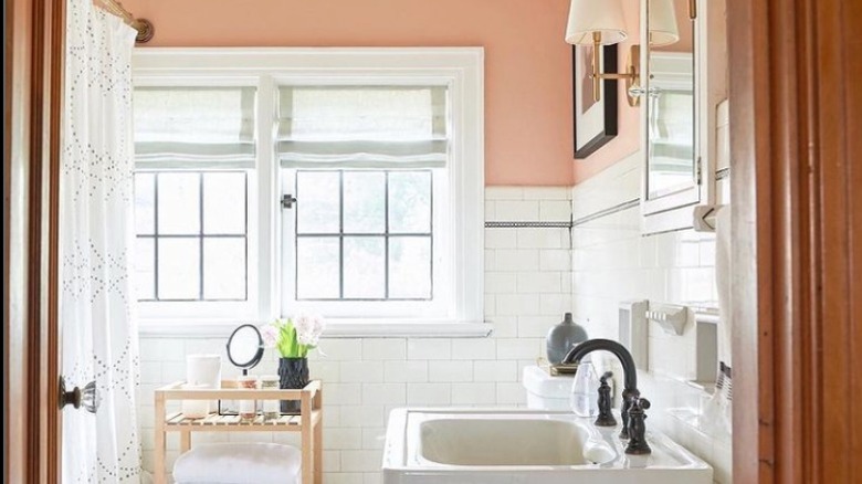
Shades of blush and rose are beautifully harmonious with wood trim, as their undertones are very similar. In this sweet bathroom, the blush walls are a lighter value of the wood stain, creating a seamless palette. The white tile breaks up the color story, which could have felt overwhelmingly warm. A sunset soak? Don't mind if we do.
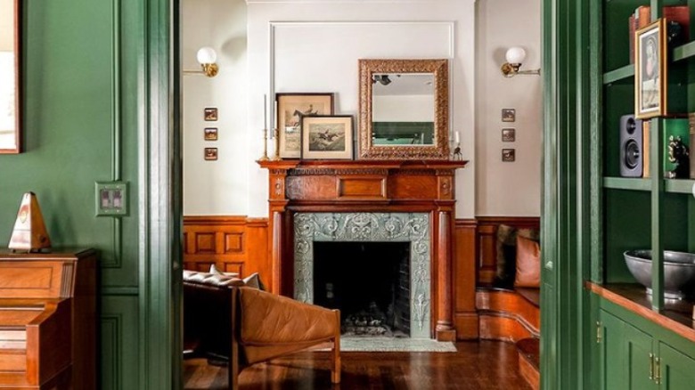
11. Deep green
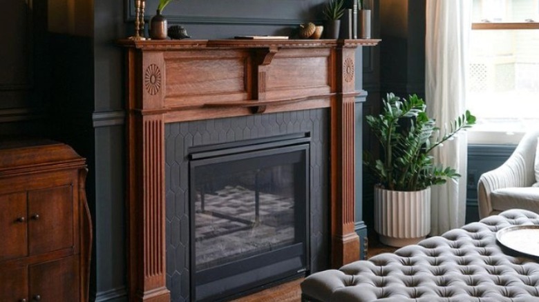
Deep Narragansett Green by Benjamin Moore looks almost black in particular lighting but retains its depth of color, contributing drama and warmth. Dark shades can obscure details, yet conversely, the wood mantle emphasizes rosettes and fluting — the walls are a better place for the dark paint treatment. How inviting is this living room situation?
12. Yellow green
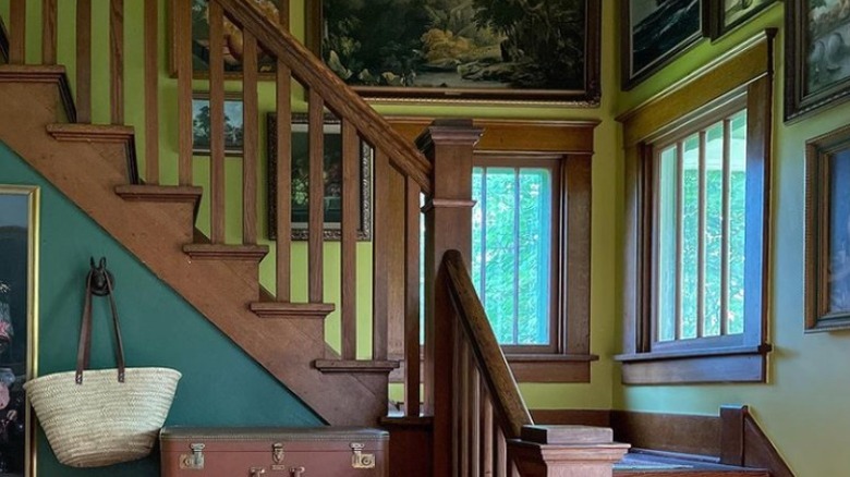
Yellow-greens have a vital and organic energy. They pair well with wood, yet clash a little, in a good way — like a riotous garden. An art gallery and windows cover much of the walls, helping to lessen the strength of the bold color.
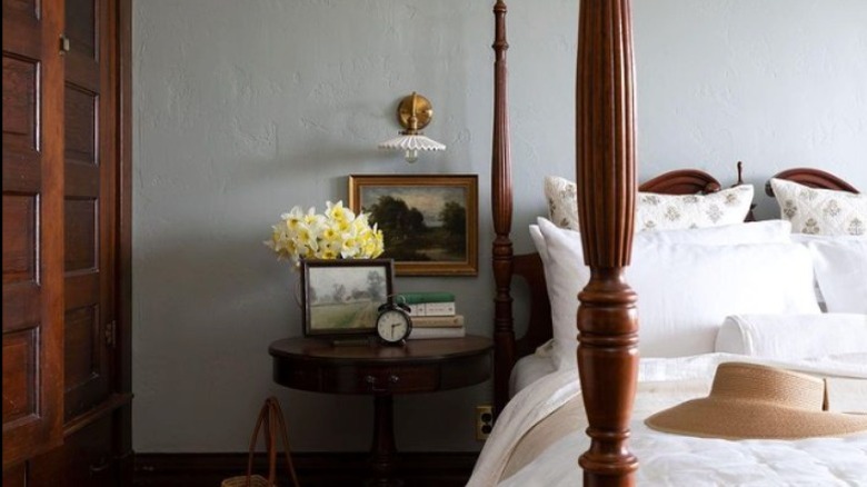
13. Putty gray
Try soft gray for a light neutral option that, while still timeless, imparts more interest than ivory. Recalling plaster walls, the color complements everything and creates a cool hush in the room. Here, the dark molding adds character and an assertive visual component that serves the design well.
14. Robin's egg blue
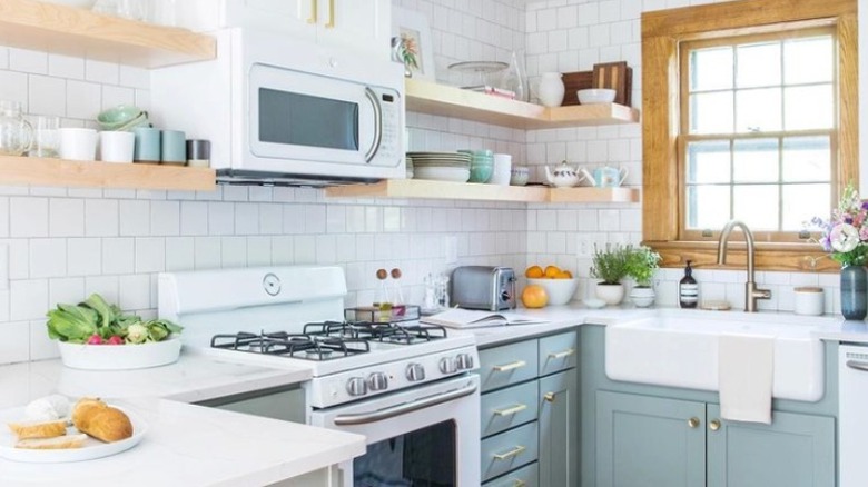
In the kitchen above, an updated retro take is carried out with robin's egg blue cabinets and bright white subway tile. Wood molding and shelves give the room an appealingly rustic and warm element; imagine them white and you'll see what we mean.
15. Black
Black is bold and classic simultaneously. The inky base makes colors pop, white zing, and neutrals feel rich. Additionally, it adds an instant cozy factor. Test swatches first, and opt for a selection that has depth in its undertone.
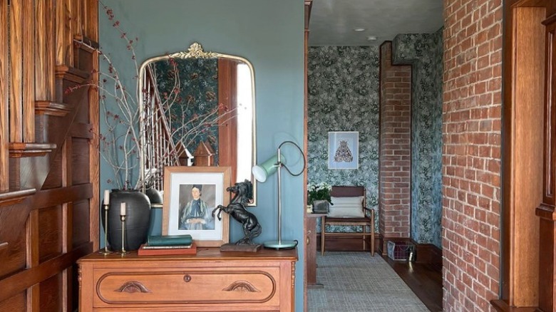
16. Wallpaper
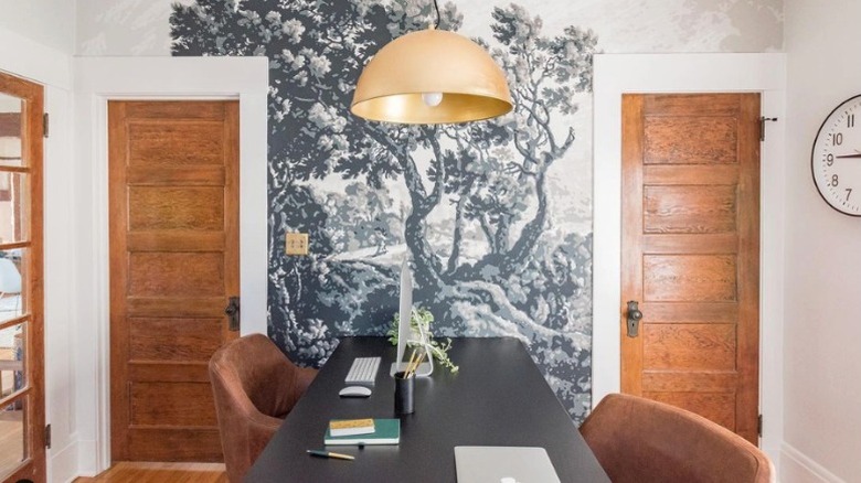
Bonus: Wallpaper provides color and tonal variations for the walls, just as wood does for the trim; combining them in one space creates a room brimming with layers and understated opulence. The Washington Post suggests a pattern with a light background to keep things crisp. For an atmospheric or vintage vibe, go with a medium to dark paper.