15 Paint Colors To Decorate With For A VSCO Girl Aesthetic
The VSCO Girl aesthetic began with a simple photo editing app and bloomed into a definable, popular style. It is known for its free and easy-going casualness, vintage-inspired nostalgia, a palette of soft, candy-colored pastels, warm sunset-drenched colors, and rich earth tones inspired by nature. According to Seventeen Magazine, this style wave began filtering into the general consciousness over the past decade. It takes its inspiration from the textural and vintage patina filters for images in the app, similar to Instagram's capabilities today. The rise in popularity of the filter among young women gave rise to the VSCO Girl aesthetic.
At times beachy and California-inspired, the VSCO style has influenced everything from personal fashion to décor. Its hallmarks include a vintage-inspired love of Polaroids and record players, mood lighting like salt lamps and LED strands, and a palette of perfect VSCO Girl wall colors. If you are looking to bring a bit of VSCO style to your interiors, there are a number of perfect shades that capture this casual, fresh aesthetic.
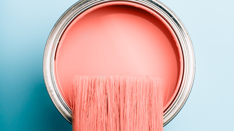
1. Romantic pinks
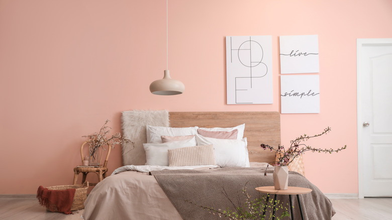
One of the most cited colors when it comes to VSCO-style interiors is pink. From the softest shade of blush to the brightest cotton candy pink, the color is often a favorite among those espousing the VSCO style. Pink is flirty and feminine, endlessly adaptable, and immediately gives any space a hint of romance and joy.
2. Aquatic blues

VSCO style loves the beach, where its casual, trendy, sun-washed feel is adrift in various shades of blue. A soft aqua shade mixing just the right amounts of green and blue is always seaworthy and can be easily paired with other pastels for contrast.
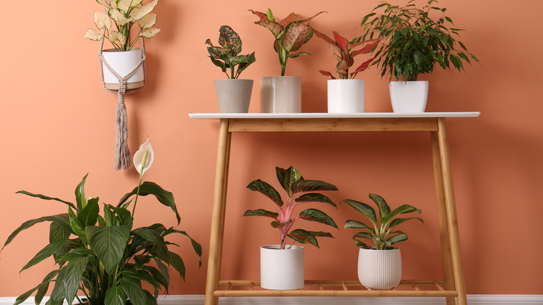
3. Just peachy
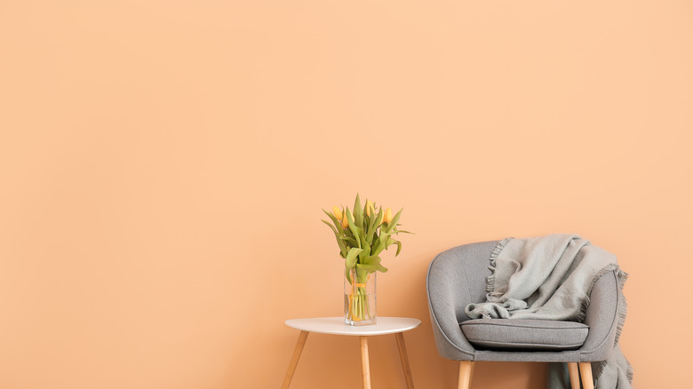
VSCO-style interiors love the sun as much as the sea, so sunset colors and tropical flavored hues are popular, including delicious sherbet oranges and peachy pinks. Peach also pairs particularly well with other pastel shades and neutrals like gray and brown.
4. Lavender dreams
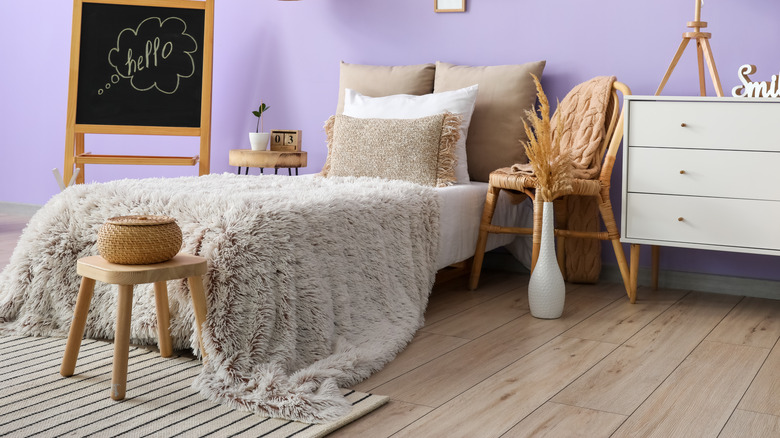
Lavender is one of the hottest shades in VSCO interiors and fashion, complimenting a variety of other pastels as well as neutrals like tan and cream. Try a bright wall in lilac or violet alongside neutral-colored bedding and décor.
5. Soft yellow
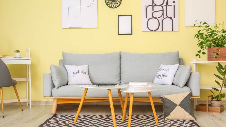
Another VSCO Girl-approved color is a soft buttery yellow. This shade instantly screams summer and is an immediate mood-lifter. Look for shades of lemon, goldenrod, and daffodil.
6. Minty fresh
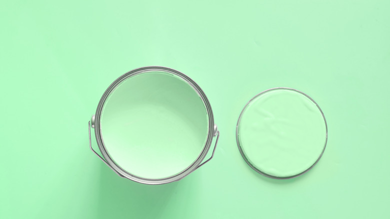
Mint green is a perfect paint color for restoring energy, and a tinge is ideal for nature and the tropical style. The shade is a popular edition to vintage-inspired spaces, including kitchens and bathrooms. Variations in the color include a soft sage green or pale celadon.
7. Deep teal
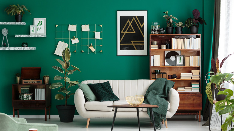
Deep turquoise or teal is a rich sea-worthy shade that adds depth to darker interiors. It is perfect when combined with upholstery and accessories in other shades of green or light aqua to create gorgeous sea-glass-inspired spaces.
8. Perfect periwinkle
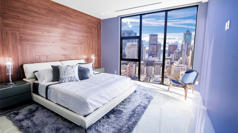
This popular mix of blue and violet is not only Pantone's color of the year for 2022 but one of the brightest and freshest shades for VSCO-inspired interiors. While it's deeper than many candy and pastel colors, it still gives off a similarly youthful and hip energy.
9. Soft coral
Depending on the shade's depth, Coral can be either a fun pastel or a deep sunset-inspired color, both of which perfectly fit the VSCO aesthetic. Look for shades of salmon, papaya, and poppy to compliment hues like aqua and turquoise for a vintage feel.
10. Sunset orange
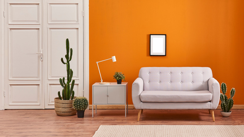
VSCO style loves sunset-drenched colors like rich oranges. A darker, deeper shade of orange not only evokes the colors on the horizon but also pairs well with lighter shades like yellow, peach, and pink.
11. Dusty rose
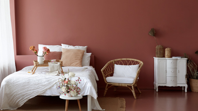
This deeper, duskier variation of pink is pure desert style, reflecting the laid-back sunniness of the VSCO aesthetic. It can be paired with other desert and sunset-inspired colors that echo the natural world, and it also layers well with other lighter shades of pink.
12. Basic brown
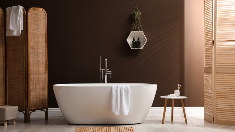
While it may seem deceptively plain and simple, brown is a popular color for VSCO interiors, echoing an earthiness that pervades the style. Brown is an endlessly versatile neutral shade that pairs well with pastels, particularly turquoise, aqua, and pink. You can also pair brown and orange for a fun, 1970s-inspired look.
13. Tans and khakis
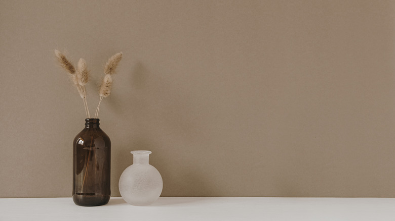
If you take the versatility of darker brown and lighten things up a shade or two, you get an array of tans, khakis, and caramel shades that are perfect nature-inspired colors for VSCO interiors. These neutrals pair well with most pastels and deeper shades of brown and cream for an earthy monotone palette.
14. Mossy greens
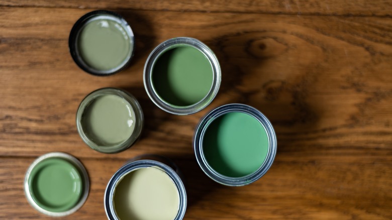
The most common color in the natural world, earthy green shades make a perfect addition to VSCO-inspired décor schemes, complimenting all nature-inspired shades of brown and tan, as well as pastels like pink, its opposite on the color wheel. Consider shades like sage, moss, juniper, olive, and avocado.
15. Slate gray
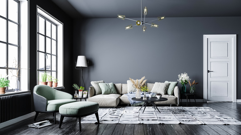
Slate grey is a perfect VSCO-style option if you prefer neutral tones or want a great neutral base to establish some color. Gray typically compliments many different colors as accent colors and looks lovely when even layered with other shades of lighter or deeper gray.