5 Bedroom Paint Colors To Pair With Blue Bedding

Your bedding choice and style are a big representation of your personality and reflect everything from your emotions to your tastes. Depending on how you decorate, the sheets and comforter you pick might determine how the rest of the bedroom décor comes together. Having those as a base or jumping-off point will allow you to design a dwelling that speaks to your nature and heart. It can also help with paint selection when the time comes.
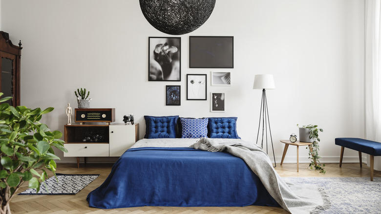
If you have chosen blue bedding, it can indicate a lot about your person. According to Sleep & Beyond, this color represents sincerity and peaceful notions, and people who use it in their bedroom seek a relaxing respite filled with trust and balance. Blue is a staple of most homes and can match a variety of other colors, tones, and shades. Finding the right options to make the sheets pop while still complementing them is key. Designers and homeowners who have had success using them with their décor highly recommend the following paint suggestions.
1. Light blue
One of the perks of using blue in any space is the variety of shades there are to mix and match. Blue is such a versatile color and offers a multitude of different hues that all complement one another. If you have medium to darker bedding, picking a lighter paint option for your walls will make the bold sheets pop while gently adding depth and dimension. By mixing two different tones of blue, you are creating a calming space that is both bright and peaceful. Opt for very subtle paint shades like sky blue, blue and gray combinations, and anything that mixes white and blue undertones.
Avoid going too dark with sheets and bedding that is already an inky shade, as it can make the room feel smaller and dimmer. According to Home Painters, using blue in a sleeping space is beneficial because it can make your mind feel more focused, and there are also studies proving that this color lowers people's blood pressure. If you do want to use darker paint, contrast it with lighter bedding and white or cream accents to offset the bold nature of the walls.
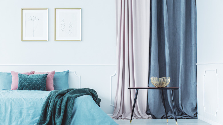
2. Dusty pink
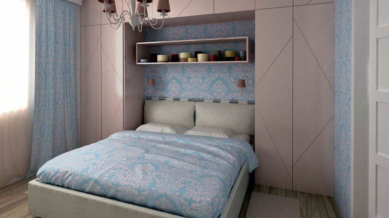
A blue theme or interior design can offer a range of options, and you can choose a darker décor or seek ways to lighten up this cooler color. Dusty or light pinks are great to mix with blue bedding because they can still match the undertones while warming up the room a little. These shades are subtle enough that they won't overpower the room, but they will add a cozy vibe that helps even out the cool side of the sheets, no matter their tone.
Lighter bedding can be slightly easier to pair with options like pink because the color is already bright and less intense than the darker hues. ArtRadarJournal suggests using dusty rose if you have light blue sheets, as the two compliments one another without appearing too vivid. They actually have the opposite effect, creating a gentle backdrop perfect for a guest room, master bedroom adorned with warmer accents, or even children's rooms.
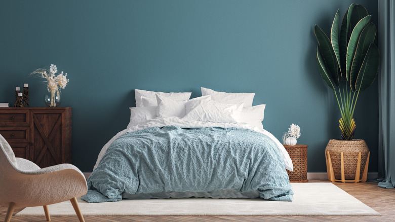
3. Gray
While your bedroom should feel cozy and inviting, it can still have cooler undertones that work together to create a minimalistic atmosphere. Gray is one paint color that you can easily use with blue bedding to make a simplistic décor scheme, but it also allows you to adjust or build on it whenever you're ready for a change. In addition, gray sits on the neutral palette, meaning it is perfect for a variety of purposes and combinations, especially those that incorporate blue.
You can choose from brighter, bolder sheets that offer a turquoise or teal tint, which creates a jewel-inspired backdrop that can be complemented with other pops of color or mixed metals. Using a lighter or medium gray with these will allow them to be the focal point. If you are looking for a more lavish vibe, use navy with deeper shades of gray that still open up the space but make for an elegant interior. According to Archi, gray is associated with communication, peaceful emotions, and positivity.
4. Green
Just like with blue, green comes in so many tints and shades that it can be easy to find the perfect paint match for your bedding. Both colors are ideal for a bedroom setting, and you can choose if you want a bright, bold décor or something more subdued and simplistic. The possibilities are endless, whether you have a deep blue comforter and use peacock green or blue paint to complement it or pair a navy bedding set with sage green.
When you use the color green in your home, you are generating a feeling of relaxation and a connection to the earth. This paint can bring a refreshing atmosphere to any area and create a truly welcoming atmosphere that inspires anyone who comes to the house. Incorporating this color into the bedroom to offset the blue or pull it through will breathe new life into it and also give you a wide palette to play with. Ameritas notes that green is important to humans and provides a soothing feeling representing health and vitality. Using it will surely turn your room into a restful and rejuvenating respite that complements the blue bedding and other accents.
5. White
Throughout the history of interior design, white and blue have been paired in various styles. These two colors go together so well that they are instantly recognized as partners in any theme or palette. Whether you opt for a nautical theme or country-house chic, using blue and white will instantly transform your bedroom into a fashionable space that boasts both elegance and simplicity in equal measure. Because there are many different shades and tones of white paint, you can choose from a brighter palette or a darker one, merging into beige or creams where you see fit.
Blue bedding complements the white walls by creating a crisp, clean décor that is easily pulled through the room with accents in both colors. Lauren McBride discusses the benefits of using white paint in your bedroom, including making the whole area feel larger, cleaner, and versatile. In addition, no matter what shade your bedding is, it will blend seamlessly with the white walls. Another perk of using this paint color is that it makes it easier to change or revamp the room whenever you're in the mood because it matches everything.