25 Stylish Tile Patterns Perfect For Any Room In Your Home
Your floor is often the most overlooked blank canvas in your home. Perhaps that's because, unless you've built your house from the ground up, there's always been some kind of flooring beneath your feet when you walk through the door. As Forbes points out, there is no single surface in your home larger than your floors, although how you present and preserve them will almost certainly vary from one room to another. Unlike your walls, floors can accommodate patterns that are more intricate and imaginative, and undoubtedly send a silent, though not always subtle, message about who's living under your roof.
Your choice of materials will depend on numerous variables including taste, budget, and the kinds of activities that take place in a given room. These days, there are more options in how to cover a floor than ever, ranging from materials like laminate and vinyl floors to engineered wood, stone, hardwood, and carpeting. But there is one tried and true classic that continues to find new designs and devotees: tile. Tiles range in composition including glass, cement, ceramic, porcelain, stone, marble, granite, and even resin and metal, according to Bauscher Construction. Here are two dozen and one creative ways to use tile to tell your own story as a homeowner.
1. Stone bedroom
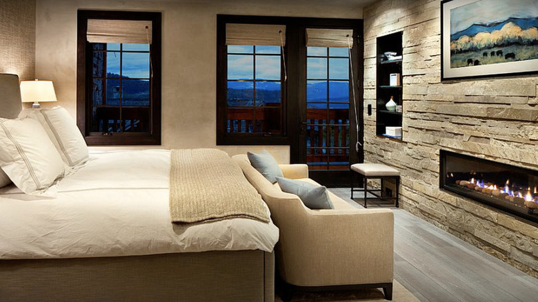
Stones like slate, granite, and marble add a timeless elegance to any space. Used here to tile the wall and fireplace, they bring a touch of nature into the room. There are multiple ways to achieve the effect, from real stone to manufactured facsimiles that will bring your costs down considerably.
2. Wood and steel
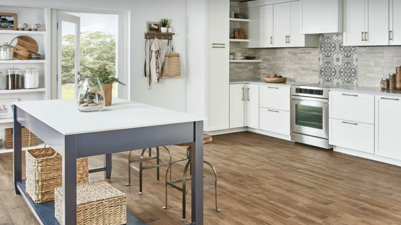
Try combining the industrial with the organic. Wicker baskets alongside wood laminate blunt the stark white of the tabletop and surrounding cabinets, drawers, and walls. But look closer, and you'll see there's intricate tile work along the backsplash. Part of the point (and certainly a selling tool) is that you can't tell if it's real or faux.
3. Clean colors
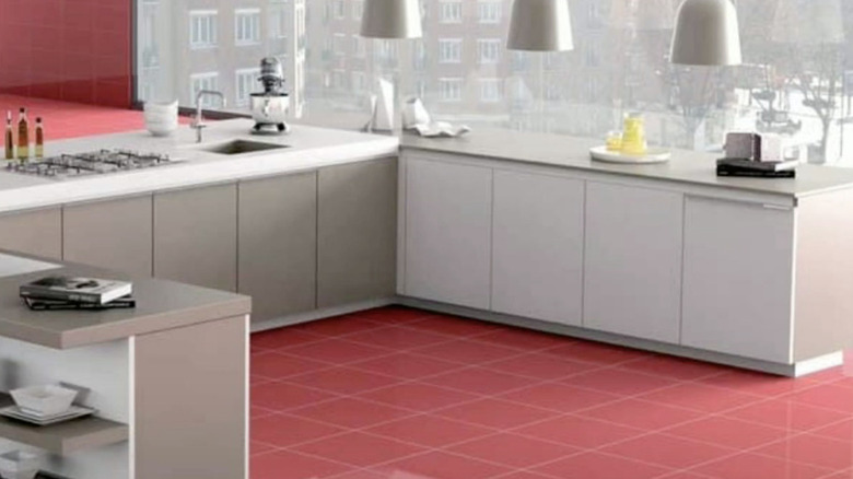
These raspberry tiles work against the white and gray elements of the kitchen because the contrast is played so well. The cabinets are matte, the hanging lamps appear to be brushed metal, and the red is able to bounce off these like lip gloss. It's not a look for the faint-hearted and also leans industrial. But it works.
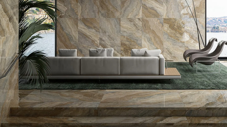
4. Polished stone
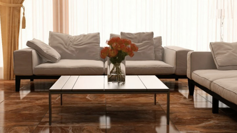
The amount of polish on your floor tile is increasingly in the hands of the consumer, as the range runs from such mattes as clay to the polished look above. If what you want is more rustic, then matte is definitely what you seek. However, for an upscale image, the more polish the better.
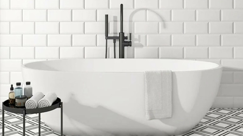
5. Plain gloss
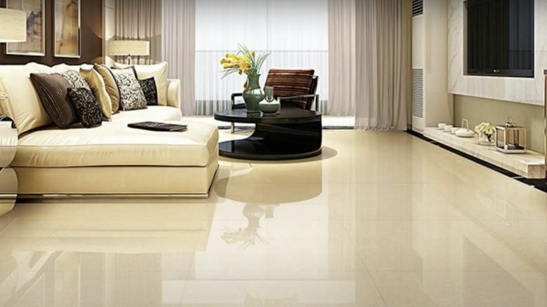
One of the hallmarks of good taste is getting out of your own way and letting the room speak for itself. Everything you see here contributes to the room's serenity; busy floor tiles would have been counterproductive. Notice how what you see not only matches in color (with the pillows adding visual spice), but tone as well.
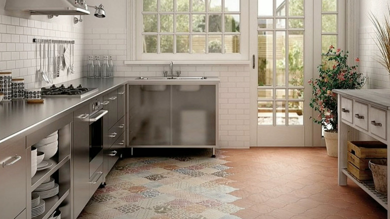
6. Matching accents
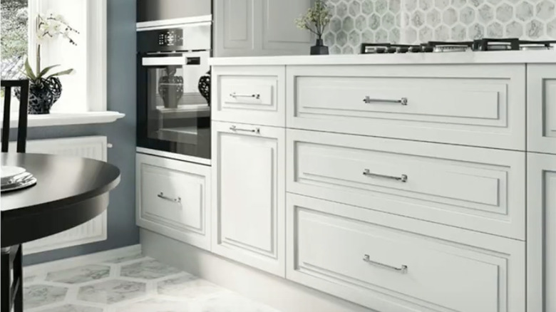
Carrying colors from a floor to an accent wall is nothing new, but the spin here is that the design of the tile beneath your feet is referenced in a smaller version of the same design used as a backsplash. The white and gray theme keeps the design as clean as you'd hope a kitchen would be.
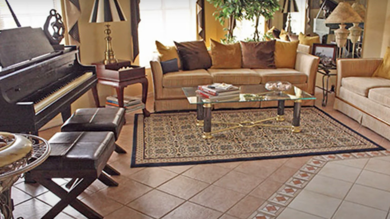
7. Patterns in tile
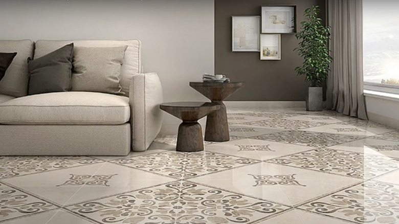
The more monochromatic the walls and simpler the furniture, the more opportunities you'll have to work with what's beneath your feet. The furnishings in this room would appear almost drab if they weren't complemented by the intricately patterned tile, which not only brings the room to life, but pulls the beige and brown color scheme together in sharp relief.
8. One color
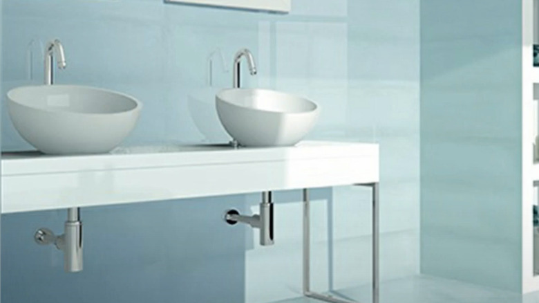
All it takes is one perfect color — in this case, a gorgeous semi-gloss aqua — to set your bathroom apart from the rest. Toiletries are intentionally tucked away on shelves so this unique design scheme can take center stage. Admittedly, this isn't a look for everyone, but it's still easy to admire.
9. Polished Clay
By paying particular attention to buffering, you're able to control precisely how much sheen you'd like to have on your floor tiles. That can mean mixing and matching between one that has a matte finish to one that is slightly shinier. You can also dabble in transitioning from one to the other. Time spent is art earned.
10. Faux-wood tile
No one has improved on nature — yet. But today's textiles can impressively mirror the natural beauty of wood, and that means tiles too. The end result preserves the organic look you're seeking, but is easier to maintain than the real deal. Here, the verdant matching chairs, light brown drapes, and wall art bring outdoor beauty inside.
11. Two-toned tile
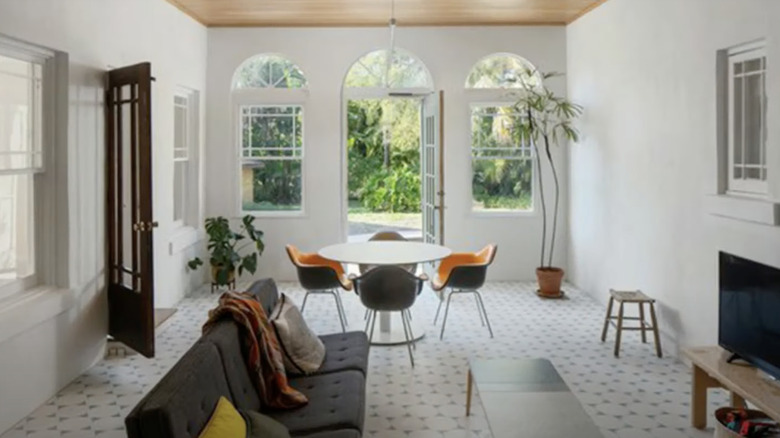
You've heard that less is more, and here's an example of the principle at its best. The subtle black and white tile pattern suggests this is a transitional room; not quite indoors and not yet outside. Even if you can't be sure which décor trend these mid-century furnishings represent, you know relaxed elegance when you see it.
12. Colored patterns
In this clever concept, it's hard to tell if we're looking at a hobby room, a break room, or someone's living space. You can tell from the choice of tiles that there's an artist in residence. Bold colors offset bold patterns, kicking the visuals up a notch, but not beyond the boundaries of good taste.
13. Statement tiles
Picture this kitchen area without its thoughtfully chosen tile and you can immediately imagine just how lifeless this small space would be. It makes sense that the designers would pick up on the brown and black tones of the cabinetry, but the pattern and burst of red are just what was needed to liven up the room.
14. Glossy cobalt
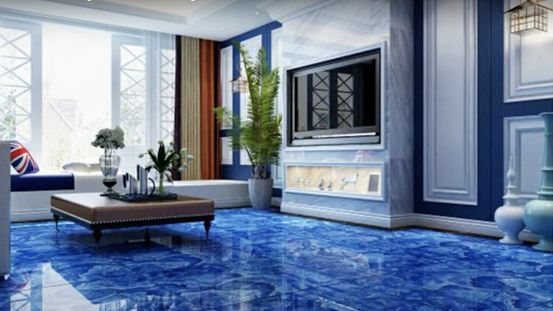
These deep cobalt tiles create a luxe look that's eye-popping and opulent, and nowhere near natural. The Union Jack pillow suggests there's a bit of whimsy at work here, but only in the most subtle way. Otherwise, this room looks so regal that any monarch could walk in, observe the surroundings, and nod in silent approval.
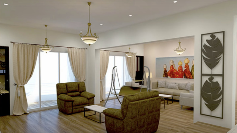
15. Matching walls
When designing a room, it's important to think in multiple dimensions. That requires strategic thinking when it comes to what the other components in the room might be, from furniture to potted plants and artwork. Sometimes that means you can actually drive your idea right up the wall from the floor below.
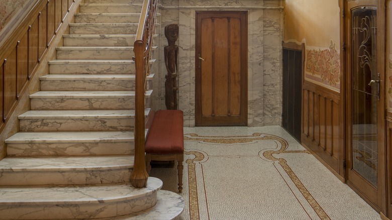
16. Art deco
Refinement, geometry, and bold patterns were all signatures of the Art Deco style, now just under 100 years old. But the reason it caught on and will never truly leave is it telegraphs class. Here the white subway tile provides the ideal backdrop for the sharply drawn lines of the floor tiles. The design is historic and timeless.
17. Patchwork tiles
Who couldn't spend an afternoon here? Clay panels join with a patchwork to suggest that no matter what's for dinner, you can bet it will bear the unmistakable imprint of a chef who values originality. Yes, there's a hint of white in the quilt-like pattern here, but otherwise? The intention is to offer a creative sense of contrast.
18. Spanish tile
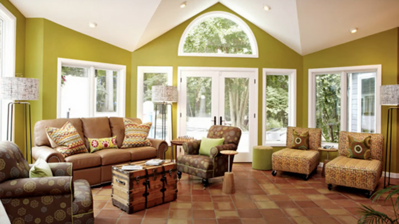
What goes with avocado walls and white trim? Ideally, something complementary that doesn't make you think you're on the set of a '70s sitcom. Here, designers take their cue from the steamer trunk coffee table and choose a rich assortment of reddish-brown Spanish-inspired tiles that seem to radiate warmth and welcome.
19. Classic
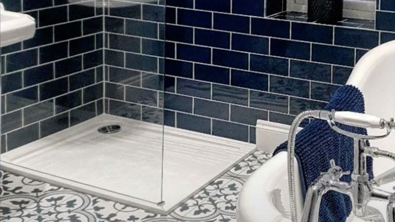
It's a bathroom built for a 21st century tycoon. High-gloss navy brick lines the walls and the classic floor tile design may remind you of times gone by. Yet, the open shower and on-point porcelain furnishings let you know that this style associated with yesteryear is a concept that's been updated to state-of-the-art.
20. Go for the gold
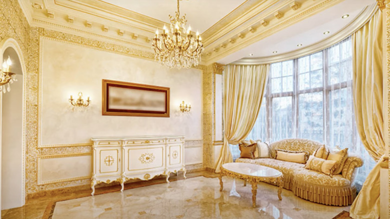
No matter how dazzling a room might be, the right tile selection can certainly elevate a space to even the next level. In this Marie Antoinette concept, gold and yellow combine to make this sun room even sunnier. Other than the pillow trims and the frame on the wall, this space is wonderfully and intentionally monochromatic.
21. Austere stone
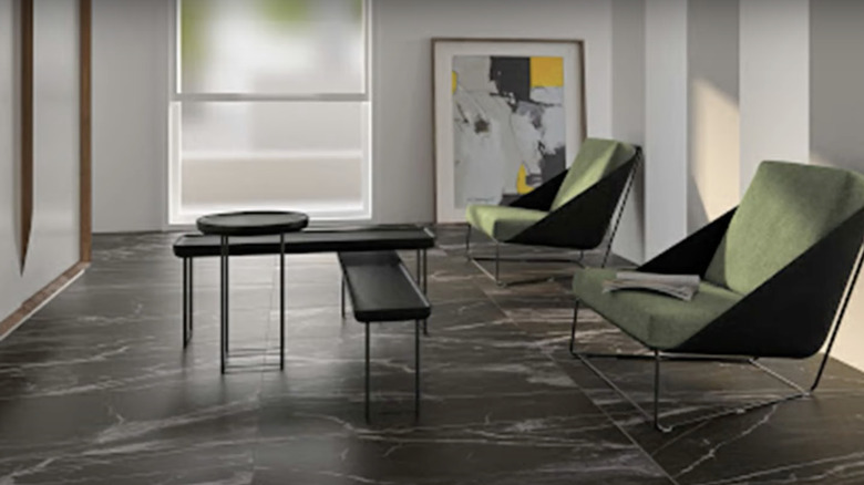
Looking for a visual way to communicate gravitas? You can't go wrong with simple black stone tiles. Whether they're real or faux in origin (and who can tell without touching them to your bare skin?), they transmit a very clear message that you're all business. The finish is also more matte than glossy, which mutes the effect.
22. Color schemes
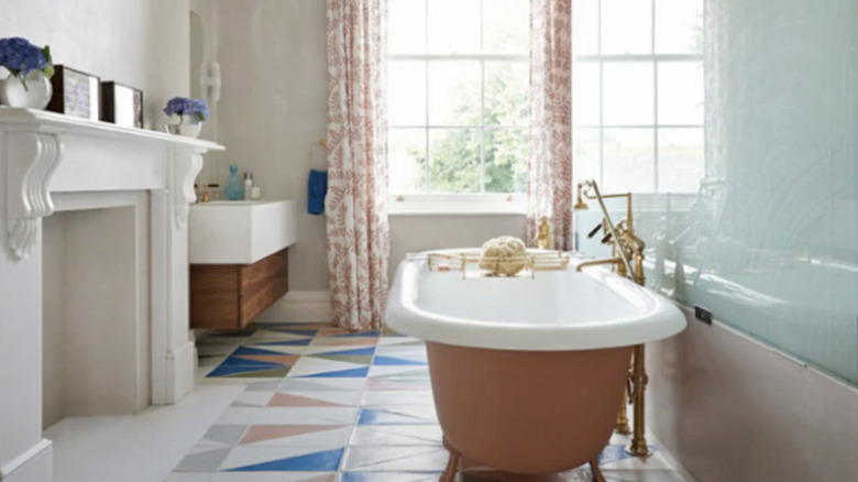
Here's a DIY-looking bathroom where peach is inventively married with white and blue in the floor tile, tub, walls, and window treatments. The geometric patterns in the tile add visual interest to the floor and remind the eye to pick up the different color accents throughout the room.
23. Mismatched simplicity
There's been no attempt to place these tiles in a way that makes them look like they appeared here organically. Instead, there's a slyly mismatched quality about them that takes the edge off the white-on-white furnishings. There's barely any color here, and yet, the aura of a family gathering place is well in evidence.
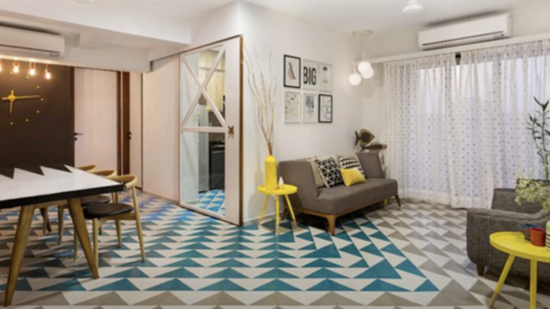
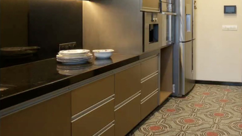
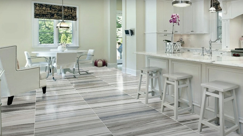
24. Use geometrics
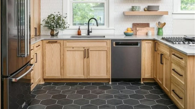
Symmetry is your friend. Have a look at how these tiles — in varying shades of grays placed randomly — play off and unite the elements of this kitchen simultaneously. The gray geometric tiles pull from the refrigerator and dishwasher, and the grout nods to the countertops and wall treatment. The easy way would have been to choose brown.
25. Your style
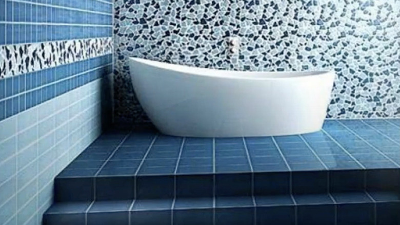
Ultimately, it's your sense of style that should prevail, and the designer here who mixed three different tiles seems to have an innate understanding of that. The mosaic, the deep azure floor tiles, and the way they're all tied together on the facing wall is nothing short of sublime. All you need now is wine and a soak.