The Biggest Paint Color Mistakes That Homeowners Make, According To Interior Design Experts

Any interior design enthusiast knows that paint is one of the quickest, easiest, and most cost effective ways to transform a space. As Kiki Interiors explains, depending on the color you select, paint can make the space look much brighter and fresher, and in some cases, can even give the illusion of a little extra space and make the room feel a bit bigger.
Paint is also a relatively low-stress upgrade because it's easy to change if you don't end up liking the color you select. With something like new countertops or cabinets, for example, a wrong choice can force you to essentially start from scratch, and is an extremely expensive error to make. With paint, you can always just grab a different color and toss on a new coat to cover the shade that didn't quite end up the way you envisioned.
However, painting does take time and effort. As Glidden calculates, depending on the size of the room, you're looking at a full day or two of solid work. After all, it's not just rolling the paint onto each wall — you have to move furniture, tape, cut in along the trim, and more. So, you want to avoid making a color mistake whenever possible. To help you steer clear of common errors, House Digest spoke with Jameelah Watkins and Ebonee Clark in an exclusive interview — two savvy interior designers from Lauren Wesley Designs – to get the scoop on the biggest paint color mistakes that homeowners make.
Forget the accent wall
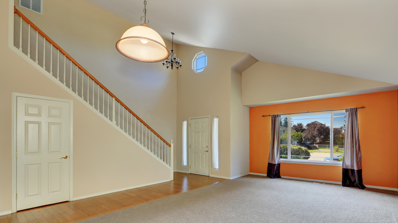
For quite some time, if you fell in love with a particularly bold color that you feared would be a bit too much for an entire room, the answer was simple: You would paint an accent wall in that shade. Paired with a neutral hue on the remaining walls of the space, this gave you permission to add a splash of your desired hue without it being too overpowering. However, according to Jameelah Watkins and Ebonee Clark, you should be avoiding this crutch if you want your space to look up-to-date. "Accent walls are a thing of the past," they revealed.
While covering every wall in a room with that particular hue may make you nervous, especially if it's something bolder than you typically go for, just take a deep breath and start painting. "It's best to commit to muted or even deeper tones to create mood," Clark and Watkins continued. After all, there's a good chance that you were drawn to that shade for a reason — and you might just end up thankful that you opted to use it throughout the space rather than in one condensed area.
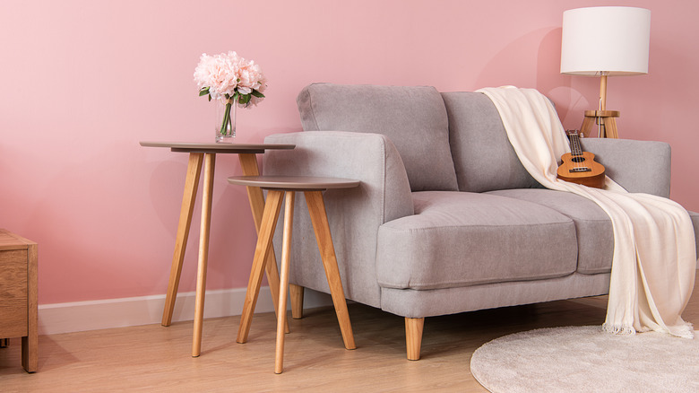
Consider the full spectrum of the color you want
When you're facing that wall or book of paint swatches, it can be easy to think you'll never be able to narrow it down to just one shade — after all, there are so many gorgeous hues, each infusing a space with a distinct feel and mood. Often, though, you'll go in with a general color in mind; for example, since you know blue can have a calming effect, you might be gravitating towards some shade of blue for your bedroom refresh.
However, as Jameelah Watkins and Ebonee Clark warn, you want to make sure that you're considering all the variations of that hue. "All blue or green paints aren't created equal," they explained. "There are thousands of color options, and a muted version of a paint color can provide a great effect without being too harsh."
For example, if you know you want to go with green for a certain room, you don't need to pick the hue that will make you feel like you've been transported to the Emerald City. You might want to select a deep forest green for a moody feel, or a pale sage green for a calm vibe. This can especially come in handy for colors that can be a bit more divisive — for example, a soft blush pink can work in a wide variety of spaces, but it takes a certain type of homeowner to relish an ultra-saturated Barbie pink.
Don't ignore your furniture
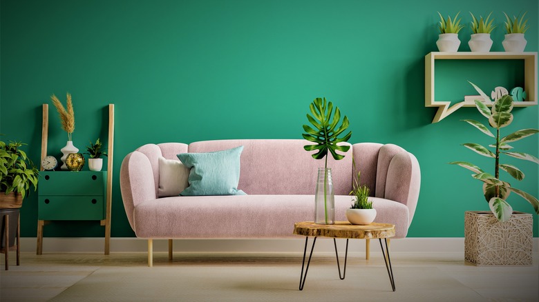
Jameelah Watkins and Ebonee Clark have one final tip when it comes to the paint colors in your home: Keep your furniture in mind, and use it as a bit of a jumping off point. "Another mistake homeowners make is choosing paint colors prior to making furniture selections," the duo shared. "Paint choice should always be one of the last selections as fabric choices are limited, but there are thousands of paint colors to tailor to your priority design choices." The pointer makes sense — no matter how much you love a certain shade, if it clashes with all your furniture, the space just won't work.
And, this advice works whether you want to pair bold furniture with a complementary bold paint hue, whether you want to keep everything neutral, or whether you want your neutral furniture to be livened up with an eye-catching shade on the walls.