5 Paint Trends That It's Time To Ditch In Your Home
Painting your home is a common practice for anyone who has lived in the same place for more than just a few years. More specifically, Colorado Painting notes that a well-applied interior touch-up can remain viable for as long as 10 years with excellent care. This means you'll need to apply new coats to your walls at least once a decade.
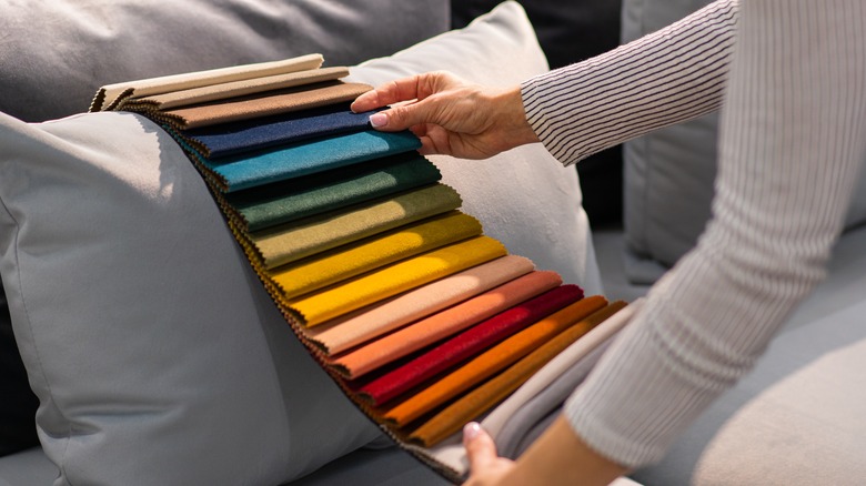
Now, if you haven't refurbished your entire home for 10 years or longer, you may have some difficulty finding the right scheme to match your style and today's current trends. With years of the same color pattern — and the dulling effect that takes over any paint job after a while — homeowners are often at a loss for how to re-envision their home's spaces.
Looking for inspiration online can be a major point of assistance, but there are some trends that should be avoided at all costs, even if they look great in digital imagery. The difference between staged photographs taken for a digital publication or online blog content and the finished product on your walls can be dramatic. Ultimately, misunderstanding the specifics of a new coloring scheme found online can leave you living in a home that feels incomplete or poorly designed — and potentially lasts for many years to come.
Avoiding these five painting trends will help you steer clear of potential pitfalls when it comes to redesigning the look and feel of your home.
Uniformity in color around the whole home
These days, perhaps the most obvious color scheme trend found in homes is the uniform paint job. In the past, homeowners have opted to stain every room with the same texture and tone, creating a singular living space that looks and feels like one cohesive unit. This style is great for office buildings and commercial real estate properties, but it doesn't really suit the modern needs of homeowners. For one thing, color can dramatically influence the mood in any room of the home, according to Mountain Vista Psychology. With a singular color pattern rolled across the entire interior, any home is bound to look and feel like one monotone environment — and the energy inside the property soon matches that outward vision.
That's why it's important to bring character and spirit into the home by changing up the color pattern and general design elements of every room. In fact, there's nothing wrong with painting a few different rooms the same, neutral color in support of basic design foundations. However, each room needs its own unique character. Thus, a completely uniform color palette is the wrong way to go in a modern design scheme.
Overloaded whites
Another trend that has gained significant traction among homeowners is the use of saturated whites in multiple areas of the home. Indeed, an all-white room looks beautiful in images posted online, and these rooms tend to exude natural lighting. Plus, the combination of white walls, white linen curtains, white furniture and rugs, and other elements can be immensely enticing for a homeowner looking for a fresh, new look in their living room or other relaxation space.
Then again, all-white rooms are immensely hard to care for, as keeping these spaces clean and neat is a full-time job all on its own. Oftentimes, homeowners who create these types of spaces quickly find that staged design elements and lighting tricks make any room pictured in glossy magazines look far better than the ones they've created in real life (via Maria Killam). While these white-dominated rooms may seem like a great option in the moment, they're typically far more trouble than they're worth.
Gray everywhere
On the other hand, a totally gray room is also problematic, but for its own set of reasons. Using this color throughout your home (in the same way a homeowner might create an all-white space) can quickly dominate the aesthetic of the living space and make it feel drab and dreary.
Grays work as a wonderful accent color and offer a nice neutral tone to transform a space quickly and easily. The Design Sheppard notes that this tone can add sophistication and elegance, in particular, to a tall room. However, used all on its own, gray can wash out the energy and positivity that many homeowners try to infuse into their living spaces.
It can be easy to underestimate the power of gray shades. They often feel easy to apply and lend themselves as a great complementary hue in many different settings. Yet, too much of it can really take away from the visual impact of the space, leading to the atmospheric equivalent of a thunderstorm constantly hovering over your rooms and home more broadly.
The rose quartz craze
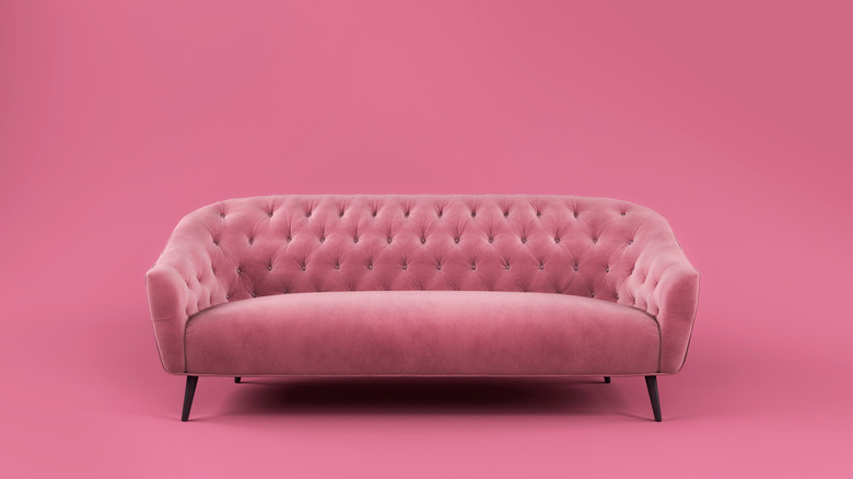
Pink tones can also act as a wonderful accent, or even as a base color option in children's rooms and beyond. But too much pink can create the same kind of washed-out effect that happens with an excess of any other color. The issue of including or overusing pink is that its utility as a dominant shade is limited as a trend in the design world. Similarly, whites and grays rely solely on the energy that these colors create. Yet, with pink, too much of the same shade can lead a home into this same issue, alongside its problem with stylistic trends.
Pinks made their way into homes all across the country just a few years ago (with rose quartz listed as the color of the year in 2016, via Pantone) as an important accent and base color. But color schemes quickly go out of style, and homeowners are beginning to shy away from this feature. Other options hold more staying power because they are more neutral in tone. However, pink paint can easily become grating for a homeowner looking for an update or as an obstacle to selling.
High contrast combinations
Contrast is a crucial component in good home design. Moreover, adding disparate elements to the color or furniture schemes in your property can make for a visually appealing space. Yet, too much distinctness can quickly become too much of a good thing.
Indeed, intense color contrasts can be jarring, leading to a disjointed room or home. Instead of using color gradients to create diverseness, matching similar tones found on the color wheel or opting for distinct shape differences or texture variations can make for a more free-flowing option that's less abrupt and more comforting, according to My Move.
Big, bold color differences have their place, of course. But as a design element in the home, these choices often take away from the comfort and quality of life that a homeowner is trying to instill in their property. Instead, more subtle contrasts are often the best way to approach color changes and home design alterations.