What Are Superneutral Colors And How Can You Use Them In Your Home?
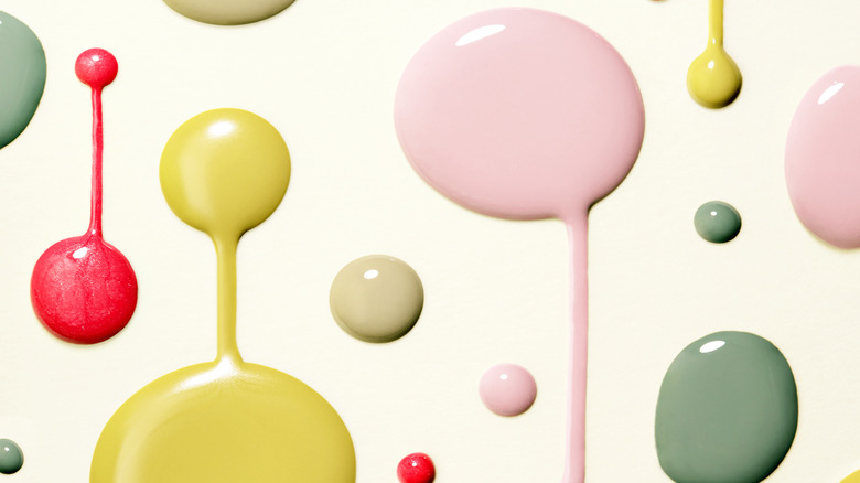
Beige and grey walls have existed in homes for decades. While they are non-offensive choices that have true staying power when it comes to home design, they aren't exactly exciting either. Enter the "superneutrals" — fun and inviting hues that won't clash with furniture or décor. As first described by Martha Stewart, superneutral colors are created when a bold color is mixed with the aforementioned beige or grey — the result is a toned-down version of green, red, purple, pink, or yellow. Superneutrals aren't limited to these mentioned colors but are great subdued options for your walls, carpets, and accent pieces.
According to Sherwin-Williams, neutral paint colors are great because they are versatile enough to pair with other colors. You can have a beautiful, consistent feel throughout your home without settling for a boring vibe. Superneutrals rest comfortably on the spectrum between bright colors and neutrals that feel too safe.
Gorgeous green
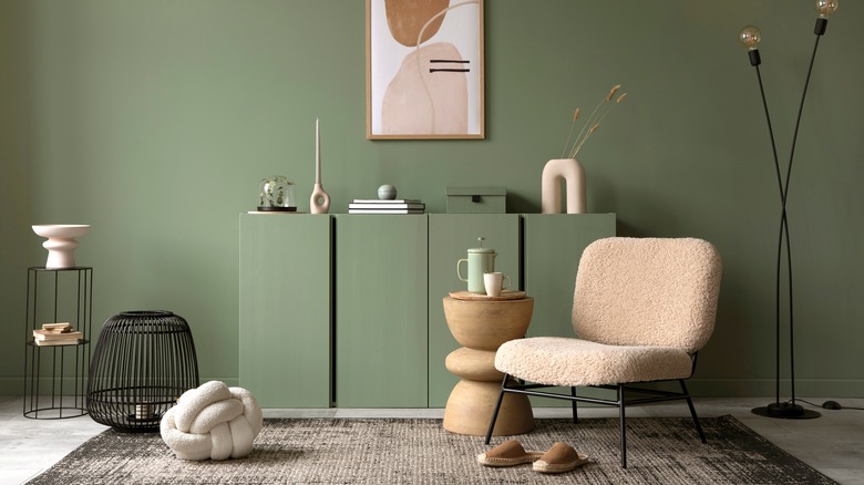
While Kermit the Frog may have lamented that "It not that easy being green" (via YouTube) when it comes to your home décor, green can actually be a great choice. You might be used to seeing white as a base wall color when designing a sleek and clean look, but a muted superneutral green can bring a calming and peaceful feeling to your home.
As described by Lilu Interiors, green is a color we see plenty of when we are out in nature. If you live in a region with harsh winters or summers, stepping into a green room can bring you some zen when your yard or local park aren't as easy to enjoy. Green doesn't have to be harsh or overbearing. Go for a shade that takes a cue from the great outdoors, such as grass, leaves, and other natural hues that take a step away from brighter childhood tones.
Lovely lavender
Purple is a pretty risky choice for home décor, but have you considered lavender? This superneutral hue is a whimsical choice while also tying together a calm and welcoming environment. According to Verdissimo, lavender represents purity, calmness, and silence. Sounds pretty inviting, right?
While we aren't suggesting you go out and paint a wall purple, there are lavender accents you can easily work into a room, be it furniture or wall art. Try some pale purple chair cushions, a sheer lavender curtain, or even one statement furniture piece like a couch. If you can't find purple furniture or art locally, check online or consider a DIY with a new chair cover or a coat of chalk paint on a table or dresser. Don't forget to bring some bundles of real lavender into the room. This soothing flower is lovely and inviting to the senses, it's affordable to buy, and it fits in well with a variety of room styles, from boho romantic to sleek and modern.
Springtime yellow
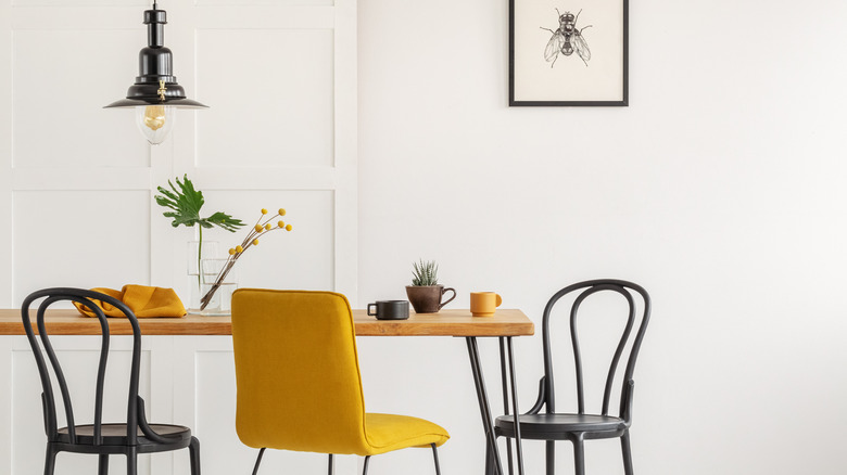
Yellow is known for being bold and bright, but there are plenty of superneutral yellow shades that can work well in any home. Whether you go with a pale, springtime-inspired yellow or a deeper goldenrod, neutral yellows are sure to inspire you.
Mid-century modern is a home décor trend that never falls completely out of style, and many vintage pieces incorporate yellow. As Emily Henderson remarks on her design blog, a mustard yellow rug can bring texture and interest into a beach-themed room, as this color ties in well with blue and white. You can also work this color into bedding, upholstery, throw pillows, or even a painted coffee table.
Whether you choose to pair it with modern hues like teal or black or go for special occasion decorations like floral Easter centerpieces, yellow is a superneutral color that works well with a wide variety of design choices.
Feeing peachy
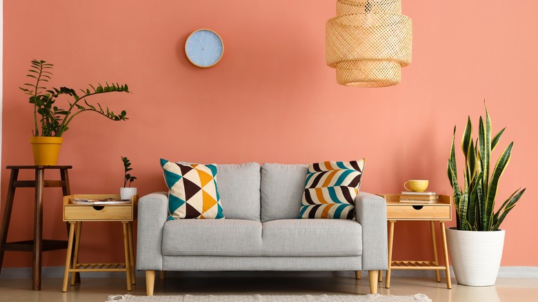
Fun and funky without going overboard, peach is a superneutral color that many will love. Peach is a Southern-inspired hue that can come in the form of everything from paint color to displays of the actual fruit. Relaxing in a peach room can be reminiscent of a sunset, an orchard, or the end of a perfect summer day. Who wouldn't want those rosy reminders in their home?
As suggested by Wow1Day, a kitchen can be beautiful with peach and white paired together. Not ready to paint a wall? Purchase a peach tablecloth, plates, cups, or even a counter vase. Other kitchen tie-ins inspired by this hue can include dish towels, miniature peach trees, kitchen appliances, or some fun food-related wall art. You can be as cautious or bold as you want with peach — it comes in so many different shades, from a pale blush to a bolder orange.
Cool mint
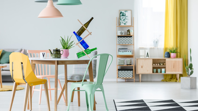
Mint green is a fun accent color for a kitchen, office, bathroom, or anywhere you can get creative. According to Treehouse, there's a relatively newer hue known as "neo mint." This color is a more pastel mint, bringing a lovely, dainty look to any room. Classic mint shades are also growing in popularity, finding their way into every aspect of home décor, from curtains to couches.
Some fun mint green ideas include a dresser or closet with gold fixtures, a classic wingback chair with black trim, or metal chairs for your kitchen breakfast island. Mint is a fun choice because you can go as subtle or big as you want — paint a wall, purchase a whole furniture set, or do something small like add trim to a wall or boost some favorite wall art with a mint-colored frame. Superneutral mint green also isn't new. You can see evidence of it in décor of the 1950s and 1980s, as well as the many design trends today.