The Best Color Palette For A Vintage Home Decor Aesthetic
Do you love old things? If you want to decorate your home with a vintage flair, there's a color palette that might ultimately keep things in the past. From warm neutrals to assorted shades of blue, red, or yellow, vintage eras like craftsman and mid-century modern continue to influence our contemporary designs. According to Antiques, many antique dealers might consider that anything older than 40 years old is vintage, although décor that aims towards the late 1970s and 1980s may be considered more retro. Ways to implement color through your vintage home décor could come through chandeliers, mirrors, lamps, vases, clocks, furniture, curtains, rugs, and art.
What colors might suit your vintage home design? Within typical vintage fashion, which can often lean towards something more eclectic, many vibrant colors, including blue, ochre, and red, may generally outweigh various neutral tones. However, as vintage décor preserves a focus on different wood features through timber beams and teak and walnut furniture, you might pair these elements with more subdued shades like blue-gray, olive green, or terracotta red. Whether nostalgic or traditional, vintage décor can be diverse yet sophisticated through the mixing and matching of characteristic pieces. Keep reading to discover how to curate your vintage style with the best color palette.
Find balance through a minimal palette
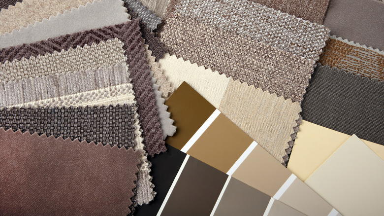
Whether you want to include several colors within your vintage palette, or only a few, establish a specified combination within your pieces. Popular vintage palettes might incorporate neutrals like whites, creams, grays, tans, and browns, against vibrant blues, yellows, greens, and pinks. These days, you might opt for something more minimal, Benjamin Moore notes. The above contemporary color palette centers on whites, creams, and browns mixed with a chic orangish-red hue. To attain ultimate contrasts, blend lighter shades with the darker ones, or pick one rich hue like black, red, or blue to juxtapose the neutral tones.
Another option might be to create a palette that emphasizes closely related hues like white, gray, and brown or cream, brown, and tan. These groupings will keep things grounded and muted while making room for accentuated color to appear within the process. Black and white is also a classic neutral combo that could be represented within an animal print rug while complementing brown or taupe furniture with yellow, orange, or red colors among accent pillows and artwork.
Establish a sophisticated color scheme through furniture and decor
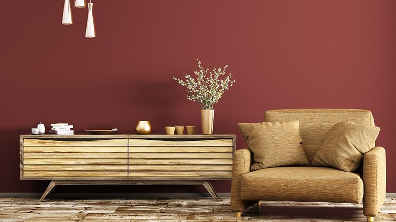
However old-fashioned your interior design vision is, start with a neutral foundation for your chosen colors to stand upon. For a sophisticated look, you might choose shades like beige, tan, white, gold, and brown to offset a deep, distinguished red hue, as seen pictured above. The sandy colors of the low-slung armchair, console, and floor all provide an earthy contrast against the eye-catching wall color, including the brass metal décor pieces and silver pendant lights.
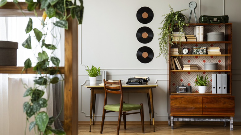
Wood is also a common element that both craftsman and mid-century modern styles emphasize. From exposed wood beams to furniture, a teak credenza or walnut bookcase would stand out amidst a white or gray background while incorporating some light blue or yellow accent pieces. According to Modern Bungalow, you might start with the various textiles like a carpet or rug as the basis for a more craftsman-style interior design. Additionally, explore your vintage combos through a variety of décor, like pottery, stained glass windows, and floor tiles, including the use of natural stones. Overall, you might aim for an indistinct background by applying hints of pigment without placing too many similar elements together.