The Versatile Paint Colors That Look Different In Each Room
We've all been there — we see a piece of furniture, some fabric, or an accessory and imagine how terrific it would look at our place, but then we take it home and wonder what we were thinking because the color is way off. How did that happen? The quick answer is that color looks different in various places. Your home's lamps and overhead lights are massively different from the ultra-bright lights in retail stores. More, a lot of rooms in a lot of living spaces are severely under-lit, and that affects your décor's appearance.
As True Value explains, besides intensity, colors also look different in natural and artificial light. The object's finish, whether matte or glossy, will also affect the perceived color. While designers can help you pick out the perfect shade of paint, with just a little concentration and research, you'll be able to work with a wide variety of colors in your room. You can also learn to work with colors that change and adapt to different lighting as day morphs into the night and as seasons affect the intensity and quality of your interior's illumination.
Gray and beige
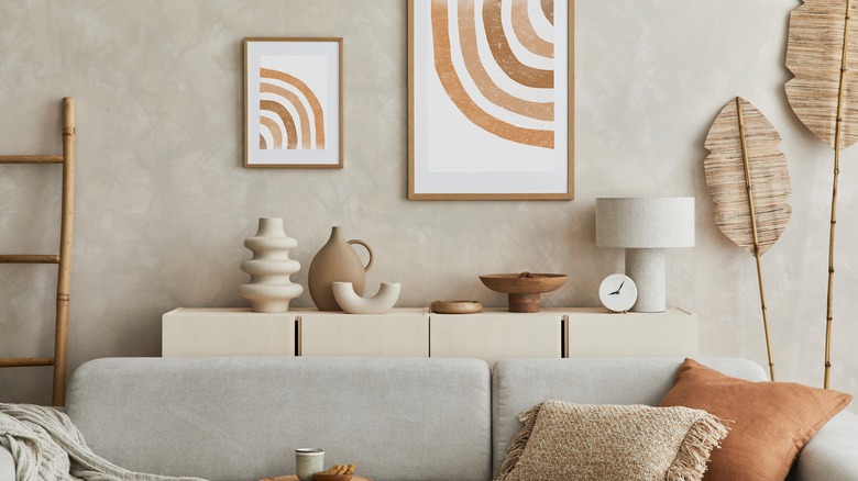
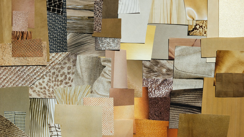
Before we get more in-depth about the paint colors that look different in a variety of rooms, there's one thing about colors you should be on top of, and that's the concept of warm and cool colors. Benjamin Moore has a great overview of this idea. The basics: red, orange, and yellow are warm colors, evoking energy and heat, while blue and green are cool colors that feel soothing and calming. It's easy enough until you start with a base color like gray, which can be a warm gray with yellow undertones or a cool gray with a lot of blue underneath. Just wait until we get into gray with brown, pink, or mint green in its DNA.
And that brings us to beige, which is right up there with other mysterious hues like ecru, verdigris, and puce (off-white, blue-green, and purple-brown). Beige is a blend of gray and brown, and the different appearances and depths that occur in the beige palette are surprising. Mod and Mood has an insightful way to determine which beige will look best inside your living space by determining if the color is in the warm or cool spectrum. In fact, all neutrals come in warm and cool shades, including black and white/off-white.
Blue/green/gray
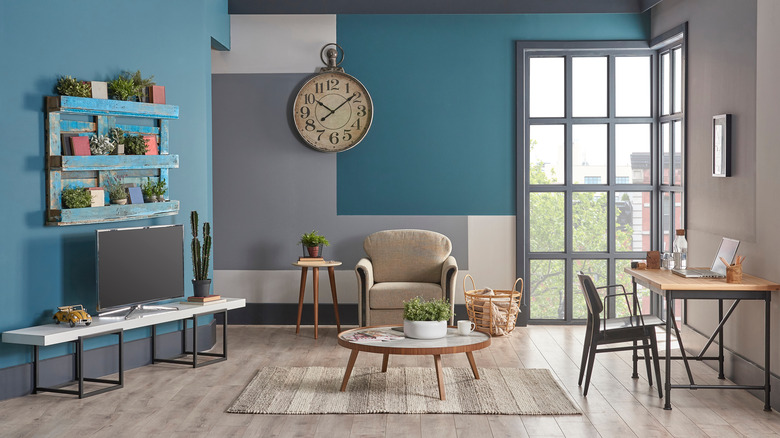
This combination has a lot of fashionable names and comes in lighter, pastel-like shades as well as hues that are several tones deeper. One of Sherwin Williams' popular blends is called Sea Salt (via The Turquoise Home), which is green mixed with blue and has gray undertones. Sea Salt contrasts wonderfully with white, off-white, and navy blue. The color will look different depending on the light coming in and what you pair with the color. Mixed with metal finishes, the gray will come out. With plants and foliage grouped in front of a Sea Salt colored wall, the green will stand out. The Turquoise Home shows how this is an ideal color for kitchens because of its versatility.
Behr refers to their blue/green/gray mix as Green Meets Blue, a lighter shade is called Nature's Reflection, and a darker shade is called Longmeadow. A rule of thumb with painting is that lighter shades make a room look bigger, while darker shades make the room more intimate. DIY sites and paint companies have lots of tips on applying paint. One of the most important is to get a sample of the color or a self-stick color patch for the walls. Apply the new color and watch to see how it looks in your interior over several days to be sure this is the color you want for the room or accent wall.
Mauve
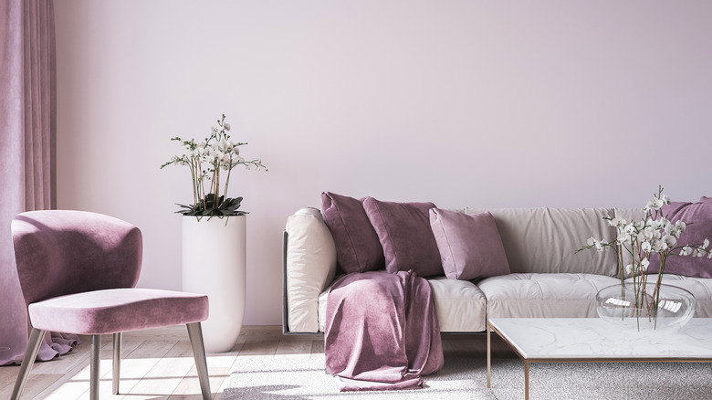
Nix Color Sensor offers a great description of a somewhat elusive color, mauve. Their website indicates the color is named after the mallow, a flower called mauve in French. The hue is between pale violet and pink with blue or a warm gray undertones. They note that a dye invented in the 19th century was wildly popular and used in women's clothing, furniture, and cosmetics for many years.
The color made a big comeback in the 1980s when entire rooms were painted in a pastel version of mauve, which worked as a sort of feminine neutral. Decorators and designers have rediscovered this remnant and are bringing mauve back into the mix, according to the Defender News Service. This time, however, this trendy color is more saturated, a little bolder than the light pink/purple of 30-plus years ago. They recommend using it in a smaller room, and if paint is too permanent for you, try using mauve as an accent color. With white or gold, the pink tones will come out. Paired with blue items, the purple side will become more apparent.
Sage green
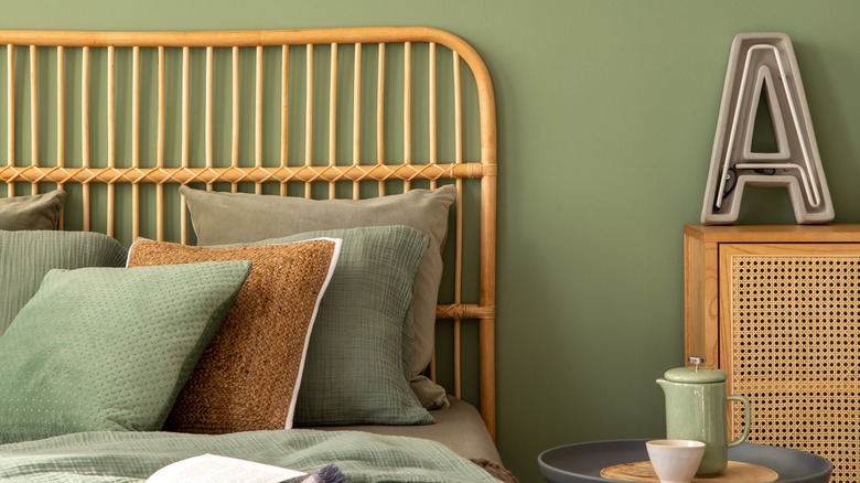
Sage green is named after the herb Salvia Officinalis, according to The Wisconsin Horticulture Division of Extension. The plant grows oval, textured leaves 3 to 5 inches long that are greenish gray on top but silvery gray on the underside. Variations of common sage have yellow-trimmed, even dusty-purple leaves, which wouldn't be bad contrasting colors to use in a room. Sage, often used as a neutral as it's not too different from gray, can make your home feel calm.
In interior design, sage tones can go from minty to nearly emerald; this variation is where we find such interest in the color. The Washingtonian reports that sage was named the trendiest color of 2022, partly due to actress Dakota Johnson's Architectural Digest video of her sage kitchen (via YouTube) but also because the pandemic increased our longing to connect with nature. They note that sage not only brings sophisticated gray undertones to a room but also pairs beautifully with brick finishes and white trim. Foter has an excellent list of other ways to pair sage to warm up or cool down a room, using colors from light pink to terra cotta to teal blue.
New hue: Terra Rosa
Every year in the last quarter, speculation begins regarding what shades will be named Color of the Year by various paint manufacturers. While the colors named usually vary, for 2023, there's a common denominator: several are leaning toward shades of red. These include eye-popping Raspberry Blush by Benjamin Moore and earthy Canyon Ridge by Better Homes & Gardens. But the shade that could be both the trickiest and most magnificent to use is Terra Rosa by Dunn Edwards Paint. This color is a sophisticated mix of dusty medium pink, terra cotta, and light tan, and sample photos show it used indoors and out.
Terra Rosa is both a neutral and a statement color that carries power and strength. Complimentary colors are darker reds like Merlot, while contrasting colors are sage and deeper greens, as well as light yellow or a warm white. Like all of the color ranges mentioned here, Terra Rosa is going to take on a different look when paired with older wood furniture versus a white or gray upholstered sofa or chairs, not to mention how different a room will look with an accent wall in this color, versus all four walls in this color. No matter which option you choose, be sure to add a contrasting color or a neutral gray, tan, or white somewhere in the room so your eye can rest.