This Color Combination Will Be A Huge 2023 Home Decor Trend
The beginning of the new year marks the season for resolutions and fresh starts. If the interior of your home is feeling dated, this is the best time to keep an eye on budding trends so you can get ready to introduce new colors into your design scheme. Right about now, paint companies like to reveal their choices for color of the year, and for 2023, there's no lack of inspiration in regard to using color creatively to liven up your home. And whether you like or loathe the hues promoted this year, one trend all experts agree on is that — regardless of your primary choice — rich, warm, earth-toned shades are the hottest trend for accompanying whatever palette you choose.
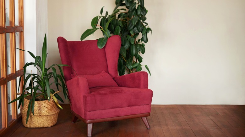
Pantone, a top color consulting company for fashion, beauty, and interior design has named their color of the year: Viva Magenta. This is a bold, bright red found in natural elements such as flowers, fish, and bird plumage from around the world. Pantone designers and decorators are pairing the deep hue with sage greens and yellow-brown ochre. They suggest painting walls and ceilings with Viva Magenta to highlight the burnished tones in wood trim and timbered ceilings, or adding the color via an accent rug to beautifully offset hardwood flooring.
More shades of red
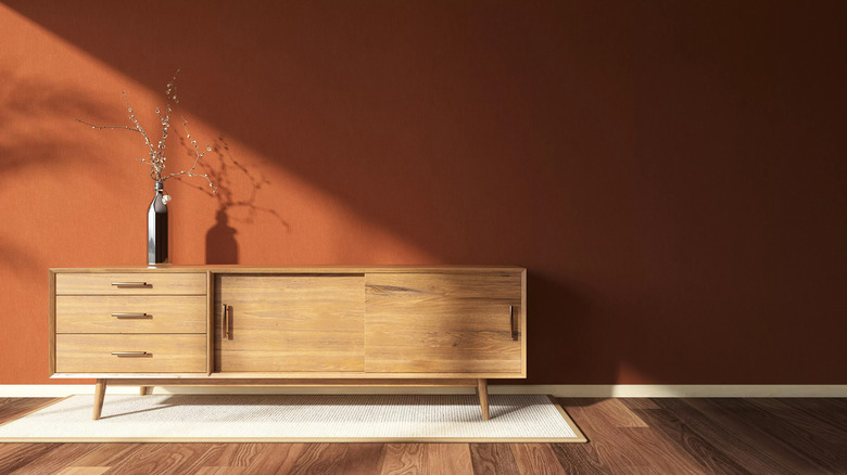
Similar to Pantone, paint company Benjamin Moore offers Raspberry Blush for 2023. This is a color similar to magenta, but slightly more subdued. To help you work with this color, Benjamin Moore also offers a Color Trends palette containing eight bold colors taken from natural settings that include a warm-tone brown called Cinnamon, and a deeper black-brown they call Wenge.
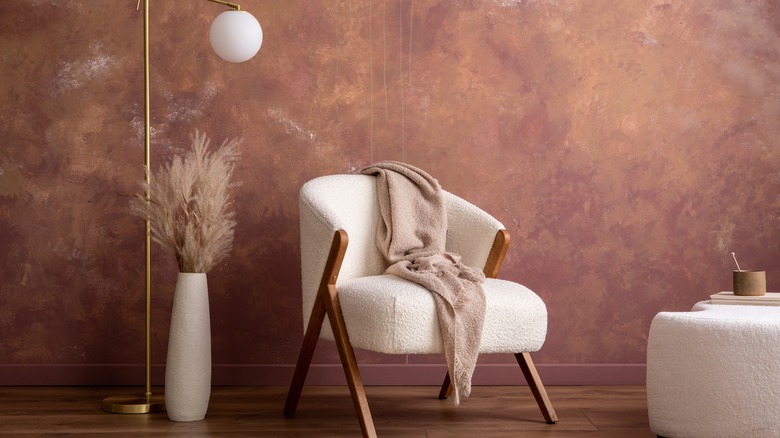
Sherwin-Williams decided on an unusual neutral called Redend Point, which is part blush and part beige. Neither too sweet nor sentimental like pink or lavender, Redend Point is slightly reminiscent of both, although the beige/clay tone it offers works as a calm mix of cool and warm. Sherwin-Williams also has an inspired collection of nature-based tones to work with, among them Evergreen Fog, a sage gray/green, Carnelian, a stone-like brown with red undertones, and Urbane Bronze, a smoky dark gray.
One thing to remember about mixing and matching tones in any particular room is that while your main color can certainly be used for the paint on your walls, ceiling, or floor, you can also bring these shades into your interior with fabrics, pillows, and artwork. Think of paint as your primary frame of reference, then work off that color by adding complimentary and contrasting colors and textures through your décor.
More inspiration from nature
Descriptions of additional colors of the year are readily available, but it's evident that while various companies push their favored tints and shades, the universal trend among paint companies and designers alike are the deep hues from nature such as browns and greens pulled from verdant forests, and warm yellows and honey beige tones taken from arid environments. As the popular design blog The Nordroom points out, using colors directly from nature forces us to leave the monochromatic gray-on-gray or white-on-white rooms behind. The agreed upon observation is that people are hungry for bolder colors and richer, more complex tones. The trend of bringing the outdoors right into the home speaks to a longing for balance and calm, uncluttered serene spaces, and an unforced luxuriousness in our private residences.
No matter where the paint company and its color experts are based (Norway's Jotun, England's Farrow & Ball, or the Dunn-Edwards/Nippon Paint Holdings based in Japan), the recommended earth-toned palettes are remarkably similar: down to earth, minimalistic yet versatile, and ready to fill your home with new color.