Valspar's 2023 Paint Colors Of The Year Are Perfect For A Gentle, Calming Home
Comfortable, joyous, and beautiful. These are the three words Valspar chose to describe their 2023 Colors of the Year. In a press release published back in August 2022, Valspar stated that their goal for 2023's collection focused on everyday emotions and facets of life, with joy, comfort, acceptance, and lasting change at the center of their vision (via PR Newswire). Any one of these shades is sure to bring beauty to the beholder. As Sue Kim, Valspar's Color Marketing Manager, stated in the press release, "Valspar's 2023 Colors of the Year are usable shades that encourage self-expression and anyone can envision in their space. With our 12 colors to choose from, you are guaranteed to find a color that is picture-perfect for you!"
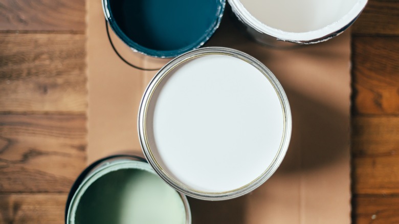
The colors featured in this collection include Ivory Brown, Cozy White, Villa Grey, Desert Carnation, Southern Road, Holmes Cream, Gentle Violet, Blue Arrow, Flora, Green Trellis, Rising Tide, and Everglade Deck. Each carefully chosen shade has a warm and cozy appeal, like wearing your favorite cotton T-shirt on a sunny spring day. Learn more about the soft, touchable, and adaptable colors in this collection and how we're envisioning them in our homes this year.
Creamy warm tones
Valspar perfectly toed the balance between cozy and energetic with their warm tones for this year, including Southern Road, Desert Carnation, and Holmes Cream. Out of all the colors in this collection, Desert Carnation is certainly one of the bolder choices. The orange shade is intended to inspire with its soft yet vibrant terra cotta hue. A warm, playful shade that leans toward peach, Desert Carnation is perfect for brightening up small nooks and adding a touch of energy to playrooms, crafting rooms, or office spaces. Southern Road, on the other hand, is a faded clay shade with touches of raspberry that works beautifully for cabinets, furniture, and accent walls. According to Valspar, this color is meant to evoke feelings of contentment (via PR Newswire).
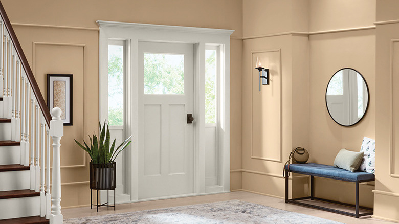
Finally, Holmes Cream (pictured above) is a neutral that leans proudly into the warm tone category, designed to represent feelings of joy. Like a soft orange blossom in sunlight, this beige tone practically glows around windows and entryways. Out of all of Valspar's warm tones for 2023, Holmes Cream is the best suited for expansive walls and rooms, but it can easily adapt to warm up small spaces too.
Soothing cool tones
Gentle Violet, Blue Arrow, Flora, Green Trellis, Rising Tide, and Everglade Deck give plenty of range in the cool tone category. Beginning with the blues, Rising Tide is a light, healthy blue that brings a fresh take to reliable pastel wall colors and works beautifully as a backdrop for any room. Blue Arrow takes a slightly deeper approach with warm undertones that evoke natural balance and softness. While most of the colors chosen by Valspar for 2023 are relatively unsaturated, Everglade Deck stands out as a bold and moody statement. This deep midnight teal was chosen to bring a restorative and calming vibe to any space it's used in.
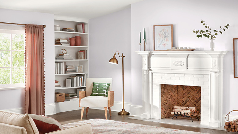
For a trendy touch of verdancy, Valspar offers Green Trellis and Flora, two surprisingly adaptable shades of green that represent calmness and thoughtfulness, respectively. Green Trellis is a faded minty sage, perfect for a pop of color on wood furniture or splashed on a wall for a unique statement. Flora, on the other hand, is a deep olive with hazy overtones that give it the flexibility to be used as a neutral anywhere in the home. Lastly, Gentle Violet (pictured above) is a cheery, barely-there shade of soft lilac white. Like Rising Tide, Gentle Violet is a playful yet subtle pastel that's ideal for large walls and entire rooms. This color was chosen to represent human connection, flowing effortlessly from room to room.
New takes on neutrals
Valspar's 2023 collection wouldn't be complete without a few stunning and reliable neutrals, and their takes on the theme are anything but boring. Ivory Brown, Cozy White, and Villa Grey will translate well into any room in your home, keeping with Valspar's theme of comfortable and self-expressive shades. Ivory Brown is a washed brown tone that symbolizes a hopeful return to nature and appreciation for natural abundance. The warm-toned light brown is flexible for indoor and outdoor spaces, furniture, or cabinets, and it's the ideal warm neutral to make large rooms feel more grounded.
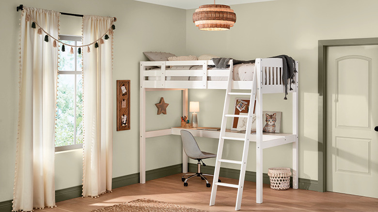
Cozy White wraps the whole space in soft light; think creamy vanilla meets fresh linen. Inspired by the feeling of comfort, this muted, yellow-toned white is the ideal backdrop for living rooms, bedrooms, and anywhere else you want to feel welcoming and wholesome. Grey has been one of the most popular neutrals of the last decade, but Villa Grey (pictured above) offers a gentler take on the cold and stale grays of the past. Villa Grey has undertones of yellow, bringing it into the warm and relatable side of the spectrum and helping it complement natural wood tones. Villa Grey pairs well with home offices, bedrooms, and any other spaces where mindfulness is encouraged.