Here's Why You Should Consider Using The Two Least Popular Paint Colors
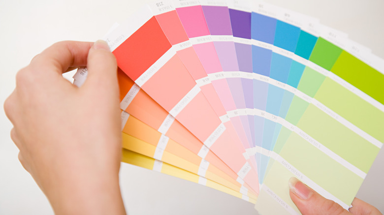
Greens, whites, and blues rest at the top of the paint charts, infusing rooms with feelings of mother earth, coastal elegance, and bohemian themes. But the truth of the matter is each color has its place in every aesthetic if the perfect shade is chosen and executed, even the least popular paint colors. In a survey conducted by interior design service Modsy, purple and yellow were ranked as two of the least favorite paint colors (via the National Association of Realtors). However, respondents that used these colors found that they were at the top of their list for creating positive spaces, as opposed to reds and browns, which were noted as the least positive.
It is easy to perceive purple and yellow as gaudy colors, and many people discount these shades because they have no idea how to integrate them into a space. As you scour paint wheels for colors to liven up your home, here is why you should reconsider using these least favorites.
Positively purple
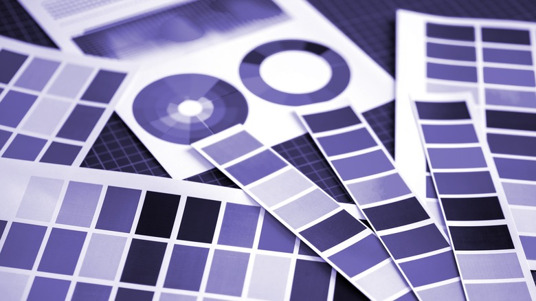
Purple has been an archetypal color used by musicians and fashion icons for decades. It is a color of many lives, taking on whimsical, sophisticated, glamorous, and peaceful forms. It is also a bold choice that does not always pair well with one's décor or other palettes in the home. Famous designers like Alexa Hampton and Jonathan Adler have been prominent advocates for the violet chromatic scale, finding numerous ways to use deep raspberries, cool magentas, and muted lavenders.
Benjamin Moore's purple family boasts hues for every occasion, including a true purple entitled Mystical Grape, a timid shade Touch of Gray, and a dusty tone of Lily Lavender. It pairs exceptionally well with off-whites and grays for a subtle look, golds and silvers for a feeling of fortune and royalty, and baby pinks and greens for a playful and youthful appeal. If you love purple, but a fully-painted room is too much for your taste, wall trimmings and window panes can be painted to add perfect amounts of color to a room. You can go even smaller by painting drawer knobs, accents on doors and doorways, or a side table. Lampshades, velvet accent chairs, and throw pillows are another easy way to incorporate a purple palette if painting isn't up your alley.
Youthful yellows
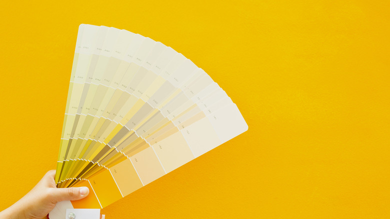
The color yellow is attractive in how it embodies three seasons: Spring, summer, and fall — springtime sunshine and honeybees, summer dandelions and daffodils, and autumn leaves and sunsets. While it is a shade that connects us deeply to nature, it also offers us vintage charm and sophistication in saturated and gold hues. "Yellow is a tricky color. It's an uplifting color, but you really have to pick the right shade," said interior designer of Agus Interiors, Jennifer Agus (per HGTV). "You want to make sure it's not too bright or too muted, so use those test cans of paint and look at the yellow on your walls in the different lights of the day."
Benjamin Moore's yellow palette offers us a variety of yellows to consider including a subtle shade of Mannequin Cream, an authentic Hawthorne Yellow, and a gold/brassy option of York Harbor Yellow. Pair this buttery color with creams, greens, and natural woods. Paint your kitchen cabinets, planters, and floating shelves in shades of lemon, marigold, and sand. Go bold and combine with navy blue and black for an art deco experience. Whether you want a cool and calm aesthetic or jewel tones and moody vibes, yellow has a place to flourish.