Here's Why HGTV's Christina Anstead Swatches Paint Colors On Poster Board

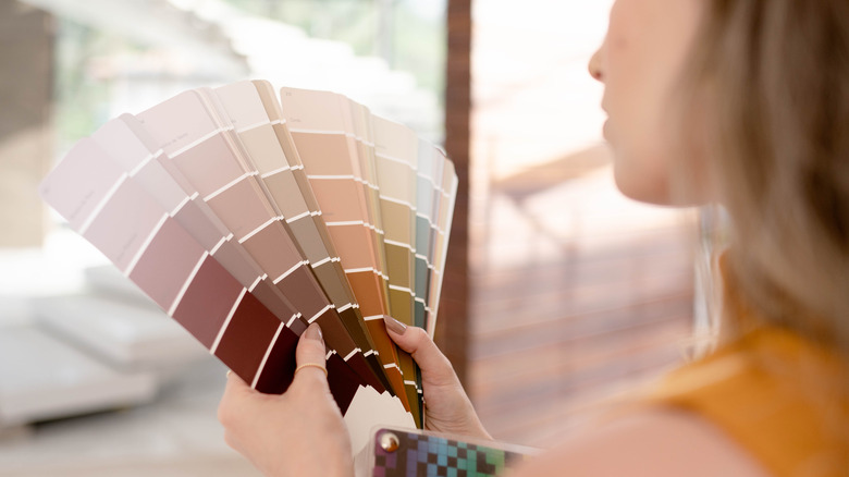
Have you ever been deceived by a paint color? You know, the one that looked so lovely in your sister's powder room but the result after laboriously applying the same exact color to your own bathroom wall is a sad mistake. It's even worse when you pay a pro to paint based on a swatch you absolutely adored in the store only to find you made a poor choice. Fortunately, HGTV's Christina Hall has a solution to that problem so you won't have to do it all over again. In an article that originally appeared in HGTV Magazine, Hall suggests swatching paint colors on a poster board so it can be easily moved around a room to see what the paint will look like in various locations and light.
Hall admits that even though she has personally selected countless paint colors through her work, the process can be difficult. Her swatching technique makes selecting a color less of an ordeal and helps to eliminate color mistakes. According to Hall, "Paint a few coats of different shades on poster board and move the board around the room at different times of day and at night to see how they look in different light. Then go for it!" Hall's suggestion works if you're using the same paint color in more than one area, too. Having a portable swatch board to move from room to room will assure the look you're going for in each space.
Other tips for proficiently picking paint colors
Another HGTV tip to keep in mind concerns paint finishes, specifically that glossier finishers tend to look darker than their corresponding paint chip. For this reason, it's always a good idea to take a paint chip over by a window, or even outdoors, while shopping to view it in natural light. If you still like it, take it home to see how it looks there. You can place chips on the wall butted against the trim and check them several times a day to see how they look as the light in the room changes over the course of the day. You can then move on to painting your poster board like Christina Hall for even more accuracy.
As an alternative to paint chips, many major paint brands now offer convenient peel-and-stick squares in their most popular colors. You can move these around from room to room, if needed, using the same process of elimination as paint chips. The caveat is that stick-ons usually have a small cost associated with them whereas larger paint chips are often free.
All the well-known paint brands also offer online tools that can help you get a feel for what different colors might look like on your walls. All you do is upload a photo of your space and then you can try several different colors to see what they might look like in your home before you even visit the paint store.
Other considerations when choosing paint colors
There's nothing wrong with selecting a bright, bold, or moody paint color for your walls. Before choosing a dark paint hue for a big room, though, keep in mind that color can become exaggerated in larger spaces. If you still like the idea of a dark shade of paint to add a touch of drama or highlight specific artwork, though, maybe consider it for an accent wall rather than an entire room. Going lighter in the same color family can be a way to get the same basic hue without overdoing it. Even with lighter paint colors, however, you should still consider several different similar shades. They may look the same on the chips, but undertones can make a huge impact on how bright they'll look on your particular wall.
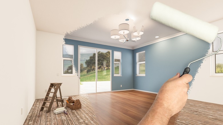
While you can get a good idea about what a paint color will look like with chips, poster board swatches, and apps, you're still going to want to paint samples on your wall as a final test. Be sure they're thoroughly dry, however, before making a color decision. The colors may look more alike when wet than when they've completely dried. With this said, with a little effort, you can select paint like an interior design pro like Christine Hall and avoid making color mistakes.