The Paint Color That's Most Likely To Make You Tired
There are a lot of resources when it comes to deciding the colors to use inside our homes. Whether you embrace trends or not, color is a personal decision, and no matter your preference, your home must work for you. But we admit we were surprised when we explored this question and found that bright yellow is the most tiring paint color. Yes, the color of daffodils, lemons, and bananas can make us feel a little less happy when it comes to interior design.
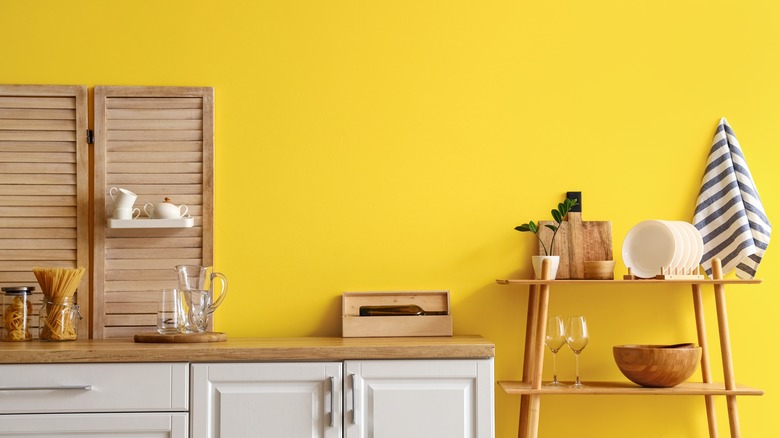
We've discussed how cheery the tone can be and how it can brighten a home. However, an entire room of bright yellow walls can be overwhelming. Maybe it's the unrelenting cheeriness that makes us feel anxious or hyper. Yellow is the most visible color to the human eye, so painting a big wall with the bold, bright shade is actually an eye irritant. But don't give up on yellow altogether. Sprightly accents throughout a room delight the eye, especially if the color is paired with contrasting shades. Blending yellow tones with a more sedate palette is also a great choice.
Shade and tone
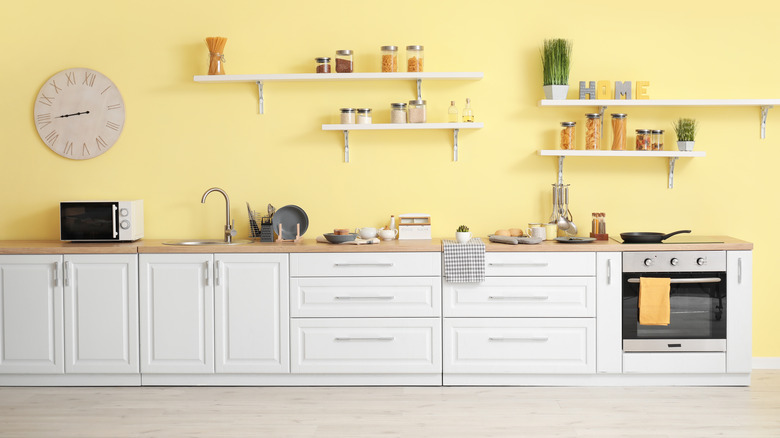
In small doses, yellow makes us feel energized and happy. You can easily exchange a bold, in-your-face yellow for something more soothing and welcoming. Leverage the warm glow yellow emits by blending it with white, off-white, tan, or beige. Sherwin-Williams just named White Raisin as its color of the month. This inviting neutral, appealing blend of butter and vanilla is an excellent example of softening the bright tone. White Raisin leans towards a calming yellow hue which works perfectly with steely grays and blues, clear whites, and shades of dark brown.
Colors like this indicate how intensity and shade matter. Pale colors warm up a space, while deep or earthy tones are more pronounced and visually work their way into a room. This is why a soft, nearly pastel yellow is easy on the eyes, even on every wall in a room. While more intense shades of yellow, like mustard and ochre, work best on one wall of four or as an accent color. Bringing yellow into a room may start with paint or wallpaper, but there are plenty of options for color by working with upholstery fabric, carpeting, and accents from pillows to flowers.
Complementary colors
One of 2023's paint colors of the year is a deep shade of yellow because it's so striking and appealing. The trick to applying any color is using the correct shade in the right room.
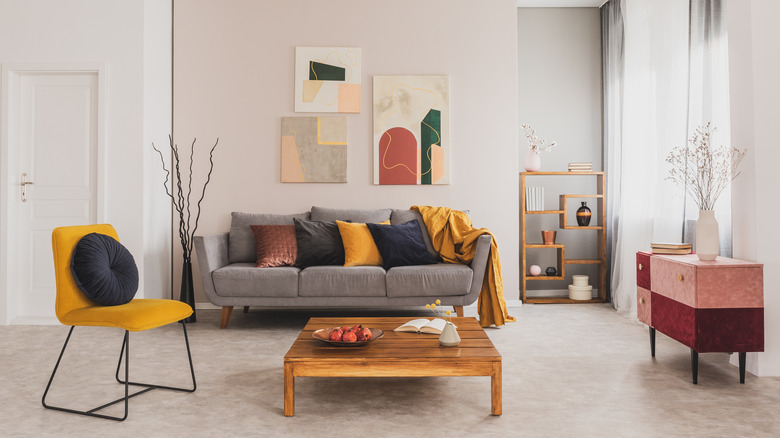
A bright, primary yellow might work best in small doses throughout the house, such as accents in a kid's bedroom, shelves in a pantry, or trim in a backdoor entry. Another great use of pure yellow is in a room facing north and needing warmth since it likely gets just a little bit of natural light.
Remember, too, that yellow pairs well with darks, greens and blues. More importantly, it's complemented by gray tones from a soft pebble to a harder slate color. Placing gray and yellow together creates an elegant, layered, sophisticated look. Be thoughtful using yellow in rooms like kitchens or bedrooms. The first thought may be to bring in a touch of cheer, but the intensity can become overwhelming. Consider using yellow in your interiors by balancing warm and cool tones.