18 Colors To Accent Your Pink Room With For A Fresh Aesthetic
When you picture a pink-painted room, you probably imagine a child's bedroom or a colorful play area. However, this paint color doesn't have to be reserved for just childlike spaces. Instead, it can be used throughout the home and even look sophisticated and chic. One of the best ways to do this is by pairing your pink walls with another accent color, which could either look similar to or completely opposite your pink shade.
While basically any color could be paired with pink (in theory), some will provide a more unexpected appearance over others for a fresh aesthetic. It's also important to choose your shades wisely, as certain undertones will look better with specific colors. To do this, instead of honing in too much on the actual colors, consider the overall feeling or atmosphere the pairing creates in the space. Below, you'll find 18 accent colors you could use in a pink room to make it look modern, as well as what vibe the combination will create.
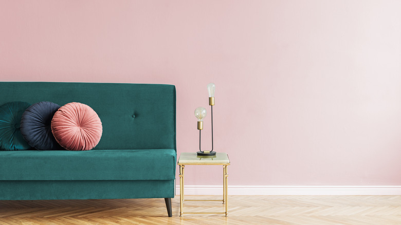
1. Teal
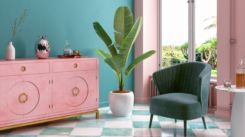
Teal and bubblegum pink make a great pair because they're both bright and fun. At the same time, they also create contrast with their undertones, since teal is cool while pink is warm. This is great for coastal or beachy homes as it produces a tropical feel. If your room is painted with both these colors, make them mesh together by placing pink furniture along the teal wall and vice versa.
2. Light tan
Light tan looks beautiful when coupled with a deep pink, as these colors are contrasting. If the pink was a lighter shade, the tan would get washed out, but because they each have different levels of richness, they look beautiful together. This mixture is ideal for a bohemian or desert vibe and looks very natural and autumnal. To include the light tan shade in your space, you could use wicker or rattan pieces of furniture.
3. Light blue
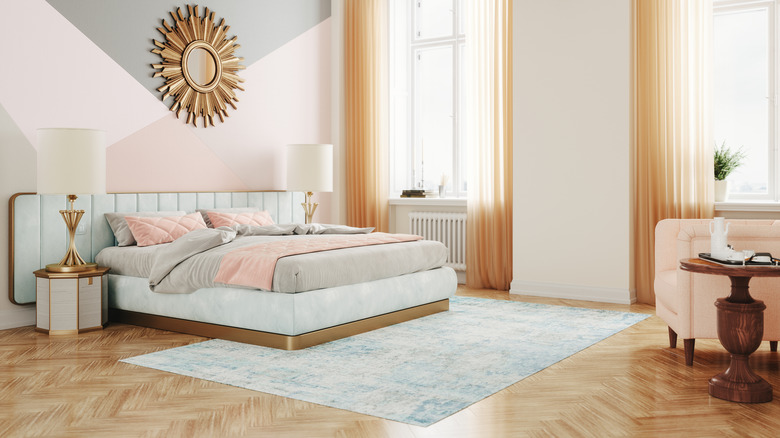
Pairing light blue with light pink is a no-brainer since they're both pastels and give off a gentle, delicate feeling. However, while pastels are often seen as childlike, that doesn't have to be the case. To make these tones appear more sophisticated, add elements of gold, gray, and dark wood. Also choose large statement pieces of furniture, like the blue and gold bed frame, as this will make more of an impact than smaller items.
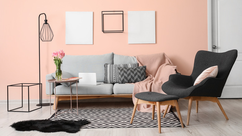
4. Black
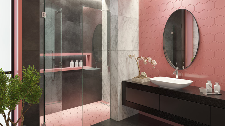
Pink tiles in the bathroom are often seen as old-school, so many try to paint over them or replace them altogether. However, instead of doing that, you could embrace the tiles and emphasize them with another color: black. This will remove their traditional connotations and give them a modern, edgy, and fresh appearance. The contrast between delicate pink and deep black draws the eye in and makes both colors really stand out.
5. Gold
Wherever gold is used, it adds elegance, glam, and an expensive appearance. If you're mixing gold with pink in the kitchen or the bathroom, simply add this metal to your handles and knobs or your lighting. In other areas of the home, you could include gold through furniture or small decorative elements. Gold can be used with any shade of pink and look beautiful, but mixing it with blush or dusty shades may be the most sophisticated.
6. Sage green
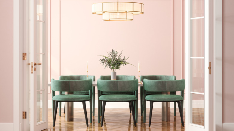
While blush pink may feel like a statement, it often reads as more of a warm neutral, especially when paired with a bolder color like sage green. These tones beautifully complement each other, as the green works to tone down the pink but still allows it to bring a delicate and refined feel to the space. This room feels very modern and bright but without having that childish feel that most want to avoid.
7. Taupe
When you paint a room a bright color like pink, the light bounces off the surface and bathes all the furniture and other elements in that shade. This is especially true if you use taupe items in a pink room, as the warmth of the walls will translate onto your cool taupe items. A mixture of brown and gray, taupe is a great neutral option for a pink room that is less expected and provides more character than stark white.
8. Light gray
Gray is often called a sophisticated color, but it can also read as too cool-toned or boring. To add more interest and warmth, you could mix light gray with a light shade of pink, which will create balance in your space. This color combination is ideal for glamorous, luxurious, and modern spaces, especially when also mixed with black items or metals.
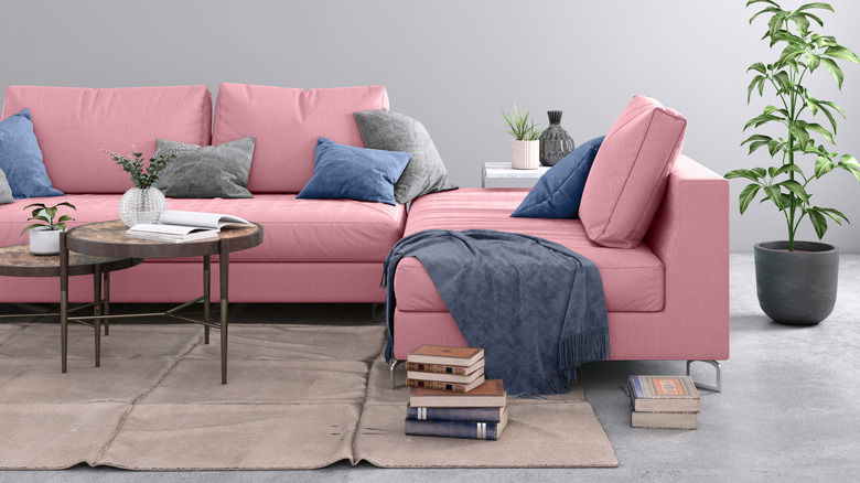
9. Medium gray
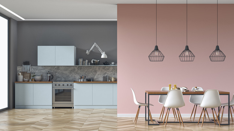
Using a slightly darker gray with a light pink will create more contrast, and the different levels of pigmentation will make each shade stand out more. As demonstrated in the above kitchen design, you could also mix in another cool-toned color like light blue, which will perfectly marry all the shades together. Adding the gray and tan/pink marble backsplash was also an excellent idea, as it works to make the whole space feel cohesive.
10. Burnt orange
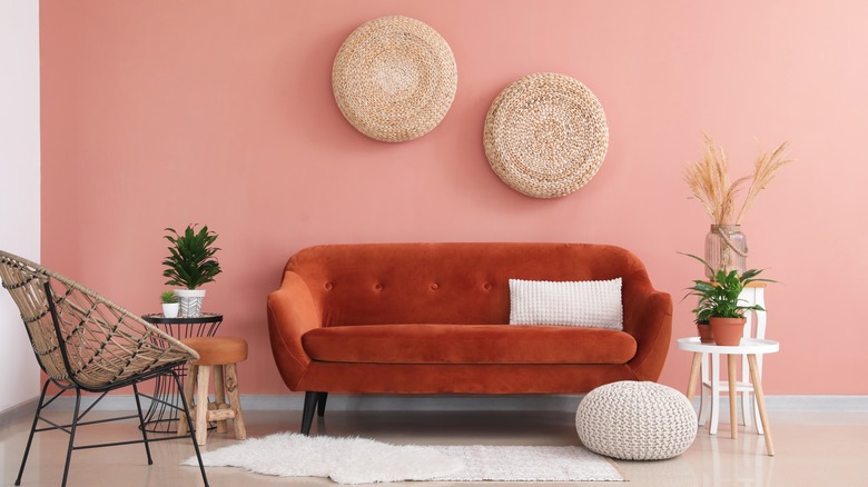
While both burnt orange and bright pink are warm-toned colors, they have different vibes. This is because deep orange feels more autumnal, while pink is more floral and spring-like. When these two colors are combined in a room, they create a bohemian feel, especially when paired with wicker and other light tan materials. However, this space also has a dash of glam, as shown through the bright wall color and the velvet material on the sofa.
11. Lavender
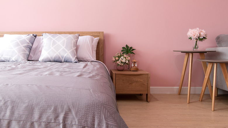
Lavender and light pink is a classic pairing, especially in young children's rooms, as both colors are pastels. However, when done right, this pairing can also look chic. To make these colors work well together, try choosing light or muted tones for at least one or both of the colors. For instance, the medium pink tone on the wall in the above room works well with the lavender because it's light and has slight gray undertones. Using other materials like wood will also add an extra layer of interest to your space.
12. Yellow
Bold, sunshine yellow is a great accent color for many different shades of pink, including highlighter tones and deep magentas. Because both pink and yellow are warm and bright, this combination makes sense. If you want to give your space a fresh look, try combining one dark and one light shade, like pastel yellow with dark pink or baby pink with deep yellow.
13. Peach
While peach shades are similar to pink, they also have clear orange undertones. However, since peach can sometimes be mistaken for light pink, it's typically best to pair this color with a darker pink, as this will help differentiate between the colors. Another option is to mix peach with many different shades of pink, as this will create a monochromatic, modern feel and will add dimension to the room's design.
14. Emerald green
Pale pink with dark emerald green is an elegant color combination that emphasizes the contrast between light and dark colors. When married, these tones draw out the deep, cool nature of emerald green and the delicate, light beauty of blush pink. Emerald green also looks amazing when paired with dark magenta, as both these shades are jewel tones. You could also accent with midnight blue and gold to give your space an extra regal aesthetic.
15. Brown
Brown and pink are often seen coupled together, as the brown shade tones down the pink and gives the space a more natural appearance. To lean into the natural look even more, you can include other earthy elements like wooden pieces of furniture. Further, you can either make the brown and pink shades appear perfectly cohesive with a warm-toned brown hue, or you can create contrast with a cool-toned brown.
16. Purple
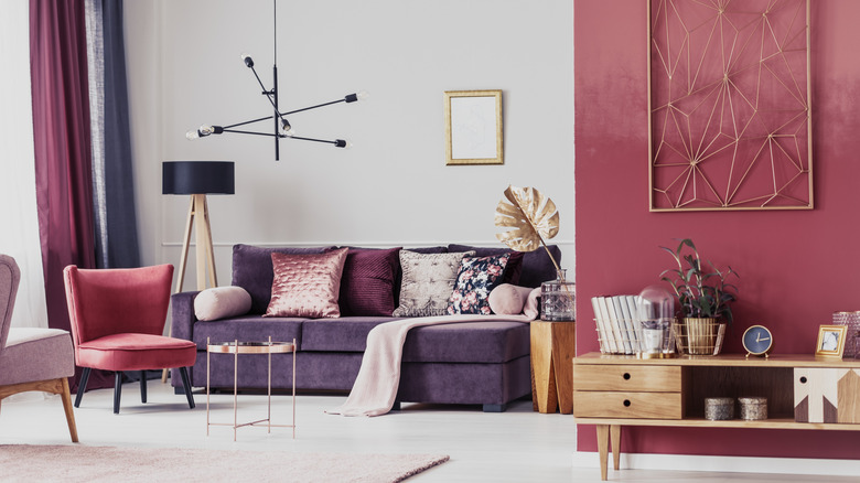
Because both dark purple and deep pink are jewel tones, they are an obvious choice for a couple. To add variety, you could also introduce a pale pink shade, which could even act as a neutral tone in the space. Black, gold, and light wood accents will add more dimension to the design. Typically, these spaces have an elegant and glamorous look that's emphasized by the richness of the shades.
17. Dusty blue
A great accent color for bubblegum pink is dusty blue, as this will mix cool and warm shades. While these are playful colors on their own, partnering them together is unexpected and instantly makes your space look more chic but still comfortable and colorful. To add another punch of coolness that's similar to the blue shade, include light gray in the mix, which could also make the design appear more sophisticated.
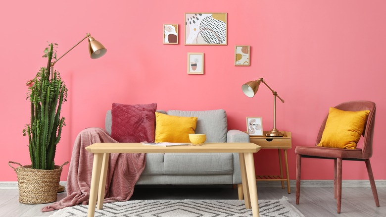
18. Red
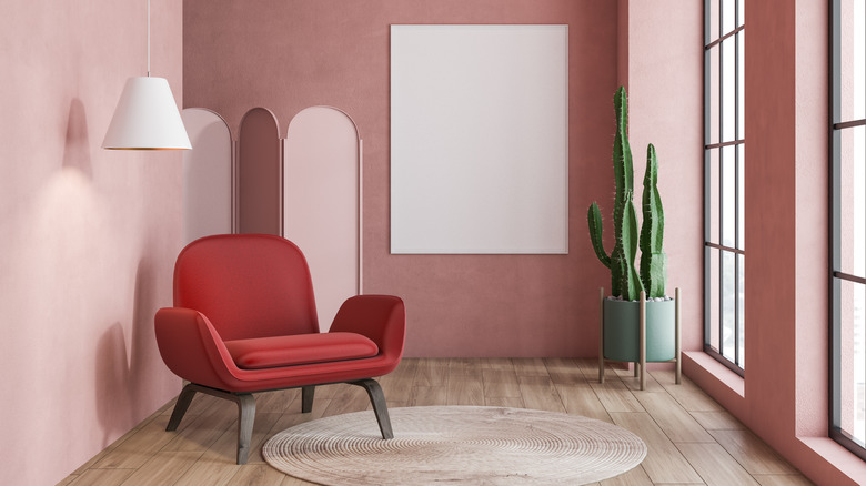
While pink is a loud color, red makes even more of a statement. Because of this, most avoid painting their walls red, since it could create an overwhelming feeling. Pink is typically a better choice as it can feel relaxing, but that doesn't mean you can't use red at all. Instead, introduce it into your design through the decorations or furniture pieces. While both red and pink are warm tones, this is still quite an unexpected coupling, as both of them can look loud.