12 Color Rules Joanna Gaines Swears By

We would all love to live in a home designed by Joanna Gaines. Yet unless you live in the Waco, Texas, area, it's probably not likely. But there is still the next best thing: knowing her ride-or-die color rules when decorating our own homes. In the world of interior design, few names shine as brightly as Gaines'. The beloved designer has become a household name with her keen eye for aesthetics and innate ability to create captivating spaces. But beyond her effortless style and charming personality, a secret ingredient has contributed to Joanna's remarkable success: her understanding and mastery of color.
She recently revealed that "deep rich greens" are her favorite color — always have been, always will be. But what about when she is pulling color samples for clients' homes? We did a deep dive into Joanna Gaines' world to round up her color rules. She uses these principles to design homes that are not just visually stunning, but also brimming with warmth and personality. Whether you are prepping for a redecorating project or are just filling up your Pinterest board for your "one-day" dream house, it's always best to listen to Joanna Gaines. Here are her best color rules.
1. You can never go too dark
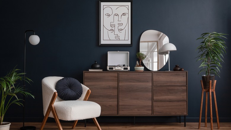
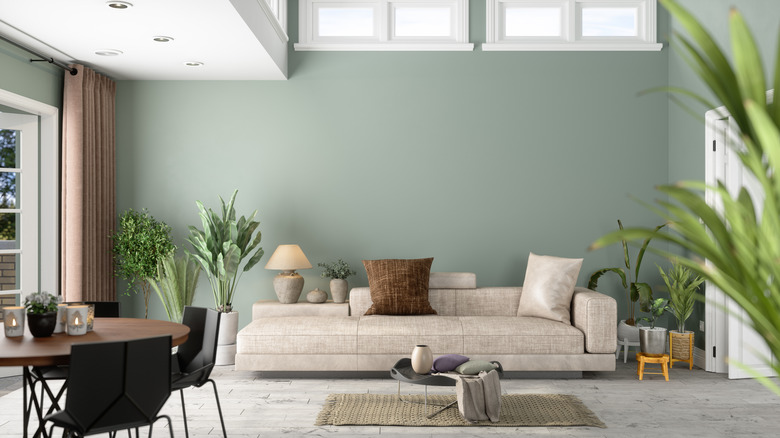
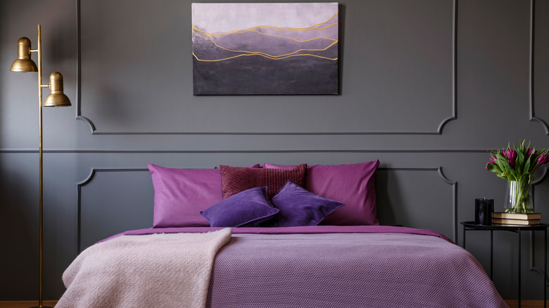
We've all heard the saying that dark paint colors make rooms seem drab and cramped. Even Joanna Gaines has second-guessed her own color choices when reaching for darker paints. "A lot of the time, I'm like, 'Did I go too dark?'" she revealed to Better Homes & Gardens. "But I just feel like I'm at a stage in life where I'm willing to take these risks, and it's more fun that way." We mainly see her take these risks on her show "Fixer Upper: The Castle" on the Magnolia Network. The dramatic heritage building is moody, but in an elegant, regal way conducive to darker shades. Your home design might warrant the same approach.
"You'll see that even beyond the Castle, in some of the spaces that we're designing just on the side," she continued. "I am going darker and moodier because I just feel like those more storied and saturated colors — that's just what's speaking to me right now. I'm having fun with it." If you want to add a dramatic flair to your home, take the same attitude. Have fun with these moodier shades and see what you can create.
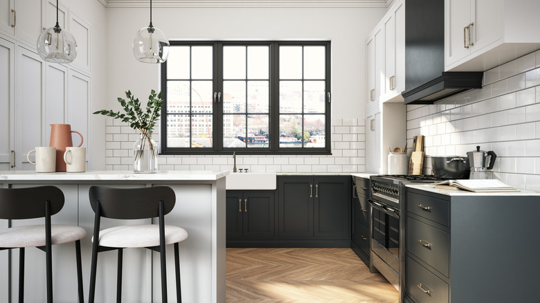
2. You can interchange gray and white
As the senior designer at Magnolia, Kristen Bufton works directly with Joanna Gaines. She helps the HGTV star implement her decorative ideas and communicate them to the public. Bufton shared that one of Gaines' favorite tips is playing with gray and white as easily-swappable neutrals. "You can interchange these colors easily since they are both neutrals, although I would recommend avoiding a monochromatic scheme of all gray," she told House Beautiful. "I encourage you to play with fun hardware, lighting, and rugs to add pops of color and texture throughout the space."
The colors are also very flexible, so no matter the overall theme of your space, they still work well. This means you can fashionably combine gray and white to decorate a modern loft or a classic farmhouse and pull it off effortlessly. This also means that if you want to redesign your space in the future, it will be a snap because you don't have to repaint it. Instead, you can swap out a few painting and furniture pieces and have a new vibe in just a few hours.
3. Keep high-traffic rooms neutral, but go bolder in smaller spaces
Gaines has the perfect tip for anyone trying to decide between neutrals or bold colors: You can do both, but just in different rooms. "Right now, I'm seeing a lot of creamy whites and grays, darker shades of green, and calming blues," she told Real Simple, listing the year's top paint colors. "In general, I think neutrals can help keep a look consistent throughout the primary living areas of a house, but it's always fun to go a bit bolder in more specific rooms like the dining room, the study, or the mudroom."
So your entryway and living room can be a subtle, neutral shade, but if you have your eye on something funky, you can include it elsewhere in the house. "In spaces like these, I gravitate toward more unique shades and even wallpaper patterns that add interest," Gaines continued. She also notes that she lets her clients' tastes influence her design choices for them, so let your personal preferences run wild. Your powder room is the perfect place for one of the eccentric or bold wallpapers from Magnolia Market, or even the brightest shade of your favorite color. The sky is the limit in smaller spaces, according to Gaines.
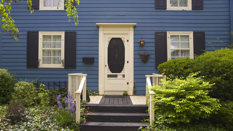
4. Use red for curb appeal
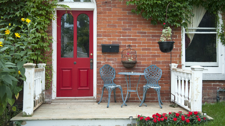
Red can be a controversial color for home interiors. Some might love it because it's bold and invigorating, while others would encourage you to stay well away from the hue, especially in the bedroom. Some research even suggests that a red wall in a relaxation space might increase your anxiety and blood pressure, causing discomfort and restlessness. However, as per usual, Joanna has found the perfect solution for those who love red and want to incorporate it into our homes the right way. "I do think the right shade of red can add character to a front door and is great for curb appeal," she told Real Simple.
Curb appeal is your home's one chance at a great first impression. It's especially important when you are trying to sell. A bright, friendly red door will stand out perfectly against a healthy green lawn, making it the perfect choice. It's also great feng shui, for those keeping track. A red door is considered to be lucky, safe, and full of hospitality. So if your front door looks a little drab, or if you want to score a quick facelift for your house's front facade, reach for red.
5. Use green where you need a touch of nature
If you have a green thumb and love incorporating your love of plants into other home decor elements, Gaines has the perfect color for your collection. "At the moment, I'm really drawn to fresh botanical shades, like 'Magnolia Green,'" she told Country Living. "I've always been drawn to nature in my design work and really love bringing a touch of it inside. I think it would be a fun choice for kitchen cabinets, or anywhere that needs a touch of nature."
The color is a rich, earthy shade modeled after the green of the Magnolia leaf, so it's a color close to Gaines' heart. If you have a houseplant collection that needs a great backdrop, or just want your home to feel more nature-inspired, green is a great bet. Fans of the shade also note that since it's trending, it's a great way to update outdated pieces in your home. "I used this in my 1940s kitchen on the lower cabinets, and they look incredible," a reviewer wrote. "It's bright enough that it can pair nicely with vintage interiors without looking neon or sagey!"
6. Use trim work to create color contrast
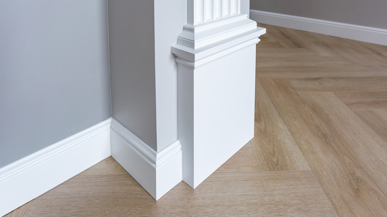
A fun way to incorporate more color into a space is through trim work. This can be the crown moldings that run along the tops of your walls, the baseboards along the floor, or even the wainscotting that comes halfway up. For Joanna Gaines, all these are fair game for a perfect pop of color. "One thing I feel like I've loved doing this past year that I can't wait to incorporate more of in more unique ways is trim work," she told Country Living. "Even though it's a muted color, it can be a bold accent."
That doesn't mean you don't have to paint your trim work bright red for it to stand out against cream walls. What Gaines means here is that even the slightest contrast in color creates a bit of visual interest. A white baseboard adds a touch of personality against a gray wall, as would a soft gray picture railing against an eggshell background. If you prefer colored walls, the trim can be white and stand out perfectly, although the inverse can look just as fabulous.
7. Use darker colors for more historic elements
Gaines thinks that older homes tend to look great in darker colors. There is something impressive and regal about a heritage house perfectly restored in rich, deep shades. On "Fixer Upper: The Castle," Gaines got to flex her restoration muscles when taking care of a literal castle in Waco. "In some rooms where I really wanted to play up that story and that history and that richness and that intention, I went darker, and I didn't look back," she told Better Homes & Gardens. If you have an older home, like a Victorian, a Colonial, or even an Art Deco creation, consider using darker colors to enhance its innate character.
However, you don't have to use uniform moody colors throughout the house. Instead, try leaning into the feel and history of each room by enhancing its natural elements. "For me right now, what I'm loving ... is letting each room tell its own unique story," she told the outlet. "When you do that, and you do it with that intention, somehow it still ties in." So if you have an old-fashioned bathroom with a 1920s exposed sink, feel free to paint the walls a dark forest green to complement its time period. But that doesn't mean you must paint the powder room the same color for continuity. Instead, follow the needs of the house.
8. Use one hit of color to make a statement
Before "The Castle," Gaines was famous for using one pop of color to make a statement. Those who recognize her iconic, all-white farmhouse interiors will know that she preferred a neutral design, but used an accent color to liven the aesthetic. Even in "The Castle," while Gaines' color selections have gotten darker, she still limits one statement hue per room. And that's because that's her mantra. "Just a hit of color can make a big statement in a space," she told HelloGiggles. That's all you need to keep your room visually interesting.
But are you unsure of how to select that statement color? Gaines is a firm believer in following your gut. She told Domino that each person has a section of the color wheel that they naturally gravitate towards and should listen to that instinct. If a color sample immediately caught your eye, it was probably for a reason. Don't overthink it, and try adding that hue to the room. You can also take inspiration from your closet. If you have a neutral wardrobe but seem to gravitate towards a pop of emerald green, implement that into your home design as well.
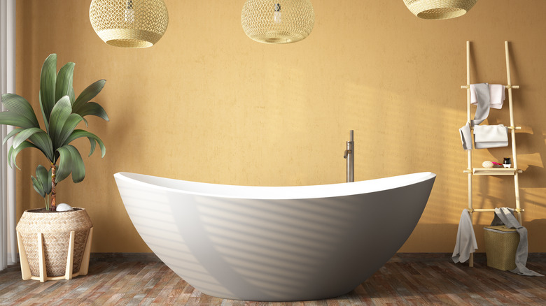
9. Use gray in bathrooms to create a relaxing atmosphere
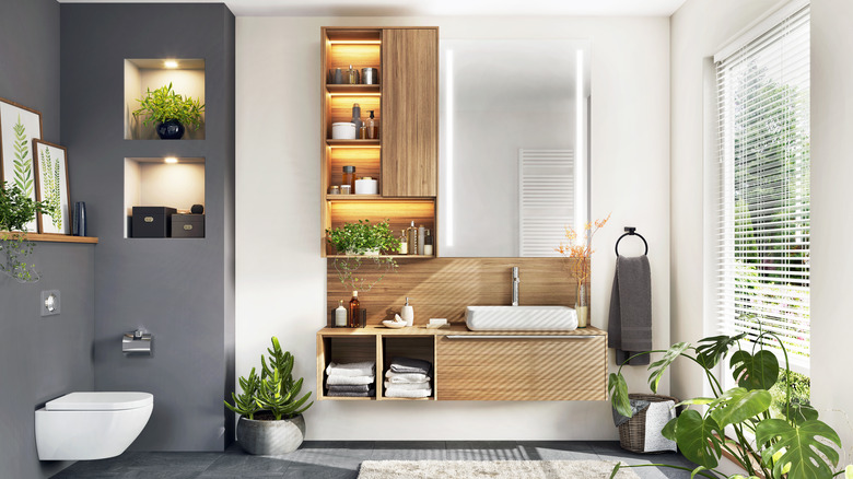
The right color can make our bathrooms seem like luxurious day spas. For Gaines, that color is gray. "In a bathroom, I like the idea of using something fresh and clean, like one of my favorite grays, Wedding Band," she told Country Living. Those who took the leap and used the color in their own homes echo these sentiments. "[I] was a little nervous with how dark it was going on, but that's to be expected. [I] was pleasantly surprised the next morning! The paint dried to a warm and comforting color that made my bathroom feel soothing like a spa," one purchaser wrote.
If you've followed Joanna's designs for a while, you'll notice she uses gray often. And for a great reason, too. Gray's secret sauce lies in its unique ability to effortlessly blend neutrality with sophistication. It acts as a versatile backdrop, allowing other elements in the space to shine while maintaining a sense of understated elegance. Whether it's a light, airy gray or a rich, deep shade, gray has the power to create an ambiance that instantly elevates any room.
10. Never choose a stark white shade
Sometimes a bright white can look crisp and clean in your home, but if not selected correctly, it can easily look more like a hospital ward than a living room. To avoid this, Joanna advises fans not to go for stark white, as it's too harsh. Instead, go for softer shades with warmer undertones. "Shiplap is a go-to white — it's creamier and feels more comfortable in a space than a harsh, sterile white," she wrote on her Magnolia blog. "It's such a versatile shade that works well on walls, trim, and cabinets. In bright, natural light, you can really notice the cream undertones."
In her own line of Magnolia Paints, Gaines has dozens of options with different undertones, proving that choosing stark white is unnecessary. You'll be able to find a tone that matches your existing color theme. Even when shopping outside Gaines' paint line, make sure you never go too sterile and look for warmer, welcoming white hues.
11. Stay far away from purple and orange
Every designer has colors they simply can't work with, no matter how hard they try. For Joanna Gaines, it's actually a combination of two."Purple and orange are the hardest colors for me," she told Country Living. Big "Fixer Upper" fans will agree that the colors don't pop up much on the show, whether individually or as a pair. Yet Gaines' reasoning for avoiding the colors is solid, stating that they seem a bit too "theme-y" for her taste. This means a room decked out in oranges or purples might appear more like a themed room from an old "Trading Spaces" episode rather than a timeless fashionable space.
Of course, your lilac curtains or creamsicle throw blanket isn't going to ruin your home's resale value. But you might want to think twice before you decide to paint your walls burnt orange.
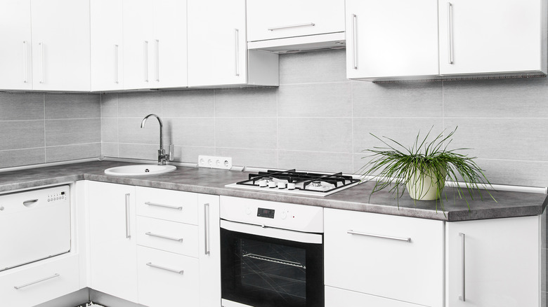
12. Use colorblocking to create bigger kitchens
We would all love more space in the kitchen, but Joanna Gaines has a color trick to make even the smallest kitchens seem much bigger. "I love to play with color because it's all about an illusion. One of the things I tell people is that anything from the countertop up, keep light in a space that's this small," she told HGTV. To make a 150-square-foot kitchen feel less cramped, Gaines painted the bottom cabinets a charcoal color and the top cabinets a creamy white hue. This tricks the eye into thinking the room is airier than it is since all the visual weight is condensed at the bottom.
But you don't have to stop with just the cabinet color. "From the wall color to the cabinet color to the lights against a white tile backsplash, it really gives this feeling of a light and airy space. It gives the illusion it's a lot larger than it actually is," she explained. Colorblocking light hues on top of dark will help open up the space each time.