The Trendier Alternative To Boring Green Walls Combines The Tone With Another Classic
We may receive a commission on purchases made from links.
All-white interiors once ruled interior design trends, but as homeowners looked to add more color, one shade took over. Green became one of the most popular colors for tiles, walls, and cabinets. For instance, the internet went crazy for Dakota Johnson's iconic green kitchen, which sparked an uptick in the color's use throughout the home — and it's not hard to see why. Reminiscent of nature, green evokes feelings of calmness, bringing a serene quality and relaxation to a room. Plus, in many ways, green can act as a neutral since it's easily paired with other colors.
However, green's popularity may also be leading it to become overused, prompting many people to use a similar but less popular color. "Because green took off last year, people want something a bit different and more unique, which is why this year rich teals are going to make a huge comeback," color specialist Tash Bradley explains in an interview with Better Homes & Gardens. "I'm seeing more and more people wanting that combination of blue and green." What's great about teal, as Bradley points out, is that it also has some color-changing abilities. "What's lovely about teal is that in the natural morning light, it looks a lot more green, then in the evening, under artificial light and with warm lamps, it goes really dark, moody, atmospheric, and blue. And I think people love that change in environment."
Choosing the right teal shade
Teal perfectly combines green and blue for a color that's just as relaxing but not as common as shades like sage, hunter, and emerald. Combining the best of blue and green, teal is also a great way to make a bold statement and have a dynamic interior without overwhelming a space with too much color.
Teal provides a range of color options, including energetic shades, deeper and moodier options, and more muted tones. Vining Ivy was Gildden's Color of the Year for 2023, a mid-toned teal. Dunn Edwards' Nocturnal Sea is more of a true teal with some bright vibrancy, while Stone Blue from Farrow & Ball is more muted in color. And for something dark and moody, opt for Weekend from Magnolia Home or Still Water from Sherwin Williams.
Bathe a bedroom in teal to take advantage of the serene qualities that will help relax your stress and encourage you to sleep. Consider the mid-tone and muted shades for bedrooms and bathrooms where relaxation is the goal. Livelier and bolder shades are great options for living rooms, kitchens, and other energetic spaces. Darker shades and options with a hint of gray are good choices for home offices to create a statement while aiding in focus.
What colors to pair with teal
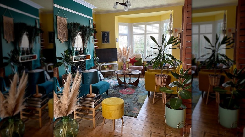
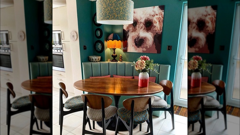
Greens and blues are often treated like neutrals in interior design because they so easily pair with other colors and tones. Because teal is the combination of both these common colors, many shades can easily complement teal interiors. Of course, shades of white pair well with teal. Crisp white shades create a clean and simple color scheme, while warmer whites bring out the green undertones. Wood tones also pair well with teal, bringing more of a natural element to a design. Darker wood tones paired with darker shades help create a moodier space, while mixing more vibrant shades with light and mid-toned woods can be energetic and reminiscent of the ocean.
Other tones of teal can be dynamic and create depth, so keep this in mind when trying trends like color drenching and monochromatic schemes. Using multiple tones of teal throughout the room rather than just one for the walls, furniture, and decorative details helps add the depth that makes a design feel dynamic rather than flat. Going across the color wheel, consider using shades of pink, red, yellow, and orange, which can serve as a complementary colors. These warmer shades can add a pop of color and a bright accent to spaces that are mostly teal.