10 Common Mistakes To Avoid When Painting The Interior Of Your Home White
So you want to paint your walls white. Two words: amazing choice. Why? Because white, believe it or not, is one of the most interesting interior wall colors. Described by some as being a non-color, white is incredibly classic, classy, and timeless. It's safe, simple, and great for resale. Yet white walls can also be a bold design move. With the plethora of paint shades available, accent walls everywhere, and the multitude of moody paint transformations dominating our feeds, choosing to go with white walls might almost feel like a rebel move — in all of the right ways.
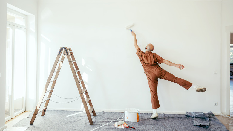
But before you bust out those brushes and get your roller arm ready, there are a few important things to know. Although white is a great paint color choice, it's also one that's easy to mess up. From choosing the correct shade (out of hundreds) to ignoring your trim and not thinking about sheen, there are lots of common mistakes to avoid. Nobody likes having to do double work, and repainting walls because you didn't get it right the first time around has to be one of the most tiresome tasks there is. Fortunately, once you know what pitfalls to pre-empt, painting your walls white won't be complicated, and you'll be pretty much guaranteed impeccable results. So before you shake out that drop sheet, read on to find out how you can avoid going wrong with white paint.
Not evaluating how all-white spaces make you feel in person

All white spaces can either make you feel calm and at peace, or they can make you feel like you're living in an institution. White walls tend to look amazing in photos, as they allow other elements like art and furniture to stand out. But just because pale walls can make for eye-catching images online doesn't mean that you're guaranteed to enjoy them in person. Whether white interiors chill you out or give you the chills is a highly personal thing. The best way to know for sure how a white-walled space will make you feel is to visit one in the flesh and note down your emotional reactions.
If you know someone who's got white walls in their home, invite yourself over and really evaluate whether or not you like the effect. Don't have a white-wall-loving friend? Even better, pop into an art gallery. Art galleries are often painted in shades of white, which makes them a great place to visit if you want to analyze how you feel surrounded by the color. Because they're public spaces with minimal furniture, you may also be less distracted by decor schemes. For example, if you're not all that into modern design but you visit a very minimalistic home, you might think white walls aren't for you when it's actually the design style you're reacting to.
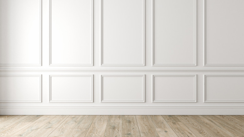
Thinking white is white

One of the most common (and dangerous) mistakes to make is assuming that all shades of white paint are pretty much the same. Sometimes people choose to paint their walls white because they think it's the easiest option. Instead of spending hours agonizing over different colors, you can simply pick up a pot of white paint and get started. But there's a lot more to choosing white paint than meets the eye.
Just like other more saturated paint colors, white comes in a massive range of shades, all slightly different in temperatures and undertones. There are hundreds of variations in existence, and when you visit the paint store, you'll be greeted by a plethora of options. So why can't you simply grab the closest can and head to the checkout line? Well, the shade of paint you pick can heavily influence the look and feel of your space.
One of the first steps to selecting white paint is considering whether you want a cool or warm-toned shade. Cool-toned whites are great for rooms that are south-facing, feel hot, or have warm colors reflected into them (i.e., from a warm-toned wall or building next door). Cooler shades can also work well if you have a very colorful decor scheme or want to hang lots of bright art. Warm whites are wonderful for north-facing rooms that receive gray, cold-feeling light. If you have a lot of furniture in hot hues, going with a warm white can be the most harmonious choice. You can also opt for true white, which is as close to a non-color as you can get. True white can be trickier to work with than white paint colors that have an undertone because it can appear too stark. But it's often a good option for trim or if you want to pair your paint with white appliances or subway tile.
Not factoring in reflections
One of the trickiest things about white walls is their tendency to reflect other colors. Dark, saturated shades don't do this because they absorb colors. Light walls change tone in response to the color of the light that falls on them and other strong hues that are nearby. This can completely change the way they look. For example, if you have a tree that's casting dappled green light through a window, this is going to show up on your walls. Brightly colored buildings that face a window are the bane of interior decorators because no matter what you do, some of this color is going to reflect into the space and change the tone of your walls. The color of your floor can also have a big impact on how your white walls look. For instance, if you have red-toned hardwood floors, this is going to throw a warm, rosy reflection up onto your walls. A gray floor will give them a cool cast.
Fortunately, there are ways to counteract this annoying scenario. True whites are the most reflective because their absence of undertones gives them super high LRVs (light reflective values) that can reach up to 94. So, if you've got a lot of reflected color in your space, whether from the outside, your floor, or your decor, true white probably won't be your best choice. Instead, look for a tone that's the opposite of the reflected color. For instance, if a big tree is throwing emerald-tinged light into your living room, painting your walls a shade of white with a slightly pink undertone could help to cancel out the green.
Not thinking about glare

Painting a room white can amplify the amount of natural light it receives. This is usually a good thing, but too much white in rooms that are flooded with light could leave you with a glare problem. If you'd rather not have to wear Ray-Bans in your living room when the sun hits the windows, here are a few tips.
First, think about your floor. A dark floor or area rug can help absorb light and counterbalance glare from the walls. As an added bonus, dark flooring will make the footprint of the room feel more expansive. Also, consider flat paints over glossy finishes — the latter will reflect more light. If your windows get a lot of sun, you could also look into getting UV-blocking window film installed. UV film won't just cut down on glare, it can also help protect your furniture and textiles from sun damage. Just make sure you opt for a high-quality product from a trusted installation provider. In the past, window films were almost always tinted and cast a gray shade. As UV film technology advances, you can now get products that are almost entirely un-tinted and won't influence the color of your walls.
As outlined above, the type of white you choose can also play a big role in how much light it bounces around. True white paints are a lot more reflective than those with undertones. If glare is going to be a problem, you can still go white with your walls, but you may want to pick a hue that has faint undercurrents of other colors.
Overestimating white's ability to brighten dark spaces
Painting a room white can help to bring in more light and make the space feel airy, but there are limits to white's brightening powers. In a dim room that gets little to no natural light, white walls might make the area feel dull and dingy. If you have a very dark room, painting it white might leave you disappointed. Instead of a beautifully bright space, the walls may feel cold, gray, and drained of life. There are ways to counteract this, such as implementing a cozily layered lighting plan that has lots of mood and task lights and using warm-colored bulbs.
But if you don't have your heart set on white walls — and your goal is to remedy a dark space — you could go in the opposite direction and embrace the moodiness. Using strong, dark colors with lots of drama can be surprisingly effective for small, enclosed areas that don't get a lot of natural light. Rather than making the space more depressing, this approach can create an enveloping, cocooning feel. Dark colors can even trigger the illusion of more space because they add depth. That said, every small space is different, and these are just guidelines, not hard-and-fast rules. Some small rooms might benefit from pale, bright walls, even if they don't receive a lot of natural light. If you're not sure which direction to go, it might be helpful to use an online planning tool, such as this color visualizer from HGTV by Sherwin Williams.
Not being intentional about trim
If your trim is already a pale shade, you might think that it will automatically match your new white walls. But this is another area where picking white paint can get tricky. If the shades are similar but not intentionally paired, this can look messy and incohesive. Your best bet is to go for the same paint color but in different finishes. Switching up the finishes can add dimension, without any danger of things looking mismatched.
If you do want to have different shades of white on your wall and trim, make sure they have the same undertones. For instance, if you've chosen Benjamin Moore's Atrium White, you can echo its faint peachy undertone on your trim with its complementary hue, Elmira White. This same concept applies if you want to paint your trim in a more saturated color. If it has similar undertones as your wall paint, the combination will look cohesive and harmonious.
Not considering the finish

Another common mistake to avoid is randomly selecting a sheen when you enter the paint store. Sheen levels can have a big impact on the look and feel of a space. The more sheen, the more light the paint will reflect. Because white paint reflects a lot of light as it is, you need to carefully consider where and how you want to leverage sheen.
High-gloss paints tend to highlight irregularities and reflect more unwanted colors. Flat and matte options are softer, more soothing, and better for hiding imperfections. However, they might not be suitable for all areas and surfaces. Matte, flat, and eggshell finishes are sometimes best for walls, ceilings, and low-traffic areas, while semi-gloss is traditionally best suited for bathrooms, kitchens, mudrooms, and high-traffic hallways. Paints with more sheen can be easier to wipe clean, and they're ideal for baseboards and trim that tend to accumulate stains and scuff marks. Besides being practical, painting your doors, baseboards, and trim in satin or semi-gloss can also help add subtle dimension.
If you're looking to paint your living room or bedroom, a matte or eggshell finish is usually your best bet. Being less reflective, you'll have fewer issues with odd colors being thrown up on your walls. But what if you have a kitchen or bathroom to repaint? If you're worried about unwanted reflections, you can look into going with an eggshell finish. Paint technology has made big advances, and a lot of new paints are highly stain- and moisture-resistant at all sheen levels. This means you don't have to stick as religiously to the old formulas for determining where to use what finish.
Not using swatches
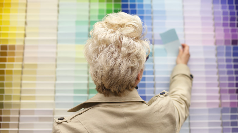
As we outlined earlier, picking out the perfect white can be a tricky process. One of the worst mistakes you can make is not using swatches to evaluate how different shades will look on your walls. To start, arm yourself with lots of color swatches, including any outlier shades that you're not sure about. Hold them up against your walls and other elements like trim and doors. Do this at various points during the day, including under artificial light. Once you've zeroed in on the ones that work best, see if you can get bigger swatches.
Judging how a particular white will look painted over an entire room from one tiny square is pretty much impossible. Larger, 12-by-12-inch samples will give you a much clearer idea. If you're someone who needs time to make a final decision, tape your samples to the wall and let your mind marinate on the color tones. You can also purchase peel-and-stick samples from most leading paint brands, or companies like Samplize. These come in large formats, and you can move them between rooms.
Once you've identified your favorite whites, you can take things one step further and buy a few paint samples. These small tins shouldn't cost you more than $10 at the most, and painting test patches will give you a clear visual of how your favorite whites will look up on the wall.
Assuming you don't need primer
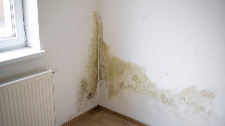
If you're making a gentle color change, you probably don't need primer, especially if you use a high-quality brand for your top coat. But if you're transitioning from a dark or very saturated wall color to white, primer will help to block the old color from shining through and reduce the number of topcoats you have to do. You should also do a coat of primer if your walls have any obvious stains or marks on them. If you paint directly over large marks without a layer of primer, it might take multiple coats of white to cover them. Depending on the cause and severity of the discoloration, you may want to use a stain-blocking primer. Certain types of stains (like water-based marks) can migrate through paint, reappearing over time. Stain-blocking, oil-based primers seal in these marks, stopping them from seeping through your fresh white paint job.
If you're painting over any porous patches of drywall compound, raw drywall, plywood, or plaster, these areas will also need a coat of primer. Another scenario where you need to apply primer is if the original paint is oil-based. Finally, if you're struggling with a mold issue, you might want to use an antifungal primer. Antifungal primers contain biocides that help prevent mold growth, which will instantly mar the look of new white walls. Besides stopping spores in their tracks, antifungal primers can also help protect your walls from excess moisture.
Opting out of a second coat
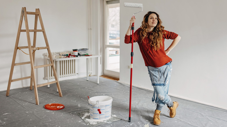
White paint can't cover nearly as well as dark colors, so it's essential to do enough coats; otherwise, the final result will look patchy. Not only will the color look blotchy, but you might also notice unevenness in the finish. The exact number of coats you'll need can depend very much on the quality of your paint. Cheap paints typically have much lower coverage than premium options, which means you'll have to do more coats. With a leading brand of paint, such as Behr, Benjamin Moore, or Sherwin Williams, aim for at least two coats. Two coats of high-coverage paint can be enough for some colors, but when it comes to white, you might have to do one or two more, especially if you're painting over a dark color and haven't used primer.
Also, don't be tempted into doing fewer, thicker coats. One thick coat is not going to provide the coverage that two or three thin coats can. Applying paint too thick can also lead to drips and cause drying issues in humid spaces.