HGTV's Erin Napier Shows Us The Perfect Subtle Paint Shade For Kitchen Cabinets
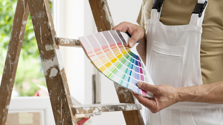
Finding the perfect paint shade for your kitchen cabinets can be a challenge. While many believe white or off-white shades offer the most flexibility and adaptability, others prefer a multitude of wood tones or deeper, more dramatic colors like gray and black as an alternative. HGTV's Erin Napier, in a recent episode of "Home Town," chose a distinctive shade that may be a surprising choice for the cabinetry–a pale pink with yellow tones, similar to peach.
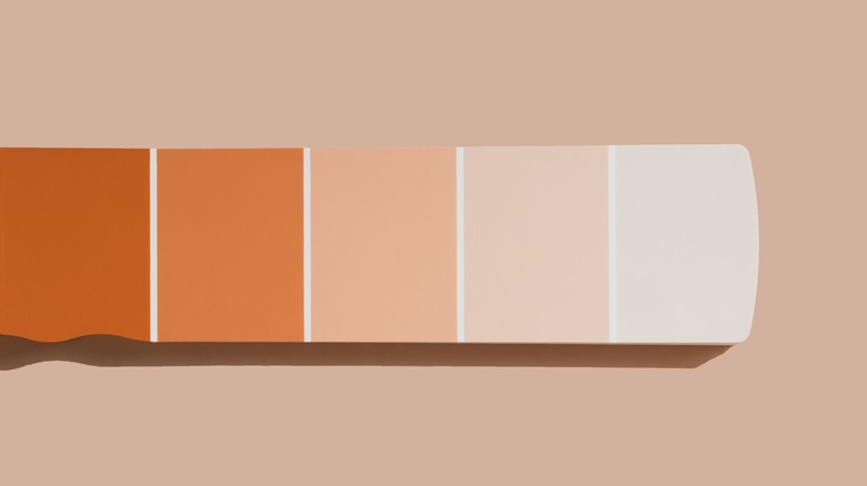
The shade, Valspar's Cape Sands is a perfect choice for the kitchen that remains colorful and bright without being too precious of a shade of pink. According to Napier on Instagram, " "It reads as a neutral in natural light, never babyish or bubblegummy." The more sophisticated shade is a fitting complement to the classic Shaker-style cabinetry and luminescent tile on the backsplash, as well as the warm tones of the natural stone tiled floors.
About Cape Sands
While pink in a kitchen may seem surprising, Erin Napier tells Instagram there is nothing to fear, "If you're going to paint with pink, choose a dusty one with a yellow undertone that leans peach like Cape Sands by @valsparpaint." The paint's neutrality makes the color a great backdrop for other soft shades, including soft whites, creams, and other shades of pink or yellow, while still remaining sophisticated.
Cape Sand's close cousins are popular blush, ballet pink, and millennial pink shades, all of which were popular in the past decade, but Valspar's shade has more tones of yellow than many more traditional shades of pink. It is also a great alternative to basic white, which, while a classic among designers for its adaptability and fit to a variety of décor schemes, can often look boring or sterile, or feel entirely too cold. Cape Sands, inspired by the desert, is also a way to infuse more shadowy rooms with a dose of sunshine and warmth through subtle color.
Using peachy-pink in kitchens
Cape Sands is a great shade for a number of styles, including sunny cottage kitchens or southwestern-inspired decorating schemes, pairing particularly well when combined with shades like copper, terracotta, and deeper warmer wood shades. It is also a great complement to vintage-leaning and grandmillennial-style kitchens, where it can be combined with a multitude of textures and patterns, including florals, damask, and stripes.
There are several close shades to Cape Sands made by other manufacturers, including Sherwin-Williams' Organza and Behr's Paper Heart. Darker, similar shades include Valspar's Sandbar and Clove Bud, which are both orangey terracottas that confer desert vibes. The Cape Sands shade also complements Valpsars' Bistro White, which makes a great wall color option if you are using the pink shade on your cabinetry. If you are still wary of going too colorful on the cabinets and favor more traditional neutrals, a kitchen would also look stunning with Bistro White on the cabinets and Cape Sands on the walls.