Home Town's Erin Napier Reveals The Perfect Color Scheme For Masculine Design
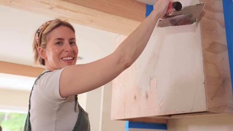
It's no secret that HGTV star Erin Napier is a brilliant interior designer, but in Season 8, Episode 17, her creativity with color really shines. In a recent Instagram post, Napier wrote that her long-time friend and client asked her to refresh his home and "Make it professional, masculine, creative, layered, mysterious, unexpected, the opposite of vanilla and fresh eggs on the farm." When many people are designing for a boy's or man's room, they tend to lean into either earth tones or shades of green and blue. But the color scheme that Napier chose was incredibly novel — even to her! In the end, she was able to mix these typical color schemes and pull off a perfect balance between raisin, black, navy, and brown to create a harmonious, masculine feel that was anything but vanilla.
Of course, while Napier was aiming for a "masculine" feel in this home, anyone can appreciate this comfortable color scheme and use it to make the space their own, especially if you want to repurpose some unused space you should turn into a cozy man cave. Here's how Napier used this color scheme in her clients home and how you can follow her inspiration to create your own unique and bold design scheme.
Confident neutrals meet a touch of sweet raisin
For the home of her friend and client Brad, Erin Napier opted for a smoky navy on the cabinets and most walls with softened black and natural warm wood details. Brighter raisin reds in the décor and kitchen appliances bring a dash of color and romantic appeal, like a sweet black cherry. Napier tied it all together with soft navy trim throughout. "I'm in love with this color scheme. It really gives it this moody, smoky vibe that's so different from the stark white that it was before," Napier said in the episode. These unexpected colors work well together in Napier's design because they're all in the same family of deep neutrals, bringing dark and moody vibes into the space.
Napier admits that the black and brown combination may feel divisive to some. "If you don't like these colors, that's so completely fine with me. It wasn't designed for everyone," wrote Napier (via Instagram), "These houses are so specific and individual: that's the joy in the work we get to do." When choosing the shades of paint to use in your man cave, consider swapping out any one of Napier's bold, rich colors for something more neutral or appealing to you. Instead of black, for example, you could opt for a simple warm white or a neutral olive green. If the pop of raisin isn't your speed, a burnt orange or goldenrod may be just the thing.