12 Tips For Making Small Rooms Appear Larger Using Paint
Unless you compromise on functionality, you'll notice that small rooms fill out fast. And with your decor and furniture eating into the space, the room might start feeling tight. Although you can bust down a wall or two, it isn't a realistic choice if you don't have the space or the budget for an extension. But don't lose hope just yet. There are many stylish, yet affordable ways to make your small bedroom look bigger with nothing but paint — a view shared by the four experts House Digest reached out to for exclusive interviews.
They opine that for a room to appear unified and extensive, you must smooth out or soften any visual boundaries, edges, and clutter. This often translates into painting over furniture or key architectural elements the same or near-similar hue as your walls. Additionally, the kind of paint you choose, its tone, finish, tints, or how it combines with other hues also influence how you perceive the room. Lightening the color as you go higher or deploying glossy finishes can give the place a visual lift. Similarly, vertical stripes can optically expand or broaden the room. Curious to learn more? Here's a quick roundup of expert tips you can follow to make your rooms look bigger with paint.
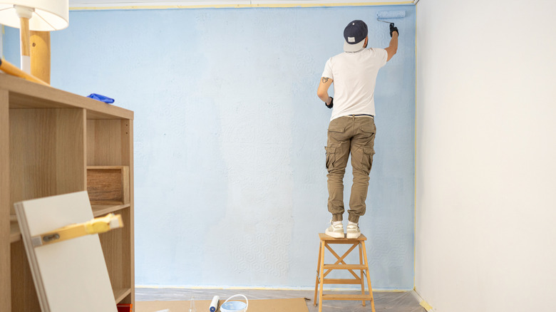
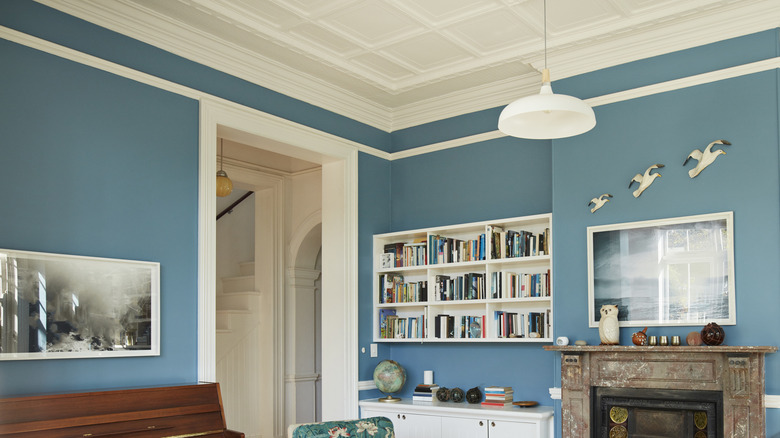
Paint the ceiling a paler shade to lift it visually
Pairing white ceilings with darker walls can spoil your room's moody or regal aesthetic due to the sharp color contrast. This may also not open up the space fully, especially if your room receives limited light. Plus, the visual breaks will cause your gaze to stop and notice the distinct seams where the walls and the ceiling meet. Which is why, a superior way to create the illusion of a bigger space is to take cues from the surrounding walls and pick a hue for the ceiling that's a few shades paler.
Expanding on why this works in her exclusive interview with House Digest, Jo Rich, a designer at Raydoor Sliding Walls & Doors, says, "A go-to trick of mine is painting the ceiling a shade lighter than the walls. The lighter tone draws the eye upward and gives the illusion of added height, making the room feel airier." As you can guess, this tip works even for rooms following a dark color scheme, as you're still on a similar spectrum and maintain color harmony. Plus, you get to enjoy a visual lift. For maximum impact, choose a ceiling color that's about 20% lighter than your walls.
Color drench the room to dissolve visual boundaries
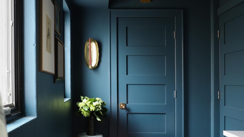
In a bold departure from conventional design rules that champion contrasting trim and wall colors, Rich makes the case for the trend of color drenching. Basically, you douse the various elements in a room, including the walls, trim, doors, and ceiling, in an identical hue. This will infuse the room with a sense of enormity and expansion. Curious to know how it would play out in small areas? Rich elaborates, "Another idea I recommend is painting the trim, baseboards, and door frames the same color as the walls. Eliminating contrast between surfaces blurs the edges of the room and makes the walls appear to stretch beyond their actual limits."
This especially works in rooms heavy on architectural details, where differing shades can trigger visual interruptions. But with them mirroring and merging into each other, the eye can glide continuously around the space without pinpointing where these decorations truly begin or end. As a result, the room looks stretched out and more spacious than it is. To color drench your small rooms, pick out dark hues, such as navy blue and jewel green. However, if you'd rather play it safe and rely on natural light, neutral, earthy-toned colors also work well.
Choose monochromatic tints of the same color for an illusory expansion
If you find repeating the same color across the room monotonous and underwhelming, Rich suggests an alternative: monochromatic tints. Under this approach, you choose the same color in different tonal intensities — usually, not more than three. Using them across the room creates a layering effect, adding visual depth to the space. "I also find that using a monochromatic palette with varying tints of a single hue can very much create continuity. When walls, trim, and even built-ins are all in related tones, the space reads as one uninterrupted volume," she explains. For instance, a room bathed in lavender could have fixtures painted over in light purple and plum shades for a visually-interesting, yet unified and layered, look. You can think of similar variations for blue, rust, or green, depending on your color scheme.
Weighing on this during his exclusive interview with House Digest, Seymen Usta, interior design specialist at Seus Lighting, adds, "This method eliminates hard visual stops and starts, a must-have when working in close quarters." The reduction of visual clutter and disjointed seams in a monochromatic theme significantly pulls together the space without detracting from the existing décor, a sentiment Usta shares. "This is one I like to implement in small apartments and townhouses for a more cohesive, airy look, and to not lose the [warmth] or personality."
Incorporate a thin stripe just below the ceiling to widen the space
When you're dealing with a room that feels narrow, enclosed, and hemmed in, you may be more interested in making it roomier. This is usually the case for cabins or attics that feature A-frame or low-hanging ceilings. For such cases, Rich proposes adding a thin band underneath the ceiling so the eye is directed sideways. "If you are looking for a subtle widening effect, try to consider using a very thin horizontal stripe that is more than a few inches tall, near the ceiling line," she says.
Aim to place the strip about 10 centimeters or 4 inches from the ceiling. Alternatively, you could treat the wall molding or cornice as the cutoff point. "What this does is help draw the eye laterally and give a perception of a wider room while not overpowering the space," states Rich. If your ceiling is a dark shade, but you'd also like to add some height, consider coating the stripe in white or light colors. This way, it'll naturally become the focal point. Plus, it'll bounce light around the room and make the space look taller.
Add more depth in cramped rooms with the ombré effect
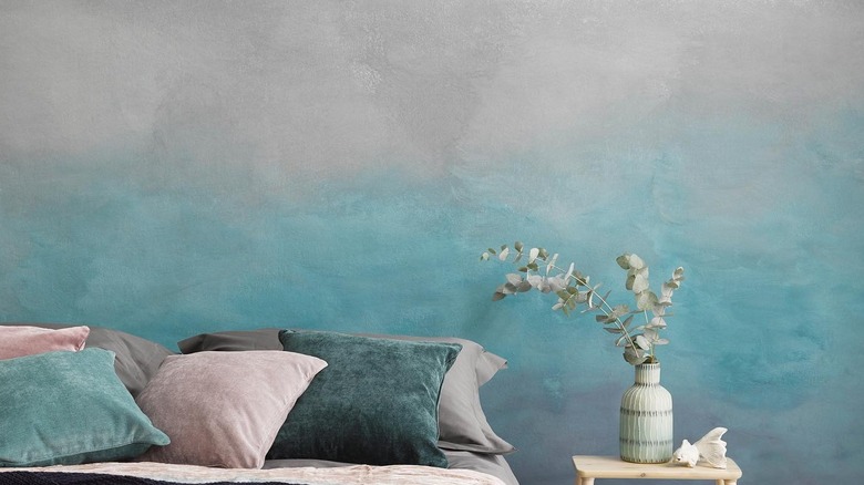
If you've already mastered spray painting your DIYs, this tip from Anastasiia Amani, interior designer at the Cruise & Hospitality division at Big Time Studios, might be right up your alley. Rather than focusing exclusively on the ceiling or the overall paint in rooms with peculiar or challenging dimensions, she suggests centering on an accent wall. "In narrow or oddly-shaped rooms, I sometimes introduce a soft gradient or tonal shift on one feature wall — darker at the bottom and lighter as it moves upward," she says during her exclusive interview with House Digest.
Such a wall treatment is called the ombré effect, and it often turns the place dreamy (just think of the setting sun). Besides adding whimsy to the room, this nuanced tonal shift encourages the onlooker to look upward, following the gradient's smooth transitions. This makes the ceilings appear higher, adding more dimension to the room, while the dark color keeps the space grounded. "This ombré effect adds depth and makes the room feel taller without using any physical architectural tricks," clarifies Amani.
Pick a reflective paint finish that bounces more light
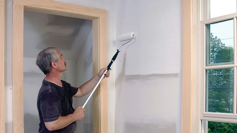
Like color, using the right paint finish can help a room feel larger, according to our experts. That's because it's the finish that dictates how the paint interacts with the light. A matte finish usually absorbs the light, constricting the space. Contrastingly, a glossy or reflective surface will open up the area instead. Rich advises that "choosing a paint finish with a slight sheen — like an eggshell or satin — reflects more light than a flat finish, brightening corners and reducing visual 'dead zones' where shadows can make a room feel cramped." The reflected light reaches into the deepest recesses and minimizes visual fragmentation, adding a sense of fluidity to the room. Note that eggshell is more appropriate for wood-clad walls or around the skirting.
But if you're hesitant about committing to a silken sheen on every wall, Amani offers a middle ground. Utilize a satin finish on the ceiling or an accent wall where you have one. "A subtle semi-gloss or satin paint on the ceiling or certain accent walls helps bounce natural light around the room. It creates a livelier, more dynamic environment — especially in spaces that tend to feel boxed-in or dark." However, avoid going all out with a high-gloss finish. Even though it will make the room seem larger, it'll also highlight any dents, dings, scruffs, and imperfections on the wall.
Coordinate the color of bulky furniture with the walls to reduce its visual mass
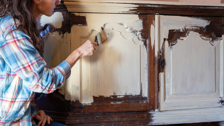
One advice you must have encountered while exploring small living room ideas to make your space seem bigger would be to scale back on furniture. Although it can work wonders for a confined area, it isn't always practical. Certain bulky pieces, especially built-in solutions like storage cabinets, armoires, dressers, or bookcases, are indispensable in homes and will eat up premium real estate. To tackle such scenarios, Amani advises color coordinating them with the walls. "I also like to paint large pieces of furniture — like wardrobes or cabinets — in the same color as the walls. It visually minimizes their bulk and makes them 'disappear' into the background, which keeps the space feeling less cluttered and more expansive."
If the larger furniture items are a different color, they would pop in the room and make their presence known. This fragments the space, forcing an onlooker to acknowledge their size. But after they're painted a similar color, these furnishings harmoniously blend into the surroundings, hinting at greater square footage and a more intentional design. This tip will work for most color schemes, including white, warm neutrals, or cool blues.
Use color-blocking to create an illusion of more space
Another sophisticated way to make small rooms appear larger is to color-block the walls. It's a painting technique where you use big chunks of contrasting colors to add a touch of eclectic and vibrant character to the area. Although you can use up to three shades in this technique, Amani's suggested method employs only two. In her words, "Color-blocking can help too, but it has to be used carefully. If you divide the wall horizontally and keep the lower half in a deeper tone and the upper in a lighter shade, it can make [the] ceilings feel higher." Many painters use the wainscoting as the cut-off point to start with the next block of color.
Such a horizontal division essentially tricks the brain into perceiving greater vertical space than is present, effectively lengthening the top section. In contrast, the dark bottom will keep the users zoned in. However, there's another side to this. "Horizontal divisions can stretch a space wider," mentions Amani. While this can be valuable in narrow rooms and hallways, not everyone will find the use for it. That's why she recommends envisioning the final look beforehand and choosing your strategy that best fits that vision. "The key is understanding what you want the room to 'do' visually and then guiding the paint strategy accordingly."
Opting for a bold paint shade for the ceiling can add a sense of vertical volume
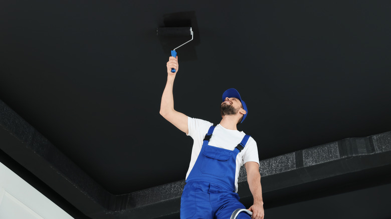
Generally, you should keep the ceilings pared down with whites or warm neutrals for depth and dimension. However, if your room is already stripped down to the basic hues, introducing a rich color overhead can raise the room's vertical volume. As Amani puts it, "Something many people overlook is the power of a bold-colored ceiling in a small room. If the walls are kept neutral and the ceiling is painted in a richer or unexpected hue, it immediately draws the eye upward and adds a sense of drama and volume."
Consider painting the ceilings in mostly-white rooms in deep shades, such as velvety black or ruby red. Not only will this bold contrast inject drama and tension into the space, but also visually raise the room's height. However, Amani recommends using this technique in transitional spaces, such as entryways or powder rooms, where you can afford to take a few creative liberties.
Going dark on one wall can make an area feel deeper
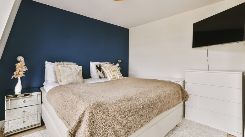
If you aren't particularly enthused with the idea of maintaining a bold ceiling, Amani has another trick up her sleeve. "When I want to add visual depth, I'll sometimes use a technique I call 'color perspective.'" Under this, she picks the wall most distant from the entry and intentionally coats it a few shades deeper than the surrounding walls. As a result, the dark wall appears to retreat, giving off the impression that it's sitting farther back than its real position, enhancing the room's depth.
Explaining her reasons for using this technique, Amani states, "Painting the farthest wall slightly darker than the others makes it feel farther away, helping the space appear longer than it actually is." That being said, it's worth noting that this option relies on subtlety and not dramatic contrast. If the farthest wall is far too deep, it may actually appear closer and shorter. This is where the shape and configuration of your particular room should dictate whether this painting technique is actually an efficient approach.
Select light, cool-toned paints to keep the space bright
Another way to enhance a modest room's airiness levels involves saturating it in muted, cool-toned paints. Usta continues, "One of the best ways to make a small room seem open and inviting is to paint it in light, cool colors — soft blues, pale grays, and crisp whites have a similar effect to open skies and sunlit expanses." Essentially, these colors reflect natural and artificial light around the room. This charges the room with an airy, expansive feel, while adding a touch of calm and tranquility.
Just keep an eye on the undertones. Although blues and grays are considered cool-toned colors, they may be heavily mixed with warmer shades like reds and oranges. The resulting blending may make them warmer than originally intended, causing the ultimate undertones to not match up in the room, counteracting this scheme. But with the right tone in place, expect the room to feel fresher. "The cooler undertones of these colors assist in visually pushing the walls outward, which makes for a more open-feeling room," voices Usta. He advises utilizing this space-opening tip where knocking down walls seems like overkill, but breathability remains paramount, such as in small bedrooms or playrooms.
Use paint to create vertical lines
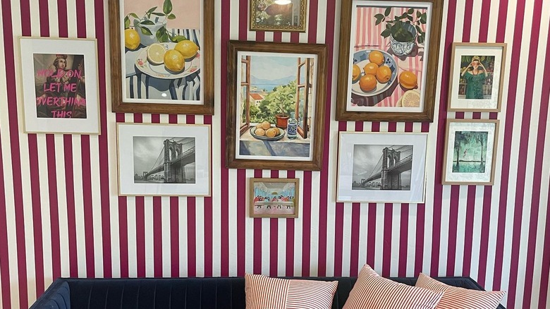
If you love decorating your home with stripes, this tip from Scotch Painter's Tape Ambassador and Home Renovation Expert Drew Michael Scott may seem interesting. He states in his exclusive interview with House Digest, "One of my favorite tricks for making a ceiling feel taller is painting vertical stripes or faux picture molding using painter's tape. Vertical lines draw the eye upward, creating the illusion of higher ceilings." This works particularly well in low-ceiling rooms as vertical bands seem to elongate the top. It's also convenient when your ceiling is saddled with cross beams.
Once you've cleaned, sanded, and prepped the area, lay down painter's tape to mask off trims and edges. Afterward, demarcate the area into various sections. Most stripes are 4 and 12 inches wide, so pick your look accordingly. But if you're feeling creative, you can also aim for a pinstriped look. Highlight these divisions with a painter's tape, like ScotchBlue PROSharp Painter's Tape, to keep track of your pencil markings. As most tapes come loose without leaving sticky residue when peeled off within the intended time, they can be safely painted over. However, "If the idea of striped walls feels intimidating, try using two similar colors, or even two different sheens of the same color for a more tonal look," advises Scott. "The effect will be subtle, but still create that same vertical lift."