6 Worst Colors To Paint Your Kitchen (And What To Choose Instead)
Your kitchen should be a place where you look forward to spending time. After all, it is widely considered the heart of the home. Your color scheme can instantly transform the vibe of the area, so the selection process is key. Choosing the right paint color for your kitchen can be tricky, so expert advice can be crucial. If you're overwhelmed with possibilities and finding it difficult to narrow down your options, don't fret. This is why we've elected to consult the pros.
House Digest has sourced exclusive advice from several successful design experts on picking the perfect shade of paint. They've underlined the shades you should stray away from when giving your kitchen a modern makeover. There are several paint colors that'll make your kitchen look expensive without the cost. But the hues highlighted below can cheapen and date the overall look. So, discover the contemporary alternatives that will ensure a chic, stylish space.
Orange can be too overpowering for a kitchen
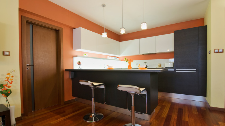
Even if your goal is to create a bright, warm cooking space, you might want to rethink an orange kitchen. Gala Magriñá, holistic interior designer and principal at Gala Magriñá Design, explains the problem with this vibrant choice exclusively to House Digest, saying, "Orange is a bright, yang, energizing color — great for a workspace or breakfast nook where you want to feel awake and productive. But in the kitchen, which already contains a lot of natural fire and activity, it can be too much." She goes on to warn that bright orange can be overstimulating in direct sunlight, which can result in headaches and may even negatively affect your mood. So, although it can be a stimulating color, it's not ideal if your goal is to create a soothing atmosphere. Orange is more preferable for social spaces like living rooms.
For a calming, sophisticated alternative, Magriñá suggests keeping the warmth but straying away from the saturation. If you're on the hunt for a classic wall hue or a timeless kitchen cabinet color that interior designers swear by, consider her advice. She explains, "I recommend Bone China by Benjamin Moore. It's a soft, warm neutral that supports clarity and calm without draining the space." The all-white kitchen might be on its way out, but a warm variation of cream or ivory will never go out of style. You can ensure a serene, contemporary space by borrowing techniques from Magriñá's own strategies, including touches of warm wood and rich, earthy tones.
Primary shades of blue that lack nuance might not be the best choice for a kitchen
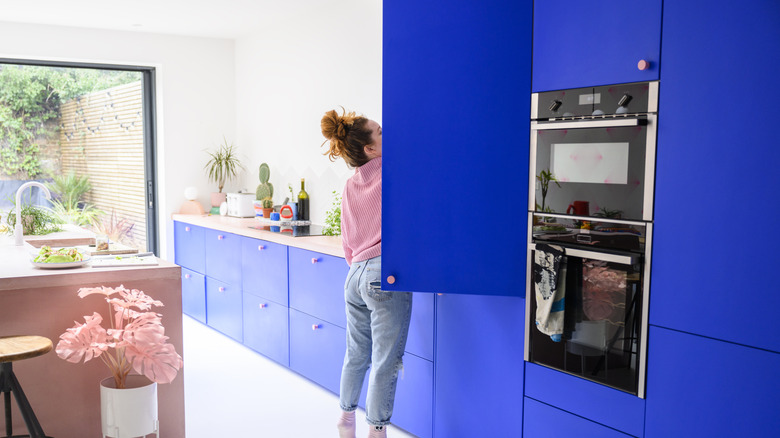
Although it's an extremely popular paint color, not every shade of blue is a winner. Jennifer Jones from Niche Interiors exclusively tells House Digest about the main problem with overwhelming your kitchen with bright blue. The principal designer explains, "Blue has been shown in some studies to suppress appetite, likely due to the fact that blue is not a color commonly found in natural foods." Alice Moszczynski, interior designer at Planner 5D, agrees with Jones' assessment. She elaborates in our House Digest exclusive interview, saying, "In a kitchen, which is meant to feel warm, welcoming, and lively, too much blue can create a cold, almost clinical vibe, especially if paired with stark whites or grays."
Cool tones have been increasingly swapped for warmer shades over the last few years, with a major shift towards cozy, natural interiors. Echoing Magriñá's advice, Jones offers a similar tip: "In a kitchen, where the goal is to create a space that encourages cooking and dining, using neutral or warmer tones is a better choice." If you do select cooler shades, opt for warmer variations with yellow undertones. And if you're really committed to a cooler shade, just be mindful of placement. Moszczynski has a few well-balanced ideas, explaining, "Consider bringing in blue through accents like dishware, textiles, or even cabinetry hardware while opting for warmer neutrals or soft greens on the walls to keep the space inviting." Soft green shades are also an ideal alternative to bright blue, as they fall in line with the rise of natural decor while still adding a splash of color.
Stark white can read as harsh and uninviting
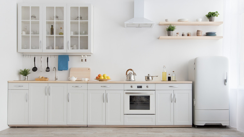
Angelique Kreller, interior designer at Yabby, gives House Digest readers an exclusive warning against using bright white with no underlying dimension. She explains, "Many people like neutral shades in the kitchen, but many people make the mistake of going for a stark white. It might seem like a safe choice, but it can make your home look more like a lab than a home." Although an all-white kitchen used to be synonymous with contemporary design, it no longer holds the title of the most popular kitchen paint color. Instead, homeowners are searching for the best ways to decorate their homes for a warm and inviting vibe.
Modernism doesn't mean cold and unrelatable. In unison with our other experts, Kreller advocates for a warmer approach. She says, "Instead, go for a soft off-white or warm greige to keep things bright without the harshness." Even if you love a cooler neutral, a shade like greige or taupe can bridge the gap between brown and gray, ensuring that your kitchen doesn't look dated as neutral trends change. Natural Cream by Benjamin Moore is an understated choice that will help create cohesion between both warm and cool decor.
Black can box in a kitchen
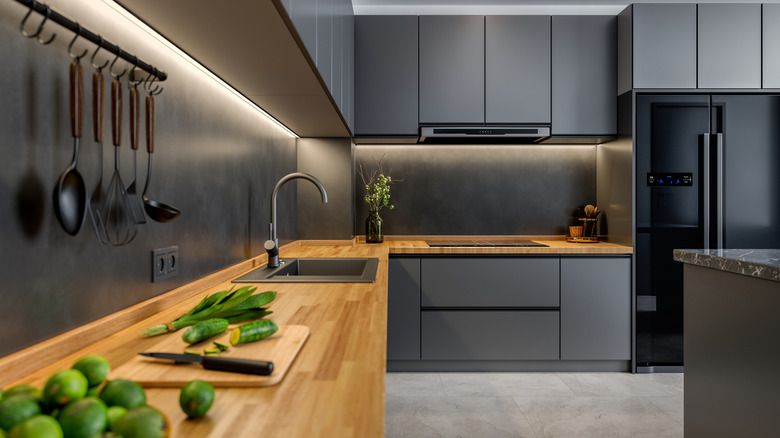
Black is a color that has been widely debated in the design world. After warning against the use of bright white, Kreller advises against jumping to the other side of the spectrum, explaining, "Black is another shade that works in a similar sense to white, with some people thinking that it's a safe shade to use in the kitchen. However, if you don't have enough natural lighting in your kitchen, it can look too enclosed." This could be perceived as a controversial take, as other modern designers have been advocating for dark walls in every space – no matter how small.
But don't mistake Kreller's advice as a warning against all use of dark hues. There are several ways to incorporate dramatic tones without risking a closed-in look. A solid, true black kitchen can indeed be overwhelming, but there are slightly softer shades that can provide an equally bold appearance. Try shades like charcoal, deep brown, and slate as rich alternatives. If you have your heart set on black, Kreller urges homeowners to balance the black with light benchtops or brass fixtures to break up the space. This will keep the kitchen looking moody while still creating enough contrast to avoid a shadowy, gloomy feel. When it comes to dark paint colors, it's all about balance.
Purple is probably going to feel dated or dim
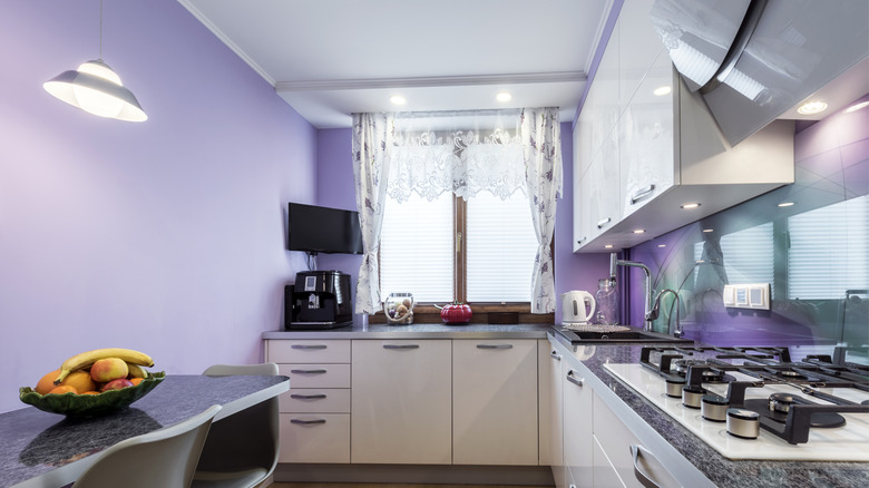
Moszczynski calls out another kitchen paint color that can make your kitchen look garish and instantly out-of-date. The color she always strays away from is purple — in almost any shade. She shares, "Purple can quickly veer into overwhelming territory in a kitchen. Deep shades like eggplant or plum can make a kitchen feel heavy and dim, while lighter lilac tones can look surprisingly dated, especially under artificial lighting." More than selecting the right tone, the fatal mistake is drenching your kitchen in a color that demands all of the visual attention. Before covering your kitchen in purple paint, consider whether it will throw off the natural harmony of your room.
As an organic alternative, Moszczynski recommends choosing colors that make your kitchen feel fresh and clean. Creamy whites can create a bright, airy atmosphere, and earthy taupes or soft sage greens are effortlessly warm and calming. If you're intent on using purple in some capacity, adding thoughtful touches throughout your space is a much safer way to go. Moszczynski advises to use it sparingly: "...perhaps a vase of fresh lavender on the counter or plum-hued upholstery on bar stools. This way, the color reads as a playful accent rather than dominating the entire room." When it comes to the best ways to incorporate purple into your home decor, remember that less is more — especially in the kitchen.
Mint green shades can clash with contemporary kitchens
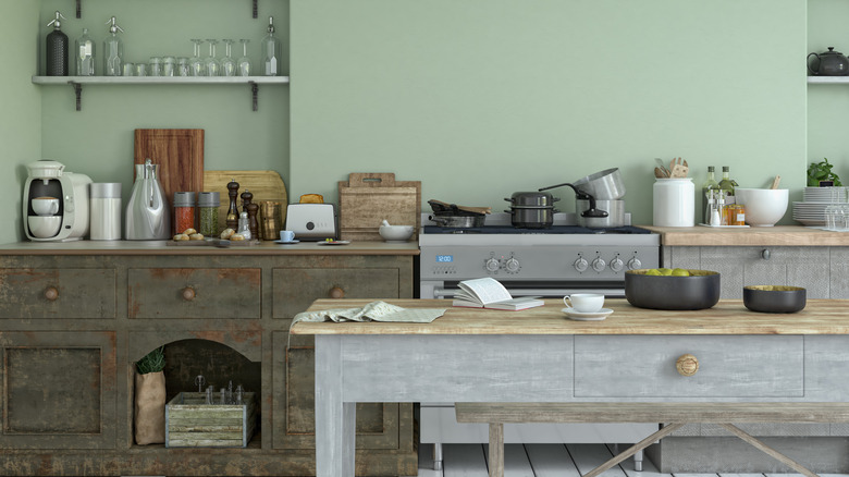
Not only is green a top-trending shade, but it is unlikely to go out of style due to its organic nature. A green kitchen will add a pop of vibrancy to your home, as long as you go with an earthy variation. In an exclusive interview, Teri Simone, head of design and marketing at Nieu Cabinet Doors, encourages homeowners to be extra-mindful about the shade they choose. She explains, "I love a green kitchen moment right now — but if it leans more mint chip than eucalyptus in tone, you might be dating yourself." She explains that this pastel shade is too reminiscent of retro fridges in vintage kitchens with checkered floors.
If you're having trouble deciding on the right green paint color, Simone lists a range of hues that will remain stylish. "Rich emerald hues and lighter, grey undertoned earthy greens are still very much IN," she notes. For example, Benjamin Moore describes Soft Fern as "a pleasing pale green misted with gray tones," making it a perfect choice for your cabinets, backsplash, or kitchen walls. The beauty of muted, natural green tones lies in their ability to complement almost any surrounding shade and finish.
