Green Paint Shades That Won't Scream Millennial Cringe
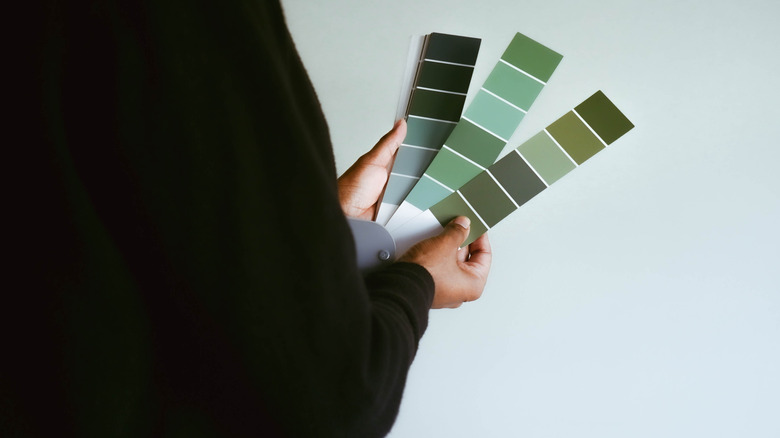
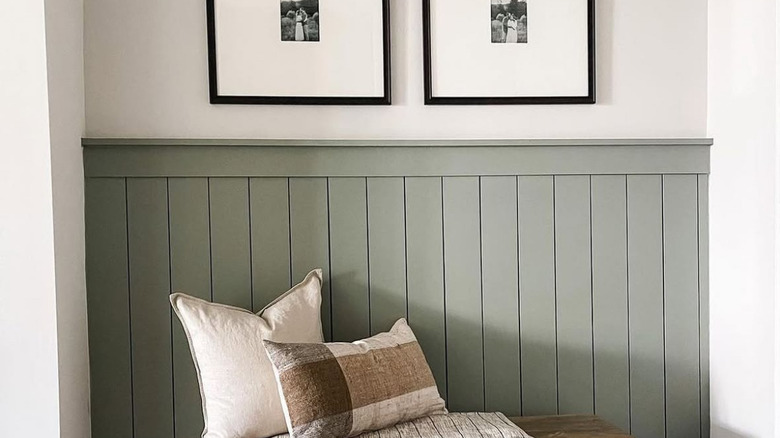
Green is a standard paint color that is showcased in many ways, more commonly today in millennial DIY projects and homes. While green isn't a bad choice for a paint color, the popular shade of sage has become far overdone in primary areas of the house, making them cringe-worthy. Green is now considered the new "millennial gray" since it is so trendy and well-used. The label reflects a more minimalist design. However, in 2025, green paint shades with browner bases, very slight gray tinges, or blue undertones are far more preferred for freshness and won't evoke the same millennial cringe associated with sage green.
You should choose your paint shades in line with your personal style and preferences while maintaining consistency with your home's overall aesthetic. If you want to keep green paint shades, you can opt for bolder tones and softer hues that provide more light throughout the room. Here are 10 green paint shades to bring out the more natural and subtle qualities that give your home a lovely makeover, and the best places in your home for these more trendy neutral green paint colors.
Pewter Green
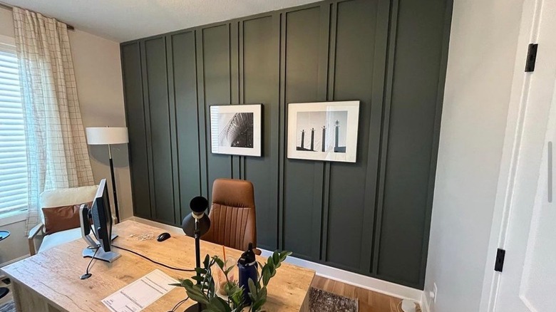
The Pewter Green by Sherwin-Williams is a bold, yet calming color. It provides a natural aesthetic and cool green undertones with a much deeper, dark hue. It works well with complements of lighter colors, wood, or metal in a room. It can be an excellent color for your kitchen, office space, or dining room, accented by metal light fixtures and wooden furniture. It works best in rooms that receive a good amount of natural light to bring out the gorgeous dark shade.
Juniper Breeze
The green in the Juniper Breeze by Behr paint is the perfect shade for a more farmhouse-chic style, with a much lighter shade. It pairs well with brighter and bolder tones of browns and wood, and even other greens that provide much-needed character and charm to your room. You can also go the other way and complement it with lots of whites and creams for a more modern and bright feel to work in any space.
Forest Floor
Benjamin Moore has a timeless and historical charm with its olive green color in Forest Floor. If you're going for a vintage-style vibe that's lush and dark, staying far away from the millennial gray sage color, this is the green for your home. It has an old world feel that's dramatic as an accent wall, on cabinets, or cozy across an entire room. This green also brings about the pleasant, lush feel of nature to bring the outdoors inside.
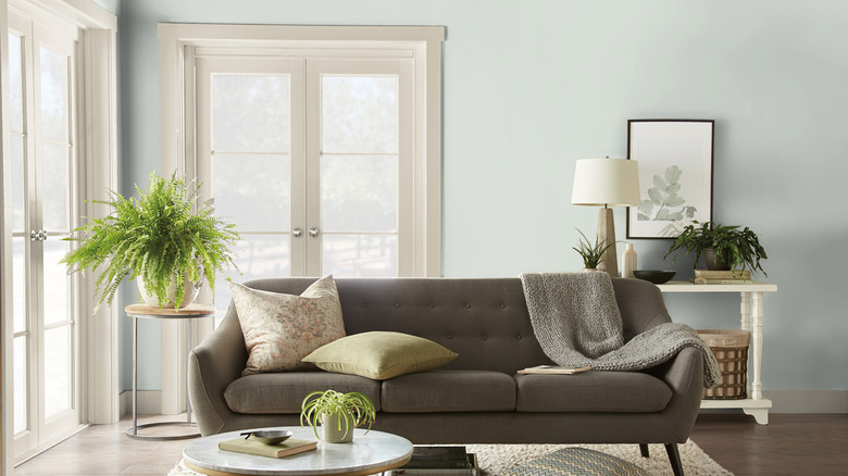
Quietude
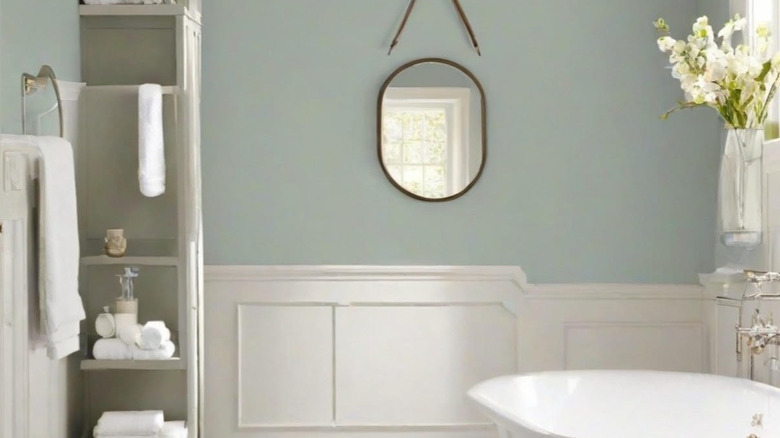
Another Sherwin-Williams favorite called Quietude brings out more light, bluish tones, and a more sea-colored shade to your green. It is even HGTV Home's Color of the Year for 2025. It gives a fresh and cool feel, so it can work well in bedrooms and hallways. It could also be used in a lake house or for a tropical ambiance in your bathroom. This brings out the slight teal tint and lighter, brighter appeal without too much boldness. Instead, it's soft and neutral.
Calke Green
If you're looking for a bolder, yet classically stated green, Calke Green by Farrow & Ball is the ideal choice. It presents itself with a brown base as an elegant showcase of sophistication and class, with a rich hue for a dramatic statement. It can work well in a dining room area, particularly when paired with darker wood furniture or bright whites, to create a more creative and contrasting effect.
October Mist
Lighter than most shades of green, October Mist by Benjamin Moore has more of a silver tone to it, which is similar to other gray-green paint colors, but don't confuse it with the millennial gray that you see everywhere. The lightness of the tone is an excellent palette for lightened or woody elements to complement it within the room to create a bright, airy feel. You can also add other greens with it throughout the space to create a layered effect.
Sap Green
Farrow & Ball has created a bold, earthy hue in Sap Green that can help create a nice, calm, and welcoming quality in your room. It works well with natural tones and textures and can be complemented by bolder, darker pieces of furniture and bright colors. It would be great in an entryway for an inviting feel, or even used in an area of the home where you want to promote a change in atmosphere, like the sitting area of your bedroom, or a cozy reading nook.
Evergreen Fog
Another subtle shade with very light undertones and a smoky, powdery finish is Evergreen Fog by Sherwin-Williams. If you are going for a more modern and upscale design, this color can help provide that little touch of nature for an inviting and refreshing mood. It complements furniture and decor with whites, creams, and beiges well, making it perfect for an entryway or hallway in the home, keeping things bright and welcoming.
Weekend Upstate
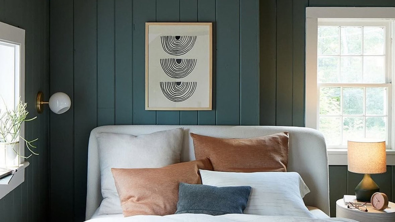
The color Weekend Upstate by Backdrop features subtle blue undertones within the darker green color. It's a richer, bolder shade that can work well in the bedroom to create a soothing space and promote a restful aesthetic. Pair it with a lighter gray or wood bed frame and some silver or cream-colored curtains. Brighten things up a bit by adding a pop of color with boldly colored bedding against the green to create a light and comfortable atmosphere.
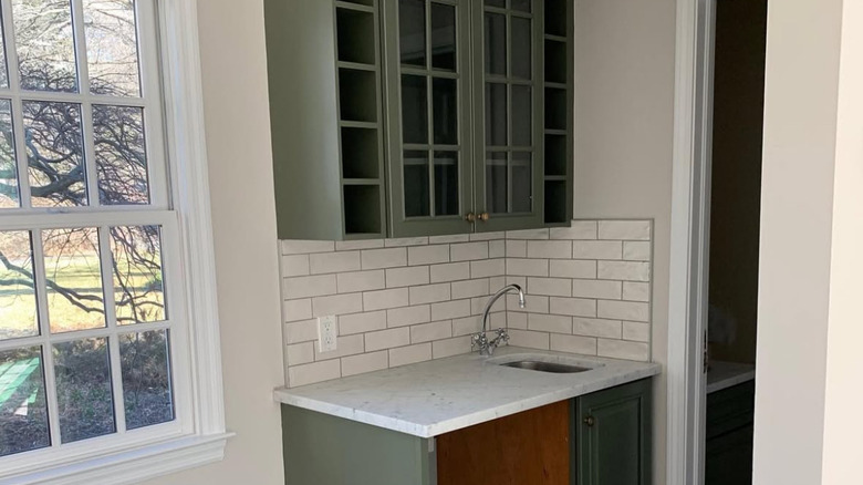
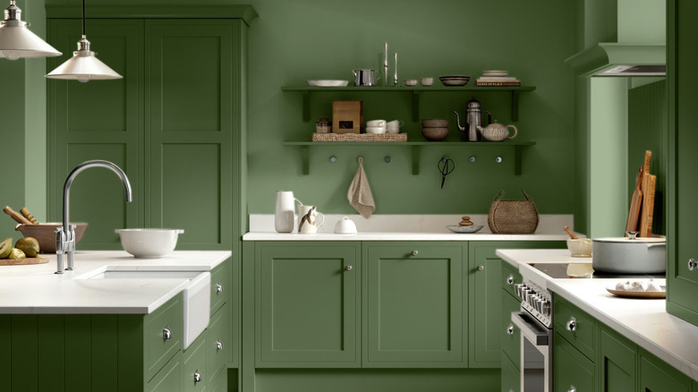
Green Scene
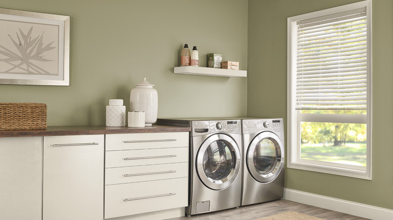
Finally, Behr's Green Scene is a mossy, earthy hue with brown and beige undertones, and it's a light green paint color that's sure to inspire you. The inviting green reflects the natural aesthetic with a blend of both modern and traditional styles, providing an outdoorsy feel. Complement it with woody or cream-colored decor, or go bold and add in some bright accents. It's an excellent, versatile color to paint within a guest space, laundry room, or other themed room.