8 Worst Paint Colors For The Bathroom
Bathroom makeovers are some of the hardest ones. You have to work with paint, tiles, sinks, showers, toilets, towels, and decor pieces. It's a lot to take on in a small space, and it requires matching different shades perfectly to create a cohesive color palette. When choosing paint, consider both shades and mirror placement. For example, an accent wall can easily overpower a bathroom when it faces a large mirror. There are certain paint colors to avoid in bathrooms, as well. Dark hues like brown and black can make a bathroom feel like a dark, cramped cave. Light colors, such as a crisp white, can make a bathroom look dirtier by showcasing grime buildup. And finally, saturated, bright colors can feel too overwhelming in such a small space.
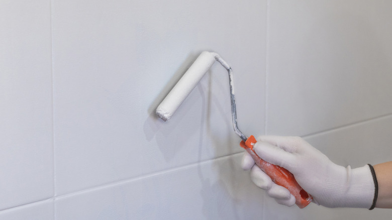
Going overboard with paint is a common mistake everyone makes with color in the bathroom, but it's easy to avoid in a DIY makeover if you steer clear of the following eight paint colors. If you absolutely love some of the colors on the list and would like to incorporate them into your bathroom, consider doing so through colored tiles in shower corners and backsplashes instead. You can also include these shades through towels, decor, and even cabinets. And if you really want to paint a wall with it, consider starting with lighter, more pastel shades instead of saturated hues.
White
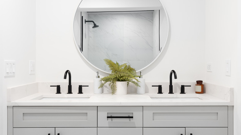
White always seems like a safe option. It's a basic "no-color" paint color for those who aren't ready to go with something more vibrant and pronounced. But unfortunately, white is actually a much riskier choice than many people think. First of all, it's unforgiving with grime and dirt. In bathrooms, it means makeup spills and toothpaste splashes are instantly visible. In addition, white can also present as a bit surgical looking, like a hospital room, which makes it a poor choice for a bathroom. If you prefer a light and bright option, consider using beige instead.
Dark brown
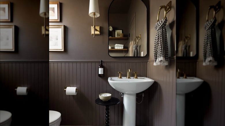
Bathrooms are often dark and lack natural light due to their compact size. When there are windows in bathrooms, they tend to be small and do not let in a lot of light. Oftentimes, the only source of significant light is artificial lighting. That's something to consider when looking at paint colors. Dark brown is one of the worst colors for your bathroom because it makes it feel tight, dark, and cave-like. In small spaces like bathrooms, it's best to avoid dark paint colors, as they can make the walls feel like they are closing in on you.
Black
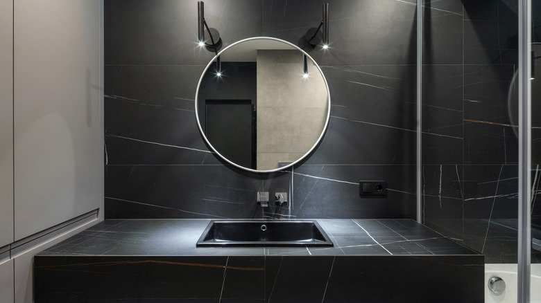
What's true for dark brown is also true for black. Sure, you've probably seen black-tile bathrooms in the pages of architectural magazines and spa pamphlets, but it doesn't work as well in many homes. Magazines make black bathrooms look luxurious because they showcase larger spaces, high ceilings, and luxurious finishes like lighting and hardware. If you have a smaller bathroom and are looking for a paint color for the walls, it's best to avoid imposing black shades. These will make your bathroom look more cavernous than luxurious.
Red
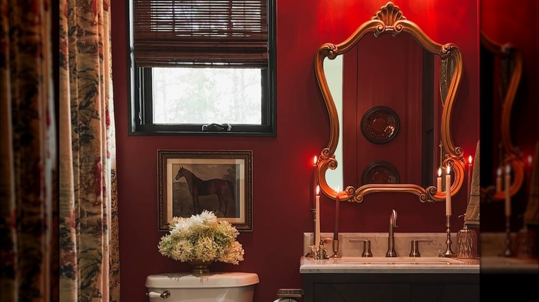
Red paint rarely looks good in a bathroom. While some people might be able to pull it off with vintage decor, bigger windows, and red tiles, it's not an easy feat. Red paint is more temperamental than other colors, which makes application mistakes very visible under a bathroom's bright artificial lights. In addition, the lack of natural light that's typical in bathrooms can make red look dull, cold, and anxiety-inducing. If you'd like to incorporate red into a bathroom, it's best to use it through small accents rather than covering an entire wall with it.
Millennial gray
Millennial gray refers to the use (often overuse) of shades of gray in interior design, a trend that gained popularity among millennials a few years ago. It's neutral, basic, and it's a safe choice for people looking to sell their homes soon. As a result, it's become synonymous with short-term rentals and quick house flips. While it's still popular, it can make your bathroom look cold and lifeless — quite the opposite of cozy. Trendier alternatives to dated gray paints include beige or warm white, which are also safe choices if you decide to resell.
Hot Pink
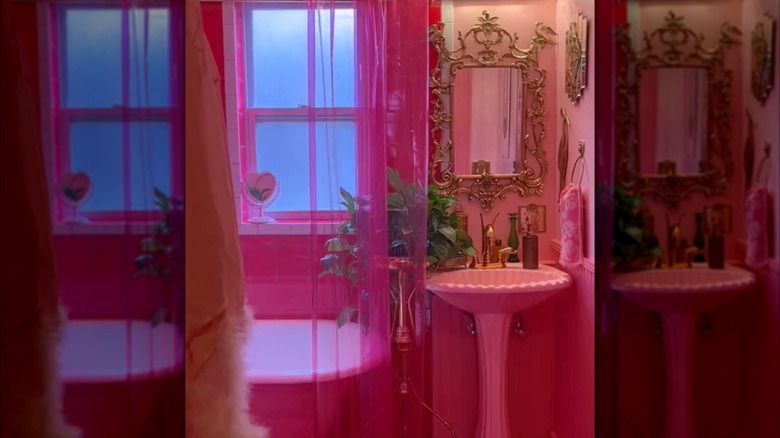
Saturated colors can also make for poor bathroom paint choices. For example, "Barbiecore" hot pink bathroom makeovers are really difficult to pull off. Bright and hot pink paint shades are energetic and exciting, but they can also be stress-inducing. This tends to make small pink rooms feel overwhelming rather than relaxing. Pink isn't the best choice, even if you're looking to create a fun, powder-room-style bathroom where you can spend hours indulging in beauty regimens. If your heart is set on a pink bathroom, choose more muted pink tones.
Yellow
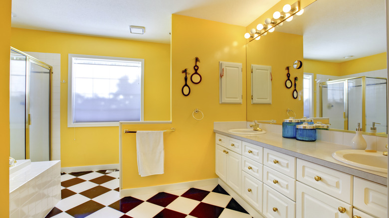
Yellow is a color that many associate with happiness, joy, and sunshine. However, yellow can also make people feel stressed out and agitated because it's so attention-grabbing (like caution signs!). In small spaces like bathrooms, where there are typically mirrors that reflect the wall colors, the use of yellow paint is not recommended. It's best to stick to small yellow accent pieces, like hand towels, soap dispensers, and tiles, to bring a bit of sunshine into a small bathroom. This is a way to have a yellow bathroom that isn't anxiety-inducing.
Bright orange
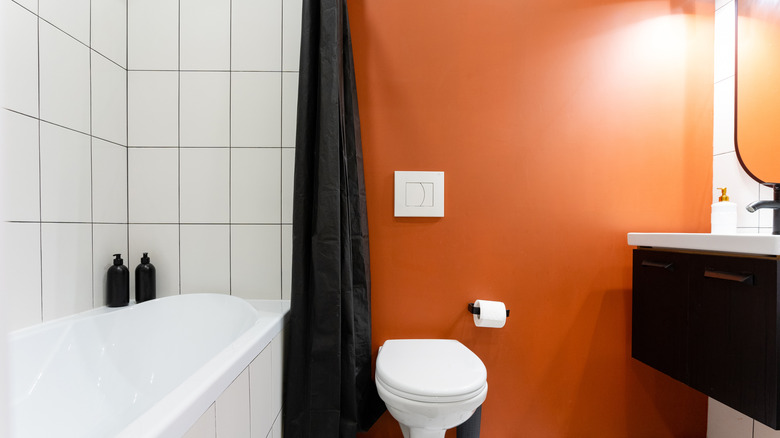
Orange is another one of these bright colors that can increase anxiety by literally increasing your heart rate. When used in tight spaces with mirrors, like bathrooms, orange paint is a lot to deal with. Bathrooms, which we tend to visit at all hours of the day, from early mornings to late nights, are better kept to neutral colors that won't affect your nervous system. If you really like orange, consider using terracotta tiles in your bathroom, which have a light orange tint and feel much calmer and earthier than bright paint.