12 Living Room Colors That Are Overrated In 2026
We may receive a commission on purchases made from links.
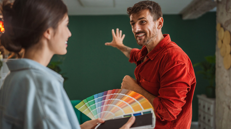
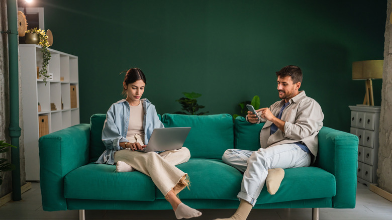
Selecting the right color for your living room is a crucial task to curate a welcoming home. Not only do you want your space to feel cozy and comfortable, but it should reflect your personality. Paint can completely change the energy of your space, for better or worse. You want to create a living room that feels like you, while still looking fresh and up-to-date. It's a delicate balance between exploring trends and ensuring a timeless space. Before you pick your color, make sure to avoid the shades that designers have dubbed overrated in 2026.
There are a few reasons why a color might have a rapid fall from grace. Sometimes, the internet falls in love with paint colors that aren't practical or appealing for long-term living. Rather than jumping on a trendy bandwagon, it's important to look ahead and determine whether certain hues will still look contemporary in the future. We've rounded up top tips from interior design pros to ensure you choose a color that will look beautiful now and later.
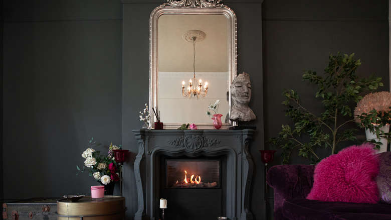
Dark burgundy and rich reds are on their way out
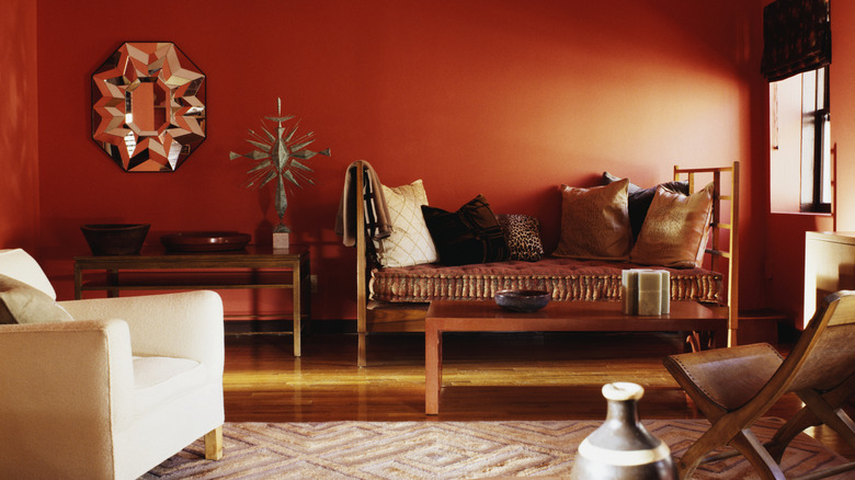
It's important for your living space to feel like a warm reprieve from the chaos of the outside world. By selecting a saturated shade of red, you are risking an unsettling, overly-dramatic environment. While burgundy is having a moment, don't fall for this moody approach too quickly. Interior designer and television host Shay Holland told Real Simple: "Home hardly feels like a sanctuary when the walls are screaming for attention. I don't recommend them in a living room or open concept. These shades will likely make a swift appearance on our paint colors going out of style in 2027. I always tell my clients to only paint the walls in a trending color if they honestly love it."
This warning goes beyond just burgundy and deep red. Most importantly, a color should bring you joy. If you are still drawn to red living rooms, but you don't want to select a color you might regret, try taking an earthier approach. Clay tones are currently trending, but they will also look totally timeless. Choose a reddish terracotta shade like Clay Red by Behr. For a brighter option, a brick red like Fire Cracker by Behr is also a beautiful hue.
Cool-toned beige doesn't have enough visual depth
Beige has had a tumultuous journey in and out of interior design trends. One minute it's considered dated and lackluster, and the next minute people are clamoring to douse their entire house in beige. There's one beige tone that you definitely want to stay away from if you want your home to look current. Tash Bradley, director of interior design at Lick, told IdealHome readers about the danger of cool-toned beige: "One colour direction I'm definitely seeing fall out of favour in living rooms is those very safe beiges that don't have much depth to them. In the colour consultations I do, people often tell me they chose them because they felt like the easiest option, but quite often they sit slightly grey and can end up draining the energy from a space."
This doesn't mean you can't use beige at all. There are several alternatives to flat, cold beige tones. The key is to select a beige color that is inspired by natural materials like linen. A vanilla-adjacent shade is a cozy alternative to bright white, and it certainly won't look dull. Kylie M. Interiors recently suggested Natural Linen by Sherwin-Williams on her interior design blog. She wrote: "For those used to the muted approach of gray, greige, and taupe, will seem incredibly beige. However, compare it to the traditional beiges of yesterday, and you'll see how massively subtle and freakin' gorgeous it is." Beyond beige and white, this creamy color is taking over interiors.
Don't go with stark white if you want a family-friendly living space
Countless designers agree that stark white should be avoided at all costs. Even in a crisp, minimalist interior, pure white can look clinical. Interior Designer Amy Switzer said in an interview with Real Simple: "Stark whites are losing their grip, too, [they're] too clinical and unforgiving in real-life settings such as family homes with children." Similarly, Thomas Vanderford of Studio Thomas James told the The Spruce: "For years, cool white was the backdrop for modern, minimalist aesthetics, providing a crisp and clean look. But this stark shade can feel clinical, particularly in a space meant for gathering and relaxing."
Similar to the shift towards warmer beige tones, warm whites are ideal for creating a more convivial, communal space. White Down by Benjamin Moore is one of their top recommended off-white colors, and is described as having a "feathery softness." This softness is key to creating a living space that feels peaceful rather than cold. For an even warmer option, consider a shade like Shell White from Sherwin-Williams with a hint of peach.
Jade green and dark teal should be reserved for very specific spaces
When it comes to modern living spaces, designer Valentina of House of Valentina doesn't see jade green as a universal choice for 2026. Although it may work for very specific spaces, it can look out of place in a modern living space. She explained on her YouTube channel: "I think I could see this in, let's say, an English cottage. I could see, maybe, a kitchen being painted in this color. I could see this color being used in more of a bohemian application, with someone who loves these jade colors and jewel tones. But could I see that in my own house anywhere? I've tried and tried to rack my brain. But thinking about ways to use it in my own home, I just don't see it happening. I really don't."
Rather than opting for a deep teal like jade, try leaning into warmer greens for an earthier look. Jade Romanesque by Benjamin Moore puts a cool, muted twist on your classic jade shade, making it the perfect alternative if you love the shade but want something more organic. You can also opt for an olive tone, such as Forest Floor by Benjamin Moore.
Sage green is another cool color that is ready to retire
Jade green isn't the only blue-toned green that is fading away in 2026. Tash Bradley, Director of Interior Design at Lick, told Homes & Gardens: "What I'm noticing, is a shift in the type of green people are choosing. Those cooler, blue-undertoned greens think sage (Green 02 by Lick) are starting to feel a little less popular. They can sometimes feel slightly flat or a bit cold, especially in living rooms where you want that sense of warmth and comfort."
Light green is still a stylish possibility, but stay away from sage that leans too blue. Behr offers a shade called Bitter Sage that is a warmer and earthier variation. For an even warmer option, consider Cooking Apple Green by Farrow & Ball. Pair these shades with natural wood furniture for a 2026-approved look that won't go out of style anytime soon. For more soft green ideas, these light green paint colors will inspire you.
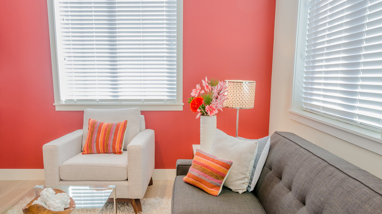
BarbieCore is officially out, and so is your bright pink living room
The Barbie movie didn't just have an influence in the fashion world; it also spurred some of the top interior design trends over the past few years. While Barbie pink was undoubtedly fun, it's proving to lack longevity in living spaces. Marianne Shillingford, creative director and colour expert at Dulux, was quoted in an article by IdealHome: "Pink has had an interesting evolution. The sugary, bubble-gum variants are slipping quietly away."
It's not a surprise that something so overtly playful can feel overwhelming in many spaces. If your goal is to curate a refined space, a shade like Barbie pink can cheapen your interior. However, it can be used in smaller doses in less high-traffic areas. Consider wallpaper that has a splash of bright pink, like this Veelike Cottage Pink Floral Wallpaper in a half-bathroom or small office. In your living room, focus on more neutral shades of pink like peach, clay pink, and rose. Pink Quartz by Behr is more exciting than beige, but still sophisticated.
Bright, bold, and garish shades are going out altogether
Beyond Barbie pink, similarly bright, neon hues are taking a back seat in favor of more organic variations. Helen Shaw, Director of Marketing at Benjamin Moore, told Homes & Gardens: "The new direction embraces 'quietly colorful' tones — subtle, comforting hues that feel fresh yet timeless." Color shouldn't be thrown out altogether, but rather, modified and muted to create a more enduring interior. You want your home to appear vibrant without being blinding.
Shaw suggested using neutrals with warm, colorful undertones to achieve a lively look that won't go out of style. She said: "Neutrals with pink and red undertones are becoming increasingly popular, bringing warmth and depth to bedrooms and living spaces. Plaster pinks and soft dusky rose shades add an earthy, grounded feel while providing a perfect foundation for layered décor and evolving personal style." Color-tinted neutrals are also a great way to liven up a neutral color scheme without going over the top.
Cold, icy grays are the opposite of warm and welcoming
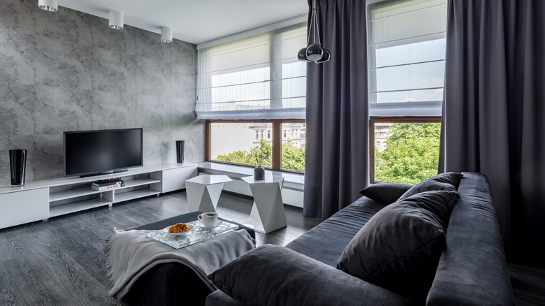
There is a noticeable shift towards warmer hues, and gray is another trend casualty. Interior Designer Amy Switzer is quoted in Real Simple, stating: "Cool, icy grays are officially out in 2026; their flat and sterile vibe is no longer cutting it in homes craving warmth and dimension." This echoes the same issue designers are having with stark white and cool-toned beige. Neutrals can work, but they should make your living room appear homey and restful rather than commercial.
While cool gray may be out, you can opt for stone-inspired shades for a more timeless look. For example, brown is currently a huge paint color trend – and you can easily find a chic shade that mixes gray with brown. Stone by Benjamin Moore is a perfect example of a neutral that still has visible depth. If you already have a gray interior, you can distract from the cool color by adding visible texture through linens and upholstery. A blend of bold, natural textures can make the gray appear less inhospitable.
Charcoal and near-black look claustrophobic, not dramatic
Over the past few years, homeowners have gotten more daring when it comes to experimenting with darker paint colors. Cocoa and charcoal living spaces were trending, but designers doubt that this daring shade will actually have staying power. Interior designer Jacqueline Wens explained the problem with charcoal in an interview with Veranda: "Usually ... the client will want to add drama to a room or to accentuate it. More often than not, the room ends up feeling unnecessarily heavy, uncomfortable, and automatically feels smaller than it is."
There are several ways to incorporate dark colors into your home, but dousing your living room in charcoal might be too bold. You can still create a moody space with more understated, enveloping tones. For example, Mouse's Back by Farrow & Ball is a mix of brown and gray with green undertones. This shade is hard to define, which is why it is perfect for a living space. Keep in mind that whatever shade you choose, it will look much darker on your walls than the paint swatch or sample.
Butter yellow will make your living room look dated
Butter yellow has been having a moment, but it might not last much longer. This shift might be surprising, considering the warm color palettes that are taking over. However, the polarizing nature of yellow has made homeowners hesitant to commit to the shade in large areas like living rooms. Last year, Zillow reported that the color yellow can turn off potential buyers. Interior designer Cathy Hobbs told Veranda: "Yellow and yellow-based tones are often hard to pair with other colors. These colors can also make a room feel old-fashioned or dated."
While it's true that yellow can be tricky, you can still use it if you're clever with your selection. Try finding your favorite shade of butter yellow, and then going a couple shades lighter. This will satisfy your yellow craving while creating a living space that has broader appeal. In general, this is a great trick for selecting a shade that brings you joy without accidentally designing a polarizing atmosphere.
Don't cover your entire living room in navy blue
Similar to charcoal, navy blue can be a bit overbearing in a living room. While the paint color itself isn't out of style, it should be used as an accent color rather than the main event. When discussing navy blue in an interview for Martha Stewart, Anabella Mainetti, CEO of Mainefactured, said: "These dramatic colors will always have a place — but on trim, doors, or cabinetry, rather than entire rooms."
Pops of navy blue can work beautifully — if you know what colors pair best with the deep hue. Clay pink and rose look stunning with navy blue accents, and this combination falls perfectly in line with current trends. If you prefer something darker, you can't go wrong with brown and blue. The key is to choose something warm and neutral-adjacent to make the navy blue pop. If you're still sold on the idea of a blue living room, these are the best blue paint shades for a dark and moody living room outside of your typical navy hue.
Bright chartreuse green is the opposite of relaxing
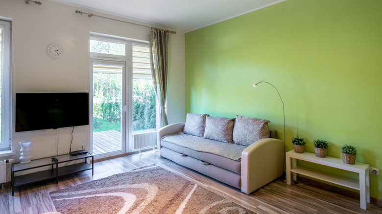
Chartreuse is a mix of yellow and green, sometimes described as an "acidic" shade. While playful pops of this color can work, you'll want to avoid it in your living room for several reasons. Livingetc's color expert, Amy Moorea Wong, elaborates: "Sour chartreuse ignites ideas and fills us with energy, which is just not what the living room is for. Living rooms should be places of relaxation and comfort, and it's simply the antithesis of that. Keep it in creative spaces, the study or the downstairs loo."
This designer perspective solidifies the idea that ultra-daring shades are better for smaller, low-traffic areas. When it comes to a yellow-green that can work for your living room, consider something more like Edamame by Sherwin-Williams. This medium green with yellow undertones is much more palatable than a bright chartreuse. For similar concepts, explore gorgeous green living room ideas you can recreate at home.