6 Kitchen Colors From The '60s We Can't Help But Love
Kitchens in the 1960s were anything but minimalistic and bland. Some of the most popular colors to decorate with for a 60s aesthetic include avocado green, turquoise, yellow, and carnation pink. Not only were these kitchens full of various colors, textures, and patterns, but the technology was booming, introducing life-changing appliances like dishwashers and built-in ovens. While our tech may now be more advanced, that doesn't mean we can't enjoy bold accent colors in one of the most used rooms of our homes. And luckily, there are tons of way to incorporate these hues into your 2026 kitchen without painting every wall.
Before we reached the era of all white, chrome, or black appliances, homeowners were showcasing brightly colored refrigerators, kitchen tables, and toasters. The big appliance companies like General Electric were producing a plethora of bold options. Even the small kitchen details, like backsplashes or dishware, were vibrant. Interior design trends may come and go, but the colors of the 1960s are something to cherish. If you want to add a retro pop to your home, look no further than the trends of this groovy decade.
Not only are these shades a statement on their own, but they are easy to pair with fun, funky patterns, also popular from that distinct era. For example, combine a bright color with a 60s pattern everyone had in their kitchen: checkerboard. If you want to go totally retro, add a budget-friendly laminate countertop as the cherry on top.
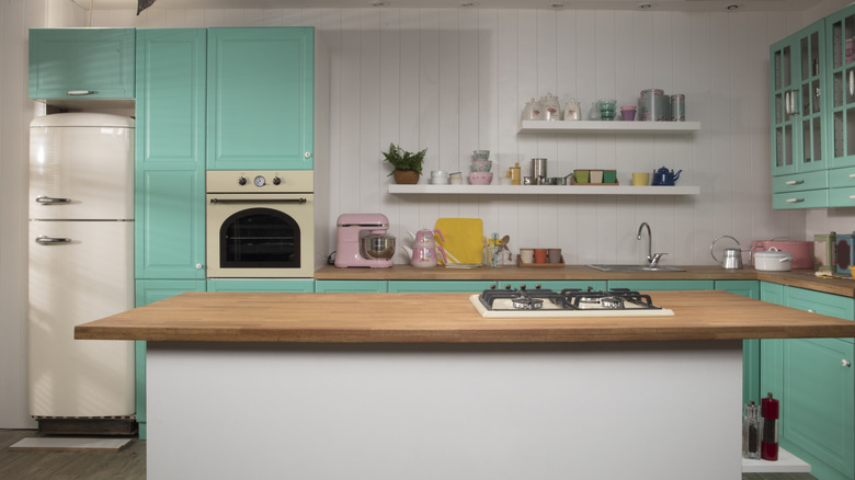
Avocado green
One of General Electric's most popular colors in the 1960s was the classic avocado green. The brand officially launched the shade "Avocado" in 1966, with many other companies following suit. Various manufacturers produced multiple products in this pastel shade of green, including blenders, knife sharpeners, fridges, ovens, and can openers.
Today, you can even find avocado Kitchenaids. But if you can't score a appliance in this particular retro shade in 2026, you can still utilize this calming color in your kitchen, whether it be for your cabinet doors, your backsplash tile, or your dish cloths.
Turquoise
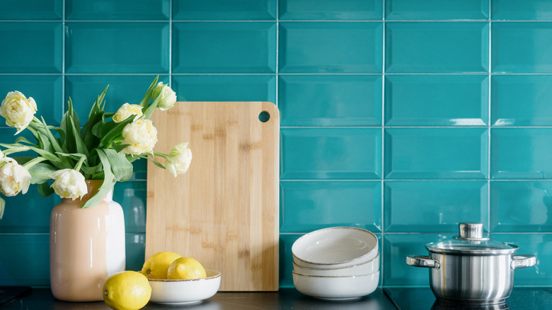
One bright option that started in the 1950s and made its way into the 1960s is the color turquoise. This bold blue was a fan favorite across the board for tiles and appliances. After World War II, American kitchens started incorporating more blue into their designs, and you could spot numerous fridges, ovens, range hoods, and dishwashers in the shade.
This vibrant color pairs perfectly with other bright accents like yellow or pink, and if you want to opt for a neutral, you can't go wrong with white as a complementary accent.
Golden yellow
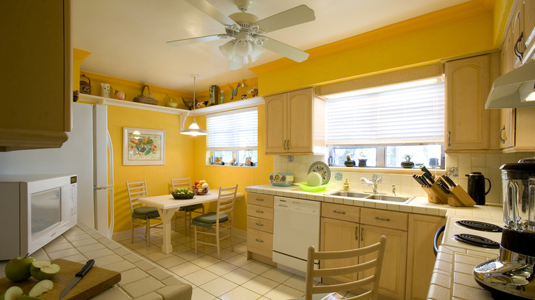
When you picture a 1960s kitchen, your brain probably conjures up an image of an all-yellow room. While a yellow-filled kitchen may not be everyone's cup of tea, this was a major interior design trend in the 1960s.
To incorporate this color in 2026, you can start small with yellow accents, like a flower vase, a butter dish, a toaster, or a simple rug. It's always wise to test out a new color in small proportions before making a big switch, like a wall re-paint or a new fridge. Back in the day, this buttery shade was often paired with blue as an accent color.
Bright red
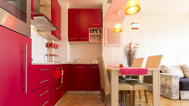
When we think of old diners, we picture bright red tables and chairs. Red was a common interior design choice for many in the 1960s, particularly when it came to kitchen furniture and appliances. Some kitchens had red and white tile backsplashes and walls, evoking vintage restaurant vibes. Online, you can find some nostalgic communities posting about their once-bright-red kitchens from the 1960s.
To try out this color in your kitchen, start with red accents like dish and glassware. You may want to stop there or go even further, adding an accent wall or finding a vintage red fridge.
Burnt orange and coppertone
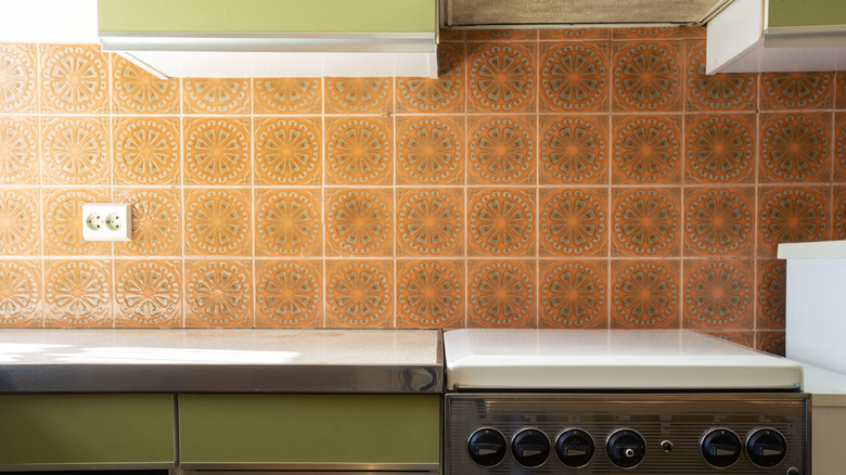
The 1960s welcomed both bright and warm tones into the home, like burnt orange and coppertone. While you may have spotted a few 1970s kitchens covered in these shades, they were also popular in the 1960s, with companies releasing many appliances with these accents. These colors were popular as a backsplash tile option, as well as for upper and lower cabinets.
If you want to incorporate these shades into your home without overwhelming the rest of your space, try pairing them with another pastel shade from that era: avocado green.
Carnation pink
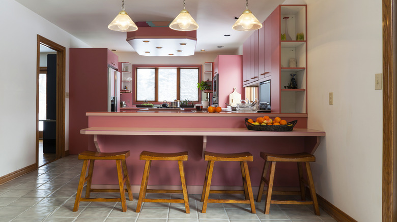
Who doesn't love an all pink kitchen? You've probably seen a number of online creators bringing their homes back to the 1960s with bold, bright pink interiors. Pink is the perfect shade for any fan of maximalism design, incorporating vibrant shades without making it overwhelming.
One easy way to bring a subtle hint of pink into your kitchen is with a patterned pink wallpaper. You can keep it on just one wall for a chic accent. Who knows, maybe you'll want to add even more.