Why Painting Your Kitchen Gray May Be A Huge Mistake
According to Apartment Therapy, painting your kitchen walls or cabinets can be a game-changer when it comes to updating your kitchen on a budget. The outlet took it up with realtors, who cautioned people not to go overboard when painting their cabinets since they are the most significant focal point in the room. Whether you're keeping up with the latest interior paint color trends, looking for a hue to inspire creativity, or searching for a color that will increase the value of your home, there's truly something for everyone.
As we've seen, paint colors can really change the feel of a space, and according to Forbes Advisor, you want to ensure that the cabinet paint color coordinates with the countertops or open shelving. Keep reading to see why painting your kitchen gray may be a huge mistake and what it would take to make the color work well in your space.
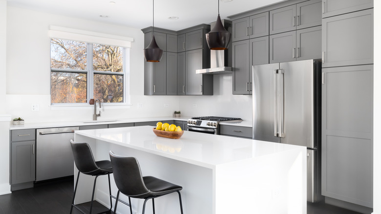
You might want to skip darker shades of gray
Gray has been incredibly trendy this year as a paint color in general, and we must admit, we've seen our fair share of gray kitchens. According to Gintaras Steponkus, the Marketing Manager at Solid Guides, you may want to avoid darker shades of gray and stick with light gray if you have a tiny or windowless kitchen. He told Best Life that darker shades of gray could "stimulate depression, loss, or inhospitality," which can be utterly depressing.
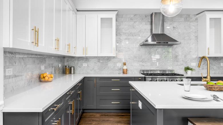
Not to say that it can't work. Kitchn talked to several interior designers to get advice for a happier kitchen and how a gray and white combination could work in the right space. "It's important to keep in mind how much natural light your space gets before deciding on paint colors. White and a rich, dark gray are my favorite colors to use in a kitchen," explained Elizabeth Lawson of Elizabeth Lawson Design. "We recently used Benjamin Moore Decorator's White on upper cabinets and Farrow & Ball Down Pipe on lower cabinets in a kitchen project, and it turned out so well. The dark gray really grounded the design, and the satin brass hardware that we used really popped against it, while white on the upper cabinets and walls kept the space feeling light and bright."