How To Choose The Right Grout Color For Your Tile
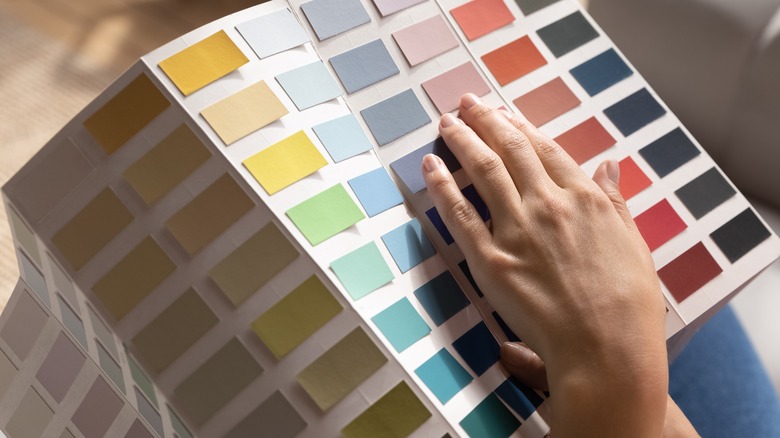
When you're considering using tile for a floor, backsplash, or wall, figuring out how to pick your grout color is often overlooked. But according to Foyr, the color scheme you choose will be influenced by several design factors, including the amount of contrast you hope to achieve and what type of overall color palette you're working with. Balance is key when choosing colors, so considering the space you're working with is important.
Hudson & Crane recommends using contrast in every interior design setting, even in monochromatic designs, because too much of one element can get boring fast. Adding interest and depth to certain rooms with grout can be the difference between your tile being plain and utilitarian or a major design feature. Working your grout color into the rest of your room will make your tile a part of your overall space. Choosing the right color doesn't have to be a headache if you keep some tips in mind.
Choose based on pattern
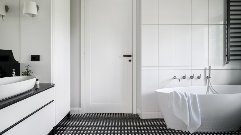
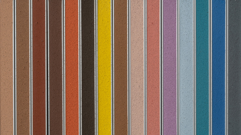
In some cases, it's nice not to see the shape of your tile, as the seams between tiles aren't part of the desired pattern. But some tiles are meant to be boldly outlined. Some types of tile patterns look better when they're highlighted. Complex tiles that aren't simple square or straight line layouts can really pop if you use contrasting grout with them. An example of this would be light-colored tile with dark grout or dark-colored tile with light grout.
Rok Hardware explains that the choice to use high contrast tile and grout combinations can change the look of your tile. You can use this technique to accentuate the pattern of a mosaic or to bring out some colors in an accent tile. This will make your tile layout pattern pop and draw the eye to the outlines of the tile, bringing out shapes in the design. If you're looking for a statement wall or a colorful backsplash, high-contrast tile and grout combinations will give it a boost.
Choose to fade grout lines
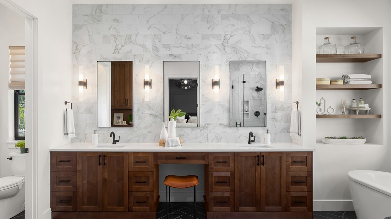
The opposite of creating contrast is to match your grout color fully. This will make the grout less noticeable and fade the tile layout pattern. For a softer look, blending the seams between tiles can make the edges look less sharp. Choosing a grout that is low or no contrast to your tile color will make the grout lines less noticeable for a smoother and more understated look.
Emily Henderson says that using a low contrast grout on lighter colored tile can give you a polished, contemporary look. Using dark tile with matching grout will make the tile color more rich and saturated-looking, allowing your other elements like light fixtures or flooring to pop. Using matching grout can make the texture of the tiles themselves more noticeable, rather than drawing your eye to the pattern the tile is laid out in, so this can be an excellent choice for natural stone tile elements.
Keep maintenance in mind
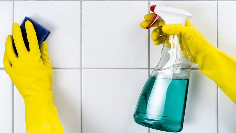
If a lower maintenance option is what you have in mind, there are a few tips to make your tile easy to clean and care for. Real Simple advises using white grout for easy cleaning because it can be scrubbed with bleach and other chemical cleaners that normally cause the color to fade in other grout colors. This is important, especially for bathrooms where mildew can build up on grout surfaces, and since it tends to be rough, it can be hard to remove.
The amount of exposed grout depends on the size of your tile, according to ATS Tiles & Bathrooms, so the size of your tile might affect what grout color you choose. If you plan to use bigger tiles, the amount of exposed grout is smaller, and sealing and cleaning it will be easier. Using a white grout in this situation will be the simplest choice.
Try bold colors
If you decide that a bright, bold design is important to you, using colored grout is an excellent way to go. Grout comes in more than just shades of white and gray these days. Choosing a bold color can really add to your tile design and make your surface stand out. According to Peachy the Magazine, visible grout lines are popular, and with all the choices in color, the grout can be an eye-catching and ornamental part of your tile design.
"Many homeowners who feel that bold patterns on tile might be a bit too much could find a nice middle ground in opting for colorful grout," Jerry DiFabrizio, president of Tampa Tile, told Real Simple. Adding color or metallic grout can give you a surprisingly different look with the same type of tile. Contrasting the color, which is choosing colors from the opposite sides of the color wheel, will give you the boldest pattern, drawing the eye to the tile layout.
Add some glam
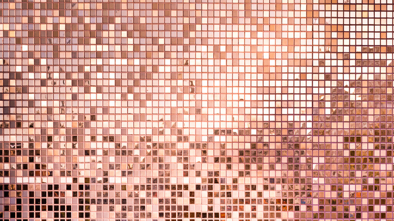
In addition to various new colors, grout also comes with new, shiny elements as well. Glitter grout is now available, and it's very sparkly. You can add glitter wherever you want to add grout, so there are many possibilities for warm, cool, or bold color grout. You can use glitter grout anywhere you would use regular grout, so the options are limited only to the amount of surface you want to tile.
You can buy pre-mixed glitter grout in many varieties and colors, but if your grout doesn't come with the glitter/pigment option you want, Tiles Direct points out that you can add your own sparkle to any existing grout. If budget is your concern, mixing your own will save you money. If you use glitter grout as a design element, it can be paired with any tile type, although it will look best with a shiny, reflective tile.
Choose the right color for your space
In small spaces, busy, fussy patterns can be overwhelming, while in larger ones, tiny shapes can get lost. Grout can help make your space feel bigger or smaller depending on color, so choosing the right combination matters. Jeffrey Court advises that for a more open, expansive look, blending tile lines with the color of the tile is best. This can make a room feel larger.
Conversely, high-contrast, bold grout can bring out the pattern in your tile and make a space look busier. Complementary colored grout — one that is a shade or two different from your tile color — can give you a middle-of-the-road, soft, and textured look. Keeping this in mind when you choose a tile color for a tiny bathroom shower or a large subway tile wall in a kitchen can help you figure out how the grout and tile will look in their intended space.
Visualize your tile and grout combo

Sometimes looking at a pile of samples or holding up a color swatch doesn't give you a good idea of your intended color comb once installed. Luckily, there are tools to help you with this that can help you see what your design looks like in your room. A visualizer tool, available from Tile America will allow you to virtually tile your surface with the grout and tile you want before making a decision.
You can upload a picture of your room or use a template to see what your tile and grout color will look like before you buy. Although this tool won't do everything a live sample can — like reflect the light in the space you're tiling, for instance — it can give you a broader idea of how your tiling project will look once it's complete. Since it's free, there's no harm in trying it out in addition to using samples or swatches.
Weigh the type of your tile against your grout
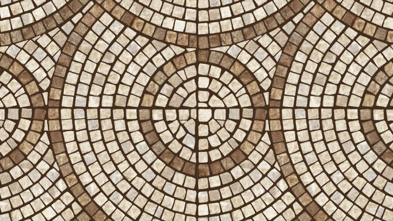
The type of tile you're using will affect the grout color you choose. Texture and intended style are definitely things to consider when picking out a grout shade because the amount of contrast will help shape the overall look of your tile. If you're decorating with natural stone, for instance, Sefa Stone points out that you are likely looking for a natural feel to your surface. Choosing a neutral grout can add to your nature-inspired design, blending the edges of your tiles and drawing your eye to the texture of the surface.
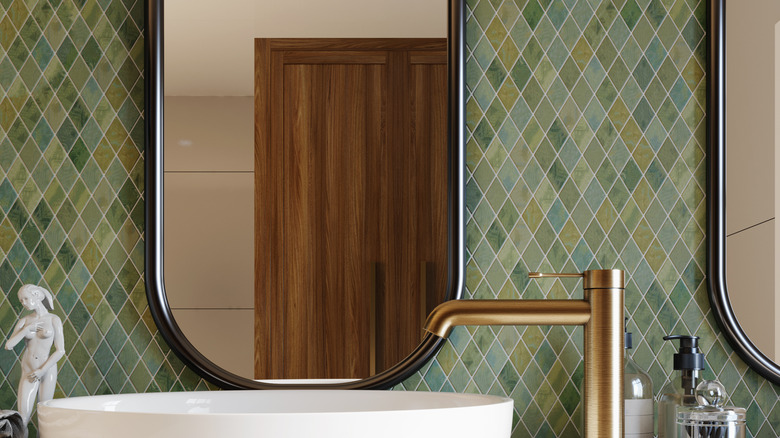
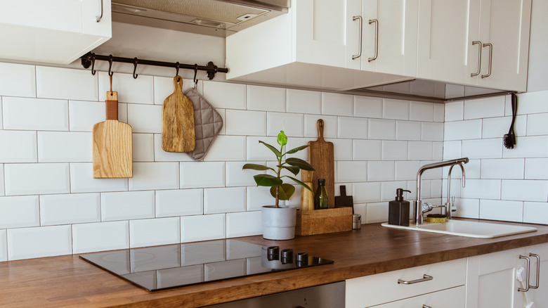
When using glass mosaic tiles, "no color" translucent epoxy grout is recommended by MEC Artworks because it will blend with the colors of the tiles and won't interfere with the design. It blends into the background. Since it's not a problem of utility, there is no hard and fast set of rules for choosing grout colors, but it can be helpful to know what parameters the pros use to figure out what colors will work best.
Take installation into consideration
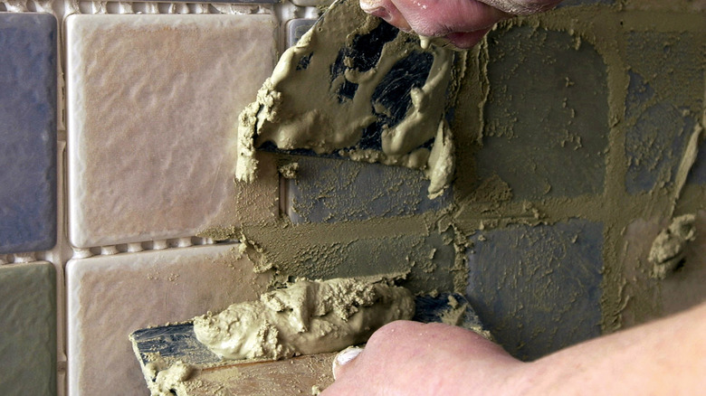
Grout application can be tricky, and the color can affect the application process more than you might expect. The higher the contrast, the more you will see imperfections. High contrast grout will highlight any unevenness, mistakes, and small, awkward tile cuts. Griffin Design Source says an expert installer can minimize these flaws and bring out the beauty of your tile. But if you're doing a first-time DIY installation, you should consider choosing a grout closer to your tile's color.
This will hide small imperfections more efficiently and blend awkward lines. It's important to note that if you decide on high contrast grout, your tile job will likely take longer, as it will require more work to make all the seams look clean and straight. If you're just beginning to learn about tiling, it's recommended to get creative with the tile color or pattern, but allow the grout to be a neutral background.
Consider custom mixing
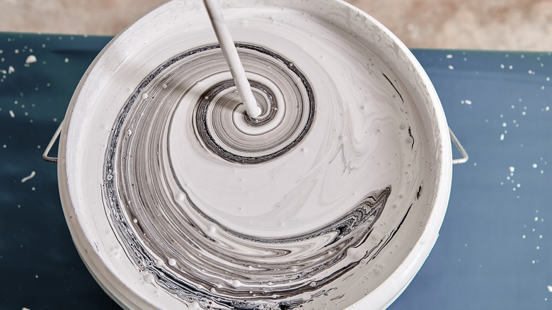
If you have specific colors you want to match to your overall room design, or if you have a tile color that you just can't find a matching grout for, you can mix custom grout colors for specific applications. From mosaic art tile to a backsplash that needs to match your countertops, mixing your own custom color using tint is a good way to get exactly what you want.
Mixing your own color is actually pretty simple. Just add some acrylic water-based interior paint in the color of your choice into the grout, says Collective Gen. Start with a small amount of paint and add more as you go. It's simple to make the color darker, but once you've added too much paint, it's difficult to go the other way. Also, make sure to mix enough for your whole job, as matching the color of a custom-mixed grout will be difficult.
Weighing utility against design
Choosing a tile color should involve a fair amount of assessment of how you will be using the space you're tiling. Sometimes, hiding mistakes is the most important element of your grout. Sometimes, ease of use and cleaning is the most important. Sometimes, the look is your ultimate decisive factor. For instance, choosing a tile color that doesn't show dirt as much as another color might be a practical choice for a kitchen floor.
Going with a shade like gray or tan — which will hide stains better — is a good choice for this application, says Love Remodeled. If you're going for a bold accent piece and don't mind a little extra elbow grease, go for bright white, sparkly green, or whatever color makes the best statement. Thinking through which practical elements are most important to you can help you choose the best color for your project.
Choose a matching color to highlight veins in natural stone
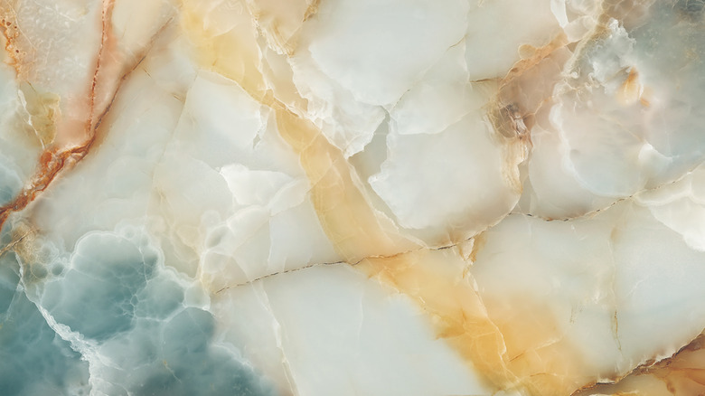
If you've got marble tile for a shower wall or marble countertops, you can use a grout color that will make your marble's unique pattern pop. Choosing a grout color similar to the color of the veins can help draw the eye to the natural pattern of the marble. Experimenting with metallics or different tints can really elevate the look and add a luxe design element to your overall room.
Gambric recommends buying various grout samples to get the best match to your marble surface. Using a bright white to match the lightest color visible in your marble will draw the eye to the stone and showcase its natural beauty. Using gray or off-white will soften the look of the marble. Using a darker gray will bring out lowlights in the stone and make the lighter colors pop. If you have some beautiful, veiny marble that needs to be showcased, picking the right shade of grout can help you accomplish that.
Don't leave grout till the last minute
Renovations can be exhausting, and all the choices can seem overwhelming. By the time you've picked a contractor, chosen paint, tiles, and everything else, the grout color can often get short shrift. But grout color can completely change the look of your tile, so you don't want to throw your hands in the air and give up before you choose it. Think of grout and tile as a combination, and begin looking at grout colors alongside your tile so that your decision will be based on the overall look and not just on a last-minute whim.
According to MyHome Design & Remodeling, getting overwhelmed with choices is a key reason people tend to overlook the impact grout color can have on how the tile looks when installed. Keeping in mind all the factors affecting this choice from the beginning will give you much better results.
Choose a color combination that fits your sensibilities
With all the many things to consider when picking out a grout-tile combination, your own personal sense of style can get lost in the process. You should never feel pressured to make a color choice without first weighing your own preferences. You should choose a grout and tile combo that fits your aesthetic and personality, and makes you feel comfortable.
The Tile Doctor advises you to consider your own taste when picking colors because it's a big choice. Knowing all the possible combinations, color options, and reasons that these things might matter is important, but since design is really a matter of taste, knowing what you like is the ultimate factor when making a decision. Your tile will hopefully last years if not decades, so picking something you don't like will annoy you for a long while. You're the one who will be living with it, so make sure that your color combo feels good for you!