10 Throwback Colors That You'll Want To Paint Your Walls In
Those who are part of Generation X probably never thought the paint colors they grew up with in the '70s, such as green and yellow, would make a comeback. Well, everything that goes around eventually comes back around, per Faith Floors & More. However, they've returned in much more sophisticated ways. For example, homeowners are painting their kitchen cabinets a forest green to accomplish a warm and outdoorsy aesthetic instead of installing an avocado green bathtub in their bathroom.
So if you loved these paint colors as a child, you could introduce them into your residence now as a homeowner. They don't have to give off a vintage vibe, as you can use different shades in different materials and spaces. Kitchen and bathroom tiles, furniture, and other design materials have come a long way and are turning vintage colors into something sophisticated and capable of elevating your space. Check out the 10 throwback colors we've found that you can paint your walls while also complementing your modern, updated home aesthetic.
1. Light pink
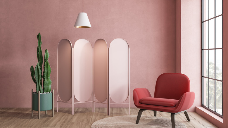
Shades of light pink have been making a comeback, as it has evolved to accomplish not just cute and quirky looks but also sophisticated and elevated designs. In addition, light pink can serve as a neutral hue and be painted on any room's walls. Or, it can be used as a contrast color; if your home is white, a light pink accent wall will create a welcoming entryway.
2. Bright red
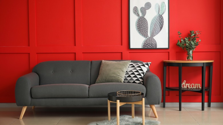
Bright red is a dramatic color that you can tone down with neutrals such as gray, black, and wood tones. This hue can be a stunning visual in your living room or bathroom, especially with plenty of natural light to help keep the area upbeat. It would be hard to introduce any other colors into a red room, so ensure this tint is the only one you want to see if you plan on painting your walls with it. A bathroom with bright red walls and white subway tile would be a beautiful combination.
3. Mustard yellow
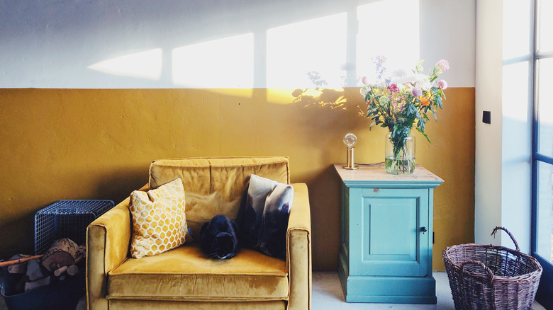
Mustard yellow is also following current design trends, mostly as an accent wall. This color may be too overpowering to cover an entire room, but when used to create an accent wall or focal point, it can have a positive impact without being too bright. It will pair well with white walls and can mainly be used in homes that are aiming to be eclectic.
4. Light yellow
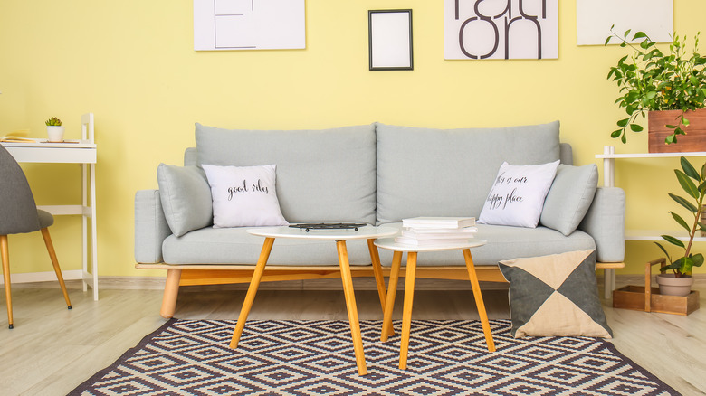
A light yellow is also a great option that's come back to bring cheer into our spaces. If you enjoy darker accents in your home, such as black artwork and gray furnishings, light yellow paint color can complement them. This will not only introduce necessary contrast but will also brighten up a space significantly, especially with enough natural lighting.
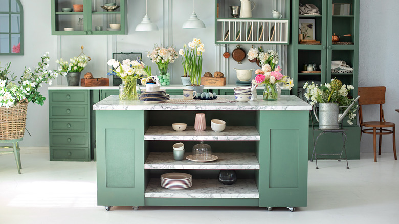
5. Pale green
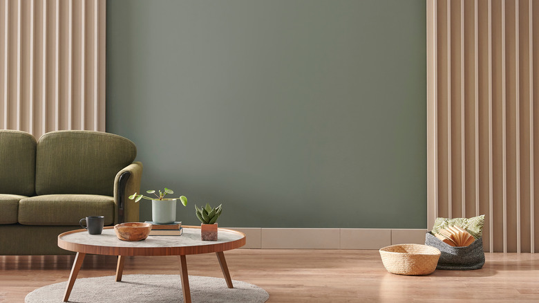
Pale green is a great shade to create a soothing environment. It pairs well with warm wood tones and makes it a great hue if you want a minimalistic design with just a bit of color. Since it's a lighter hue, darker shades of green also go along with it to create contrast. You could also pair this color well with tones of gray for an industrial look.
6. Mint green
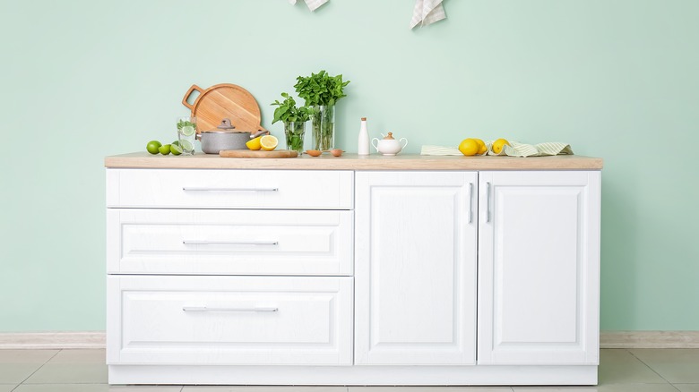
Mint green has been reintroduced as a bright and fresh color that is perfect for neutral furnishings to sit against. In addition, it's cool-toned, meaning that cool-tinted wood and colors will complement it well. This shade of green is also perfect for creating a monochromatic scheme, such as a living room with mint green walls and a dark green Cheshire sofa that will work with the playfulness of the wall color.
7. Teal
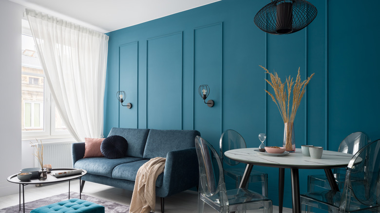
This lovely shade of blue is back to add a soft and cool touch to your space. Unlike before, this hue can now be used in modern spaces and as a background for standout pieces such as marble tables or uniquely shaped light fixtures. This color also has a touch of green and is light enough to complement other shades of blue in the space and can be used to create a monochromatic design.
8. Navy blue
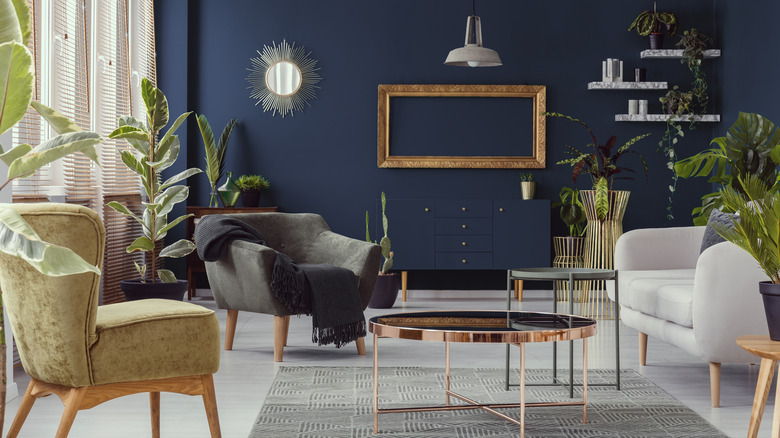
Navy blue is a deep, cool color that you can use to either paint an entire room or apply as an accent wall. It's a traditional shade that always seems to make its way back to popular color schemes and can help ensure your home never appears outdated. It's a tint that has always looked great with gold and silver, but it can also look beautiful when matched with cool wood tones.
9. Light beige
We've probably all walked into an old, all-light beige bathroom (from the floor tile to the bathtub) before and remember being horrified by the outdated yet cozy look. However, the soft feel is being brought back as a beautiful neutral color that goes along well with contemporary, minimalistic, and Scandinavian designs. It pairs well with other neutrals and can be contrasted with darker woods or cool-toned colors.
10. Warm white
For the past years, homeowners have mostly been using bright white to paint their houses. It's been used to enlarge their home's appearance while creating a bright atmosphere. However, designers have now brought back warm white, as it can have the same effect while also creating a softer look that furniture can contrast against. Painting a room in a warm white may be easier, as it's already an inviting color and not as sterile as bright white.