The Property Brothers Reveal Two Colors You Should Never Paint Your Walls

Although it may not seem like a big deal, the colors you choose to paint your walls can have a significant effect on an area and the way it makes you feel. For example, Entrepreneur The Arts explains that when it comes to businesses, the colors you choose to paint the walls prove to affect a store's success. Specific colors can influence people to feel a physical temperature inside an area and affect their mood. For instance, green corresponds with a sense of calmness and productivity, while yellow inspires a sense of creativity.
Despite the positive effects colors can have in a space, when it comes to choosing colors for a comforting and pleasant feel within your home, there are a couple of colors Jonathan and Drew Scott from HGTV's "Property Brothers" recommend avoiding to make your home more desirable (per Realtor). Let's take a look at these colors and possible alternatives.
Mellow yellow
One color that the Property Brothers recommend painting over is the iconic mellow yellow commonly used in many living spaces in older homes. This specific shade of yellow is similar to the color of butter and can make a space look dated. Therefore, if you want to improve or sell your home, they recommend getting rid of your yellow walls (per Realtor).
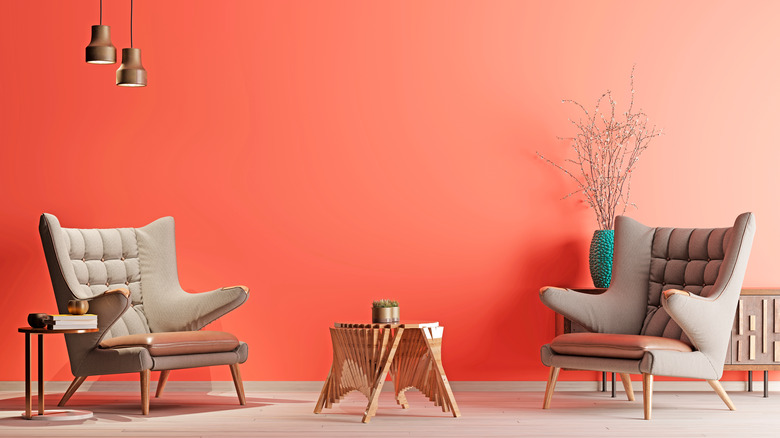
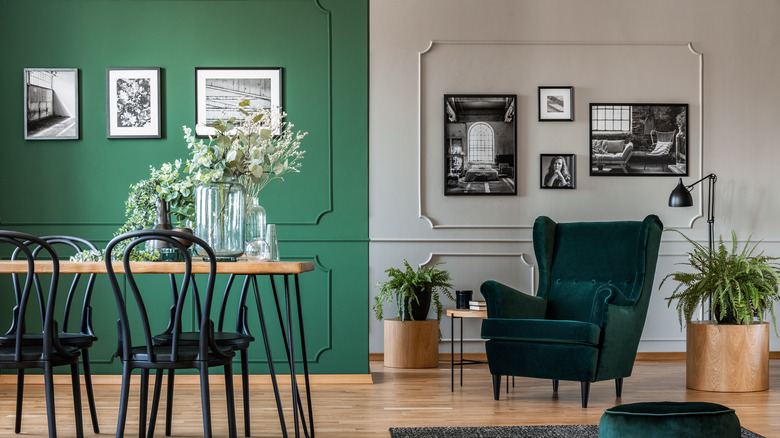
My Move notes that some trending colors you can use to replace your yellow walls include a classic blue or grey, a bright and lively coral, a light peach, or even a variety of greens. Using blue or grey can have a relaxing effect on the area while supporting a modern vibe that can match nearly any style you wish to incorporate. Although coral can be a relatively bright and vibrant color, it is perfect for tropical or coastal homes with a relaxing aura. A light peach is almost like a muted version of coral but is still an uplifting color with a soothing undertone. Finally, green can add a unique touch of character to your home while adding a sense of tranquility to the area.
Angry red
Commonly seen in '90s homes, the harsh red displayed on Realtor is another color that should be cut from your space. Jonathan and Drew Scott further explain that this shade of red was commonly used in the dining areas but is now seen as unsettling in modern homes due to its vibrance and resemblance to blood red.
Some more favorable and modern dining room colors you can choose from include light grey or beige, muted greens, rosy or dusty pink, or even crisp white. Living Cozy explains that exchanging your angry red dining room for a light grey or beige can add elegance to the area while still incorporating the desired element of warmth and coziness. Green is also an excellent choice that is more versatile and stands out for an eye-catching effect. Lighter shades of pink can also perfectly fit a dining room setting and add an element of happiness and comfort to the area. White, on the other hand, may be considered a more plain color but is a natural way to light up a room that you will never have to worry about looking outdated.