The Best Bedroom Color For A Warm And Inviting Vibe
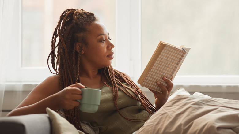
Your bedroom should be the place in your home where you feel the most comfortable, and how you design it all depends on the vibe you're going for. If you desire a cold and dark vibe, you would probably incorporate shades of black and cool-toned blues and greens. Those who feel nostalgic and want a retro vibe would probably fill their room with bright colors and neon. But for those looking for a warm and inviting vibe — you'll need specific paint colors to execute that.
If you're able to correctly incorporate warm colors into your bedroom, you can create a space that's comfortable and soothing, but also energetic and cheerful, per StoneGable. This isn't just executed through paint colors, though, but also through bedding, pillows, rugs, art, among other items. There are various ways you can turn your bedroom into the relaxing and warm surroundings you've always wanted. So, let's take a look at the best bedroom color that will help you succeed in your design endeavor.
Creamy whites
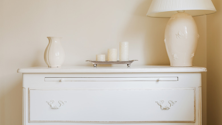
According to Improovy, Benjamin Moore's White Dove is the way to go if you're looking to turn your room into a cozy space that's warm and inviting. As noted, the color is creamy white with warm gray undertones that can sometimes look a bit yellow when natural light hits it a certain way. This is also a great color to make a small room look bigger due to its brightness, and would look great for those who have flooring with warm tones.
One tip is to match this paint color with flat ceilings and trim that's painted with a white semi-gloss. Benjamin Moore says gray, beige, and deep reds complement this color. If you're hoping to create a monochromatic design, you can use different shades of it, such as April Showers, Camouflage, Ivy Lane, Hiking Path, Nature's Reflection, and Avocado.
If this color isn't your cup of tea, there are similar colors to choose from, such as Oxford White, Steam, Swiss Coffee, Vanilla Milkshake from Benjamin Moore, and, of course, other paint manufacturers have their own color offerings in the same creamy-white range as well.
Off-white

In its review of Origami White by Sherwin-Williams, KnockOffDecor.com notes an important feature of this color is its Light Reflective Value, or LRV, which refers to the amount of light that reflects off the paint on a scale of 0% (black) to 100% (pure white) (via Cobb Brothers Company).
In Origami White's case, the LRV is 76%, which, as the DIY blog explains, means it can be used as a neutral or base and is an easy color to match with different furniture pieces. This color can be beneficial to those who love bright white walls but don't want their rooms to look cold. Origami White is a good option if you want something in the middle of creamy and bright white. It's definitely a color that is reminiscent of your favorite fall sweater.
Sherwin-Williams says this color is complemented well by shades of beige and brown and is in their Top 50 Colors collection. There are quite a few similar colors from Sherwin-Williams if you're looking for a different tone, such as Sanctuary, Heron Plume, Aesthetic White, Zurich White, and Windfresh White — all of which can again provide you with a color guide when comparison-shopping paints from different manufacturers.