The Best Bedding Color If You Have A Green Bedroom
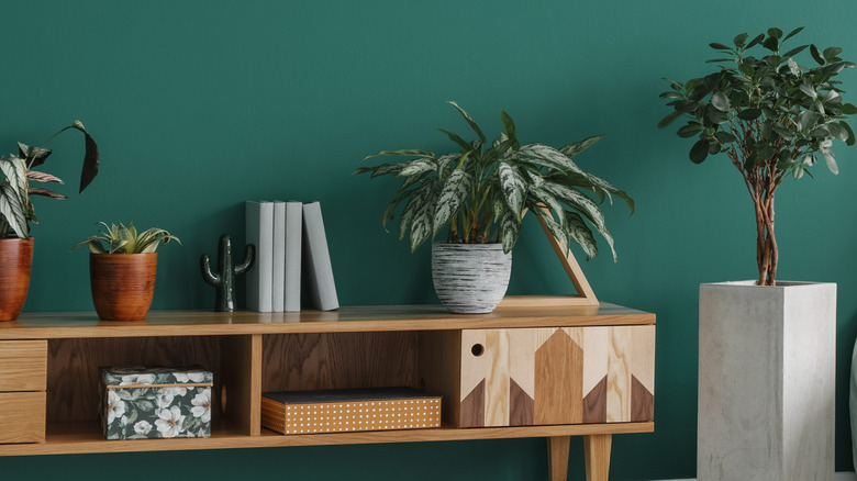
Green has raised itself from simply being trendy to being a home décor and design staple, used as an accent color, complimentary tone, or entire room theme. Green as a color is both energizing and relaxing, representing sentiments and moods like hope, safety, prosperity, and growth, according to Colors Explained. It is also a very natural, earthy tone while still adaptable to various aesthetics.
With all these positive traits, green makes a wonderful paint color for bedrooms. Brighter, more yellow-toned greens can act as an early morning energy boost, whereas paler, earthier greens can help create a sense of calm before bed. In addition, green is a very versatile color, pairing wonderfully with neutrals like white, cream, ivory, etc. However, having a green bedroom presents a great opportunity for color mixing and matching with your bedding, which can bring out the best of the classic and timeless paint color.
Soft green and purple
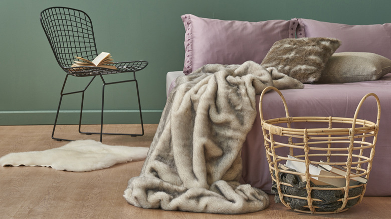
Green is a combination of blue and yellow, mixed in various ratios to create different tones and shades. Matching greens with colors that share their undertones is a nearly foolproof method. Matching complementary colors is also a great idea, but you don't have to just stick to the shade's direct opposite. Instead, Lushome recommends looking for the color's square color scheme, which for green includes mauve pinks and purples, the latter of which shares a blue undertone.
To keep the shades from clashing too much, choose green paint and purple bedding that have similar saturation levels and undertones. For example, don't choose a lime green and bright, pink-toned purple. Instead, pair a softer sage green with a similarly herby lavender purple. Tie it in with earthy neutrals like bamboo, neutral wood tones, creams, ivories, etc. Other shades in the square color scheme include orange and pinks, so play around with adding softer hues of those as well.
Pink and green
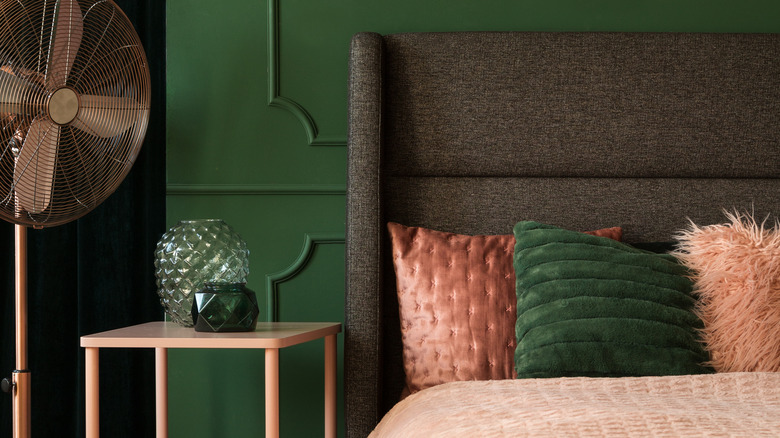
Consider opting for bold and rich green paint and an equally bold, vibrant pink for a bolder approach. According to The Sleep Judge, richer, blue-toned greens sit opposite bold, warm tones on the color wheel, like red-orange. So while those two hues can be a bit hard to work with, you can soften the red's impact by making it pink. Light pink is also fantastic.
You can make your room feel a little art deco inspired with a deep blue-green paint paired with a flamingo pink bedding, for example, coupled with gold tones and other characteristic accents. You can also soften your pink to a pastel shade, letting green be the star of the show while pink acts as a neutralizer. For a more romantic, earthy look and feel, incorporate lots of darker, rosier pinks with a rich moss green, Color Palettes recommends. Children's rooms can be made incredibly whimsical with lots of bright, flatter pinks and greens, too.