Tips For Incorporating Brown Into Your Home Decor
According to Pigments through the Ages, brown is derived from the Old English term brún, which generally refers to dark or dusky hues. And, of course, before the advent of modern housecleaning products, painting things deep brown was a centuries-old tradition that helped hide burn marks and dirt. Along with other consciousness-raising movements in the '70s, the color brown came out along with other liberation movements, and briefly, you'd see it as an option in fudge-painted refrigerators, stoves, and other appliances.
More recently, brown has been associated with the American Old West in leather and adobe, and now, after centuries of only being considered as an accent or an afterthought, this hue is having a moment all its own. Maybe it's the rise of café culture, but these days when people think of brown, they're no longer dwelling on dingy gray browns or yellowing hues of yesteryear. Now, the color world is abuzz with shades inspired by mochas, lattes, and gelato. Here are a few tips for incorporating brown into your home décor.
Go brunette
What is brown, exactly? The hue is not just a single color in a crayon box, and its use generates a variety of emotional responses in humans. Unlike gray, which transmits a chilly, overcast, and industrial vibe, brown is the color of earth and trees. And according to an assortment of designers interviewed by Vogue, it gets a bad rap for being misused in its most muted and drab hues when there's nearly an endless variety of options to choose from otherwise. Consider ivory, for example. To the naked eye, it's white. But placed near a truly white object, you'll see that ivory has deep warm brown undertones.
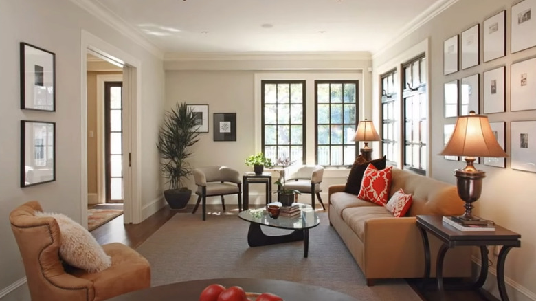
Although brown has traditionally been considered reflective of more masculine color palettes and tastes, it may be time to reconsider that shopworn notion. In the light and breezy showroom above, you can see how well colors like white and light gray offset the heaviness that this hue can sometimes bring into a room. Likewise, prints on the chairs (perhaps matched by a center couch pillow) or on throw pillows pull everything together for a cohesive look that's anything but dreary.
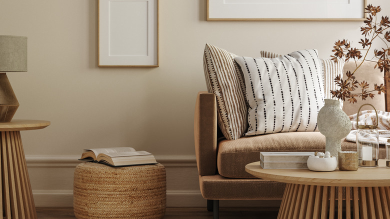
Harmonious browns
Color contrasts don't need to be stark to be appealing. Here, Manchester Tan is the wall paint of choice and envelops the room in autumnal serenity (via Benjamin Moore). The palomino furniture lends rustic charm to the otherwise muted color choices that involve darker accents in the end tables, planter, and windowsill treatments. The end result is as rich and satisfying as tucking into a warm slice of apple pie served á la mode.
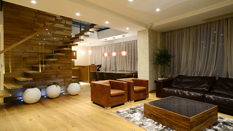
While remodeling, many people forget that brown is so much more than a hue or a mood; it actually calls texture more to mind than almost any other color in the rainbow because it's the shade of most sand and many stones. It's also a color associated with bricks and a wide assortment of woods. On that note, the design team at Acupanel advises that wood can not only be used to add opulent decoration to walls and floors; these days, the anachronistic mid-century concept of wood paneling is making a 21st-century comeback through a variety of wood panel options that add depth and beauty while improving a room's acoustic ambiance.
Finally, leather is your friend when it comes to designing a space with this color, according to Element Designs. Distressed or brand-new, brown appears in an endless variety of tones and textures that show up not only in furniture but in flooring and walls, accents for drawers, cabinets, and elsewhere.