5 Creative Ways To Bring The Two-Toned Wall Trend Into Your Home
Two-tone walls are the new accent wall — a way to enhance a room a step beyond a single color of paint. Daily Design News explains that in this treatment, it's common to divide the space horizontally, with a darker shade on the lower portion and a light tone above. According to the outlet, this allows furniture pieces a contrasting background while maintaining some brightness in the room. They also create interest and change the perception of space, such as elongating a hallway or visually raising a low ceiling. Additionally, they can showcase furniture and architectural details, like a fireplace, or mimic them, as in the modern and minimal interpretation of a classic chair rail. However, blogger Interior Notes mentions that two-tone walls have the ring of nostalgic pubs or school classrooms for her. And she feels they're ideal for introducing just the right amount of color rather than overwhelming a space with entire walls of it.
As far as the skills or materials needed, determining and recording the demarcation line and some painter's tape are the only extras required beyond the customary painting process, per Lincoln Painting Pros — happily, two-tone walls won't demand double the work. To that end, the unique and personal result is a great return for the effort and expense. We take a look at the many creative and attractive ways to use them below.
Highlight artwork
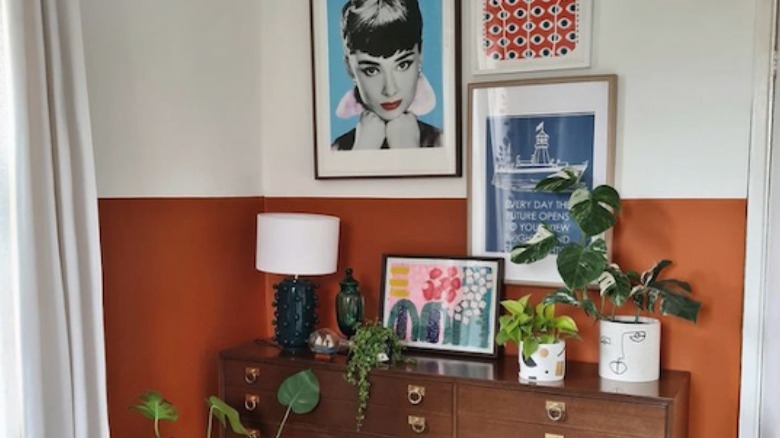
When it comes to landing on the perfect paint color to showcase artwork, Saatchi Art suggests a few ideas. First, they note that choosing a color similar to one that appears in a piece's background can create a cohesive and clean display; the foreground image will pop as the background blends with its twin wall color. Second, they explain that selecting paint in a complementary hue (a shade opposite on the color wheel) to the primary hue in the artwork will make the imagery seem more vibrant. A red photograph on a green wall would buzz, for example. And finally, the art purveyor recommends a neutral paint shade as the fail-safe choice; light, for a minimal gallery aesthetic and to allow the piece to truly be the focal point, and dark for bright and neon art. If you're hesitant to make your space too dark, they suggest a single accent wall to display the pieces on.
Hanging artwork on a two-tone wall combines the best of the options. A piece better suited for a neutral backdrop can be accommodated, while art that wows on a colorful wall can shine too. In the above vignette, a red and black graphic print relates to the lower section and carries the color up the wall visually. Additionally, the intersecting artwork connects the color fields and the gallery wall composition to the sideboard and objects below. A bold wall treatment becomes a statement piece itself.
Showcase or disguise architectural features
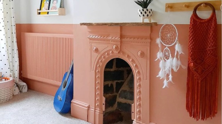
In the home of Victorian Cheshire Terrace, this part ivory and part salmon paint application traces every wall in a girl's bedroom. The charming fireplace is made a feature and also quietly absorbed at the same time, while the small wooden mantle caps it off and affords a spot for plants and special objects. Similarly, a graphite stripe might disguise a cast-iron wood stove in a family room, or a line of built-in shelving could continue as paint, creating cohesion in the design.
For example, Renovating Retro covered Ikea shelves in the same blush paint that ran around the top of her walls; the bottom cabinetry and lower portion are a spring shade of green. The effect is joyous and unique and it makes the units appear intentional without creating busyness. 21 Oak says a complementary color pairing is adventurous since the usual mix is any color safely combined with some tone of white.
Additionally, paint is a great concealer of damage and imperfections, and can be a good way to hide repairs as well as work positively with the imbalance of features frequently seen in period homes.
Create a multi-functional space
Flexible and multi-purpose spaces help us get the most out of our homes, and we've become crafty at implementing floor plans and finding furniture pieces that provide enhanced functionality. A dining room china cabinet also holds work and school supplies, a closet is a meditation space, and the garage morphs into a gym, for example. Designer Zoe Feldman told the Washington Post, "We are asking so much of our homes, and we are living in our homes in such a harder and deeper way." Two-tone walls can be a method for transforming a room's purpose instantly, without rearranging or adding square footage.
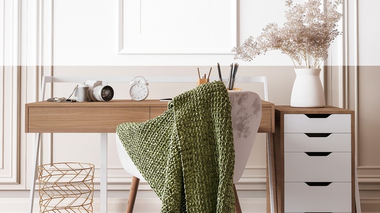
Let's imagine the home office above shares space with a bedroom; a dual color scheme allows a restful, bedroom-appropriate taupe as well as a bright white well suited for focusing on work-from-home duties. The application is also an ideal solution for children coexisting in a bedroom together, permitting each to pick a hue. By the same token, a large living and dining area might be complemented by two colors — one that coordinates with the upholstery fabrics and another that brings out the richness of wood dining furniture. Wherever two energies present themselves in one space, consider a two-tone wall as a way to appease them both.
Match or contrast the furniture
Per Design Daily News, two-tone walls offer a highlighting contrast for furniture. For that reason, Home with Rina painted the bottom of her ivory walls burnt orange and then amped up the bold color by placing a teal velvet sofa against it. Orange accent pillows and blue-green elsewhere in the room tether the colors together. While it's a strong scheme, the lightness and neutrality of the ivory portion is a calming palate cleanser and keeps the space from feeling too dark. That's the beauty in this treatment — there is always a second color to either lighten, brighten, deepen, or soothe.
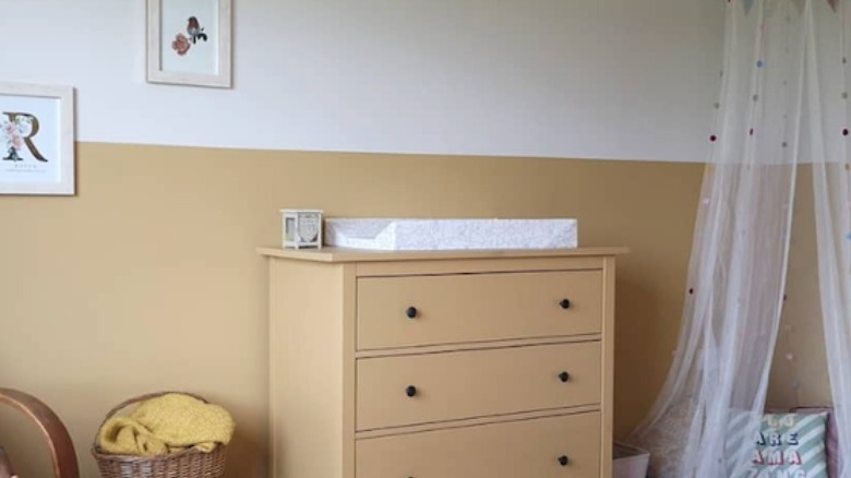
Conversely, furniture can appear to float against the walls, almost disappearing, when it's painted to match. Surprisingly then, painting a headboard in a parallel shade grounds the bed and creates a wonderful, inviting focal point in a bedroom. In the above child's room by DIY and Dreams, the maize dresser and wall are a perfectly quaint pairing, while the addition of white lightens the room. It's a feminine space for a little girl, but with a charming vintage or cottage vibe rather than anything excessively sweet or glitzy. The subdued yellow looks pretty with wood tones, and ironically, the color is a nice update for wood pieces that have seen better days.
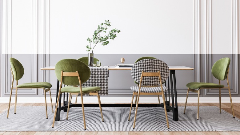
Where you place your dividing line is a combination of factors, the height of your furniture and ceiling among them. It's okay for furniture to extend above the lower division, but make sure it looks intentional.
Add drama
Craig and Rose explain that the history behind two-tone walls stems from an antique architectural feature known as a dado (chair) rail that is occasionally still seen in interiors today. Wainscoting is another treatment that visually splits the wall horizontally; per Fifth Avenue, the practice was originally developed as a way to provide additional insulation and resilience. Both presentations continue to be used in contemporary residences to add charm and classic detail. However, they can be costly to install unless you're an intrepid DIY-er, and they require a degree of commitment. Two-tone walls imply the aspects of the historic features in a budget-friendly manner, and instilling the look is far easier than installing wooden molding or beadboard. Additionally, while grounded in a classic tradition, their minimal take feels modern and fresh.
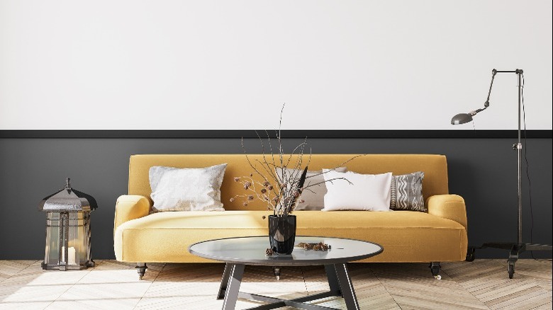
The inherent duality of the accent treatment allows a bit of drama without saturating a room in color. For a traditional and cozy mood, cover the bottom portion of the wall in a tint of white and the upper portion in a deeper shade; continuing the color onto the ceiling will ensure a space absent of too many jarring visual interruptions. Alternately, a modern and sophisticated home might use a bright white on top and a neutral or bold shade below. In the living room above, a butterscotch sofa beckons cheerily from a dark gray background. Choose two colors, like mint and ochre, suggests Dulux, and even a third as a thin stripe between them, to fashion a personal and novel space.