5 Best Accent Colors To Pair With Gray
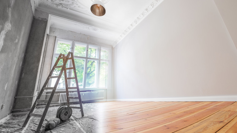
Hordes of homeowners couldn't wait to jump on the trends of avocado appliances and shag rugs in the '70s, and five years later, that look was hopelessly out of date. Many of us spend life trying to remain aware enough of what's trendy to keep current while not going so overboard that a complete makeover is required every few years. One way to do that is to make use of more muted color palettes — especially gray.
Gray is a go-to for many homeowners because it has a little more personality than white, but it's not as scene-stealing as red, purple, or (as we learned the hard way) avocado. Sharper Impressions Painting well understands the advantages of going gray. Assorted paint colors along the spectrum of grays travel from cool to warm; most are neither too cold nor too hot. Deeper tones can make a larger room seem a bit cozier, and lighter hues can do exactly the opposite.
Best of all, gray is very accepting of undertones and can pair nicely with a variety of patterned furniture and cabinetry, whether the pieces are upholstered, made of wood, or forged from metal. But that's just to state the obvious.
Let's dispel the myth that gray is dull right here. It's a highly adaptive color, and we have five examples to prove it.
1. Rose knows
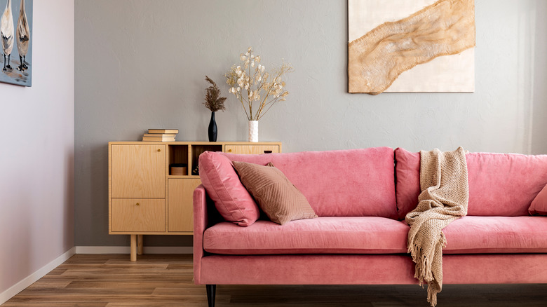
Maybe gray gets some of its bad rap because it's the color of skyscrapers and industrial machinery. But we often forget that koalas, dolphins, and kitties also come in shades of gray. The point: We often think that gray will elicit a cold emotional response because it's linked in our collective subconscious to things that are man-made, but that's not necessarily true.
In the image above, a welcoming atmosphere permeates the room because the rose pink couch rests gently against those gray walls. Here the gray is just enough to anchor the couch in this room and lend an air of serenity to what you see. Once you internalize the concept that gray is more a companion than a culprit, your challenge becomes nothing more than finding the right shade of gray with the right undertones to pair with your furniture, drapes, molding, and baseboards.
The professionals at Ideal Home will tell you that blush pink is one of the easiest colors to pair with gray. And if you're unsure about what shades to go with, they recommend testing the options you're considering before you paint an entire room. They suggest painting a section and watching how the lights of the room and the light coming in from outside change what you see over the course of a day. Make sure to bring whatever contrasting items you're considering into the experiment as well.
2. Mellow yellow
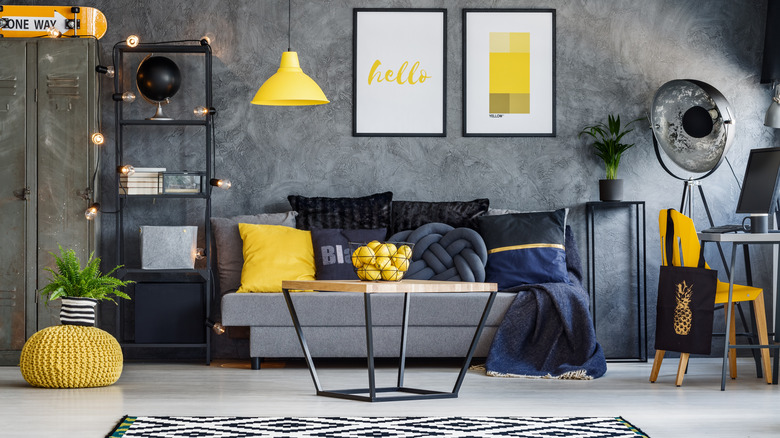
Two things make the image above seriously pop. One of them is that there appear to be brownish undertones in the gray sponge-painted walls, which provides the necessary harmony to bring in the assortment of yellow accents. The other is that there's nothing shy about the use of yellow here.
Ask the experts at 21 Oak, and they'll explain that it's the contrast that makes a room like this work. There are many things you can do with gray, but one of the worst possible mistakes would be to have a room full of furniture or accents on the walls that are too close to the same hue and shade that you've painted your walls. Here you'll see that the texturing of the walls, the wood, and the black fixtures all add to the multi-dimensional composite.
In other words, it's not only permissible to add other colors and textures; it's essential. At Farm Food Family, they prefer a mustard yellow to the egg-yolk-at-sunrise look above. It's more muted, mature, and refined.
So let's say a word about how to control your contrasts: the brighter your walls, the better your dark accents will appear. Conversely, the darker your walls, the more any light pieces will add both color and contrast.
3. Go green
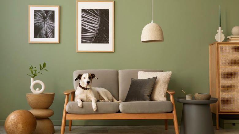
Here's a surefire way to see how gray really incorporates well into the natural world. The artwork, the loveseat, and the end table all unite to put a variety of gray shades on display. But the muted green wall, wood, lamp, pillows, and assorted tchotchkes all evoke the world of nature.
Perhaps it's a good idea to think of a river's edge. There are plants and trees with trunks that may be brown, green, gray, or white. Then at the banks of the water, you'll often find stones in varying shades of gray. That's the logic that's selling the image above so well.
The design experts at DigsDigs are such fans of the idea they've put together a gallery of more than three dozen examples of how wonderfully well this color combination works. Their examples run the gamut of color options, from minty greens and pastels to deep verdant hues opposite gray and sandy brick walls.
Over at Home Decor Bliss, you'll see clever (and perhaps kitschy to some) ideas like green grass rugs paired with dark gray accents, and even the once-banished avocado makes a comeback.
When you're using this color combination, it's also an opportunity to bring as much plant life into the picture as your heart desires. The result can lend your room a hint of rainforest beauty.
4. Mood indigo
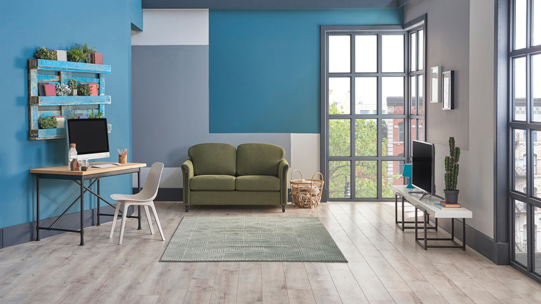
Aqua and gray go together like a swimming pool and a sunny day. In this mix-and-match example, everything works because it's all slightly muted. The blue hints at what you might call turquoise and ties in with the wall behind and the opposing wall's deeper blue. The mossy green couch picks up color from the rug and plants, and the gray of the accent wall is carried through by the darker metallic work on the windows.
Consider how you might adjust the combination of blue and gray to suit your own tastes. Some will favor a robin's egg contrasting against a lighter gray; others might favor something as rich and luxe as lapis. The only limits you face are those imposed by your imagination.
If you're a novice, don't despair. Mixing and matching can be a forgiving and adventurous practice, so long as you stick to something close to the same rule as contrasting colors. If you have a pattern like a slate gray wall with striations, pair it with a simple pattern like a light plaid. One thing is complex; another is basic and uncomplicated. It's easy enough once you get the hang of it, and there are a dizzying array of happy marriages on display at Decoist.
Likewise, at Terry Cralle, the 60 examples suggest that if you step out with a pattern or a dark color, try to alternate that with a simple backdrop or place light-colored accents against darker backgrounds.
5. Crisp white
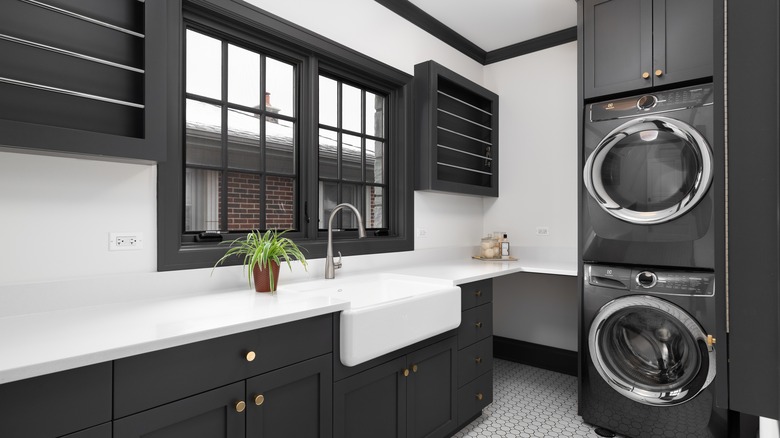
The overarching point when using gray in combination with any other color is to not be shy. As you can see in the example above, the contrast could almost not be sharper with the appliances and fixtures in silver and gray, offset by stark white everywhere else. Because of the liberal use of gray throughout the room, the white gleams — which reads as a refreshing message of cleanliness in something like a laundry room.
You'll also note a subtle suggestion of sophistication that comes with this color combination, according to Homedit. They suggest that when you're working with something as dark as charcoal, you keep in mind three main categories: cool (which carries blue and purple undertones and works well with white), neutral (which barely hints at green or brown), and warm (which evinces undertones of red, violet and taupe).
The same holds true for white, and the closer to neutral you go with both colors at the same time, the more you'll meet somewhere in the middle. Softer color palettes are less bold and appear more classy to some. Others may say that it turns a room into an undistinguished mush.
Policrete provides you with a crash course in using white and other colors to your advantage and being more playful and adventurous with texture. They emphasize tiles and polished concrete and suggest some ingenious ways to make those neutrals pop with accents of bamboo, metal, and Scandinavian pieces.